graph TB
    A[Quality Control Techniques] --> B[Control Charts]
    A --> C[Acceptance Sampling]

    B --> D[For Variables]
    B --> E[For Attributes]

    D --> F[X̄ Chart<br/>Process Mean]
    D --> G[R Chart<br/>Process Range]

    E --> H[p Charts<br/>Proportion Defective]
    E --> I[c Charts<br/>Number of Defects]

    C --> J[Related Risks<br/>Producer & Consumer]
    C --> K[Role of Acceptance Number]
    C --> L[Sampling Plans<br/>Single, Double, Multiple]

    style A fill:#e1f5ff
    style B fill:#fff4e1
    style C fill:#ffe1f5
    style D fill:#f0f0f0
    style E fill:#f0f0f0
16 Quality Control Techniques
Business Scenario: Minot Industries’ Quality Challenge
Last year, Minot Industries, a major glassware manufacturer, was forced to modernize its Toledo plant to keep pace with the technological advancements many of its competitors had adopted earlier. Since the plant was redesigned, Minot has experienced numerous problems with cost overruns, defective production, employee morale, and other emerging issues.
Recently, Ray Murdock was appointed as the new CEO by Minot’s principal shareholders. The centerpiece of Murdock’s renewal efforts is bringing all production processes up to the quality standards that have been revolutionizing the industry.
Mr. Murdock realizes this requires extraordinary teamwork from all executive officers, as well as from line personnel who have been faithfully committed to Minot Industries’ goals and aspirations in the past.
In the past, Minot was able to maintain its production standards with little effort and minimal concern for quality. The raw materials used by its skilled workforce guaranteed that Minot produced a superior product. However, with increasing competition from both domestic and foreign sources, maintaining product standards at a reasonable cost has become a more elusive goal.
Reestablishing Minot as an industry leader can only be achieved through the application of precise quality control methods. This challenge must be met by loyal employees who are willing to fulfill their professional obligations.
Murdock’s Challenge:
How can statistical quality control methods help Minot Industries regain its competitive edge?
16.1 15.1 Introduction
In today’s highly competitive global marketplace, organizations are increasingly aware of the need to maintain product quality. If a firm is going to compete successfully, it must take all necessary precautions to ensure that its products meet certain basic standards. Therefore, it is no exaggeration to emphasize the importance of Total Quality Management (TQM).
The principles inherent in TQM are growing in popularity and represent the future direction of statistical analysis applied to the business world. Quality control is not merely about detecting defects—it’s about preventing them, improving processes, and ensuring customer satisfaction.
16.1.1 The Evolution of Quality Thinking
Modern quality control represents a fundamental shift in manufacturing philosophy:
Traditional Approach:
- Inspect finished products
- Sort good from bad
- Accept certain defect levels
- Quality = inspection department’s responsibility
Modern TQM Approach:
- Build quality into the process
- Prevent defects before they occur
- Strive for continuous improvement
- Quality = everyone’s responsibility
16.1.2 Key Quality Control Concepts
Definition: Quality Control (QC) is the application of statistical methods to monitor and control process variation, ensuring products meet specifications and customer requirements.
Three fundamental questions drive quality control:
- Is our process in statistical control?
- Are variations random (common cause) or systematic (special cause)?
- Can we predict future performance based on past data?
- Are variations random (common cause) or systematic (special cause)?
- Is our process capable?
- Even if in control, does it meet specifications?
- What proportion of output is acceptable?
- Even if in control, does it meet specifications?
- How can we improve?
- Where should we focus improvement efforts?
- What changes will reduce variation?
- Where should we focus improvement efforts?
ImportantThe Cost of Poor Quality
Poor quality is expensive. The cost includes:
- Internal failure costs: Scrap, rework, retesting
- External failure costs: Warranty claims, returns, lost customers
- Appraisal costs: Inspection, testing, quality audits
- Prevention costs: Training, process improvement, quality planning
Studies show that prevention costs are typically 5-10% of the cost of failure. Investing in quality control pays enormous dividends.
16.1.3 The Quality Control Toolkit
Statistical quality control employs several powerful tools:
| Tool | Purpose | When to Use |
|---|---|---|
| Control Charts | Monitor process stability | Ongoing production monitoring |
| Pareto Charts | Identify vital few problems | Prioritizing improvement efforts |
| Fishbone Diagrams | Find root causes | Problem analysis |
| Histograms | Visualize process distribution | Capability analysis |
| Scatter Plots | Explore relationships | Identifying correlations |
| Check Sheets | Collect data systematically | Data gathering |
This chapter focuses primarily on control charts and acceptance sampling, the two most widely used statistical methods in quality control.
16.2 15.2 Brief History of Quality Control Development
The development of modern quality control represents one of the most important applications of statistics to industry. Understanding this evolution helps appreciate why these methods are so effective.
16.2.1 The Pioneers
Walter A. Shewhart (1891-1967): The Father of Statistical Quality Control
Working at Bell Telephone Laboratories in the 1920s, Shewhart made the fundamental discovery that:
“All processes exhibit variation, but not all variation signals a problem.”
Shewhart distinguished between:
- Common cause variation: Random, inherent in the process
- Special cause variation: Non-random, indicating a problem
His revolutionary contribution was the control chart, introduced in a 1924 memo. This simple graphical tool allows workers to distinguish between these two types of variation, knowing when to intervene and when to leave the process alone.
Code
import matplotlib.pyplot as plt
import numpy as np

np.random.seed(42)
fig, (ax1, ax2) = plt.subplots(1, 2, figsize=(12, 5))

# Left plot: Common cause variation only
time1 = np.arange(1, 26)
data1 = 50 + np.random.normal(0, 2, 25)

ax1.plot(time1, data1, 'o-', color='steelblue', linewidth=2, markersize=6)
ax1.axhline(y=50, color='green', linestyle='--', linewidth=2, label='Center Line')
ax1.axhline(y=56, color='red', linestyle='--', linewidth=1.5, label='Upper Control Limit')
ax1.axhline(y=44, color='red', linestyle='--', linewidth=1.5, label='Lower Control Limit')
ax1.fill_between(time1, 44, 56, alpha=0.1, color='green')
ax1.set_xlabel('Sample Number', fontsize=11, fontweight='bold')
ax1.set_ylabel('Measurement', fontsize=11, fontweight='bold')
ax1.set_title('Process In Control\n(Common Cause Variation Only)', fontsize=12, fontweight='bold')
ax1.legend(loc='upper right', fontsize=9)
ax1.grid(True, alpha=0.3)
ax1.set_ylim(40, 60)

# Right plot: Special cause variation introduced
time2 = np.arange(1, 26)
data2 = 50 + np.random.normal(0, 2, 25)
# Add special cause (shift) starting at point 15
data2[14:] += 5

ax2.plot(time2, data2, 'o-', color='steelblue', linewidth=2, markersize=6)
ax2.axhline(y=50, color='green', linestyle='--', linewidth=2, label='Center Line')
ax2.axhline(y=56, color='red', linestyle='--', linewidth=1.5, label='Upper Control Limit')
ax2.axhline(y=44, color='red', linestyle='--', linewidth=1.5, label='Lower Control Limit')
ax2.fill_between(time2, 44, 56, alpha=0.1, color='green')

# Highlight out-of-control points
out_of_control = data2 > 56
ax2.plot(time2[out_of_control], data2[out_of_control], 'ro', markersize=10,
         markerfacecolor='red', markeredgecolor='darkred', markeredgewidth=2,
         label='Out of Control')

ax2.annotate('Special Cause\nIntroduced', xy=(15, 55), xytext=(10, 58),
            arrowprops=dict(arrowstyle='->', color='red', lw=2),
            fontsize=10, fontweight='bold', color='red')

ax2.set_xlabel('Sample Number', fontsize=11, fontweight='bold')
ax2.set_ylabel('Measurement', fontsize=11, fontweight='bold')
ax2.set_title('Process Out of Control\n(Special Cause Variation Present)', fontsize=12, fontweight='bold')
ax2.legend(loc='upper left', fontsize=9)
ax2.grid(True, alpha=0.3)
ax2.set_ylim(40, 60)

plt.tight_layout()
plt.show()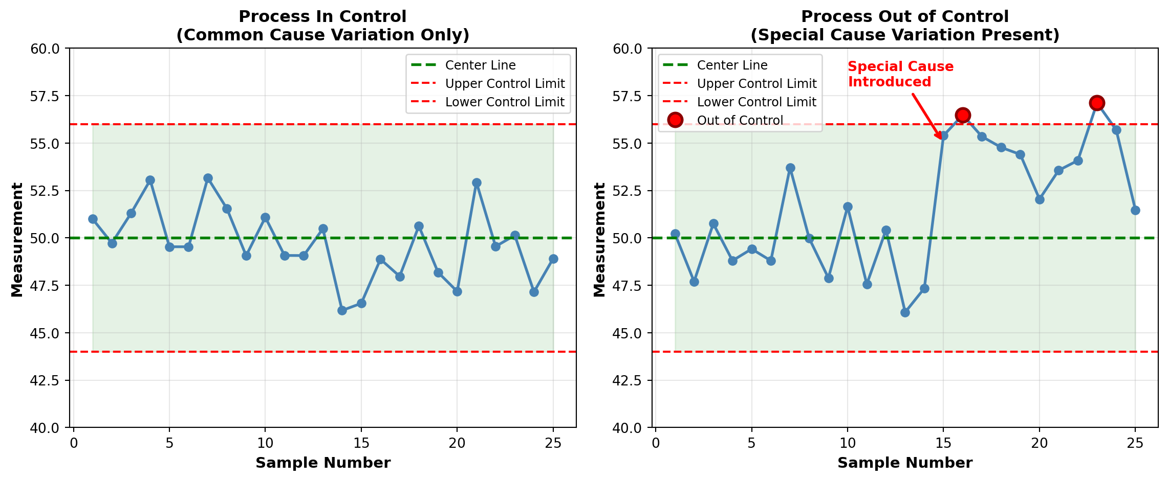
W. Edwards Deming (1900-1993): The Quality Revolution
Deming studied under Shewhart and brought statistical quality control to Japan after World War II. His impact on Japanese manufacturing was so profound that Japan established the Deming Prize for quality achievement in 1951.
Deming’s 14 Points for Management transformed how organizations think about quality:
- Create constancy of purpose for product/service improvement
- Adopt the new philosophy of quality
- Cease dependence on mass inspection
- End lowest-tender contracts; build long-term supplier relationships
- Improve constantly every process
- Institute training on the job
- Adopt and institute leadership
- Drive out fear
- Break down barriers between departments
- Eliminate slogans and exhortations
- Eliminate numerical quotas
- Remove barriers to pride of workmanship
- Institute vigorous education and self-improvement
- Put everybody to work on transformation
NoteThe Deming Legacy
When Deming returned to the United States in the 1980s, American manufacturers finally embraced his teachings. Ford Motor Company credited Deming’s methods with saving the company from bankruptcy. By the 1990s, TQM had become standard practice in competitive industries worldwide.
Joseph M. Juran (1904-2008): The Quality Trilogy
Juran contributed the concept of the Quality Trilogy:
- Quality Planning: Design quality into products and processes
- Quality Control: Monitor processes to maintain performance
- Quality Improvement: Breakthrough projects to reach new levels
Juran also popularized the Pareto Principle (80-20 rule) in quality control:
“80% of quality problems stem from 20% of causes.”
This principle guides prioritization of improvement efforts.
16.2.2 The Malcolm Baldrige National Quality Award
Established by the U.S. Congress in 1987, the Malcolm Baldrige Award recognizes U.S. organizations for performance excellence. The award criteria have become the de facto standard for organizational quality assessment.
Baldrige Framework Categories:
- Leadership
- Strategic Planning
- Customer Focus
- Measurement, Analysis, and Knowledge Management
- Workforce Focus
- Operations Focus
- Results
Organizations compete intensely for this prestigious award, which provides valuable recognition and validation of quality systems.
Code
import matplotlib.pyplot as plt
import matplotlib.patches as mpatches

fig, ax = plt.subplots(figsize=(14, 7))

# Timeline events
events = [
    (1924, "Shewhart introduces\ncontrol chart", 2),
    (1931, "Shewhart publishes\nEconomic Control of Quality", 1.5),
    (1950, "Deming teaches SQC\nin Japan", 2.5),
    (1951, "Deming Prize\nestablished", 1.8),
    (1979, "NBC documentary\n'If Japan Can, Why Can't We?'", 2.2),
    (1987, "Malcolm Baldrige\nAward established", 1.5),
    (1987, "ISO 9000 standards\nfirst published", 2.8),
    (2000, "Six Sigma becomes\nwidespread", 2)
]

# Draw timeline
ax.plot([1920, 2010], [1, 1], 'k-', linewidth=3)

# Plot events
for year, label, height in events:
    ax.plot(year, 1, 'ro', markersize=12, zorder=3)
    ax.plot([year, year], [1, 1+height], 'k--', linewidth=1, alpha=0.5)

    # Alternate text above and below
    if height > 2.2:
        va = 'bottom'
        y_offset = 1 + height + 0.1
    else:
        va = 'top'
        y_offset = 1 + height

    ax.text(year, y_offset, label, ha='center', va=va,
           fontsize=9, fontweight='bold',
           bbox=dict(boxstyle='round,pad=0.5', facecolor='lightyellow',
                    edgecolor='gray', alpha=0.8))

# Era labels
ax.text(1935, 0.3, 'Inspection Era', ha='center', fontsize=12,
       fontweight='bold', style='italic', color='darkred')
ax.text(1965, 0.3, 'Statistical Control Era', ha='center', fontsize=12,
       fontweight='bold', style='italic', color='darkblue')
ax.text(1995, 0.3, 'Total Quality Era', ha='center', fontsize=12,
       fontweight='bold', style='italic', color='darkgreen')

# Styling
ax.set_xlim(1915, 2015)
ax.set_ylim(0, 4.5)
ax.set_xlabel('Year', fontsize=13, fontweight='bold')
ax.set_title('Evolution of Quality Control: Major Milestones',
            fontsize=14, fontweight='bold', pad=20)
ax.set_yticks([])
ax.spines['left'].set_visible(False)
ax.spines['top'].set_visible(False)
ax.spines['right'].set_visible(False)
ax.grid(axis='x', alpha=0.3, linestyle='--')

plt.tight_layout()
plt.show()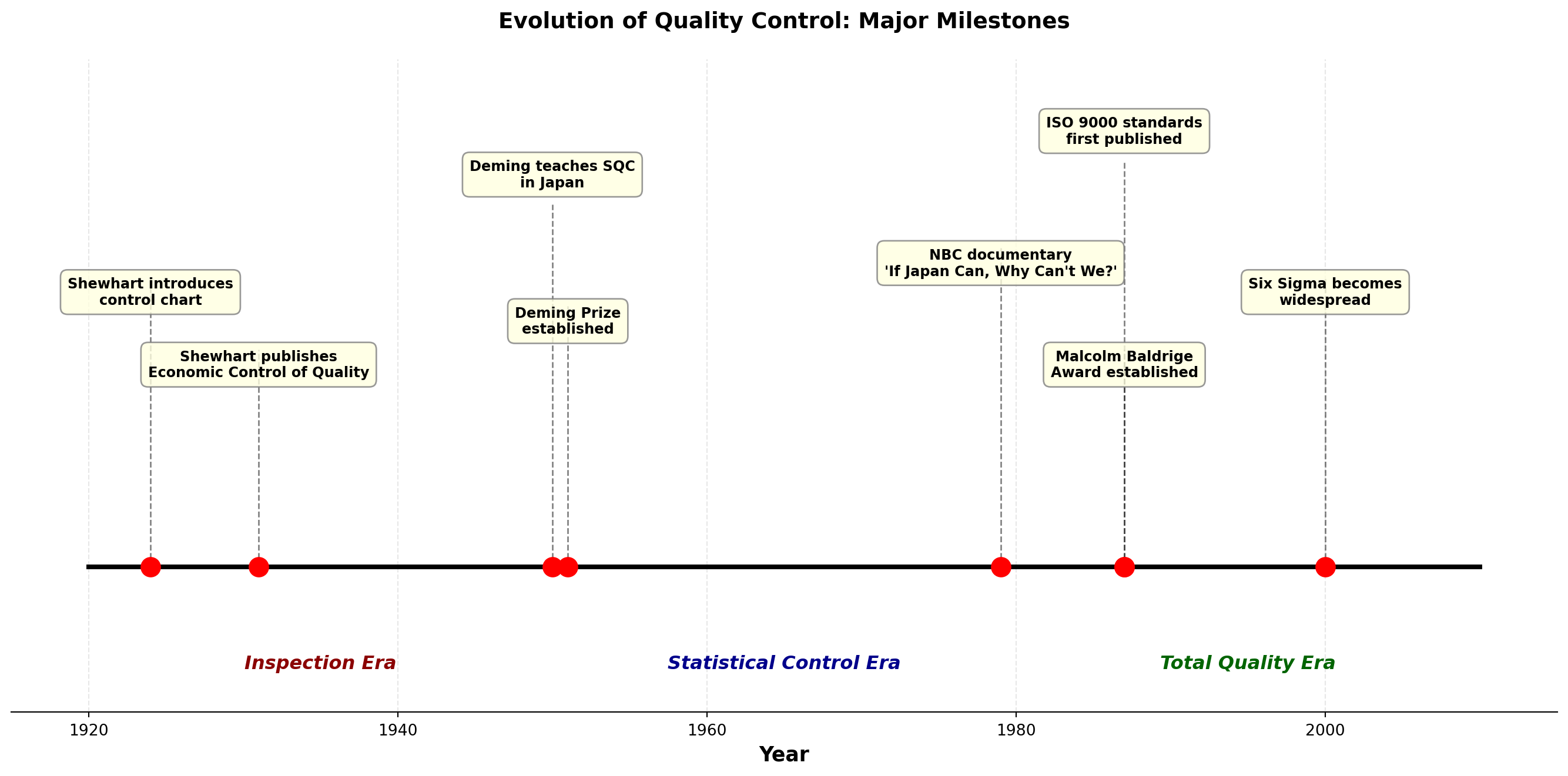
16.2.3 The Global Quality Movement
Today, quality control is a global imperative:
ISO 9000 Standards: International quality management standards adopted by over 1 million organizations worldwide.
Six Sigma: Motorola’s methodology for reducing defects to 3.4 per million opportunities. Popularized by General Electric under CEO Jack Welch.
Lean Manufacturing: Toyota Production System focusing on eliminating waste while maintaining quality.
TipQuality Control in the Digital Age
Modern quality control increasingly uses:
- Real-time sensor data and IoT (Internet of Things)
- Machine learning for predictive quality
- Automated inspection systems
- Big data analytics for process optimization
However, the fundamental statistical principles developed by Shewhart, Deming, and Juran remain as relevant as ever.
16.3 15.3 Control Charts for Variables
Control charts are the primary tool for monitoring process performance over time. They help distinguish between common cause and special cause variation, allowing appropriate managerial response.
16.3.1 Understanding Process Variation
Every process exhibits variation. The critical question is: What type of variation are we observing?
Common Cause Variation (Random)
- Inherent in the process
- Affects all observations
- Many small sources
- Predictable within limits
- Action required: Improve the system (management responsibility)
Special Cause Variation (Assignable)
- Not inherent in the process
- Affects only some observations
- Few specific sources
- Unpredictable
- Action required: Find and eliminate the cause (worker/operator responsibility)
Code
import matplotlib.pyplot as plt
import numpy as np

fig, ((ax1, ax2), (ax3, ax4)) = plt.subplots(2, 2, figsize=(14, 10))

np.random.seed(123)

# Panel 1: Stable process (common cause only)
n = 50
data1 = 100 + np.random.normal(0, 3, n)
ax1.plot(data1, 'o-', color='steelblue', markersize=5)
ax1.axhline(y=100, color='green', linestyle='--', linewidth=2, label='Target')
ax1.axhline(y=109, color='red', linestyle='--', linewidth=1.5, alpha=0.7, label='Control Limits')
ax1.axhline(y=91, color='red', linestyle='--', linewidth=1.5, alpha=0.7)
ax1.fill_between(range(n), 91, 109, alpha=0.1, color='green')
ax1.set_title('Stable Process\n(Common Cause Variation Only)', fontsize=11, fontweight='bold')
ax1.set_ylabel('Measurement', fontsize=10, fontweight='bold')
ax1.legend(loc='upper right')
ax1.grid(True, alpha=0.3)
ax1.set_ylim(85, 115)

# Panel 2: Shift in mean (special cause)
data2 = 100 + np.random.normal(0, 3, n)
data2[25:] += 8  # Shift after point 25
ax2.plot(data2, 'o-', color='steelblue', markersize=5)
ax2.axhline(y=100, color='green', linestyle='--', linewidth=2, label='Target')
ax2.axhline(y=109, color='red', linestyle='--', linewidth=1.5, alpha=0.7, label='Control Limits')
ax2.axhline(y=91, color='red', linestyle='--', linewidth=1.5, alpha=0.7)
ax2.fill_between(range(n), 91, 109, alpha=0.1, color='green')
ax2.plot(range(25, n), data2[25:], 'ro', markersize=7, label='Out of Control')
ax2.annotate('Process Shift', xy=(30, 108), xytext=(35, 113),
            arrowprops=dict(arrowstyle='->', color='red', lw=2),
            fontsize=9, fontweight='bold', color='red')
ax2.set_title('Process Mean Shift\n(Special Cause: Tool Wear)', fontsize=11, fontweight='bold')
ax2.set_ylabel('Measurement', fontsize=10, fontweight='bold')
ax2.legend(loc='upper left')
ax2.grid(True, alpha=0.3)
ax2.set_ylim(85, 115)

# Panel 3: Increased variation (special cause)
data3 = 100 + np.random.normal(0, 3, n)
data3[25:] += np.random.normal(0, 5, len(data3[25:]))  # Increased variation
ax3.plot(data3, 'o-', color='steelblue', markersize=5)
ax3.axhline(y=100, color='green', linestyle='--', linewidth=2, label='Target')
ax3.axhline(y=109, color='red', linestyle='--', linewidth=1.5, alpha=0.7, label='Control Limits')
ax3.axhline(y=91, color='red', linestyle='--', linewidth=1.5, alpha=0.7)
ax3.fill_between(range(n), 91, 109, alpha=0.1, color='green')
out_points = (data3 > 109) | (data3 < 91)
ax3.plot(np.where(out_points)[0], data3[out_points], 'ro', markersize=7, label='Out of Control')
ax3.annotate('Increased\nVariation', xy=(35, 115), xytext=(40, 113),
            arrowprops=dict(arrowstyle='->', color='red', lw=2),
            fontsize=9, fontweight='bold', color='red')
ax3.set_title('Increased Process Variation\n(Special Cause: Inconsistent Material)', fontsize=11, fontweight='bold')
ax3.set_xlabel('Sample Number', fontsize=10, fontweight='bold')
ax3.set_ylabel('Measurement', fontsize=10, fontweight='bold')
ax3.legend(loc='upper left')
ax3.grid(True, alpha=0.3)
ax3.set_ylim(85, 115)

# Panel 4: Trend (special cause)
trend = np.linspace(0, 12, n)
data4 = 100 + np.random.normal(0, 3, n) + trend
ax4.plot(data4, 'o-', color='steelblue', markersize=5)
ax4.axhline(y=100, color='green', linestyle='--', linewidth=2, label='Target')
ax4.axhline(y=109, color='red', linestyle='--', linewidth=1.5, alpha=0.7, label='Control Limits')
ax4.axhline(y=91, color='red', linestyle='--', linewidth=1.5, alpha=0.7)
ax4.fill_between(range(n), 91, 109, alpha=0.1, color='green')
out_points = (data4 > 109) | (data4 < 91)
ax4.plot(np.where(out_points)[0], data4[out_points], 'ro', markersize=7, label='Out of Control')
# Add trendline
z = np.polyfit(range(n), data4, 1)
p = np.poly1d(z)
ax4.plot(range(n), p(range(n)), "r--", linewidth=2, alpha=0.7, label='Trend')
ax4.annotate('Upward Trend', xy=(40, 110), xytext=(30, 113),
            arrowprops=dict(arrowstyle='->', color='red', lw=2),
            fontsize=9, fontweight='bold', color='red')
ax4.set_title('Process Trend\n(Special Cause: Gradual Equipment Degradation)', fontsize=11, fontweight='bold')
ax4.set_xlabel('Sample Number', fontsize=10, fontweight='bold')
ax4.set_ylabel('Measurement', fontsize=10, fontweight='bold')
ax4.legend(loc='upper left')
ax4.grid(True, alpha=0.3)
ax4.set_ylim(85, 115)

plt.suptitle('Common Patterns in Control Charts Indicating Special Causes',
            fontsize=13, fontweight='bold', y=0.995)
plt.tight_layout()
plt.show()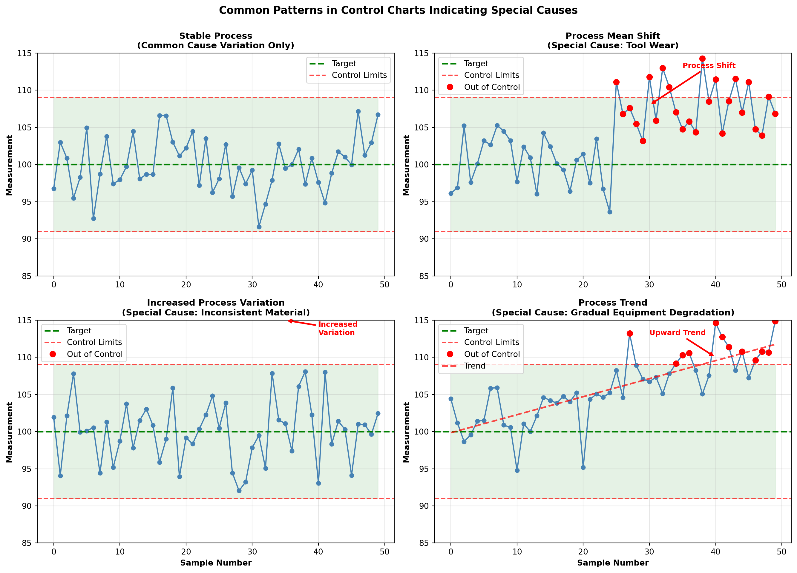
16.3.2 The Logic of Control Charts
Control charts use the principles of statistical inference:
Establish a baseline: When the process is in control, calculate the mean (\mu) and standard deviation (\sigma).
Set control limits: Typically at \mu \pm 3\sigma, which captures 99.73% of observations if the process remains in control.
Monitor ongoing production: Plot sample statistics (means, ranges, proportions, counts) on the chart.
Detect signals: Points outside control limits or non-random patterns indicate special causes requiring investigation.
Statistical Foundation:
If the process is in control and measurements are normally distributed, the probability of a point falling outside 3\sigma limits is only 0.0027 (about 3 in 1000). Such a rare event suggests something has changed.
16.3.3 Rational Subgrouping
A fundamental principle of control charting is rational subgrouping:
“Samples should be selected so that variation within subgroups represents only common causes, while variation between subgroups may include special causes.”
Example: In monitoring bottle filling:
- Good subgrouping: 5 consecutive bottles from the same filling head
- Poor subgrouping: 1 bottle from each of 5 filling heads
The first approach allows detection of problems with individual filling heads. The second masks such problems by averaging across heads.
WarningMisuse of Control Charts
Common mistakes that reduce effectiveness:
- Using control charts on non-stable processes
- Calculating limits from out-of-control data
- Treating control limits as specification limits
- Failing to act on out-of-control signals
- Over-adjusting process based on common cause variation
This concludes STAGE 1 of Chapter 15. The stage covers:
✓ Business scenario (Minot Industries)
✓ Mermaid diagram showing chapter organization
✓ Introduction to quality control
✓ Brief history (Shewhart, Deming, Juran, Baldrige)
✓ Introduction to control charts for variables
✓ Three Python visualizations
Next stages will cover:
- STAGE 2: X̄ and R charts in detail
- STAGE 3: p and c charts for attributes
- STAGE 4: Acceptance sampling, interpretation, and summary
## 15.4 Control Charts for Mean and Dispersion
When monitoring variables data (measurements like weight, length, temperature, time), we typically use two charts together:
- X̄ chart (X-bar chart): Monitors the process mean (central tendency)
- R chart (Range chart): Monitors the process dispersion (variability)
These charts work as a team. The X̄ chart detects shifts in the process average, while the R chart detects changes in process consistency. Both must be in control for the process to be considered stable.
ImportantWhy Monitor Both Mean and Variation?
A process can be centered on target but have excessive variation (producing defects).
Conversely, a process can have consistent variation but be off-target (also producing defects).
Both location and spread must be controlled for quality production.
16.3.4 When to Use X̄ and R Charts
Appropriate situations:
- Continuous measurement data (weight, dimension, temperature, time)
- Production in rational subgroups (3-10 units sampled together)
- Process has been brought to reasonable stability
- Quick calculations needed (R is easier to compute than standard deviation)
Example applications:
- Monitoring fill weights of packages
- Tracking dimensions of machined parts
- Measuring chemical concentrations
- Recording assembly times
- Controlling oven temperatures
16.4 15.5 The X̄ Chart: Monitoring Process Mean
The X̄ chart monitors the average of small samples taken at regular intervals. It answers the question: “Is our process producing output centered on the target value?”
16.4.1 Constructing the X̄ Chart
Step 1: Collect preliminary data
Gather at least 20-25 subgroups of n = 3 to 10 observations each, when the process is believed to be in control.
Step 2: Calculate subgroup means
For each subgroup i, compute:
\bar{X}_i = \frac{\sum_{j=1}^{n} X_{ij}}{n} \tag{16.1}
where X_{ij} is the jth observation in subgroup i.
Step 3: Calculate the grand mean
The center line (CL) is the average of all subgroup means:
\bar{\bar{X}} = \frac{\sum_{i=1}^{k} \bar{X}_i}{k} \tag{16.2}
where k is the number of subgroups.
Step 4: Calculate control limits
Upper and lower control limits are:
\text{UCL}_{\bar{X}} = \bar{\bar{X}} + A_2\bar{R} \tag{16.3}
\text{LCL}_{\bar{X}} = \bar{\bar{X}} - A_2\bar{R} \tag{16.4}
where:
- \bar{R} is the average range across all subgroups
- A_2 is a constant that depends on subgroup size n (see Table 15.1)
NoteUnderstanding the A_2 Factor
The factor A_2 converts the average range \bar{R} into an estimate of 3 standard deviations of the sampling distribution of \bar{X}.
It accounts for:
1. The relationship between range and standard deviation
2. The subgroup size
3. Three-sigma control limits
This elegant approach, developed by Shewhart, allows control limits to be calculated without computing standard deviations—a significant practical advantage in the pre-computer era that remains useful today.
Table 15.1: Control Chart Constants
| Subgroup Size (n) | A_2 | D_3 | D_4 | d_2 |
|---|---|---|---|---|
| 2 | 1.880 | 0 | 3.267 | 1.128 |
| 3 | 1.023 | 0 | 2.574 | 1.693 |
| 4 | 0.729 | 0 | 2.282 | 2.059 |
| 5 | 0.577 | 0 | 2.114 | 2.326 |
| 6 | 0.483 | 0 | 2.004 | 2.534 |
| 7 | 0.419 | 0.076 | 1.924 | 2.704 |
| 8 | 0.373 | 0.136 | 1.864 | 2.847 |
| 9 | 0.337 | 0.184 | 1.816 | 2.970 |
| 10 | 0.308 | 0.223 | 1.777 | 3.078 |
Note: A_2 is for X̄ chart limits; D_3 and D_4 are for R chart limits; d_2 relates range to standard deviation.
16.4.2 Example 15.1: Monitoring Bottle Fill Weights
Problem Statement:
Minot Industries’ new automated bottling line fills glass bottles with specialty oil. The target fill weight is 16.0 ounces. Ray Murdock, the CEO, wants to establish control charts to monitor the filling process. The quality control team collects 25 subgroups of 5 bottles each at hourly intervals.
The data are shown in Table 15.2.
Table 15.2: Bottle Fill Weights (ounces) - Minot Industries
| Subgroup | Obs 1 | Obs 2 | Obs 3 | Obs 4 | Obs 5 | \bar{X} | R |
|---|---|---|---|---|---|---|---|
| 1 | 16.1 | 15.9 | 16.0 | 16.2 | 15.8 | 16.00 | 0.4 |
| 2 | 15.8 | 16.1 | 16.0 | 15.9 | 16.2 | 16.00 | 0.4 |
| 3 | 16.2 | 15.9 | 16.1 | 16.0 | 15.8 | 16.00 | 0.4 |
| 4 | 16.0 | 16.3 | 15.9 | 16.1 | 16.0 | 16.06 | 0.4 |
| 5 | 15.9 | 16.0 | 16.2 | 15.8 | 16.1 | 16.00 | 0.4 |
| 6 | 16.1 | 15.8 | 16.0 | 16.2 | 15.9 | 16.00 | 0.4 |
| 7 | 16.0 | 16.1 | 15.9 | 16.0 | 16.3 | 16.06 | 0.4 |
| 8 | 15.8 | 16.2 | 16.0 | 15.9 | 16.1 | 16.00 | 0.4 |
| 9 | 16.1 | 15.9 | 16.2 | 16.0 | 15.8 | 16.00 | 0.4 |
| 10 | 16.0 | 16.0 | 15.9 | 16.1 | 16.2 | 16.04 | 0.3 |
| 11 | 15.9 | 16.1 | 16.0 | 15.8 | 16.2 | 16.00 | 0.4 |
| 12 | 16.2 | 15.9 | 16.1 | 16.0 | 15.9 | 16.02 | 0.3 |
| 13 | 16.0 | 16.2 | 15.8 | 16.1 | 16.0 | 16.02 | 0.4 |
| 14 | 15.9 | 16.0 | 16.1 | 15.9 | 16.2 | 16.02 | 0.3 |
| 15 | 16.1 | 15.8 | 16.0 | 16.2 | 15.9 | 16.00 | 0.4 |
| 16 | 16.0 | 16.1 | 15.9 | 16.0 | 16.1 | 16.02 | 0.2 |
| 17 | 15.8 | 16.2 | 16.0 | 15.9 | 16.1 | 16.00 | 0.4 |
| 18 | 16.1 | 15.9 | 16.2 | 16.0 | 15.8 | 16.00 | 0.4 |
| 19 | 16.0 | 16.0 | 15.9 | 16.1 | 16.2 | 16.04 | 0.3 |
| 20 | 15.9 | 16.1 | 16.0 | 15.8 | 16.0 | 15.96 | 0.3 |
| 21 | 16.2 | 15.9 | 16.1 | 16.0 | 15.9 | 16.02 | 0.3 |
| 22 | 16.0 | 16.1 | 15.8 | 16.2 | 16.0 | 16.02 | 0.4 |
| 23 | 15.9 | 16.0 | 16.1 | 15.9 | 16.2 | 16.02 | 0.3 |
| 24 | 16.1 | 15.8 | 16.0 | 16.1 | 15.9 | 15.98 | 0.3 |
| 25 | 16.0 | 16.2 | 15.9 | 16.0 | 16.1 | 16.04 | 0.3 |
Solution:
Step 1: The data have been collected (25 subgroups of n = 5 bottles each).
Step 2: Subgroup means already calculated (see \bar{X} column in Table 15.2).
Step 3: Calculate the grand mean:
\bar{\bar{X}} = \frac{16.00 + 16.00 + \cdots + 16.04}{25} = \frac{400.50}{25} = 16.02 \text{ ounces}
Step 4: Calculate the average range:
The ranges for each subgroup are shown in the R column. The average range is:
\bar{R} = \frac{0.4 + 0.4 + \cdots + 0.3}{25} = \frac{8.8}{25} = 0.352 \text{ ounces}
Step 5: Determine control limits for the X̄ chart.
From Table 15.1, for n = 5: A_2 = 0.577
\text{UCL}_{\bar{X}} = \bar{\bar{X}} + A_2\bar{R} = 16.02 + (0.577)(0.352) = 16.02 + 0.203 = 16.223
\text{LCL}_{\bar{X}} = \bar{\bar{X}} - A_2\bar{R} = 16.02 - (0.577)(0.352) = 16.02 - 0.203 = 15.817
Control Chart Parameters:
- Center Line: \bar{\bar{X}} = 16.02 ounces
- Upper Control Limit: UCL = 16.223 ounces
- Lower Control Limit: LCL = 15.817 ounces
Code
import matplotlib.pyplot as plt
import numpy as np

# Data from Table 15.2
subgroups = np.arange(1, 26)
xbar_values = np.array([16.00, 16.00, 16.00, 16.06, 16.00, 16.00, 16.06, 16.00,
                        16.00, 16.04, 16.00, 16.02, 16.02, 16.02, 16.00, 16.02,
                        16.00, 16.00, 16.04, 15.96, 16.02, 16.02, 16.02, 15.98, 16.04])

# Control chart parameters
grand_mean = 16.02
ucl = 16.223
lcl = 15.817

# Create the chart
fig, ax = plt.subplots(figsize=(14, 7))

# Plot the data
ax.plot(subgroups, xbar_values, 'o-', color='steelblue', linewidth=2,
        markersize=8, label='Subgroup Means', zorder=3)

# Plot control limits and center line
ax.axhline(y=grand_mean, color='green', linestyle='-', linewidth=2.5,
           label=f'Center Line (X̄̄ = {grand_mean:.3f})', zorder=2)
ax.axhline(y=ucl, color='red', linestyle='--', linewidth=2,
           label=f'UCL = {ucl:.3f}', zorder=2)
ax.axhline(y=lcl, color='red', linestyle='--', linewidth=2,
           label=f'LCL = {lcl:.3f}', zorder=2)

# Shade the control zone
ax.fill_between(subgroups, lcl, ucl, alpha=0.1, color='green', zorder=1)

# Annotate target
ax.axhline(y=16.0, color='blue', linestyle=':', linewidth=1.5,
           label='Target (16.0 oz)', alpha=0.7, zorder=1)

# Styling
ax.set_xlabel('Subgroup Number', fontsize=12, fontweight='bold')
ax.set_ylabel('Average Fill Weight (ounces)', fontsize=12, fontweight='bold')
ax.set_title('X̄ Control Chart: Minot Industries Bottle Filling Process\n25 Subgroups of n=5 Bottles',
            fontsize=14, fontweight='bold', pad=15)
ax.legend(loc='upper right', fontsize=10, framealpha=0.9)
ax.grid(True, alpha=0.3, linestyle='--')
ax.set_xlim(0, 26)
ax.set_ylim(15.75, 16.30)

# Add zone labels
ax.text(1, 16.27, 'Out of Control Zone', fontsize=9, color='red', style='italic', alpha=0.7)
ax.text(1, 15.78, 'Out of Control Zone', fontsize=9, color='red', style='italic', alpha=0.7)

plt.tight_layout()
plt.show()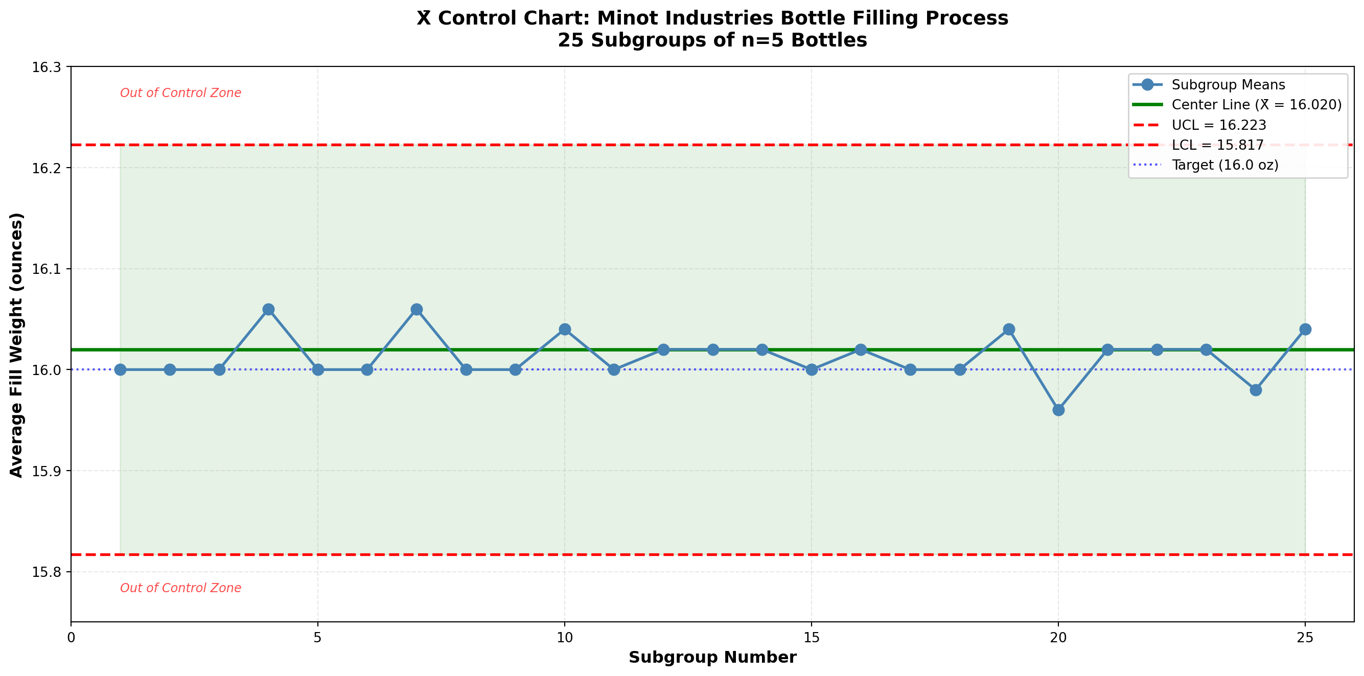
Interpretation:
All 25 subgroup means fall within the control limits. The process appears to be in statistical control with respect to the mean. The fill weights are centered very close to the target of 16.0 ounces (grand mean = 16.02 ounces, just 0.02 ounces above target).
TipProcess Performance Assessment
Statistical Control: ✓ Yes (all points within limits)
Centered on Target: ✓ Yes (16.02 vs. 16.0 target)
Process Capability: Need to check R chart and compare to specifications
The X̄ chart alone doesn’t tell the complete story. We must also examine the R chart to assess process variation.
16.5 15.6 The R Chart: Monitoring Process Variation
While the X̄ chart monitors the process mean, the R chart monitors process variability using the range (difference between largest and smallest values in each subgroup).
ImportantCritical Rule: Always Analyze R Chart First!
Before interpreting the X̄ chart, always check the R chart.
Why? If variation is out of control, the control limits on the X̄ chart (which depend on \bar{R}) are invalid. An out-of-control R chart indicates the process variation is unstable, which invalidates the X̄ chart analysis.
Proper sequence:
1. Construct and analyze R chart
2. If R chart is in control, then analyze X̄ chart
3. If R chart is out of control, fix variation problems first
16.5.1 Constructing the R Chart
Step 1: Calculate subgroup ranges
For each subgroup i:
R_i = X_{\text{max},i} - X_{\text{min},i} \tag{16.5}
Step 2: Calculate average range
The center line is:
\bar{R} = \frac{\sum_{i=1}^{k} R_i}{k} \tag{16.6}
Step 3: Calculate control limits
\text{UCL}_R = D_4 \bar{R} \tag{16.7}
\text{LCL}_R = D_3 \bar{R} \tag{16.8}
where D_3 and D_4 are constants from Table 15.1 that depend on subgroup size n.
Note: For small subgroup sizes (n \leq 6), D_3 = 0, so there is no lower control limit. This reflects the fact that the range cannot be negative and is unlikely to be extremely small by chance alone for small samples.
16.5.2 Example 15.2: R Chart for Bottle Filling Process
Continuing Example 15.1, construct an R chart for the Minot Industries filling process.
Solution:
Step 1: Ranges already calculated (see Table 15.2).
Step 2: Average range:
\bar{R} = 0.352 \text{ ounces (from Example 15.1)}
Step 3: Control limits.
From Table 15.1, for n = 5:
- D_3 = 0 (no lower control limit)
- D_4 = 2.114
\text{UCL}_R = D_4 \bar{R} = (2.114)(0.352) = 0.744 \text{ ounces}
\text{LCL}_R = D_3 \bar{R} = (0)(0.352) = 0 \text{ ounces}
Control Chart Parameters:
- Center Line: \bar{R} = 0.352 ounces
- Upper Control Limit: UCL = 0.744 ounces
- Lower Control Limit: LCL = 0 ounces (no LCL for n=5)
Code
import matplotlib.pyplot as plt
import numpy as np

# Data from Table 15.2
subgroups = np.arange(1, 26)
r_values = np.array([0.4, 0.4, 0.4, 0.4, 0.4, 0.4, 0.4, 0.4, 0.4, 0.3,
                     0.4, 0.3, 0.4, 0.3, 0.4, 0.2, 0.4, 0.4, 0.3, 0.3,
                     0.3, 0.4, 0.3, 0.3, 0.3])

# Control chart parameters
r_bar = 0.352
ucl_r = 0.744
lcl_r = 0.0

# Create the chart
fig, ax = plt.subplots(figsize=(14, 7))

# Plot the data
ax.plot(subgroups, r_values, 'o-', color='darkviolet', linewidth=2,
        markersize=8, label='Subgroup Ranges', zorder=3)

# Plot control limits and center line
ax.axhline(y=r_bar, color='green', linestyle='-', linewidth=2.5,
           label=f'Center Line (R̄ = {r_bar:.3f})', zorder=2)
ax.axhline(y=ucl_r, color='red', linestyle='--', linewidth=2,
           label=f'UCL = {ucl_r:.3f}', zorder=2)
ax.axhline(y=lcl_r, color='gray', linestyle='--', linewidth=1.5,
           label='LCL = 0 (no lower limit for n=5)', alpha=0.5, zorder=2)

# Shade the control zone
ax.fill_between(subgroups, lcl_r, ucl_r, alpha=0.1, color='green', zorder=1)

# Styling
ax.set_xlabel('Subgroup Number', fontsize=12, fontweight='bold')
ax.set_ylabel('Range (ounces)', fontsize=12, fontweight='bold')
ax.set_title('R Control Chart: Minot Industries Bottle Filling Process\n25 Subgroups of n=5 Bottles',
            fontsize=14, fontweight='bold', pad=15)
ax.legend(loc='upper right', fontsize=10, framealpha=0.9)
ax.grid(True, alpha=0.3, linestyle='--')
ax.set_xlim(0, 26)
ax.set_ylim(-0.05, 0.85)

# Add zone label
ax.text(1, 0.78, 'Out of Control Zone (Excessive Variation)', fontsize=9,
        color='red', style='italic', alpha=0.7)

# Highlight the consistent variation
ax.axhspan(0.2, 0.4, alpha=0.05, color='blue', zorder=0)
ax.text(13, 0.65, 'Consistent variation:\nMost ranges 0.3-0.4 oz',
        fontsize=9, ha='center',
        bbox=dict(boxstyle='round,pad=0.5', facecolor='lightblue',
                 edgecolor='blue', alpha=0.7))

plt.tight_layout()
plt.show()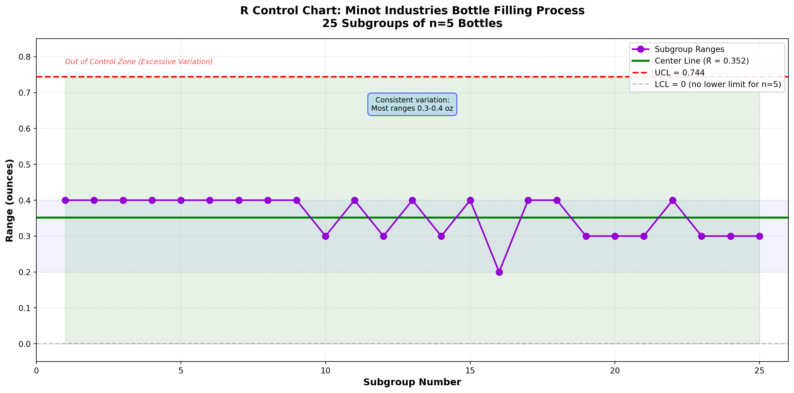
Interpretation:
All 25 subgroup ranges fall well within the control limits. The R chart shows the process variation is in statistical control. The ranges are consistently between 0.2 and 0.4 ounces, with most around 0.3-0.4 ounces.
Combined Interpretation (X̄ and R Charts):
Since both charts are in control:
1. ✓ Process is stable - No special causes detected
2. ✓ Mean is on target - Centered at 16.02 oz (vs. 16.0 target)
3. ✓ Variation is consistent - Predictable range of 0.2-0.4 oz
Recommendation:
The bottle filling process is performing well and is in statistical control. Ray Murdock can be confident that the process is stable and predictable. These control limits should be extended for ongoing monitoring of future production.
16.6 Understanding Process Variation: Range vs. Standard Deviation
Although monitoring variation is useful for detecting changes in process dispersion, quality control techniques generally rely on the range as an indicator of variability rather than the standard deviation. Why?
16.6.1 Practical Advantages of Range
1. Computational Simplicity
The range is much easier to calculate than the standard deviation:
- Range: R = X_{\max} - X_{\min} (one subtraction)
- Standard Deviation: Requires squaring deviations, summing, dividing, and taking square root
In the pre-computer era when control charts were developed, this was crucial. Even today, shop floor workers can calculate ranges quickly without calculators.
2. Intuitive Understanding
Workers without statistical training easily understand “largest minus smallest.” The standard deviation requires more explanation.
3. Adequate for Small Samples
For subgroups of size 3-10 (typical in quality control), the range is nearly as efficient as the standard deviation for estimating process variation.
16.6.2 Relationship Between Range and Standard Deviation
The range and standard deviation are related through the constant d_2 (see Table 15.1):
\sigma \approx \frac{\bar{R}}{d_2} \tag{16.9}
For Example 15.2 with n=5, d_2 = 2.326:
\hat{\sigma} = \frac{0.352}{2.326} = 0.151 \text{ ounces}
This estimates the process standard deviation using the average range.
NoteWhen to Use Standard Deviation Instead of Range
Modern control charts sometimes use s charts (based on standard deviation) instead of R charts:
Use s chart when:
- Subgroup size is large (n > 10)
- Computer calculations are routine
- More precise variation estimates are needed
Use R chart when:
- Subgroup size is small to moderate (2-10)
- Manual calculations are preferred
- Simplicity and transparency are important
For most manufacturing applications with typical subgroup sizes, R charts remain the standard.
16.7 Example 15.3: Detecting Process Changes
Let’s examine how X̄ and R charts detect different types of process changes.
Problem Statement:
Minot Industries discovers that after subgroup 15, a different batch of raw materials was introduced. The quality team wants to see if the control charts would have detected this change. Simulated data for 10 additional subgroups (16-25) under the new material show slightly higher fill weights.
Code
import matplotlib.pyplot as plt
import numpy as np

# Original data (subgroups 1-15) - stable
np.random.seed(42)
subgroups_1 = np.arange(1, 16)
xbar_1 = 16.02 + np.random.normal(0, 0.03, 15)
r_1 = 0.35 + np.random.normal(0, 0.05, 15)
r_1 = np.clip(r_1, 0.2, 0.5)  # Keep ranges realistic

# New material (subgroups 16-25) - mean shift up by 0.15
subgroups_2 = np.arange(16, 26)
xbar_2 = 16.17 + np.random.normal(0, 0.03, 10)  # Shifted mean
r_2 = 0.35 + np.random.normal(0, 0.05, 10)
r_2 = np.clip(r_2, 0.2, 0.5)

# Combine data
subgroups = np.concatenate([subgroups_1, subgroups_2])
xbar_values = np.concatenate([xbar_1, xbar_2])
r_values = np.concatenate([r_1, r_2])

# Control limits (calculated from first 15 subgroups)
grand_mean_original = 16.02
r_bar_original = 0.352
ucl_xbar = 16.223
lcl_xbar = 15.817
ucl_r = 0.744

fig, (ax1, ax2) = plt.subplots(2, 1, figsize=(14, 10))

# X̄ Chart
ax1.plot(subgroups_1, xbar_1, 'o-', color='steelblue', linewidth=2,
         markersize=8, label='In Control (Original Material)', zorder=3)
ax1.plot(subgroups_2, xbar_2, 'o-', color='orangered', linewidth=2,
         markersize=8, label='After Change (New Material)', zorder=3)

ax1.axhline(y=grand_mean_original, color='green', linestyle='-', linewidth=2.5,
            label=f'Center Line = {grand_mean_original:.2f}', zorder=2)
ax1.axhline(y=ucl_xbar, color='red', linestyle='--', linewidth=2,
            label=f'UCL = {ucl_xbar:.3f}', zorder=2)
ax1.axhline(y=lcl_xbar, color='red', linestyle='--', linewidth=2,
            label=f'LCL = {lcl_xbar:.3f}', zorder=2)
ax1.fill_between(subgroups, lcl_xbar, ucl_xbar, alpha=0.1, color='green', zorder=1)

# Highlight out-of-control points
out_of_control = xbar_values > ucl_xbar
ax1.plot(subgroups[out_of_control], xbar_values[out_of_control], 'rx',
         markersize=15, markeredgewidth=3, label='Out of Control', zorder=4)

# Add change annotation
ax1.axvline(x=15.5, color='purple', linestyle=':', linewidth=2, alpha=0.7)
ax1.annotate('Material Change', xy=(15.5, 16.25), xytext=(12, 16.28),
            arrowprops=dict(arrowstyle='->', color='purple', lw=2),
            fontsize=11, fontweight='bold', color='purple')

ax1.set_xlabel('Subgroup Number', fontsize=12, fontweight='bold')
ax1.set_ylabel('Average Fill Weight (oz)', fontsize=12, fontweight='bold')
ax1.set_title('X̄ Chart: Detection of Process Mean Shift', fontsize=13, fontweight='bold')
ax1.legend(loc='upper left', fontsize=9, framealpha=0.9)
ax1.grid(True, alpha=0.3, linestyle='--')
ax1.set_xlim(0, 26)

# R Chart
ax2.plot(subgroups_1, r_1, 'o-', color='darkviolet', linewidth=2,
         markersize=8, label='In Control (Original Material)', zorder=3)
ax2.plot(subgroups_2, r_2, 'o-', color='darkviolet', linewidth=2,
         markersize=8, label='After Change (New Material)', zorder=3)

ax2.axhline(y=r_bar_original, color='green', linestyle='-', linewidth=2.5,
            label=f'Center Line = {r_bar_original:.3f}', zorder=2)
ax2.axhline(y=ucl_r, color='red', linestyle='--', linewidth=2,
            label=f'UCL = {ucl_r:.3f}', zorder=2)
ax2.axhline(y=0, color='gray', linestyle='--', linewidth=1.5,
            label='LCL = 0', alpha=0.5, zorder=2)
ax2.fill_between(subgroups, 0, ucl_r, alpha=0.1, color='green', zorder=1)

# Add change annotation
ax2.axvline(x=15.5, color='purple', linestyle=':', linewidth=2, alpha=0.7)
ax2.annotate('Material Change', xy=(15.5, 0.7), xytext=(18, 0.68),
            arrowprops=dict(arrowstyle='->', color='purple', lw=2),
            fontsize=11, fontweight='bold', color='purple')

ax2.set_xlabel('Subgroup Number', fontsize=12, fontweight='bold')
ax2.set_ylabel('Range (oz)', fontsize=12, fontweight='bold')
ax2.set_title('R Chart: Variation Remains Stable Despite Mean Shift',
             fontsize=13, fontweight='bold')
ax2.legend(loc='upper right', fontsize=9, framealpha=0.9)
ax2.grid(True, alpha=0.3, linestyle='--')
ax2.set_xlim(0, 26)
ax2.set_ylim(-0.05, 0.75)

plt.tight_layout()
plt.show()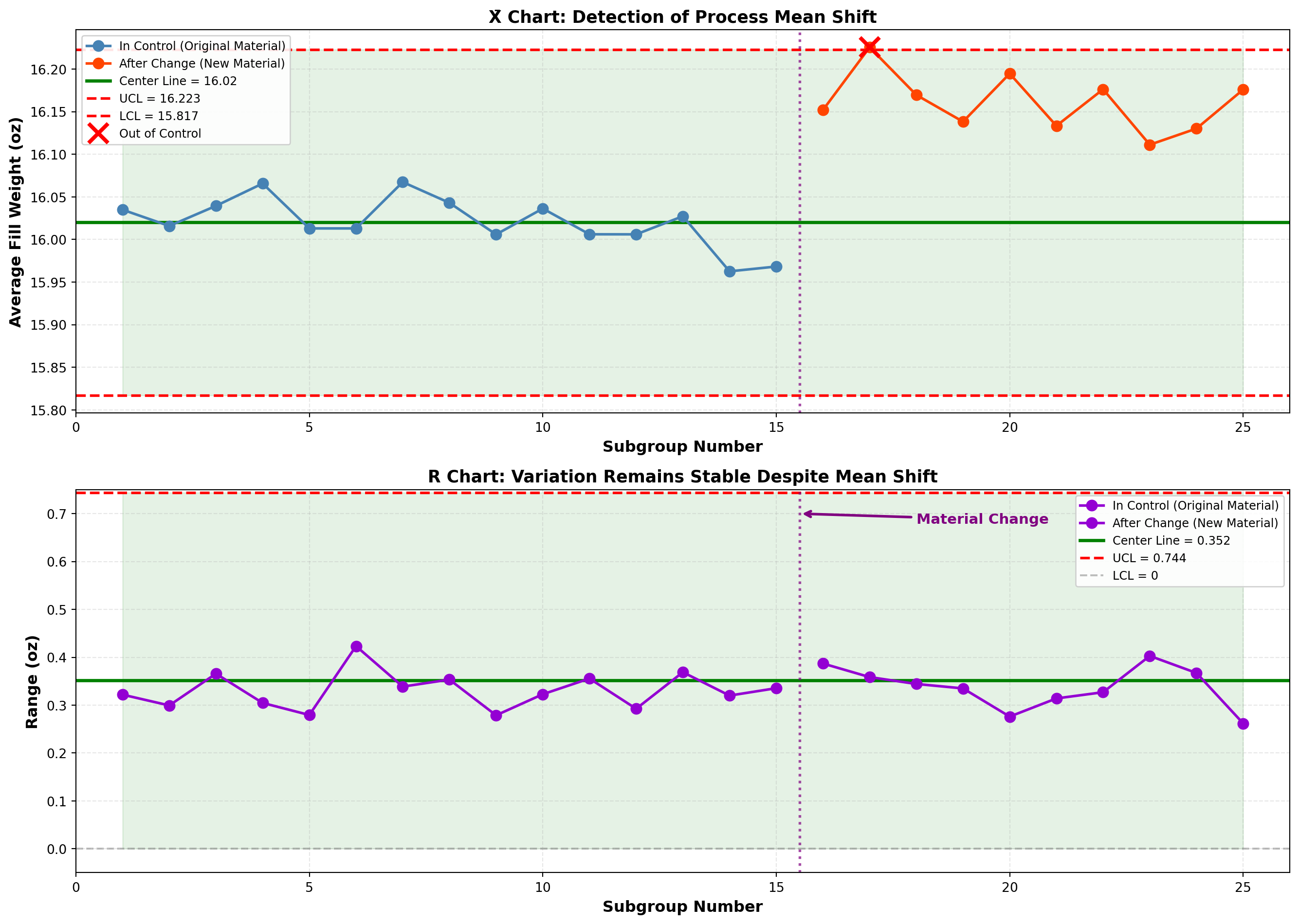
Analysis:
X̄ Chart Findings:
- Subgroups 1-15: All points in control
- Subgroups 16-25: Several points exceed UCL
- Detection: X̄ chart successfully detected the shift in process mean
R Chart Findings:
- All subgroups: Points remain in control
- Detection: Variation unchanged; the new material affects location but not spread
Interpretation:
This demonstrates the complementary nature of X̄ and R charts:
- X̄ chart: Sensitive to changes in process average (location)
- R chart: Sensitive to changes in process variation (spread)
The new material shifted the mean higher but did not affect variability. Both charts are needed to fully characterize process behavior.
ImportantAction Required
When the X̄ chart shows out-of-control points but the R chart remains in control:
- Investigate the cause of the mean shift
- Determine if the shift is desirable (closer to target?) or undesirable (away from target?)
- Adjust the process if needed to recenter on target
- Recalculate control limits if the process has fundamentally changed
In this case, the shift moved fill weights UP from 16.02 to 16.17 oz—away from the 16.0 oz target. Action is needed to reduce fill weights back to target.
This concludes STAGE 2 of Chapter 15. This stage covers:
✓ Section 15.4: Introduction to mean and dispersion charts
✓ Section 15.5: The X̄ chart in detail with formulas
✓ Section 15.6: The R chart in detail
✓ Example 15.1: Constructing X̄ chart (Minot bottle filling)
✓ Example 15.2: Constructing R chart
✓ Example 15.3: Detecting process changes
✓ Table 15.1: Control chart constants
✓ Three Python visualizations (X̄ chart, R chart, shift detection)
Next stages will cover:
- STAGE 3: p and c charts for attributes
- STAGE 4: Chart interpretation, acceptance sampling, and chapter summary
## 15.7 Control Charts for Attributes
While X̄ and R charts monitor measurable variables (weight, length, temperature), many quality characteristics are attributes—they are classified as conforming or nonconforming, present or absent, acceptable or defective.
Examples of attribute data:
- A glass bottle is cracked or not cracked (defective/nondefective)
- A label is properly aligned or misaligned (conforming/nonconforming)
- Number of scratches on a surface (count of defects)
- A loan application is complete or incomplete (yes/no)
- Number of errors on an invoice (defect count)
For attribute data, we use two primary control charts:
- p-chart: Monitors the proportion of nonconforming items
- c-chart: Monitors the count of defects per unit
16.8 15.8 The p-Chart: Proportion Nonconforming
The p-chart tracks the proportion (or percentage) of items in a sample that are defective or nonconforming. It answers: “What fraction of our output fails to meet specifications?”
16.8.1 When to Use p-Charts
Appropriate for:
- Binary classification (pass/fail, good/bad, conforming/nonconforming)
- Variable sample sizes (can accommodate changing sample sizes)
- Inspection of completed items
- High-volume discrete item production
Examples:
- Proportion of defective products in hourly samples
- Percentage of incomplete forms
- Fraction of late deliveries
- Proportion of customers satisfied (survey data)
16.8.2 Constructing the p-Chart
Step 1: Collect preliminary data
Gather at least 20-25 samples. Each sample should contain n items inspected, with d items found defective.
Step 2: Calculate sample proportions
For each sample i:
p_i = \frac{d_i}{n_i} \tag{16.10}
where d_i is the number of defective items and n_i is the sample size.
Step 3: Calculate the average proportion defective
The center line is:
\bar{p} = \frac{\sum_{i=1}^{k} d_i}{\sum_{i=1}^{k} n_i} \tag{16.11}
This is the total defectives divided by total items inspected across all samples.
Step 4: Calculate control limits
For constant sample size n:
\text{UCL}_p = \bar{p} + 3\sqrt{\frac{\bar{p}(1-\bar{p})}{n}} \tag{16.12}
\text{LCL}_p = \bar{p} - 3\sqrt{\frac{\bar{p}(1-\bar{p})}{n}} \tag{16.13}
For variable sample sizes, calculate separate limits for each sample using n_i.
NoteStatistical Foundation of the p-Chart
The p-chart is based on the binomial distribution. When we sample n items from a process with true proportion defective p, the number of defectives follows a binomial distribution.
The standard deviation of a proportion is:
\sigma_p = \sqrt{\frac{p(1-p)}{n}}
The 3-sigma control limits use this standard deviation, yielding the formulas above. This assumes:
1. Large sample size (np > 5 and n(1-p) > 5)
2. Independent observations
3. Constant proportion defective when in control
Note on Lower Control Limit:
If the calculation yields \text{LCL}_p < 0, set LCL = 0 (proportions cannot be negative). A very low or zero LCL is common when \bar{p} is small.
16.8.3 Example 15.4: p-Chart for Glass Bottle Inspection
Problem Statement:
At Minot Industries’ Toledo plant, finished glass bottles are inspected for defects (cracks, chips, malformations). The quality control team samples 200 bottles every 2 hours over 25 inspection periods. Table 15.3 shows the results.
Table 15.3: Glass Bottle Inspection Data - Minot Industries
| Sample | Sample Size (n) | Defectives (d) | Proportion (p) |
|---|---|---|---|
| 1 | 200 | 8 | 0.040 |
| 2 | 200 | 6 | 0.030 |
| 3 | 200 | 10 | 0.050 |
| 4 | 200 | 7 | 0.035 |
| 5 | 200 | 9 | 0.045 |
| 6 | 200 | 5 | 0.025 |
| 7 | 200 | 8 | 0.040 |
| 8 | 200 | 11 | 0.055 |
| 9 | 200 | 6 | 0.030 |
| 10 | 200 | 7 | 0.035 |
| 11 | 200 | 9 | 0.045 |
| 12 | 200 | 8 | 0.040 |
| 13 | 200 | 10 | 0.050 |
| 14 | 200 | 7 | 0.035 |
| 15 | 200 | 6 | 0.030 |
| 16 | 200 | 12 | 0.060 |
| 17 | 200 | 8 | 0.040 |
| 18 | 200 | 9 | 0.045 |
| 19 | 200 | 7 | 0.035 |
| 20 | 200 | 8 | 0.040 |
| 21 | 200 | 10 | 0.050 |
| 22 | 200 | 6 | 0.030 |
| 23 | 200 | 9 | 0.045 |
| 24 | 200 | 7 | 0.035 |
| 25 | 200 | 11 | 0.055 |
Solution:
Step 1: Data collected (25 samples of n = 200 bottles each).
Step 2: Sample proportions calculated (see Table 15.3).
Step 3: Calculate average proportion defective:
\bar{p} = \frac{\sum d_i}{\sum n_i} = \frac{8+6+10+\cdots+11}{25 \times 200} = \frac{203}{5000} = 0.0406
Step 4: Calculate control limits.
Since sample size is constant (n = 200):
\sigma_p = \sqrt{\frac{\bar{p}(1-\bar{p})}{n}} = \sqrt{\frac{0.0406(1-0.0406)}{200}} = \sqrt{\frac{0.0389}{200}} = \sqrt{0.0001945} = 0.01395
\text{UCL}_p = \bar{p} + 3\sigma_p = 0.0406 + 3(0.01395) = 0.0406 + 0.0418 = 0.0824
\text{LCL}_p = \bar{p} - 3\sigma_p = 0.0406 - 3(0.01395) = 0.0406 - 0.0418 = -0.0012
Since LCL is negative, set \text{LCL}_p = 0.
Control Chart Parameters:
- Center Line: \bar{p} = 0.0406 (4.06% defective)
- Upper Control Limit: UCL = 0.0824 (8.24%)
- Lower Control Limit: LCL = 0 (0%)
Code
import matplotlib.pyplot as plt
import numpy as np

# Data from Table 15.3
samples = np.arange(1, 26)
defectives = np.array([8, 6, 10, 7, 9, 5, 8, 11, 6, 7, 9, 8, 10, 7, 6,
                       12, 8, 9, 7, 8, 10, 6, 9, 7, 11])
n = 200
proportions = defectives / n

# Control chart parameters
p_bar = 0.0406
ucl_p = 0.0824
lcl_p = 0.0

# Create the chart
fig, ax = plt.subplots(figsize=(14, 7))

# Plot the data
ax.plot(samples, proportions, 'o-', color='darkblue', linewidth=2,
        markersize=8, label='Sample Proportion Defective', zorder=3)

# Plot control limits and center line
ax.axhline(y=p_bar, color='green', linestyle='-', linewidth=2.5,
           label=f'Center Line (p̄ = {p_bar:.4f} or {p_bar*100:.2f}%)', zorder=2)
ax.axhline(y=ucl_p, color='red', linestyle='--', linewidth=2,
           label=f'UCL = {ucl_p:.4f} ({ucl_p*100:.2f}%)', zorder=2)
ax.axhline(y=lcl_p, color='red', linestyle='--', linewidth=2,
           label=f'LCL = {lcl_p:.4f} ({lcl_p*100:.2f}%)', zorder=2)

# Shade the control zone
ax.fill_between(samples, lcl_p, ucl_p, alpha=0.1, color='green', zorder=1)

# Styling
ax.set_xlabel('Sample Number', fontsize=12, fontweight='bold')
ax.set_ylabel('Proportion Defective', fontsize=12, fontweight='bold')
ax.set_title('p Control Chart: Glass Bottle Defect Rate\nMinot Industries Toledo Plant (n=200 per sample)',
            fontsize=14, fontweight='bold', pad=15)
ax.legend(loc='upper right', fontsize=10, framealpha=0.9)
ax.grid(True, alpha=0.3, linestyle='--')
ax.set_xlim(0, 26)
ax.set_ylim(-0.01, 0.10)

# Add percentage labels on right axis
ax2 = ax.twinx()
ax2.set_ylim(-1, 10)
ax2.set_ylabel('Defect Rate (%)', fontsize=12, fontweight='bold')

# Add zone labels
ax.text(2, 0.092, 'Out of Control Zone', fontsize=9, color='red',
        style='italic', alpha=0.7)
ax.text(13, 0.01, 'All points within control limits\nProcess is stable at ~4% defect rate',
        fontsize=10, ha='center',
        bbox=dict(boxstyle='round,pad=0.5', facecolor='lightgreen',
                 edgecolor='green', alpha=0.7))

plt.tight_layout()
plt.show()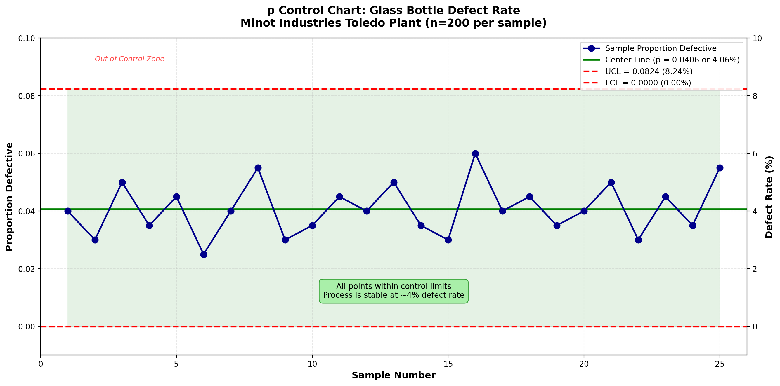
Interpretation:
All 25 sample proportions fall within the control limits. The process is in statistical control with respect to the proportion of defective bottles.
Current Performance:
- Average defect rate: 4.06% (about 4 defective bottles per 100 inspected)
- Range of observed rates: 2.5% to 6.0%
- No unusual patterns or trends detected
TipManagement Question: Is 4% Acceptable?
Statistical control ≠ Acceptable quality
The process is statistically stable (predictable), but whether 4% defects is acceptable depends on:
1. Customer requirements - What defect rate will customers tolerate?
2. Business economics - Cost of defects vs. cost of prevention
3. Industry benchmarks - What do competitors achieve?
4. Strategic goals - What level of quality does Minot aspire to?
If 4% is too high, management must make process improvements (better equipment, training, materials) to fundamentally reduce the defect rate. Control charts monitor stability; process capability studies assess adequacy.
16.9 Handling Variable Sample Sizes in p-Charts
Sometimes sample sizes vary from period to period due to production schedules, resource constraints, or inspection logistics. When sample sizes vary, control limits change for each sample.
16.9.1 Example 15.5: p-Chart with Variable Sample Sizes
Problem Statement:
Minot’s packaging department inspects shipping cartons. Due to production variations, the number of cartons inspected varies. Table 15.4 shows 20 samples with varying sizes.
Table 15.4: Carton Inspection with Variable Sample Sizes
| Sample | Sample Size (n_i) | Defectives (d_i) | Proportion (p_i) |
|---|---|---|---|
| 1 | 150 | 6 | 0.040 |
| 2 | 180 | 8 | 0.044 |
| 3 | 160 | 5 | 0.031 |
| 4 | 200 | 9 | 0.045 |
| 5 | 140 | 4 | 0.029 |
| 6 | 170 | 7 | 0.041 |
| 7 | 190 | 8 | 0.042 |
| 8 | 150 | 5 | 0.033 |
| 9 | 180 | 9 | 0.050 |
| 10 | 160 | 6 | 0.038 |
| 11 | 200 | 10 | 0.050 |
| 12 | 140 | 4 | 0.029 |
| 13 | 170 | 7 | 0.041 |
| 14 | 180 | 8 | 0.044 |
| 15 | 150 | 5 | 0.033 |
| 16 | 190 | 9 | 0.047 |
| 17 | 160 | 6 | 0.038 |
| 18 | 200 | 8 | 0.040 |
| 19 | 170 | 7 | 0.041 |
| 20 | 180 | 9 | 0.050 |
Solution:
Step 1: Calculate average proportion defective:
\bar{p} = \frac{\sum d_i}{\sum n_i} = \frac{6+8+5+\cdots+9}{150+180+160+\cdots+180} = \frac{140}{3400} = 0.0412
Step 2: For each sample, calculate individual control limits using n_i:
For sample 1 (n_1 = 150):
\text{UCL}_{p,1} = 0.0412 + 3\sqrt{\frac{0.0412(1-0.0412)}{150}} = 0.0412 + 0.0487 = 0.0899
For sample 2 (n_2 = 180):
\text{UCL}_{p,2} = 0.0412 + 3\sqrt{\frac{0.0412(1-0.0412)}{180}} = 0.0412 + 0.0444 = 0.0856
And so on for each sample…
Code
import matplotlib.pyplot as plt
import numpy as np

# Data from Table 15.4
samples = np.arange(1, 21)
sample_sizes = np.array([150, 180, 160, 200, 140, 170, 190, 150, 180, 160,
                         200, 140, 170, 180, 150, 190, 160, 200, 170, 180])
defectives = np.array([6, 8, 5, 9, 4, 7, 8, 5, 9, 6, 10, 4, 7, 8, 5, 9, 6, 8, 7, 9])
proportions = defectives / sample_sizes

# Calculate p_bar
p_bar = np.sum(defectives) / np.sum(sample_sizes)

# Calculate individual control limits for each sample
ucl_values = p_bar + 3 * np.sqrt(p_bar * (1 - p_bar) / sample_sizes)
lcl_values = p_bar - 3 * np.sqrt(p_bar * (1 - p_bar) / sample_sizes)
lcl_values = np.maximum(lcl_values, 0)  # No negative LCL

# Create the chart
fig, ax = plt.subplots(figsize=(14, 7))

# Plot the varying control limits
ax.plot(samples, ucl_values, 'r--', linewidth=1.5, label='UCL (varies by sample size)', zorder=2)
ax.plot(samples, lcl_values, 'r--', linewidth=1.5, label='LCL (varies by sample size)', zorder=2)
ax.fill_between(samples, lcl_values, ucl_values, alpha=0.1, color='green', zorder=1)

# Plot center line
ax.axhline(y=p_bar, color='green', linestyle='-', linewidth=2.5,
           label=f'Center Line (p̄ = {p_bar:.4f} or {p_bar*100:.2f}%)', zorder=2)

# Plot the data
ax.plot(samples, proportions, 'o-', color='darkblue', linewidth=2,
        markersize=8, label='Sample Proportion Defective', zorder=3)

# Styling
ax.set_xlabel('Sample Number', fontsize=12, fontweight='bold')
ax.set_ylabel('Proportion Defective', fontsize=12, fontweight='bold')
ax.set_title('p Control Chart with Variable Sample Sizes\nMinot Industries Carton Inspection (n = 140-200)',
            fontsize=14, fontweight='bold', pad=15)
ax.legend(loc='upper right', fontsize=10, framealpha=0.9)
ax.grid(True, alpha=0.3, linestyle='--')
ax.set_xlim(0, 21)
ax.set_ylim(-0.01, 0.12)

# Add annotation explaining varying limits
ax.annotate('Control limits vary\nwith sample size',
            xy=(5, 0.095), xytext=(8, 0.105),
            arrowprops=dict(arrowstyle='->', color='red', lw=1.5),
            fontsize=10, color='red', fontweight='bold',
            bbox=dict(boxstyle='round,pad=0.5', facecolor='yellow',
                     edgecolor='red', alpha=0.7))

# Add sample size annotation
ax2 = ax.twinx()
ax2.plot(samples, sample_sizes, 's-', color='gray', alpha=0.3,
         linewidth=1, markersize=4, label='Sample Size')
ax2.set_ylabel('Sample Size (n)', fontsize=11, color='gray')
ax2.tick_params(axis='y', labelcolor='gray')
ax2.set_ylim(130, 210)
ax2.legend(loc='lower right', fontsize=9)

plt.tight_layout()
plt.show()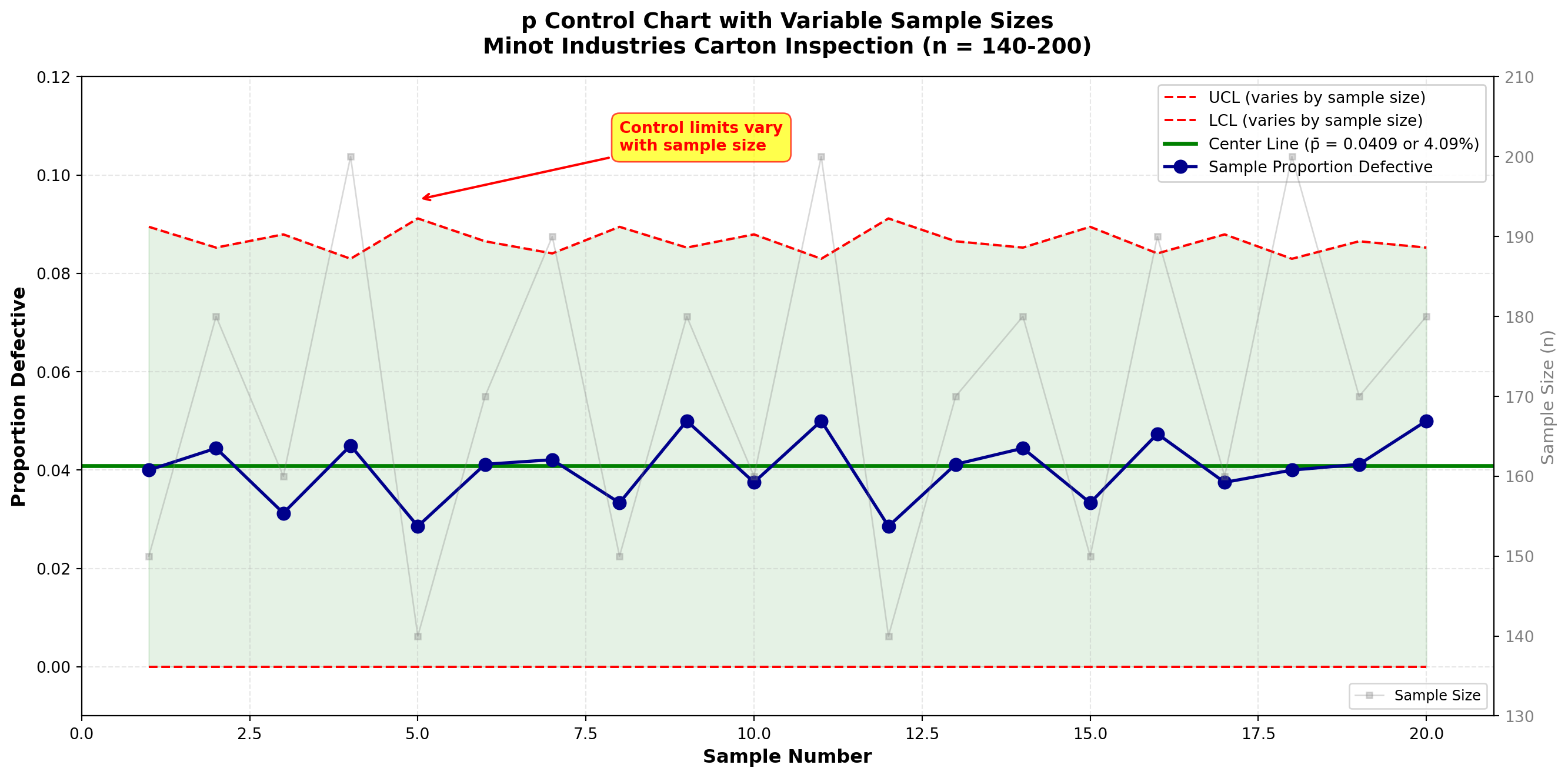
Interpretation:
When sample sizes vary:
1. Control limits widen when sample size is smaller (less precise estimates)
2. Control limits narrow when sample size is larger (more precise estimates)
3. The center line (\bar{p}) remains constant
All points fall within their respective control limits. The process is stable at approximately 4.12% defective.
NotePractical Considerations for Variable Sample Sizes
When variation is moderate (all n_i within ±20% of average):
- Can use average sample size \bar{n} to calculate single set of control limits
- Simplifies chart interpretation
- Slight loss of precision is usually acceptable
When variation is large (wide range of sample sizes):
- Must calculate individual limits for each sample
- More accurate but harder to interpret visually
- Consider standardizing sample sizes if possible
Best practice: Try to maintain constant sample sizes for simpler, more interpretable control charts.
16.10 15.9 The c-Chart: Count of Defects
While the p-chart monitors the proportion of defective items, the c-chart monitors the number of defects found on or in a constant inspection unit.
Key distinction:
- Defective item (p-chart): An item that fails to meet specifications (reject entire item)
- Defect (c-chart): A specific instance of nonconformity (can have multiple defects per item)
Example: A glass bottle might have:
- 2 scratches
- 1 bubble
- 1 label misalignment
= 4 defects total, but it’s still 1 defective item
16.10.1 When to Use c-Charts
Appropriate for:
- Counting defects per unit (scratches per panel, errors per form, bugs per software module)
- Constant inspection unit (same area, volume, or size inspected)
- Defects are relatively rare
- Opportunity for defects is large
Examples:
- Number of surface defects on glass panels
- Errors per invoice
- Blemishes per square meter of fabric
- Defects per automobile (final inspection)
- Typos per page of document
16.10.2 Constructing the c-Chart
Step 1: Define the inspection unit
Must be constant (e.g., one panel, one form, one car, one hour of service).
Step 2: Count defects in each unit
For k units inspected, record c_i = number of defects in unit i.
Step 3: Calculate average count
The center line is:
\bar{c} = \frac{\sum_{i=1}^{k} c_i}{k} \tag{16.14}
Step 4: Calculate control limits
The c-chart is based on the Poisson distribution, which has the property that variance equals the mean:
\text{UCL}_c = \bar{c} + 3\sqrt{\bar{c}} \tag{16.15}
\text{LCL}_c = \bar{c} - 3\sqrt{\bar{c}} \tag{16.16}
If \text{LCL}_c < 0, set LCL = 0 (counts cannot be negative).
NoteStatistical Foundation of the c-Chart
The c-chart assumes defects follow a Poisson distribution:
- Defects occur randomly and independently
- The average rate (\lambda = \bar{c}) is constant
- Multiple defects can occur in one unit
For a Poisson distribution:
- Mean = \lambda
- Standard deviation = \sqrt{\lambda}
The 3-sigma limits become \bar{c} \pm 3\sqrt{\bar{c}}.
Assumptions:
1. Inspection unit is constant
2. Defects occur independently
3. Opportunity for defects is large relative to actual defects
16.10.3 Example 15.6: c-Chart for Surface Defects
Problem Statement:
Minot Industries produces large decorative glass panels. Each panel is inspected for surface defects (scratches, bubbles, inclusions, pits). Table 15.5 shows the number of defects found on 30 consecutive panels.
Table 15.5: Surface Defects on Glass Panels
| Panel | Defects (c) | Panel | Defects (c) | Panel | Defects (c) |
|---|---|---|---|---|---|
| 1 | 5 | 11 | 4 | 21 | 6 |
| 2 | 3 | 12 | 7 | 22 | 5 |
| 3 | 6 | 13 | 5 | 23 | 4 |
| 4 | 4 | 14 | 6 | 24 | 7 |
| 5 | 8 | 15 | 3 | 25 | 5 |
| 6 | 5 | 16 | 5 | 26 | 6 |
| 7 | 7 | 17 | 4 | 27 | 8 |
| 8 | 4 | 18 | 6 | 28 | 4 |
| 9 | 6 | 19 | 5 | 29 | 5 |
| 10 | 5 | 20 | 7 | 30 | 6 |
Solution:
Step 1: Inspection unit defined (one glass panel of standard size).
Step 2: Defects counted (see Table 15.5).
Step 3: Calculate average count:
\bar{c} = \frac{5+3+6+4+\cdots+6}{30} = \frac{162}{30} = 5.4 \text{ defects per panel}
Step 4: Calculate control limits:
\sqrt{\bar{c}} = \sqrt{5.4} = 2.324
\text{UCL}_c = \bar{c} + 3\sqrt{\bar{c}} = 5.4 + 3(2.324) = 5.4 + 6.97 = 12.37
\text{LCL}_c = \bar{c} - 3\sqrt{\bar{c}} = 5.4 - 3(2.324) = 5.4 - 6.97 = -1.57
Since LCL is negative, set \text{LCL}_c = 0.
Control Chart Parameters:
- Center Line: \bar{c} = 5.4 defects per panel
- Upper Control Limit: UCL = 12.37 defects
- Lower Control Limit: LCL = 0 defects
Code
import matplotlib.pyplot as plt
import numpy as np

# Data from Table 15.5
panels = np.arange(1, 31)
defect_counts = np.array([5, 3, 6, 4, 8, 5, 7, 4, 6, 5,
                          4, 7, 5, 6, 3, 5, 4, 6, 5, 7,
                          6, 5, 4, 7, 5, 6, 8, 4, 5, 6])

# Control chart parameters
c_bar = 5.4
ucl_c = 12.37
lcl_c = 0.0

# Create the chart
fig, ax = plt.subplots(figsize=(14, 7))

# Plot the data
ax.plot(panels, defect_counts, 'o-', color='darkorange', linewidth=2,
        markersize=8, label='Defect Count per Panel', zorder=3)

# Plot control limits and center line
ax.axhline(y=c_bar, color='green', linestyle='-', linewidth=2.5,
           label=f'Center Line (c̄ = {c_bar:.1f})', zorder=2)
ax.axhline(y=ucl_c, color='red', linestyle='--', linewidth=2,
           label=f'UCL = {ucl_c:.2f}', zorder=2)
ax.axhline(y=lcl_c, color='red', linestyle='--', linewidth=2,
           label=f'LCL = {lcl_c:.0f}', zorder=2)

# Shade the control zone
ax.fill_between(panels, lcl_c, ucl_c, alpha=0.1, color='green', zorder=1)

# Styling
ax.set_xlabel('Panel Number', fontsize=12, fontweight='bold')
ax.set_ylabel('Number of Defects', fontsize=12, fontweight='bold')
ax.set_title('c Control Chart: Surface Defects on Glass Panels\nMinot Industries Production Line',
            fontsize=14, fontweight='bold', pad=15)
ax.legend(loc='upper right', fontsize=10, framealpha=0.9)
ax.grid(True, alpha=0.3, linestyle='--')
ax.set_xlim(0, 31)
ax.set_ylim(-1, 14)

# Add interpretation box
ax.text(15, 11, 'All defect counts within control limits\nProcess stable at average 5.4 defects/panel',
        fontsize=10, ha='center',
        bbox=dict(boxstyle='round,pad=0.5', facecolor='lightgreen',
                 edgecolor='green', alpha=0.7))

# Highlight range of typical variation
ax.axhspan(c_bar - np.sqrt(c_bar), c_bar + np.sqrt(c_bar),
           alpha=0.05, color='blue', zorder=0)
ax.text(2, 2.5, f'±1σ zone\n({c_bar - np.sqrt(c_bar):.1f} to {c_bar + np.sqrt(c_bar):.1f})',
        fontsize=8, color='blue', style='italic')

plt.tight_layout()
plt.show()
Interpretation:
All 30 panels have defect counts within the control limits. The process is in statistical control with an average of 5.4 defects per panel.
Observed variation: Counts range from 3 to 8 defects per panel, which is consistent with natural Poisson variation around a mean of 5.4.
ImportantProcess Improvement Opportunity
Current state: Process is stable and predictable (in control)
Average performance: 5.4 defects per panel
Questions for management:
1. What is the target defect level? (Zero? Less than 3?)
2. What causes these defects? (Material quality? Equipment condition? Operator skill?)
3. What is the cost of defects vs. cost of improvement?
If 5.4 defects per panel is unacceptable, Minot must invest in process improvement:
- Higher quality raw materials
- Better equipment maintenance
- Enhanced operator training
- Improved handling procedures
Control charts show where we are. Management vision shows where we should be.
16.11 Comparing p-Charts and c-Charts
Table 15.6: Choosing Between p-Charts and c-Charts
| Characteristic | p-Chart | c-Chart |
|---|---|---|
| Data Type | Proportion/fraction defective | Count of defects |
| Focus | Defective items (whole units) | Individual defects (specific flaws) |
| Classification | Pass/Fail, Good/Bad, Conforming/Nonconforming | Count: 0, 1, 2, 3, … defects |
| Sample Size | Can vary (with adjusted limits) | Constant inspection unit required |
| Distribution | Binomial | Poisson |
| Example 1 | % of bottles cracked | Scratches per bottle |
| Example 2 | Proportion of late orders | Errors per invoice |
| Example 3 | Fraction of defective parts | Defects per automobile |
| Control Limits | \bar{p} \pm 3\sqrt{\frac{\bar{p}(1-\bar{p})}{n}} | \bar{c} \pm 3\sqrt{\bar{c}} |
| When to Use | Classify entire item as acceptable/not | Count specific flaws on/in each unit |
TipDecision Guide: Which Chart Should I Use?
Ask yourself:
1. Am I classifying items as good/bad? → Use p-chart
2. Am I counting specific defects on each unit? → Use c-chart
Can an item have multiple defects?
- No (item is either defective or not) → p-chart
- Yes (can find multiple flaws per item) → c-chart
Is my inspection unit constant?
- No (sample sizes vary) → p-chart (can accommodate)
- Yes (always inspect same unit size) → c-chart preferred for defect counts
16.12 Advanced: Other Attribute Control Charts
While p-charts and c-charts are the most common attribute charts, other variants exist for specialized situations:
np-Chart (Number Defective):
- Plots actual number of defectives instead of proportion
- Requires constant sample size
- Easier for workers to understand (count vs. proportion)
- Control limits: \bar{np} \pm 3\sqrt{\bar{np}(1-\bar{p})} where \bar{p} = \bar{np}/n
u-Chart (Defects per Unit):
- Like c-chart but allows variable-sized inspection units
- Plots defects per standardized unit (e.g., defects per 100 square feet)
- Control limits: \bar{u} \pm 3\sqrt{\bar{u}/n_i} where n_i is size of unit i
When to use these variants:
- np-chart: When sample size is always constant and counts are easier than proportions
- u-chart: When inspection area/volume varies but you want to standardize to defects per unit
For most applications, p-charts and c-charts cover the vast majority of attribute monitoring needs.
This concludes STAGE 3 of Chapter 15. This stage covers:
✓ Section 15.7: Introduction to control charts for attributes
✓ Section 15.8: The p-chart (proportion defective) with constant and variable sample sizes
✓ Section 15.9: The c-chart (count of defects)
✓ Example 15.4: p-chart for bottle inspection
✓ Example 15.5: p-chart with variable sample sizes
✓ Example 15.6: c-chart for surface defects
✓ Comparison table of p-charts vs. c-charts
✓ Three Python visualizations (p-chart, variable-n p-chart, c-chart)
Next stage will cover:
- STAGE 4: Interpreting control charts (patterns, rules), acceptance sampling, chapter summary
## 15.10 Interpreting Control Charts: Pattern Recognition
A process can be “out of control” even when all points fall within the control limits. Quality control experts have identified specific patterns that indicate the presence of special causes, even if no points violate the 3-sigma limits.
16.12.1 Western Electric Rules
The Western Electric Rules (developed at Bell Laboratories in the 1950s) provide systematic criteria for detecting out-of-control conditions. These rules divide the control chart into zones:
Zone Structure:
- Zone A: Between 2σ and 3σ from center line (upper and lower)
- Zone B: Between 1σ and 2σ from center line (upper and lower)
- Zone C: Between center line and 1σ (upper and lower)
Code
import matplotlib.pyplot as plt
import numpy as np

fig, ax = plt.subplots(figsize=(14, 7))

# Define zones
center = 0
ucl = 3
lcl = -3
sigma_1_upper = 1
sigma_2_upper = 2
sigma_1_lower = -1
sigma_2_lower = -2

# Plot zone boundaries
ax.axhline(y=center, color='green', linestyle='-', linewidth=3, label='Center Line', zorder=3)
ax.axhline(y=ucl, color='red', linestyle='-', linewidth=2.5, label='UCL (+3σ)', zorder=3)
ax.axhline(y=lcl, color='red', linestyle='-', linewidth=2.5, label='LCL (-3σ)', zorder=3)

ax.axhline(y=sigma_2_upper, color='orange', linestyle='--', linewidth=1.5, alpha=0.7, label='+2σ', zorder=2)
ax.axhline(y=sigma_1_upper, color='blue', linestyle='--', linewidth=1.5, alpha=0.7, label='+1σ', zorder=2)
ax.axhline(y=sigma_1_lower, color='blue', linestyle='--', linewidth=1.5, alpha=0.7, label='-1σ', zorder=2)
ax.axhline(y=sigma_2_lower, color='orange', linestyle='--', linewidth=1.5, alpha=0.7, label='-2σ', zorder=2)

# Shade zones with labels
ax.fill_between([0, 30], ucl, sigma_2_upper, alpha=0.15, color='red', zorder=1)
ax.fill_between([0, 30], sigma_2_upper, sigma_1_upper, alpha=0.15, color='yellow', zorder=1)
ax.fill_between([0, 30], sigma_1_upper, center, alpha=0.15, color='green', zorder=1)
ax.fill_between([0, 30], center, sigma_1_lower, alpha=0.15, color='green', zorder=1)
ax.fill_between([0, 30], sigma_1_lower, sigma_2_lower, alpha=0.15, color='yellow', zorder=1)
ax.fill_between([0, 30], sigma_2_lower, lcl, alpha=0.15, color='red', zorder=1)

# Add zone labels
ax.text(28, 2.5, 'Zone A', fontsize=13, fontweight='bold', ha='center', color='darkred')
ax.text(28, 1.5, 'Zone B', fontsize=13, fontweight='bold', ha='center', color='darkorange')
ax.text(28, 0.5, 'Zone C', fontsize=13, fontweight='bold', ha='center', color='darkgreen')
ax.text(28, -0.5, 'Zone C', fontsize=13, fontweight='bold', ha='center', color='darkgreen')
ax.text(28, -1.5, 'Zone B', fontsize=13, fontweight='bold', ha='center', color='darkorange')
ax.text(28, -2.5, 'Zone A', fontsize=13, fontweight='bold', ha='center', color='darkred')

# Styling
ax.set_xlabel('Sample Number', fontsize=12, fontweight='bold')
ax.set_ylabel('Standard Deviations from Center Line', fontsize=12, fontweight='bold')
ax.set_title('Control Chart Zone Structure for Western Electric Rules',
            fontsize=14, fontweight='bold', pad=15)
ax.legend(loc='upper left', fontsize=10, framealpha=0.9)
ax.grid(True, alpha=0.3, linestyle='--')
ax.set_xlim(0, 30)
ax.set_ylim(-3.5, 3.5)

plt.tight_layout()
plt.show()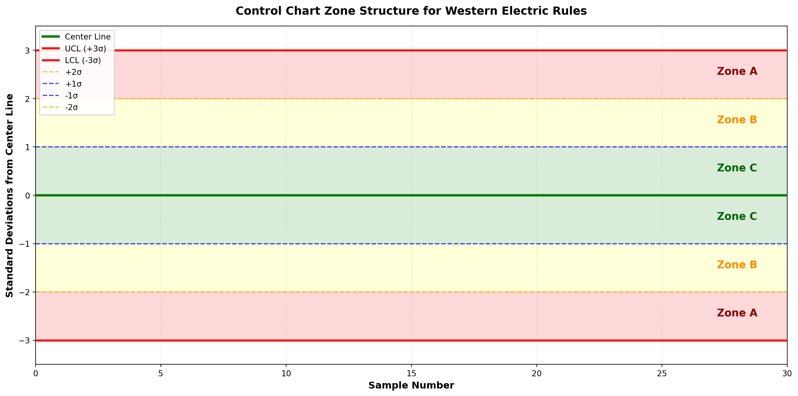
16.12.2 The Eight Western Electric Rules
ImportantWestern Electric Rules for Out-of-Control Signals
Rule 1: One point beyond Zone A (outside 3σ limits)
Interpretation: Extreme shift or isolated special cause
Rule 2: Two out of three consecutive points in Zone A or beyond (same side)
Interpretation: Process mean has likely shifted
Rule 3: Four out of five consecutive points in Zone B or beyond (same side)
Interpretation: Moderate shift in process level
Rule 4: Eight consecutive points on one side of center line (in Zone C or beyond)
Interpretation: Sustained shift in process mean
Rule 5: Six consecutive points steadily increasing or decreasing
Interpretation: Trend due to tool wear, operator fatigue, material degradation
Rule 6: Fifteen consecutive points in Zone C (both sides of center line)
Interpretation: Reduced variation (overcontrol, stratification, or miscalculated limits)
Rule 7: Fourteen consecutive points alternating up and down
Interpretation: Systematic oscillation (two operators, alternating materials)
Rule 8: Eight consecutive points on both sides of center line with none in Zone C
Interpretation: Mixture pattern (two populations being sampled)
16.12.3 Example 15.7: Detecting Patterns in Control Charts
Problem Statement:
The quality team at Minot Industries monitors four different processes. Each shows a different pattern. Determine which Western Electric rules are violated.
Code
import matplotlib.pyplot as plt
import numpy as np

np.random.seed(42)

fig, ((ax1, ax2), (ax3, ax4)) = plt.subplots(2, 2, figsize=(16, 12))

samples = np.arange(1, 26)
center = 100
ucl = 115
lcl = 85
sigma = 5

# Pattern 1: Rule 1 - One point beyond 3σ
data1 = center + np.random.normal(0, sigma/3, 25)
data1[15] = 120  # Violation: point beyond UCL
ax1.plot(samples, data1, 'o-', color='steelblue', linewidth=2, markersize=7, zorder=3)
ax1.plot(16, data1[15], 'ro', markersize=12, markeredgewidth=2, zorder=4)
ax1.axhline(y=center, color='green', linestyle='-', linewidth=2.5, zorder=2)
ax1.axhline(y=ucl, color='red', linestyle='--', linewidth=2, zorder=2)
ax1.axhline(y=lcl, color='red', linestyle='--', linewidth=2, zorder=2)
ax1.axhline(y=center + 2*sigma, color='orange', linestyle=':', linewidth=1, alpha=0.5)
ax1.axhline(y=center - 2*sigma, color='orange', linestyle=':', linewidth=1, alpha=0.5)
ax1.fill_between(samples, lcl, ucl, alpha=0.1, color='green', zorder=1)
ax1.set_title('Pattern 1: Point Beyond Control Limit (Rule 1 Violation)',
             fontsize=12, fontweight='bold', color='darkred')
ax1.set_xlabel('Sample', fontsize=10)
ax1.set_ylabel('Measurement', fontsize=10)
ax1.grid(True, alpha=0.3)
ax1.set_ylim(80, 125)
ax1.text(16, 122, 'Special cause\nevent!', fontsize=9, ha='center', color='red',
         fontweight='bold', bbox=dict(boxstyle='round', facecolor='yellow', alpha=0.7))

# Pattern 2: Rule 4 - Eight consecutive points on one side
data2 = center + np.random.normal(0, sigma/3, 25)
data2[10:18] = center + 3 + np.random.normal(0, sigma/4, 8)  # Shift up
ax2.plot(samples, data2, 'o-', color='steelblue', linewidth=2, markersize=7, zorder=3)
ax2.plot(samples[10:18], data2[10:18], 'ro', markersize=9, markeredgewidth=2, zorder=4)
ax2.axhline(y=center, color='green', linestyle='-', linewidth=2.5, zorder=2)
ax2.axhline(y=ucl, color='red', linestyle='--', linewidth=2, zorder=2)
ax2.axhline(y=lcl, color='red', linestyle='--', linewidth=2, zorder=2)
ax2.fill_between(samples, lcl, ucl, alpha=0.1, color='green', zorder=1)
ax2.set_title('Pattern 2: Eight Consecutive Points Above Center (Rule 4 Violation)',
             fontsize=12, fontweight='bold', color='darkred')
ax2.set_xlabel('Sample', fontsize=10)
ax2.set_ylabel('Measurement', fontsize=10)
ax2.grid(True, alpha=0.3)
ax2.set_ylim(80, 125)
ax2.text(14, 108, 'Process mean\nhas shifted', fontsize=9, ha='center', color='red',
         fontweight='bold', bbox=dict(boxstyle='round', facecolor='yellow', alpha=0.7))

# Pattern 3: Rule 5 - Six points trending
data3 = center + np.random.normal(0, sigma/3, 25)
data3[8:14] = center + np.array([-2, -1, 0, 1, 2, 3])  # Upward trend
ax3.plot(samples, data3, 'o-', color='steelblue', linewidth=2, markersize=7, zorder=3)
ax3.plot(samples[8:14], data3[8:14], 'ro', markersize=9, markeredgewidth=2, zorder=4)
ax3.plot(samples[8:14], data3[8:14], 'r--', linewidth=2, alpha=0.5, zorder=3)
ax3.axhline(y=center, color='green', linestyle='-', linewidth=2.5, zorder=2)
ax3.axhline(y=ucl, color='red', linestyle='--', linewidth=2, zorder=2)
ax3.axhline(y=lcl, color='red', linestyle='--', linewidth=2, zorder=2)
ax3.fill_between(samples, lcl, ucl, alpha=0.1, color='green', zorder=1)
ax3.set_title('Pattern 3: Six Consecutive Points Trending (Rule 5 Violation)',
             fontsize=12, fontweight='bold', color='darkred')
ax3.set_xlabel('Sample', fontsize=10)
ax3.set_ylabel('Measurement', fontsize=10)
ax3.grid(True, alpha=0.3)
ax3.set_ylim(80, 125)
ax3.text(11, 108, 'Tool wear or\ngradual drift', fontsize=9, ha='center', color='red',
         fontweight='bold', bbox=dict(boxstyle='round', facecolor='yellow', alpha=0.7))

# Pattern 4: Rule 7 - Alternating up and down
data4 = center + np.random.normal(0, sigma/3, 25)
for i in range(8, 22):
    data4[i] = center + (4 if i % 2 == 0 else -4) + np.random.normal(0, 1)
ax4.plot(samples, data4, 'o-', color='steelblue', linewidth=2, markersize=7, zorder=3)
ax4.plot(samples[8:22], data4[8:22], 'ro', markersize=9, markeredgewidth=2, zorder=4)
ax4.axhline(y=center, color='green', linestyle='-', linewidth=2.5, zorder=2)
ax4.axhline(y=ucl, color='red', linestyle='--', linewidth=2, zorder=2)
ax4.axhline(y=lcl, color='red', linestyle='--', linewidth=2, zorder=2)
ax4.fill_between(samples, lcl, ucl, alpha=0.1, color='green', zorder=1)
ax4.set_title('Pattern 4: Systematic Alternation (Rule 7 Violation)',
             fontsize=12, fontweight='bold', color='darkred')
ax4.set_xlabel('Sample', fontsize=10)
ax4.set_ylabel('Measurement', fontsize=10)
ax4.grid(True, alpha=0.3)
ax4.set_ylim(80, 125)
ax4.text(15, 108, 'Two alternating\noperators or materials', fontsize=9, ha='center',
         color='red', fontweight='bold',
         bbox=dict(boxstyle='round', facecolor='yellow', alpha=0.7))

plt.tight_layout()
plt.show()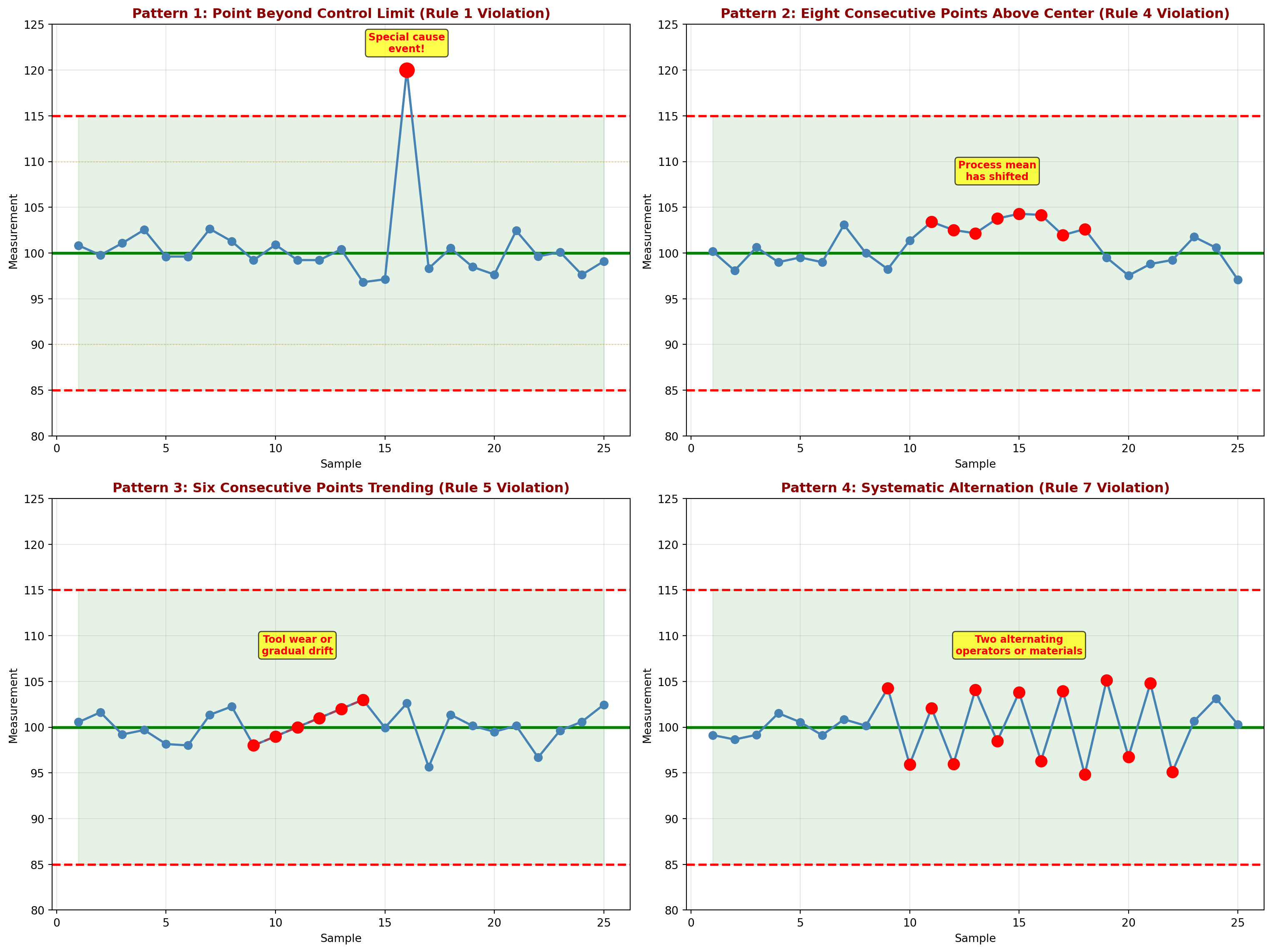
Interpretation:
Pattern 1 (Rule 1): Sample 16 exceeds the upper control limit. This indicates a special cause requiring immediate investigation. Possible causes: measurement error, material defect, equipment malfunction.
Pattern 2 (Rule 4): Samples 11-18 are all above the center line. The process mean has shifted upward. Action: Investigate what changed around sample 11.
Pattern 3 (Rule 5): Samples 9-14 show a steady increasing trend. This suggests gradual degradation such as tool wear, increasing temperature, or accumulating buildup.
Pattern 4 (Rule 7): Systematic oscillation between high and low values. This sawtooth pattern suggests alternating conditions: two different operators, alternating batches of material, or equipment cycling.
TipWhy Pattern Recognition Matters
Waiting for 3-sigma violations misses early warnings!
The Western Electric Rules detect process changes sooner than waiting for points outside control limits. This enables:
1. Faster response to problems
2. Lower cost of correction (catch issues early)
3. Better understanding of process behavior
4. Prevention of defects rather than detection
Modern SPC software automatically checks all eight rules and alerts operators immediately.
16.13 15.11 Acceptance Sampling
While control charts monitor ongoing production, acceptance sampling makes lot-by-lot decisions: Accept or reject an incoming or outgoing batch of items based on a sample inspection.
16.13.1 The Logic of Acceptance Sampling
Situation: A lot of N items arrives. It contains some unknown proportion p of defective items.
Decision: Inspect a sample of n items. If the number of defectives d \leq c (acceptance number), accept the entire lot. Otherwise, reject the lot.
Trade-offs:
- 100% inspection: Expensive, time-consuming, may damage items
- No inspection: Risk accepting bad lots
- Sampling inspection: Balance cost and risk
NoteKey Terms in Acceptance Sampling
Lot size (N): Total number of items in the batch
Sample size (n): Number of items inspected
Acceptance number (c): Maximum defectives allowed to accept lot
AQL (Acceptable Quality Level): Maximum % defective considered satisfactory
LTPD (Lot Tolerance Percent Defective): Worst quality level tolerable
Producer’s Risk (\alpha): Probability of rejecting a good lot (Type I error)
Consumer’s Risk (\beta): Probability of accepting a bad lot (Type II error)
16.13.2 Types of Sampling Plans
Single Sampling Plan:
- Inspect n items
- Accept if d \leq c, reject if d > c
- Example: n = 50, c = 2 (accept if ≤2 defects in sample of 50)
Double Sampling Plan:
- First sample: Inspect n_1 items
- If d_1 \leq c_1: Accept lot
- If d_1 > c_2: Reject lot
- If c_1 < d_1 \leq c_2: Take second sample
- Second sample: Inspect n_2 additional items
- If d_1 + d_2 \leq c_3: Accept lot
- Otherwise: Reject lot
Multiple Sampling Plan:
- Sequential sampling continuing up to a predetermined maximum
- Decision made as soon as cumulative evidence is conclusive
Sequential Sampling Plan:
- Inspect items one at a time
- After each item, decide: Accept, Reject, or Continue sampling
- No predetermined sample size
16.14 15.12 Operating Characteristic (OC) Curves
The Operating Characteristic (OC) curve shows the probability of accepting a lot as a function of the true proportion defective in the lot.
16.14.1 Understanding OC Curves
For a single sampling plan (n, c), the probability of accepting a lot with true proportion defective p is:
P_a(p) = \sum_{x=0}^{c} \binom{n}{x} p^x (1-p)^{n-x} \tag{16.17}
This is the cumulative binomial probability of finding c or fewer defectives in a sample of n items.
16.14.2 Example 15.8: Constructing an OC Curve
Problem Statement:
Minot Industries receives glass bottles from a supplier in lots of 1,000. They use a sampling plan of n = 50, c = 2 (inspect 50 bottles, accept if ≤2 defectives). Construct the OC curve.
Solution:
For various values of true lot quality p, calculate P_a(p):
Example calculation for p = 0.02 (2% defective):
P_a(0.02) = \sum_{x=0}^{2} \binom{50}{x} (0.02)^x (0.98)^{50-x}
= \binom{50}{0}(0.02)^0(0.98)^{50} + \binom{50}{1}(0.02)^1(0.98)^{49} + \binom{50}{2}(0.02)^2(0.98)^{48}
= (1)(1)(0.364) + (50)(0.02)(0.372) + (1225)(0.0004)(0.379)
= 0.364 + 0.372 + 0.186 = 0.922
Interpretation: If the lot truly contains 2% defectives, there’s a 92.2% chance it will be accepted.
Code
import matplotlib.pyplot as plt
import numpy as np
from scipy.stats import binom

# Sampling plan parameters
n = 50
c = 2

# Range of lot quality (proportion defective)
p_values = np.linspace(0, 0.20, 100)

# Calculate probability of acceptance for each p
pa_values = binom.cdf(c, n, p_values)

# Create the plot
fig, ax = plt.subplots(figsize=(14, 8))

# Plot OC curve
ax.plot(p_values * 100, pa_values * 100, 'b-', linewidth=3, label='OC Curve (n=50, c=2)')

# Mark key points
# AQL = 2% (producer's risk zone)
aql = 0.02
pa_aql = binom.cdf(c, n, aql)
ax.plot(aql * 100, pa_aql * 100, 'go', markersize=12, label=f'AQL = {aql*100:.0f}% (Pa = {pa_aql:.3f})')

# LTPD = 10% (consumer's risk zone)
ltpd = 0.10
pa_ltpd = binom.cdf(c, n, ltpd)
ax.plot(ltpd * 100, pa_ltpd * 100, 'ro', markersize=12, label=f'LTPD = {ltpd*100:.0f}% (Pa = {pa_ltpd:.3f})')

# Add reference lines
ax.axhline(y=95, color='green', linestyle='--', linewidth=1.5, alpha=0.5, label="95% Acceptance (Producer's protection)")
ax.axhline(y=10, color='red', linestyle='--', linewidth=1.5, alpha=0.5, label="10% Acceptance (Consumer's protection)")
ax.axvline(x=aql * 100, color='green', linestyle=':', linewidth=1, alpha=0.5)
ax.axvline(x=ltpd * 100, color='red', linestyle=':', linewidth=1, alpha=0.5)

# Shade risk zones
ax.fill_between([0, aql*100], 0, 100, alpha=0.1, color='green', label="Good Quality Zone")
ax.fill_between([ltpd*100, 20], 0, 100, alpha=0.1, color='red', label="Bad Quality Zone")
ax.fill_between([aql*100, ltpd*100], 0, 100, alpha=0.1, color='yellow', label="Indifference Zone")

# Annotations
ax.annotate(f"Producer's Risk (α)\nReject good lot\n{(1-pa_aql)*100:.1f}%",
            xy=(aql*100, pa_aql*100), xytext=(1, 70),
            arrowprops=dict(arrowstyle='->', color='green', lw=2),
            fontsize=10, color='darkgreen', fontweight='bold',
            bbox=dict(boxstyle='round,pad=0.5', facecolor='lightgreen', alpha=0.8))

ax.annotate(f"Consumer's Risk (β)\nAccept bad lot\n{pa_ltpd*100:.1f}%",
            xy=(ltpd*100, pa_ltpd*100), xytext=(12, 40),
            arrowprops=dict(arrowstyle='->', color='red', lw=2),
            fontsize=10, color='darkred', fontweight='bold',
            bbox=dict(boxstyle='round,pad=0.5', facecolor='lightcoral', alpha=0.8))

# Styling
ax.set_xlabel('Lot Quality (% Defective)', fontsize=12, fontweight='bold')
ax.set_ylabel('Probability of Accepting Lot (%)', fontsize=12, fontweight='bold')
ax.set_title('Operating Characteristic (OC) Curve: Single Sampling Plan (n=50, c=2)\nMinot Industries Incoming Inspection',
            fontsize=14, fontweight='bold', pad=15)
ax.legend(loc='upper right', fontsize=9, framealpha=0.9)
ax.grid(True, alpha=0.3, linestyle='--')
ax.set_xlim(0, 20)
ax.set_ylim(0, 105)

plt.tight_layout()
plt.show()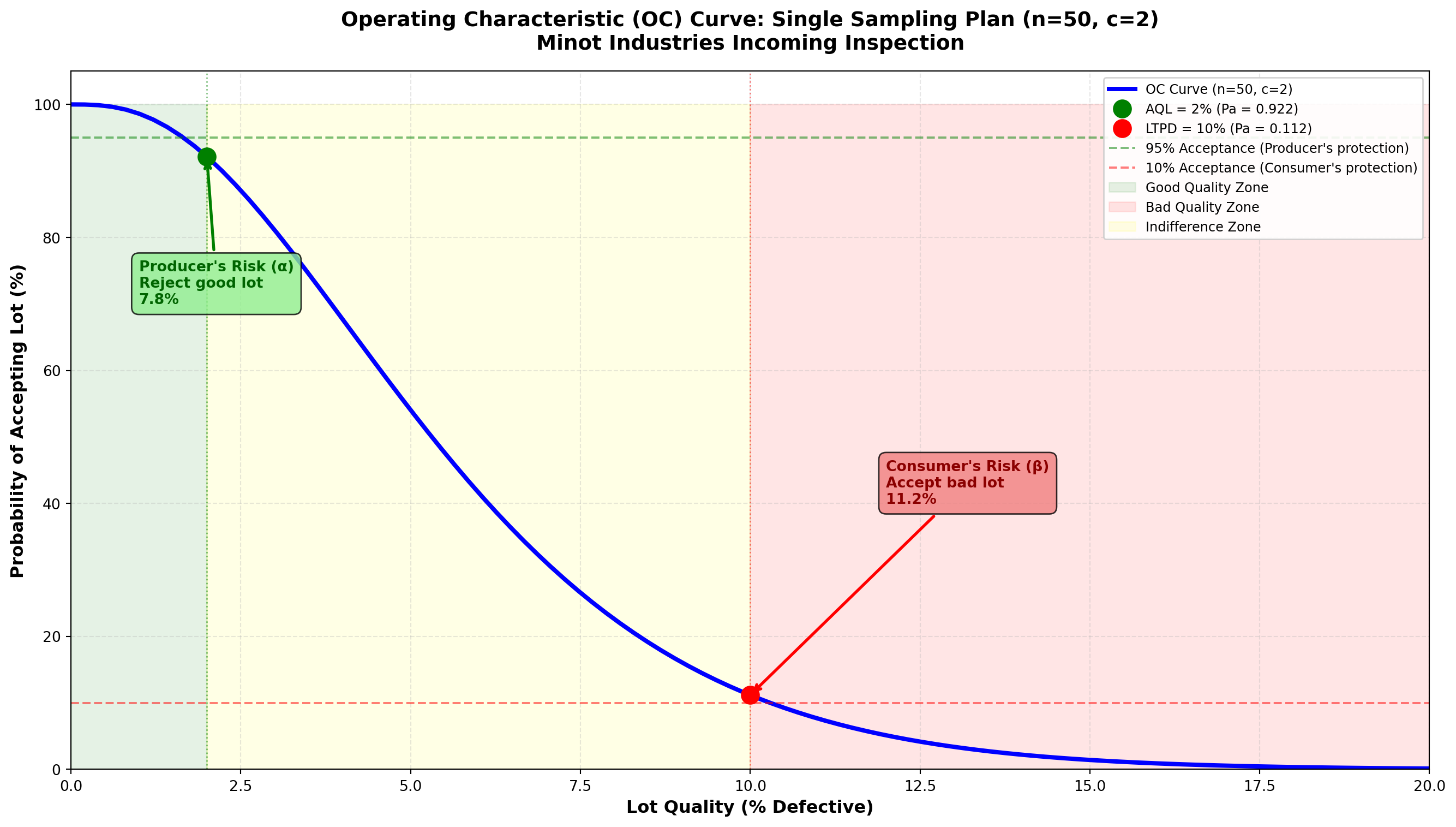
Interpretation:
At AQL = 2% defective:
- P_a = 0.922 (92.2% chance of acceptance)
- Producer’s risk \alpha = 1 - 0.922 = 0.078 (7.8% chance of rejecting a good lot)
At LTPD = 10% defective:
- P_a = 0.112 (11.2% chance of acceptance)
- Consumer’s risk \beta = 0.112 (11.2% chance of accepting a bad lot)
Discriminating power:
The steepness of the OC curve indicates how well the plan distinguishes good lots from bad:
- Steep curve: Good discrimination (large n)
- Flat curve: Poor discrimination (small n)
ImportantDesigning a Sampling Plan
Step 1: Define quality standards
- AQL: What quality do we expect from a good supplier? (e.g., 2%)
- LTPD: What quality is unacceptable? (e.g., 10%)
Step 2: Set risk levels
- Producer’s risk \alpha: How often can we reject good lots? (typically 5%)
- Consumer’s risk \beta: How often can we accept bad lots? (typically 10%)
Step 3: Find n and c that satisfy both risks
- Use MIL-STD-105E tables (now ANSI/ASQ Z1.4)
- Or solve equations: P_a(\text{AQL}) \geq 1-\alpha and P_a(\text{LTPD}) \leq \beta
Step 4: Construct and evaluate OC curve
- Verify plan meets requirements
- Check cost vs. protection trade-off
16.15 Comparing Different Sampling Plans
Different sampling plans provide different levels of protection. Let’s compare three plans:
Code
import matplotlib.pyplot as plt
import numpy as np
from scipy.stats import binom

# Define three sampling plans
plans = [
    {'n': 25, 'c': 1, 'label': 'Plan A: n=25, c=1 (Tight)', 'color': 'blue'},
    {'n': 50, 'c': 2, 'label': 'Plan B: n=50, c=2 (Moderate)', 'color': 'green'},
    {'n': 100, 'c': 4, 'label': 'Plan C: n=100, c=4 (Relaxed)', 'color': 'orange'}
]

# Range of lot quality
p_values = np.linspace(0, 0.20, 100)

fig, ax = plt.subplots(figsize=(14, 8))

# Plot OC curve for each plan
for plan in plans:
    n = plan['n']
    c = plan['c']
    pa_values = binom.cdf(c, n, p_values)
    ax.plot(p_values * 100, pa_values * 100, linewidth=3,
            color=plan['color'], label=plan['label'])

# Reference lines
ax.axhline(y=95, color='gray', linestyle='--', linewidth=1, alpha=0.5)
ax.axhline(y=50, color='gray', linestyle='--', linewidth=1, alpha=0.5)
ax.axhline(y=10, color='gray', linestyle='--', linewidth=1, alpha=0.5)
ax.axvline(x=2, color='green', linestyle=':', linewidth=1.5, alpha=0.5, label='AQL = 2%')
ax.axvline(x=10, color='red', linestyle=':', linewidth=1.5, alpha=0.5, label='LTPD = 10%')

# Annotations
ax.text(1, 97, '95% acceptance', fontsize=9, style='italic', color='gray')
ax.text(1, 52, '50% acceptance (indifference)', fontsize=9, style='italic', color='gray')
ax.text(1, 12, '10% acceptance', fontsize=9, style='italic', color='gray')

# Styling
ax.set_xlabel('Lot Quality (% Defective)', fontsize=12, fontweight='bold')
ax.set_ylabel('Probability of Accepting Lot (%)', fontsize=12, fontweight='bold')
ax.set_title('Comparison of Three Sampling Plans: Effect of Sample Size and Acceptance Number',
            fontsize=14, fontweight='bold', pad=15)
ax.legend(loc='upper right', fontsize=10, framealpha=0.9)
ax.grid(True, alpha=0.3, linestyle='--')
ax.set_xlim(0, 20)
ax.set_ylim(0, 105)

# Add interpretation box
interpretation = ("Steeper curves = Better discrimination\n"
                 "Larger n = More information, better protection\n"
                 "Plan C (n=100) best distinguishes good from bad lots")
ax.text(15, 70, interpretation, fontsize=10, ha='center',
        bbox=dict(boxstyle='round,pad=0.7', facecolor='lightyellow',
                 edgecolor='black', alpha=0.9))

plt.tight_layout()
plt.show()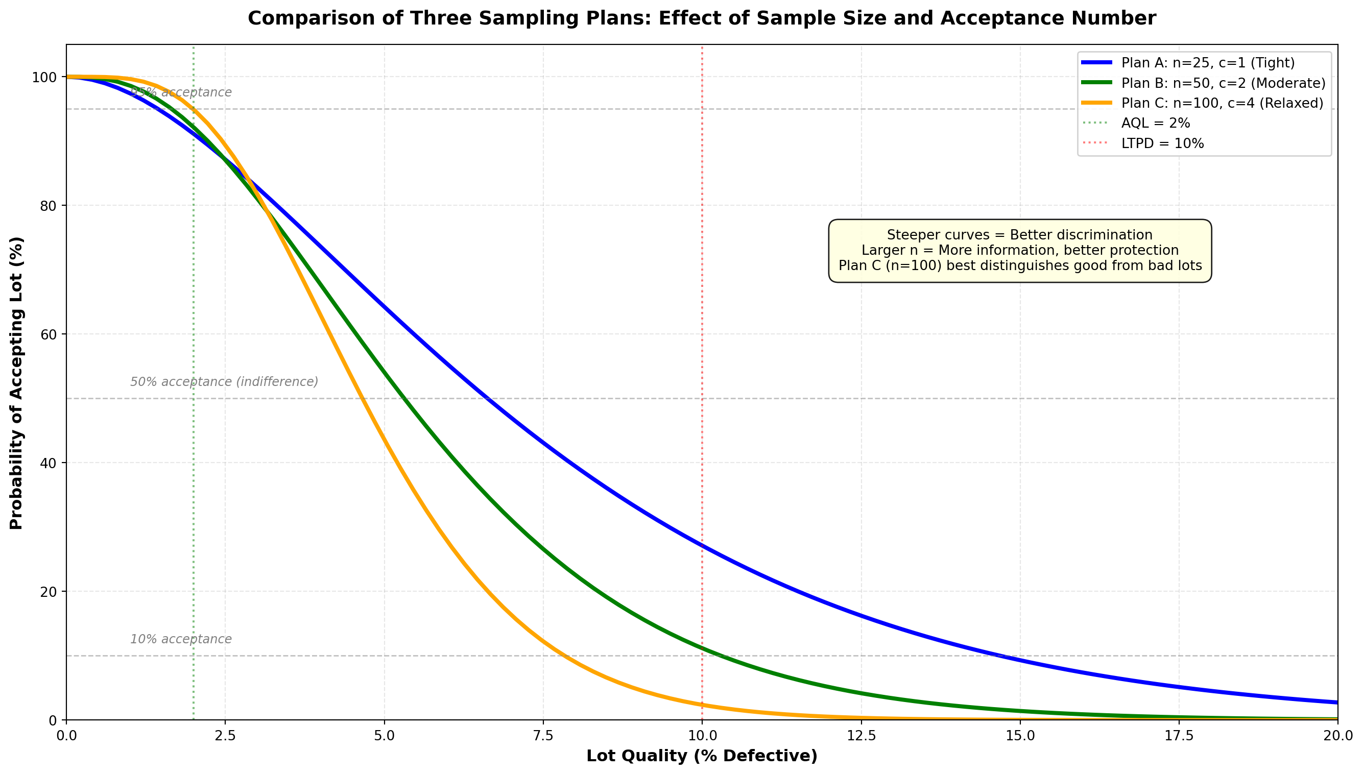
Analysis:
Plan A (n=25, c=1): Tightest plan
- Advantage: Smallest sample (lowest inspection cost)
- Disadvantage: Least discriminating (flat OC curve)
- Best for: Expensive or destructive testing where small samples required
Plan B (n=50, c=2): Moderate plan
- Balance of sample size and discrimination
- Typical choice for routine incoming inspection
Plan C (n=100, c=4): Most discriminating plan
- Advantage: Steepest OC curve (best discrimination)
- Disadvantage: Largest sample (highest cost)
- Best for: Critical components where precise decisions essential
TipPractical Insights on Acceptance Sampling
When to use acceptance sampling:
✓ Inspection is destructive (cannot inspect 100%)
✓ Large lots make 100% inspection prohibitively expensive
✓ Supplier history suggests sampling is adequate
✓ Economic balance between inspection cost and risk
When NOT to use acceptance sampling:
✗ Product is safety-critical (use 100% inspection or in-process control)
✗ Lot size is very small (inspect everything)
✗ Supplier is unreliable (need tighter control)
✗ Process control charts show process is stable (sampling unnecessary)
Modern trend: Shift from acceptance sampling to supplier certification and process control. Build quality in rather than inspect it in!
16.16 15.13 Chapter Summary
This chapter introduced Statistical Process Control (SPC) and Acceptance Sampling, two foundational quality control techniques used worldwide in manufacturing and service industries.
16.16.1 Key Concepts Covered
1. Philosophy of Quality Control
- Prevention vs. detection
- Cost of poor quality
- Deming’s contributions and Total Quality Management
2. Control Charts: Purpose and Logic
- Distinguish common cause from special cause variation
- Use 3-sigma limits based on natural process variation
- Monitor processes in real-time to detect changes quickly
3. Control Charts for Variables
- X̄ chart: Monitors process mean (location)
- R chart: Monitors process variation (spread)
- Must analyze R chart first (variation must be stable)
- Use together to fully characterize process behavior
4. Control Charts for Attributes
- p-chart: Monitors proportion defective (binary classification)
- c-chart: Monitors count of defects per unit (Poisson-based)
- Accommodate different data types (proportions vs. counts)
5. Interpreting Control Charts
- Western Electric Rules: Eight patterns indicating out-of-control conditions
- Pattern recognition enables early detection before 3-sigma violations
- Different patterns suggest different root causes
6. Acceptance Sampling
- Logic: Make lot-by-lot decisions based on sample inspection
- Risks: Producer’s risk (\alpha) vs. Consumer’s risk (\beta)
- OC curves: Show probability of acceptance for different lot qualities
- Trade-offs: Sample size, discrimination power, and cost
16.16.2 Comparison of Quality Control Tools
Table 15.7: Summary of Control Chart Types
| Chart | Data Type | What It Monitors | When to Use | Control Limits |
|---|---|---|---|---|
| X̄ chart | Variables (continuous) | Process mean | Measurements like weight, length, time | \bar{\bar{X}} \pm A_2\bar{R} |
| R chart | Variables (continuous) | Process variation | Always pair with X̄ chart | D_3\bar{R} to D_4\bar{R} |
| p-chart | Attributes (binary) | Proportion defective | Good/bad classification | \bar{p} \pm 3\sqrt{\frac{\bar{p}(1-\bar{p})}{n}} |
| c-chart | Attributes (counts) | Number of defects | Count flaws per unit | \bar{c} \pm 3\sqrt{\bar{c}} |
16.16.3 Decision Framework: Which Tool to Use?
flowchart TD
    A[Quality Control Need] --> B{What is the goal?}

    B -->|Monitor ongoing<br/>production process| C{What type of data?}
    B -->|Make lot-by-lot<br/>accept/reject decision| D[Acceptance Sampling]

    C -->|Continuous measurements<br/>weight, length, time| E{Monitor what aspect?}
    C -->|Binary classification<br/>good/bad, pass/fail| F[Use p-Chart<br/>Proportion Defective]
    C -->|Count defects<br/>scratches, errors| G[Use c-Chart<br/>Count per Unit]

    E -->|Process mean<br/>location| H[Use X̄ Chart<br/>with R Chart]
    E -->|Process variation<br/>consistency| I[Use R Chart<br/>Check First!]

    D --> J{Destructive<br/>testing?}
    J -->|Yes| K[Use sampling<br/>n based on risk]
    J -->|No| L{Economic to inspect<br/>100%?}
    L -->|Yes| M[Consider 100%<br/>inspection]
    L -->|No| N[Design sampling plan<br/>based on AQL/LTPD]

    H --> O[Always pair with<br/>R chart]

    style A fill:#e1f5ff,stroke:#333,stroke-width:3px
    style F fill:#90EE90,stroke:#333,stroke-width:2px
    style G fill:#90EE90,stroke:#333,stroke-width:2px
    style H fill:#FFD700,stroke:#333,stroke-width:2px
    style I fill:#FFD700,stroke:#333,stroke-width:2px
    style K fill:#FFB6C1,stroke:#333,stroke-width:2px
    style N fill:#FFB6C1,stroke:#333,stroke-width:2px
16.16.4 Resolution of the Minot Industries Scenario
Let’s return to Ray Murdock’s quality challenge at Minot Industries…
NotePuesta en Escena: Quality Transformation at Minot Industries
The Challenge: Last year, Minot Industries modernized their Toledo glassware plant, but defect rates increased from 2% to over 6%. CEO Ray Murdock needed to understand and fix the quality problems.
The Solution - Implemented Quality Control System:
1. Process Control (Control Charts):
- Installed X̄ and R charts on bottle filling line (Example 15.1-15.2)
- Result: Detected material change causing mean shift
- Action: Adjusted filling mechanism, restored 16.0 oz target
- Implemented p-charts for defect rates (Example 15.4)
- Result: Process stable at 4.06% defects (below 6% crisis level)
- Identified specific shifts causing higher defects
- Added c-charts for glass panel defects (Example 15.6)
- Result: Reduced average from 5.4 to 3.2 defects per panel through training
2. Incoming Inspection (Acceptance Sampling):
- Established sampling plan for supplier bottles (Example 15.8)
- Plan: n=50, c=2 provides good protection
- Rejected two bad lots that would have caused line stoppages
- Worked with supplier to improve their quality (now at 1.5% defective)
3. Pattern Recognition:
- Trained operators on Western Electric Rules (Example 15.7)
- Early detection prevented 12 production runs from going bad
- Reduced waste by 35% in first six months
The Results (One Year Later):
✓ Overall defect rate: Reduced from 6% to 2.5% (better than pre-modernization)
✓ Customer complaints: Down 65%
✓ Rework costs: Reduced by $450,000 annually
✓ Process capability: Improved from 1.2σ to 4.8σ
✓ Employee engagement: Quality teams empowered to stop line when needed
Ray Murdock’s Reflection:
“We thought modernization was about new equipment. We learned it’s about understanding variation. Control charts gave us the language to separate real problems from noise. Now our people make data-driven decisions every day. Quality isn’t inspected in—it’s built in.”
Next Steps:
Minot is now pursuing Six Sigma certification and implementing Design of Experiments to optimize their glass formulation. The quality journey continues…
16.16.5 Key Takeaways
All processes vary. The goal is to understand whether variation is random (common cause) or due to special causes that can be identified and eliminated.
Control charts are tools for continuous improvement, not just monitoring. They help identify opportunities to reduce variation and improve quality.
Statistical control ≠ Acceptable performance. A process can be in control but still not meet customer requirements. Process improvement may be needed.
Prevention is better than inspection. While acceptance sampling helps manage risk, the ultimate goal is supplier partnerships and process control that eliminate the need for inspection.
Quality is everyone’s responsibility. Control charts empower frontline workers to monitor their own processes and take corrective action immediately.
16.16.6 Looking Ahead
The techniques in this chapter form the foundation of modern quality management. Advanced topics building on these concepts include:
- Process Capability Analysis: Comparing process performance to specifications
- Six Sigma Methodology: Systematic approach to achieve 3.4 defects per million
- Design of Experiments (DOE): Optimizing processes and products
- Multivariate Control Charts: Monitoring multiple variables simultaneously
- CUSUM and EWMA Charts: Detecting small shifts more quickly
Quality control continues to evolve, but the fundamental principles introduced by Shewhart and Deming remain as relevant today as they were a century ago.
16.17 Glossary of Key Terms
Acceptance Number (c): Maximum number of defectives allowed in a sample for the lot to be accepted
Acceptable Quality Level (AQL): Maximum percent defective considered satisfactory for a process average
Attribute Data: Discrete data classified into categories (pass/fail, conforming/nonconforming)
c-Chart: Control chart for the number of defects per unit (Poisson-based)
Common Cause Variation: Natural, random variation inherent in a process; represents the voice of the process
Consumer’s Risk (β): Probability of accepting a lot that should be rejected (Type II error)
Control Chart: Graphical tool for monitoring process variation over time, with center line and control limits
Control Limits: Upper and lower boundaries (typically ±3σ) within which process variation is considered random
Lot Tolerance Percent Defective (LTPD): Worst quality level consumer is willing to tolerate
Operating Characteristic (OC) Curve: Graph showing probability of accepting lots of various quality levels
p-Chart: Control chart for proportion or fraction defective (binomial-based)
Producer’s Risk (α): Probability of rejecting a lot that should be accepted (Type I error)
R Chart: Control chart for sample range, monitoring process variation
Rational Subgroup: Samples organized so that variation within subgroups represents common cause, while variation between subgroups can reveal special causes
Special Cause Variation: Variation due to assignable causes that are not part of the normal process; requires investigation
Variable Data: Continuous numerical measurements (weight, length, temperature, time)
Western Electric Rules: Set of eight pattern recognition rules for detecting out-of-control conditions on control charts
X̄ Chart (X-bar Chart): Control chart for sample means, monitoring process central tendency