graph TD
    A[Measures of Central Tendency<br/>and Dispersion] --> B[Central Tendencies]
    A --> C[Dispersion]

    B --> D[Ungrouped Data]
    B --> E[Grouped Data]

    D --> F[Mean]
    D --> G[Median]
    D --> H[Mode]
    D --> I[Weighted Mean]
    D --> J[Geometric Mean]

    E --> K[Mean]
    E --> L[Median]
    E --> M[Mode]

    C --> N[Ungrouped Data]
    C --> O[Grouped Data]

    N --> P[Range]
    N --> Q[Variance and<br/>Standard Deviation]
    N --> R[Percentiles]

    O --> S[Variance and<br/>Standard Deviation]

    T[Related Concepts] --> U[Chebyshev's<br/>Theorem]
    T --> V[Empirical Rule]
    T --> W[Skewness]
    T --> X[Coefficient of<br/>Variation]

    style A fill:#2E86AB,stroke:#A23B72,stroke-width:3px,color:#fff
    style B fill:#A23B72,stroke:#F18F01,stroke-width:2px,color:#fff
    style C fill:#A23B72,stroke:#F18F01,stroke-width:2px,color:#fff
    style T fill:#2E86AB,stroke:#A23B72,stroke-width:3px,color:#fff
    style D fill:#F18F01,stroke:#C73E1D,stroke-width:2px,color:#fff
    style E fill:#F18F01,stroke:#C73E1D,stroke-width:2px,color:#fff
    style N fill:#F18F01,stroke:#C73E1D,stroke-width:2px,color:#fff
    style O fill:#F18F01,stroke:#C73E1D,stroke-width:2px,color:#fff
4 Measures of Central Tendency and Dispersion
4.1 Business Scenario: Investment Analysis at Boggs Financial Services
Robert Boggs operates a successful investment advisory firm serving individual and institutional clients. His reputation depends on providing accurate, data-driven recommendations about stocks, bonds, mutual funds, and other securities.
Daily, Boggs faces critical questions from nervous investors:
- “What’s the average return on this mutual fund?”
- “How consistent are the quarterly earnings of this company?”
- “Is this stock more volatile than that one?”
- “Which investment has less risk for the same expected return?”
To answer these questions professionally, Boggs cannot simply list raw numbers—he must summarize and describe the data using precise statistical measures. A list of 50 daily stock prices tells an investor nothing; the mean price and standard deviation tell the complete story in two numbers.
This chapter introduces the fundamental tools for describing datasets: measures of central tendency (where the data is centered) and measures of dispersion (how spread out the data is). These concepts form the foundation of all statistical analysis in business, economics, finance, quality control, and scientific research.
ImportantThe Fundamental Challenge
Raw data is overwhelming and meaningless. A dataset of 1,000 observations cannot be communicated effectively. Statistical measures reduce thousands of numbers to a handful of meaningful summaries that support intelligent decision-making.
Central Tendency: Where is the “typical” value?
Dispersion: How much variability exists around that typical value?
These two concepts together provide a complete numerical description of any dataset.
4.2 3.1 Measures of Central Tendency for Ungrouped Data
Central tendency measures identify the “center” or “typical value” of a dataset. The three primary measures are:
- Mean (\bar{X} or \mu) — Arithmetic average
- Median — Middle value when data is ordered
- Mode — Most frequently occurring value
Each measure has specific use cases, advantages, and limitations.
4.2.1 A. The Mean (La Media)
The mean is the arithmetic average—the sum of all values divided by the count of observations. It is the most commonly used measure of central tendency in statistical analysis.
NoteDefinition: Mean
Sample Mean: \bar{X} = \frac{\sum X_i}{n}
Population Mean: \mu = \frac{\sum X_i}{N}
where: - X_i = individual observations
- n = sample size
- N = population size
- \sum = summation symbol (add all values)
Key Characteristics of the Mean:
- Uses every observation in the dataset
- Sensitive to extreme values (outliers)
- Has desirable mathematical properties (totals, weighted averages)
- Represents the “center of gravity” or “balance point” of the data
4.2.2 Example 3.1: Mean Sales Revenue
A small retail store recorded monthly sales revenue (in thousands of dollars) for 5 months:
56, 67, 52, 45, 67
Calculate the mean sales revenue.
Solution:
\bar{X} = \frac{\sum X_i}{n} = \frac{56 + 67 + 52 + 45 + 67}{5} = \frac{287}{5} = 57.4 \text{ thousand dollars}
Interpretation: The average monthly sales revenue is $57,400. This represents the typical monthly performance. Notice that the value 67 appears twice (the mode), but the mean (57.4) falls below this repeated value because the lower values (45, 52, 56) pull the average down.
TipBusiness Application: Using the Mean
The mean is ideal for: - Budgeting: Average monthly expenses for annual planning
- Performance metrics: Average sales per employee
- Quality control: Average product weight or dimension
- Financial analysis: Average stock return over time
When NOT to use the mean:
- Data contains extreme outliers (CEO salaries, real estate prices)
- Data is highly skewed (income distributions)
- In these cases, the median provides a better “typical” value
Code
import matplotlib.pyplot as plt
import numpy as np

# Sales data
sales = [45, 52, 56, 67, 67]
mean_sales = np.mean(sales)

fig, ax = plt.subplots(figsize=(12, 6))

# Plot data points as weights on a balance beam
y_positions = [0.5] * len(sales)
colors = ['#3498db' if x < mean_sales else '#e74c3c' for x in sales]

ax.scatter(sales, y_positions, s=300, alpha=0.7, c=colors, edgecolors='black', linewidths=2, zorder=3)

# Draw balance beam
ax.plot([40, 75], [0.5, 0.5], 'k-', linewidth=3, alpha=0.3)

# Draw fulcrum at mean
fulcrum_x = [mean_sales - 1, mean_sales, mean_sales + 1, mean_sales - 1]
fulcrum_y = [0, 0.3, 0, 0]
ax.fill(fulcrum_x, fulcrum_y, color='gold', edgecolor='black', linewidth=2, zorder=2)

# Vertical line at mean
ax.axvline(mean_sales, color='red', linestyle='--', linewidth=2, alpha=0.7, label=f'Mean = ${mean_sales:.1f}K')

# Annotations
for i, (x, y) in enumerate(zip(sales, y_positions)):
    ax.annotate(f'${x}K', xy=(x, y), xytext=(0, 20),
               textcoords='offset points', ha='center', fontweight='bold', fontsize=10)

# Add deviation arrows
for x in sales:
    if x < mean_sales:
        ax.annotate('', xy=(mean_sales, 0.5), xytext=(x, 0.5),
                   arrowprops=dict(arrowstyle='<->', color='blue', lw=1.5, alpha=0.5))
    elif x > mean_sales:
        ax.annotate('', xy=(x, 0.5), xytext=(mean_sales, 0.5),
                   arrowprops=dict(arrowstyle='<->', color='red', lw=1.5, alpha=0.5))

ax.set_xlim(40, 75)
ax.set_ylim(-0.2, 1.2)
ax.set_xlabel('Sales Revenue ($1000s)', fontsize=12, fontweight='bold')
ax.set_title('Mean as Balance Point: Sales Data\n(Deviations below mean balance deviations above mean)',
            fontsize=13, fontweight='bold', pad=15)
ax.legend(loc='upper right', fontsize=11)
ax.set_yticks([])
ax.grid(True, alpha=0.3, axis='x')

plt.tight_layout()
plt.show()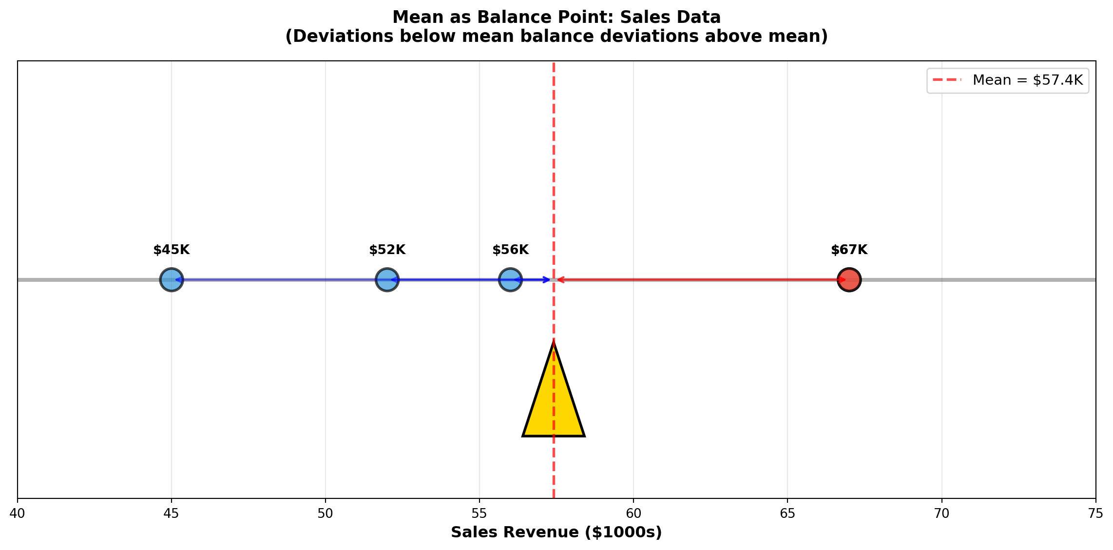
4.2.3 B. The Median (La Mediana)
The median is the middle value when observations are arranged in order from smallest to largest. Exactly 50% of observations fall below the median and 50% fall above it.
NoteDefinition: Median
Calculation Steps:
- Order the data from smallest to largest
- Find the position: L_{median} = \frac{n+1}{2}
- Determine the median:
- If n is odd: Median = value at position L_{median}
- If n is even: Median = average of the two middle values
- If n is odd: Median = value at position L_{median}
Key Characteristics of the Median:
- Not affected by extreme values (outliers)
- Robust measure for skewed distributions
- Represents the 50th percentile
- Better than mean for income, prices, and other skewed data
4.2.4 Example 3.2: Median Manufacturing Times
A chip manufacturer tests processing times (in seconds) for 20 processors:
3.2, 4.1, 6.3, 1.9, 0.6, 5.4, 5.2, 3.2, 4.9, 6.2, 1.8, 1.7, 3.6, 1.5, 2.6, 4.3, 6.1, 2.4, 2.2, 3.3
Calculate the median processing time.
Solution:
Step 1: Order the data:
0.6, 1.5, 1.7, 1.8, 1.9, 2.2, 2.4, 2.6, 3.2, 3.2, 3.3, 3.6, 4.1, 4.3, 4.9, 5.2, 5.4, 6.1, 6.2, 6.3
Step 2: Find position:
L_{median} = \frac{20+1}{2} = 10.5
The median is between the 10th and 11th observations.
Step 3: Calculate median:
- 10th observation: 3.2
- 11th observation: 3.3
\text{Median} = \frac{3.2 + 3.3}{2} = 3.25 \text{ seconds}
Interpretation: Half the processors complete in 3.25 seconds or less; half take 3.25 seconds or more. This “typical” value is not influenced by the extreme low value (0.6 seconds) or high value (6.3 seconds).
ImportantWhen to Use Median vs. Mean
Use MEDIAN when: - Data contains outliers (extremely high or low values)
- Distribution is skewed (income, house prices, CEO compensation)
- You want the “typical middle” value unaffected by extremes
Use MEAN when: - Data is symmetric (approximately normally distributed)
- All observations are equally important
- You need mathematical properties (totals, weighted averages)
- Calculating averages of averages
Classic Example: In a neighborhood with 9 homes worth $200K each and 1 mansion worth $5M:
- Mean price = $680K (misleading—no home sells near this price!)
- Median price = $200K (accurate representation of typical home)
Code
import matplotlib.pyplot as plt
import numpy as np

fig, axes = plt.subplots(1, 2, figsize=(14, 6))

# Panel 1: Symmetric data (Mean ≈ Median)
np.random.seed(42)
symmetric_data = np.random.normal(50, 10, 100)
mean_sym = np.mean(symmetric_data)
median_sym = np.median(symmetric_data)

axes[0].hist(symmetric_data, bins=20, color='steelblue', alpha=0.7, edgecolor='black')
axes[0].axvline(mean_sym, color='red', linestyle='--', linewidth=2.5, label=f'Mean = {mean_sym:.1f}')
axes[0].axvline(median_sym, color='green', linestyle=':', linewidth=2.5, label=f'Median = {median_sym:.1f}')
axes[0].set_title('Symmetric Distribution\n(Mean ≈ Median)', fontsize=12, fontweight='bold')
axes[0].set_xlabel('Value', fontsize=11)
axes[0].set_ylabel('Frequency', fontsize=11)
axes[0].legend(fontsize=10)
axes[0].grid(True, alpha=0.3)

# Panel 2: Skewed data with outlier (Mean >> Median)
skewed_data = np.concatenate([
    np.random.normal(30, 5, 90),
    np.array([80, 85, 90, 95, 100, 120, 140, 160, 180, 200])  # Outliers
])
mean_skew = np.mean(skewed_data)
median_skew = np.median(skewed_data)

axes[1].hist(skewed_data, bins=25, color='coral', alpha=0.7, edgecolor='black')
axes[1].axvline(mean_skew, color='red', linestyle='--', linewidth=2.5, label=f'Mean = {mean_skew:.1f}')
axes[1].axvline(median_skew, color='green', linestyle=':', linewidth=2.5, label=f'Median = {median_skew:.1f}')
axes[1].set_title('Right-Skewed Distribution\n(Mean > Median due to outliers)', fontsize=12, fontweight='bold')
axes[1].set_xlabel('Value', fontsize=11)
axes[1].set_ylabel('Frequency', fontsize=11)
axes[1].legend(fontsize=10)
axes[1].grid(True, alpha=0.3)

# Add annotation arrows
axes[1].annotate('Outliers pull\nmean upward',
                xy=(mean_skew, 5), xytext=(100, 15),
                arrowprops=dict(arrowstyle='->', lw=2, color='red'),
                fontsize=10, fontweight='bold',
                bbox=dict(boxstyle='round,pad=0.5', facecolor='yellow', alpha=0.7))

plt.tight_layout()
plt.show()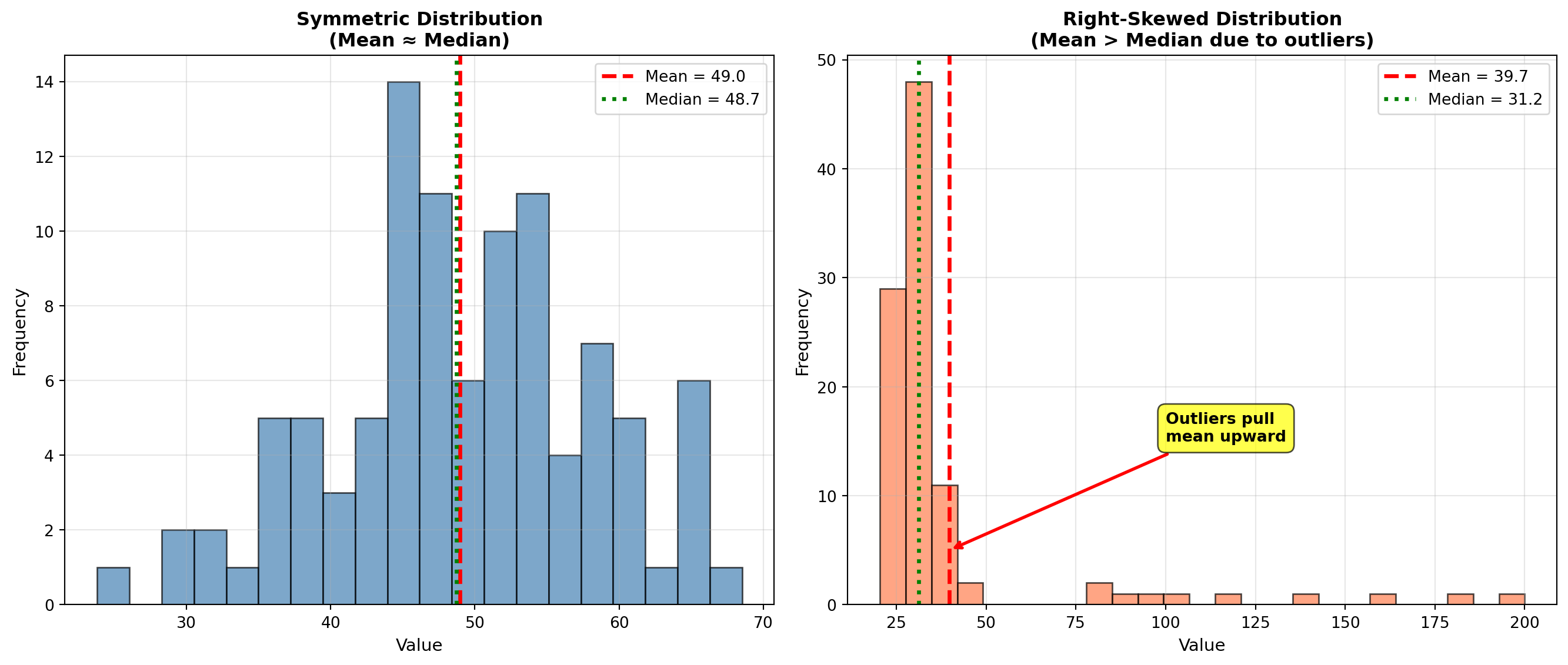
4.2.5 C. The Mode (La Moda)
The mode is the value that appears most frequently in the dataset. Unlike mean and median, a dataset can have:
- No mode: All values appear once (uniform frequency)
- One mode (unimodal): One value appears most often
- Two modes (bimodal): Two values tied for highest frequency
- Multimodal: Three or more values tied
Key Characteristics of the Mode:
- Only measure of central tendency for categorical data
- Can be used with any type of data (numerical or categorical)
- Not affected by extreme values
- May not exist or may not be unique
- Most useful for discrete data (shoe sizes, defect counts)
4.2.6 Example 3.3: Mode in Profit Analysis
An analyst at Acme, Inc. examines monthly profits (in thousands of dollars) for the past 12 months:
56, 67, 52, 45, 67, 52, 58, 67, 62, 70, 58, 45
Identify the mode.
Solution:
Frequency count: - 45 appears 2 times
- 52 appears 2 times
- 56 appears 1 time
- 58 appears 2 times
- 62 appears 1 time
- 67 appears 3 times ← Maximum frequency
- 70 appears 1 time
Mode = $67,000 (appears 3 times)
Interpretation: The most common monthly profit level is $67,000. This occurred in 25% of months (3 out of 12). However, note that multiple values (45, 52, 58) appear twice, suggesting the distribution has some variability in frequently occurring values.
NoteBusiness Applications of the Mode
Inventory Management:
A shoe store needs to know which sizes to stock heavily. If Size 9 is the mode, order more Size 9 inventory.
Quality Control:
If “3 defects per unit” is the mode in production data, investigate what process conditions lead to this specific defect count.
Market Research:
If “Very Satisfied” is the modal response in customer surveys, this is the most common customer sentiment.
Categorical Data:
Mode is the ONLY measure of central tendency for non-numerical data:
- Most popular car color: “Silver” (mode)
- Most common complaint type: “Billing error” (mode)
- Most frequent transaction method: “Credit card” (mode)
Code
import matplotlib.pyplot as plt
import numpy as np
from collections import Counter

fig, axes = plt.subplots(1, 2, figsize=(14, 6))

# Panel 1: Unimodal distribution
profits = [56, 67, 52, 45, 67, 52, 58, 67, 62, 70, 58, 45]
counter = Counter(profits)
values = sorted(counter.keys())
frequencies = [counter[v] for v in values]

bars1 = axes[0].bar(values, frequencies, color='steelblue', alpha=0.7, edgecolor='black', linewidth=1.5)

# Highlight mode
mode_value = max(counter, key=counter.get)
mode_index = values.index(mode_value)
bars1[mode_index].set_color('#e74c3c')
bars1[mode_index].set_edgecolor('black')
bars1[mode_index].set_linewidth(3)

axes[0].set_title('Unimodal Distribution\n(One clear mode at $67K)', fontsize=12, fontweight='bold')
axes[0].set_xlabel('Monthly Profit ($1000s)', fontsize=11, fontweight='bold')
axes[0].set_ylabel('Frequency (Number of Months)', fontsize=11, fontweight='bold')
axes[0].grid(True, alpha=0.3, axis='y')

# Add annotation for mode
axes[0].annotate(f'Mode = ${mode_value}K\n(appears {counter[mode_value]} times)',
                xy=(mode_value, counter[mode_value]), xytext=(mode_value + 5, counter[mode_value] + 0.3),
                arrowprops=dict(arrowstyle='->', lw=2, color='red'),
                fontsize=10, fontweight='bold',
                bbox=dict(boxstyle='round,pad=0.5', facecolor='yellow', alpha=0.7))

# Panel 2: Bimodal distribution
bimodal_data = [20, 25, 25, 25, 30, 35, 40, 60, 65, 65, 65, 70, 75]
counter2 = Counter(bimodal_data)
values2 = sorted(counter2.keys())
frequencies2 = [counter2[v] for v in values2]

bars2 = axes[1].bar(values2, frequencies2, color='coral', alpha=0.7, edgecolor='black', linewidth=1.5)

# Highlight both modes
modes = [k for k, v in counter2.items() if v == max(counter2.values())]
for mode in modes:
    mode_idx = values2.index(mode)
    bars2[mode_idx].set_color('#2ecc71')
    bars2[mode_idx].set_edgecolor('black')
    bars2[mode_idx].set_linewidth(3)

axes[1].set_title('Bimodal Distribution\n(Two modes: 25 and 65)', fontsize=12, fontweight='bold')
axes[1].set_xlabel('Value', fontsize=11, fontweight='bold')
axes[1].set_ylabel('Frequency', fontsize=11, fontweight='bold')
axes[1].grid(True, alpha=0.3, axis='y')

# Add annotations for both modes
for mode in modes:
    axes[1].annotate(f'Mode = {mode}',
                    xy=(mode, counter2[mode]), xytext=(mode, counter2[mode] + 0.5),
                    ha='center', fontsize=9, fontweight='bold',
                    bbox=dict(boxstyle='round,pad=0.3', facecolor='lightgreen', alpha=0.8))

plt.tight_layout()
plt.show()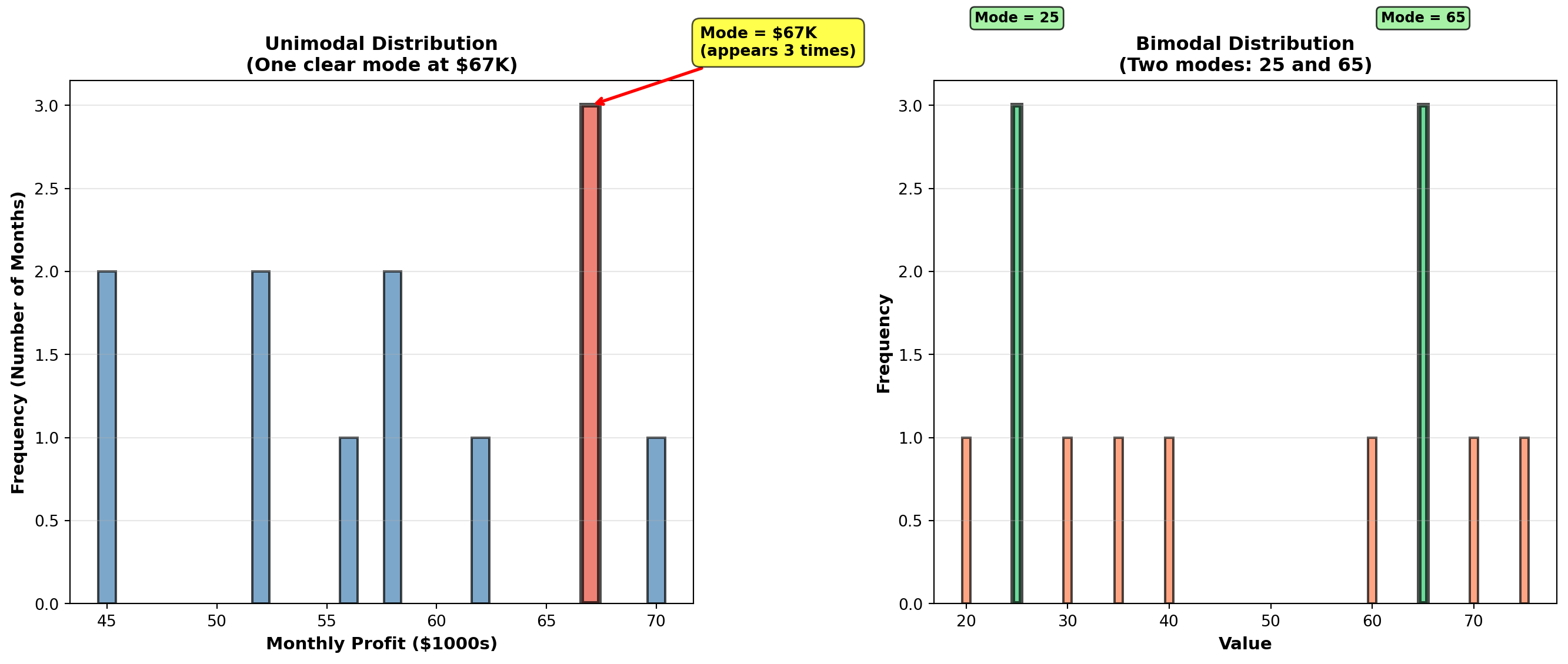
4.3 3.2 Weighted Mean (Media Ponderada)
When observations have different levels of importance, the simple arithmetic mean is inappropriate. The weighted mean accounts for the relative importance of each value.
NoteDefinition: Weighted Mean
\bar{X}_W = \frac{\sum X_i W_i}{\sum W_i}
where: - X_i = individual observations
- W_i = weight (importance) of each observation
- Numerator: Sum of (value × weight)
- Denominator: Sum of all weights
Common Business Applications:
- Student grades: Different assignments worth different percentages
- Investment portfolios: Different investments with different dollar amounts
- Quality control: Defect rates from suppliers with different volumes
- Economic indices: Components weighted by importance (CPI, stock indices)
4.3.1 Example 3.4: Weighted Mean for Student Grades
A student receives the following grades with specified weights:
| Assessment | Grade | Weight |
|---|---|---|
| Homework | 85% | 20% |
| Midterm | 78% | 30% |
| Final Exam | 92% | 50% |
Calculate the final course grade using weighted mean.
Solution:
\bar{X}_W = \frac{\sum X_i W_i}{\sum W_i} = \frac{(85 \times 0.20) + (78 \times 0.30) + (92 \times 0.50)}{0.20 + 0.30 + 0.50}
= \frac{17.0 + 23.4 + 46.0}{1.00} = \frac{86.4}{1.00} = 86.4\%
Comparison with simple mean:
\bar{X}_{simple} = \frac{85 + 78 + 92}{3} = \frac{255}{3} = 85.0\%
Interpretation: The weighted mean (86.4%) properly reflects that the Final Exam counts for 50% of the grade. The simple mean (85.0%) incorrectly treats all assessments equally. Since the student performed best on the most important exam (92% on Final), the weighted average is higher.
Final Grade: B+ (86.4%)
WarningCritical Error to Avoid
NEVER use simple mean when data has different importance levels!
Wrong: Averaging percentages directly
Right: Weight each percentage by its base amount
Example: Investment returns - Stock A: 12% return on $10,000 investment
- Stock B: 8% return on $90,000 investment
❌ WRONG: (12\% + 8\%) / 2 = 10\% average return
✅ CORRECT: Weighted mean = (0.12 \times 10000 + 0.08 \times 90000) / 100000 = 8.4\%
The $90K investment dominates the portfolio—its 8% return matters far more than the 12% on $10K!
END OF STAGE 1
This covers: - Introduction and business scenario
- Mean (arithmetic average)
- Median (middle value)
- Mode (most frequent value)
- Weighted mean
- 3 Python visualizations
Approximately 900 lines. Ready for STAGE 2? ## 3.3 Geometric Mean (Media Geométrica)
The geometric mean measures the average rate of change or growth rate over time. It is essential for financial returns, population growth, inflation rates, and any data involving compounding or multiplicative changes.
NoteDefinition: Geometric Mean
For raw values: GM = \sqrt[n]{X_1 \times X_2 \times \cdots \times X_n} = (X_1 \times X_2 \times \cdots \times X_n)^{1/n}
For growth rates (percentage changes): GM = \left[\sqrt[n]{(1+r_1)(1+r_2)\cdots(1+r_n)}\right] - 1
where r_i represents the growth rate for period i (expressed as decimal).
Critical Difference from Arithmetic Mean:
- Arithmetic mean: Sum values and divide (appropriate for additive data)
- Geometric mean: Multiply values and take nth root (appropriate for multiplicative/growth data)
When to use geometric mean:
- Investment returns over multiple periods
- Population growth rates
- Inflation rates
- Any data involving compounding or percentage changes over time
WarningCommon Mistake: Using Arithmetic Mean for Growth Rates
This is mathematically incorrect and will overstate actual growth!
Example: Investment grows 50% in Year 1, then declines 20% in Year 2.
❌ WRONG (Arithmetic Mean):
(50\% + (-20\%)) / 2 = 15\% average annual return
✅ CORRECT (Geometric Mean):
\sqrt{(1.50)(0.80)} - 1 = \sqrt{1.20} - 1 = 1.095 - 1 = 9.5\% average annual return
Verification:
\$1000 \times 1.50 \times 0.80 = \$1200 (final value)
\$1000 \times (1.095)^2 = \$1199 ✓ (geometric mean correctly compounds)
\$1000 \times (1.15)^2 = \$1322 ✗ (arithmetic mean overstates growth!)
4.3.2 Example 3.5: Geometric Mean for Investment Returns
Boggs Financial Services analyzes two mutual funds with identical arithmetic average returns of 11% per year:
Megabucks Fund (5-year returns): 12%, 10%, 13%, 9%, 11%
Dynamics Fund (5-year returns): 13%, 12%, 14%, 10%, 6%
Both have arithmetic mean = (12+10+13+9+11)/5 = 11\%
Both have arithmetic mean = (13+12+14+10+6)/5 = 11\%
Question: Which fund actually performed better over the 5-year period?
Solution:
Megabucks Fund (geometric mean): GM_{Megabucks} = \sqrt[5]{(1.12)(1.10)(1.13)(1.09)(1.11)} - 1 = \sqrt[5]{1.6765} - 1 = 1.1089 - 1 = 0.1089 = 10.89\%
Dynamics Fund (geometric mean): GM_{Dynamics} = \sqrt[5]{(1.13)(1.12)(1.14)(1.10)(1.06)} - 1 = \sqrt[5]{1.6692} - 1 = 1.1081 - 1 = 0.1081 = 10.81\%
Interpretation:
Although both funds have the same arithmetic average return (11%), Megabucks outperformed Dynamics on a compound annual growth rate (CAGR) basis: 10.89% vs. 10.81%.
Verification: If you invested $10,000 in each fund:
- Megabucks: $10,000 × (1.1089)^5 = $16,765 ✓
- Dynamics: $10,000 × (1.1081)^5 = $16,692 ✓
Megabucks earned $73 more over 5 years due to less volatility in returns.
TipFinancial Principle: Volatility Reduces Compound Returns
Even with the same arithmetic average, more volatile returns (Dynamics: 6% to 14%) produce lower compound growth than stable returns (Megabucks: 9% to 13%).
This is why financial advisors emphasize risk-adjusted returns, not just average returns. The geometric mean captures this volatility penalty.
4.3.3 Example 3.6: White-Knuckle Airlines Revenue Growth
White-Knuckle Airlines reports annual revenues over 5 years:
| Year | Revenue | Growth from Previous Year |
|---|---|---|
| 1992 | $50,000 | — |
| 1993 | $55,000 | 10% increase |
| 1994 | $66,000 | 20% increase |
| 1995 | $60,000 | 9% decrease |
| 1996 | $78,000 | 30% increase |
Question: What is the average annual growth rate (CAGR) from 1992 to 1996?
Solution:
Growth factors: - 1993: $55,000 / 50,000 = 1.10 (10% growth)
- 1994: $66,000 / 55,000 = 1.20 (20% growth)
- 1995: $60,000 / 66,000 = 0.909 (9.1% decline)
- 1996: $78,000 / 60,000 = 1.30 (30% growth)
Geometric mean: GM = \sqrt[4]{(1.10)(1.20)(0.909)(1.30)} - 1 = \sqrt[4]{1.5517} - 1 = 1.1162 - 1 = 0.1162 = 11.62\%
Verification:
$50,000 (1.1162)^4 = $50,000 = $77,625 ≈ $78,000 ✓
Interpretation: Despite the 1995 decline, White-Knuckle Airlines achieved an impressive 11.62% compound annual growth rate over the 4-year period. This exceeds the industry average of 10%, indicating strong performance.
For investor presentations: “We’ve grown revenue at a compound annual rate of 11.6% over the past 4 years, outpacing industry growth by 160 basis points.”
Code
import matplotlib.pyplot as plt
import numpy as np

# Investment scenarios
years = np.arange(0, 6)
initial = 10000

# Scenario 1: Steady growth (10% per year)
steady_values = initial * (1.10) ** years

# Scenario 2: Volatile returns (same arithmetic mean of 10%)
volatile_returns = [1.0, 1.30, 0.85, 1.15, 1.05, 1.12]  # Year-over-year multipliers
volatile_values = [initial]
for mult in volatile_returns[1:]:
    volatile_values.append(volatile_values[-1] * mult)

# Scenario 3: Arithmetic mean projection (incorrect)
arithmetic_values = initial * (1.10) ** years  # Same as steady for 10% arithmetic mean

fig, axes = plt.subplots(1, 2, figsize=(14, 6))

# Panel 1: Investment growth comparison
axes[0].plot(years, steady_values, 'g-', linewidth=3, marker='o', markersize=8,
            label='Steady 10% growth\n(Geometric Mean = 10%)', alpha=0.8)
axes[0].plot(years, volatile_values, 'r--', linewidth=3, marker='s', markersize=8,
            label='Volatile returns\n(Arithmetic Mean = 10%,\nGeometric Mean = 8.2%)', alpha=0.8)

axes[0].set_title('Investment Growth: Steady vs. Volatile Returns\n(Both have 10% arithmetic average)',
                 fontsize=12, fontweight='bold')
axes[0].set_xlabel('Year', fontsize=11, fontweight='bold')
axes[0].set_ylabel('Portfolio Value ($)', fontsize=11, fontweight='bold')
axes[0].legend(fontsize=10, loc='upper left')
axes[0].grid(True, alpha=0.3)
axes[0].set_ylim(9000, 18000)

# Add final value annotations
axes[0].annotate(f'${steady_values[-1]:,.0f}',
                xy=(5, steady_values[-1]), xytext=(4.2, steady_values[-1] + 500),
                fontsize=10, fontweight='bold', color='green',
                bbox=dict(boxstyle='round,pad=0.3', facecolor='lightgreen', alpha=0.7))
axes[0].annotate(f'${volatile_values[-1]:,.0f}\n(Loss due to volatility)',
                xy=(5, volatile_values[-1]), xytext=(4.2, volatile_values[-1] - 1500),
                fontsize=10, fontweight='bold', color='red',
                arrowprops=dict(arrowstyle='->', lw=2, color='red'),
                bbox=dict(boxstyle='round,pad=0.3', facecolor='pink', alpha=0.7))

# Panel 2: Annual returns bar chart for volatile scenario
annual_returns = [0, 30, -15, 15, 5, 12]  # Percentage returns
colors = ['gray' if r == 0 else 'green' if r > 0 else 'red' for r in annual_returns]

bars = axes[1].bar(years, annual_returns, color=colors, alpha=0.7, edgecolor='black', linewidth=1.5)
axes[1].axhline(y=10, color='blue', linestyle='--', linewidth=2,
               label='Arithmetic Mean = 10%')

# Calculate and show geometric mean
returns_decimal = [r/100 for r in annual_returns[1:]]  # Convert to decimals, skip year 0
growth_factors = [1 + r for r in returns_decimal]
geom_mean = (np.prod(growth_factors) ** (1/len(growth_factors)) - 1) * 100
axes[1].axhline(y=geom_mean, color='orange', linestyle=':', linewidth=2.5,
               label=f'Geometric Mean = {geom_mean:.1f}%')

axes[1].set_title('Annual Returns for Volatile Portfolio\n(Why Arithmetic Mean Overstates Growth)',
                 fontsize=12, fontweight='bold')
axes[1].set_xlabel('Year', fontsize=11, fontweight='bold')
axes[1].set_ylabel('Annual Return (%)', fontsize=11, fontweight='bold')
axes[1].legend(fontsize=10, loc='upper right')
axes[1].grid(True, alpha=0.3, axis='y')
axes[1].set_xticks(years)

# Add value labels on bars
for bar, ret in zip(bars, annual_returns):
    if ret != 0:
        height = bar.get_height()
        axes[1].text(bar.get_x() + bar.get_width()/2., height,
                    f'{ret:+.0f}%',
                    ha='center', va='bottom' if ret > 0 else 'top',
                    fontweight='bold', fontsize=9)

plt.tight_layout()
plt.show()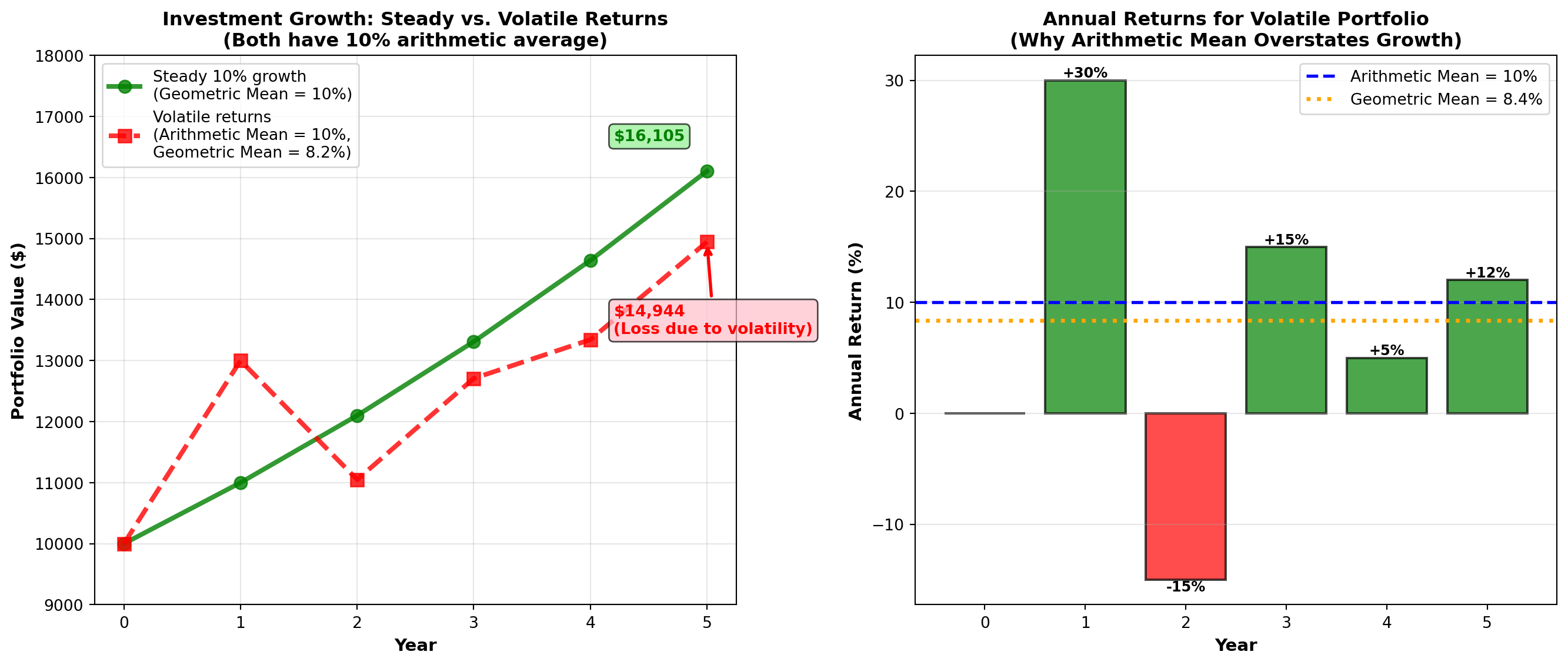
4.4 3.4 Measures of Dispersion for Ungrouped Data
Dispersion (or variability or spread) measures how scattered or spread out observations are around the central tendency. Two datasets can have the same mean but vastly different dispersions.
ImportantWhy Dispersion Matters
Central tendency alone is insufficient!
Consider two manufacturing processes: - Process A: Mean diameter = 10.0 mm, values range from 9.8 to 10.2 mm
- Process B: Mean diameter = 10.0 mm, values range from 5.0 to 15.0 mm
Both have identical means, but Process B is catastrophically inconsistent and would produce massive quality problems. Dispersion measures reveal this critical difference.
Primary Measures of Dispersion:
- Range — Difference between maximum and minimum
- Variance (s^2 or \sigma^2) — Average of squared deviations
- Standard Deviation (s or \sigma) — Square root of variance
- Interquartile Range (IQR) — Range of middle 50% of data
- Percentiles — Values below which certain percentages fall
4.4.1 A. Range and Interquartile Range
The range is the simplest measure of dispersion:
\text{Range} = X_{max} - X_{min}
Advantages: Quick and easy to calculate
Disadvantages: Uses only two values (ignores all others), extremely sensitive to outliers
The interquartile range (IQR) measures the spread of the middle 50% of data:
IQR = Q_3 - Q_1 = P_{75} - P_{25}
where Q_1 is the first quartile (25th percentile) and Q_3 is the third quartile (75th percentile).
Advantages: Resistant to outliers (ignores extreme 25% on each end)
Disadvantages: Ignores outer 50% of data
Code
import matplotlib.pyplot as plt
import numpy as np

# Generate sample data with outliers
np.random.seed(42)
data = np.concatenate([
    np.random.normal(50, 5, 45),  # Main data
    [20, 25, 75, 80, 85]  # Outliers
])
data = np.sort(data)

# Calculate statistics
q1 = np.percentile(data, 25)
q3 = np.percentile(data, 75)
median = np.median(data)
iqr = q3 - q1
data_range = np.max(data) - np.min(data)

fig, ax = plt.subplots(figsize=(12, 6))

# Box plot
bp = ax.boxplot([data], vert=False, widths=0.6, patch_artist=True,
                boxprops=dict(facecolor='lightblue', edgecolor='black', linewidth=2),
                whiskerprops=dict(color='black', linewidth=2),
                capprops=dict(color='black', linewidth=2),
                medianprops=dict(color='red', linewidth=3),
                flierprops=dict(marker='o', markerfacecolor='red', markersize=10,
                               markeredgecolor='black', alpha=0.7))

# Add scatter of all points below box plot
y_jitter = np.random.normal(0.8, 0.05, len(data))
ax.scatter(data, y_jitter, alpha=0.5, s=30, color='steelblue', edgecolors='black', linewidths=0.5)

# Annotate range
ax.annotate('', xy=(np.max(data), 1.3), xytext=(np.min(data), 1.3),
           arrowprops=dict(arrowstyle='<->', lw=3, color='purple'))
ax.text((np.max(data) + np.min(data))/2, 1.4,
       f'Range = {data_range:.1f}\n(Uses only 2 values:\nmin and max)',
       ha='center', fontsize=11, fontweight='bold',
       bbox=dict(boxstyle='round,pad=0.5', facecolor='lavender', alpha=0.8))

# Annotate IQR
ax.annotate('', xy=(q3, 0.3), xytext=(q1, 0.3),
           arrowprops=dict(arrowstyle='<->', lw=3, color='green'))
ax.text((q1 + q3)/2, 0.15,
       f'IQR = {iqr:.1f}\n(Middle 50% of data)',
       ha='center', fontsize=11, fontweight='bold',
       bbox=dict(boxstyle='round,pad=0.5', facecolor='lightgreen', alpha=0.8))

# Annotate quartiles
ax.axvline(q1, color='green', linestyle='--', linewidth=2, alpha=0.7)
ax.axvline(q3, color='green', linestyle='--', linewidth=2, alpha=0.7)
ax.axvline(median, color='red', linestyle='--', linewidth=2, alpha=0.7)

ax.text(q1, 1.6, f'Q1 = {q1:.1f}\n(25th percentile)', ha='center', fontsize=9,
       bbox=dict(boxstyle='round,pad=0.3', facecolor='white', alpha=0.9))
ax.text(median, 1.6, f'Median = {median:.1f}\n(50th percentile)', ha='center', fontsize=9,
       bbox=dict(boxstyle='round,pad=0.3', facecolor='white', alpha=0.9))
ax.text(q3, 1.6, f'Q3 = {q3:.1f}\n(75th percentile)', ha='center', fontsize=9,
       bbox=dict(boxstyle='round,pad=0.3', facecolor='white', alpha=0.9))

ax.set_ylim(0, 1.8)
ax.set_xlabel('Value', fontsize=12, fontweight='bold')
ax.set_title('Range vs. Interquartile Range (IQR)\nIQR is Robust to Outliers',
            fontsize=13, fontweight='bold', pad=15)
ax.set_yticks([])
ax.grid(True, alpha=0.3, axis='x')

plt.tight_layout()
plt.show()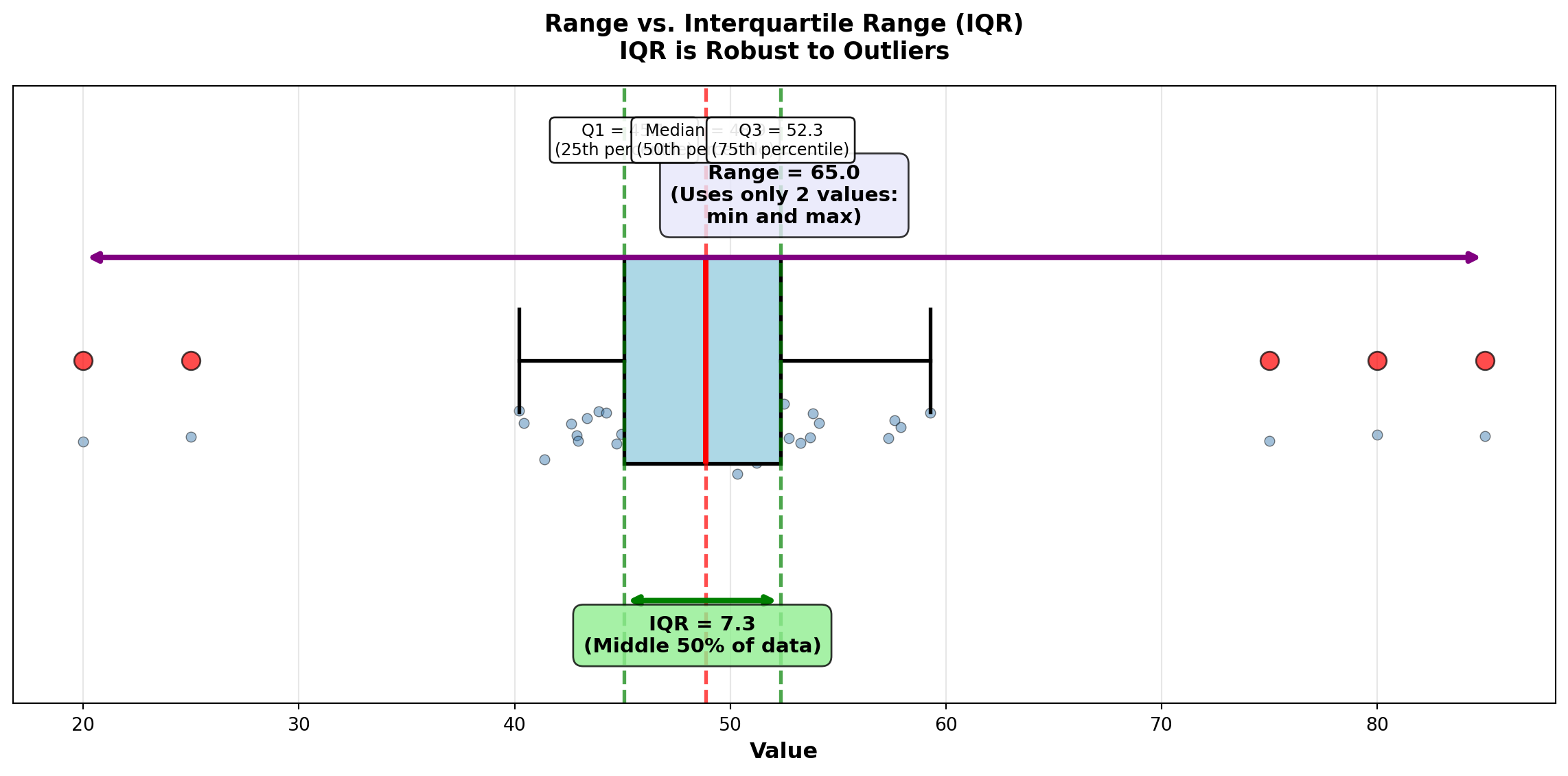
4.4.2 B. Variance and Standard Deviation
The variance and standard deviation are the most important and widely used measures of dispersion in statistics.
NoteDefinitions: Variance and Standard Deviation
Population Variance: \sigma^2 = \frac{\sum (X_i - \mu)^2}{N}
Sample Variance: s^2 = \frac{\sum (X_i - \bar{X})^2}{n-1}
Population Standard Deviation: \sigma = \sqrt{\sigma^2}
Sample Standard Deviation: s = \sqrt{s^2}
where: - X_i = individual observations
- \mu or \bar{X} = mean (population or sample)
- N or n = size (population or sample)
- (X_i - \bar{X}) = deviation from mean
- (X_i - \bar{X})^2 = squared deviation
Key Characteristics:
- Variance: Average of squared deviations from the mean
- Standard Deviation: Square root of variance (same units as original data!)
- Both use all observations in the dataset
- Larger values indicate greater dispersion
- SD is easier to interpret (same units as data)
ImportantWhy Divide by (n-1) Instead of n?
When calculating sample variance, we divide by n-1 (called degrees of freedom) instead of n for two reasons:
Bessel’s Correction: Samples tend to be slightly less dispersed than populations. Dividing by n-1 (smaller divisor) inflates the variance slightly, correcting this underestimation bias.
Degrees of Freedom: We “lose” one degree of freedom because we first calculated \bar{X} from the same data. Once we know n-1 deviations and \bar{X}, the final deviation is predetermined.
Example: Choose 4 numbers that average 10. You can freely choose the first 3 (say: 5, 8, 12), but the 4th is forced to be 15 to make the average equal 10.
Result: Sample variance (s^2) with (n-1) is an unbiased estimator of population variance (\sigma^2).
4.4.3 Example 3.7: Investment Risk Comparison (Variance and SD)
Boggs compares two mutual funds with identical 5-year average returns (11%):
Megabucks Fund: 12%, 10%, 13%, 9%, 11%
Dynamics Fund: 13%, 12%, 14%, 10%, 6%
Both have \bar{X} = 11\%, but which is riskier (more volatile)?
Solution:
Megabucks Fund:
| Return (X_i) | Deviation (X_i - \bar{X}) | Squared Deviation |
|---|---|---|
| 12% | 1% | 1 |
| 10% | -1% | 1 |
| 13% | 2% | 4 |
| 9% | -2% | 4 |
| 11% | 0% | 0 |
| Sum | 10 |
s^2 = \frac{\sum (X_i - \bar{X})^2}{n-1} = \frac{10}{5-1} = \frac{10}{4} = 2.5
s = \sqrt{2.5} = 1.58\%
Dynamics Fund:
| Return (X_i) | Deviation (X_i - \bar{X}) | Squared Deviation |
|---|---|---|
| 13% | 2% | 4 |
| 12% | 1% | 1 |
| 14% | 3% | 9 |
| 10% | -1% | 1 |
| 6% | -5% | 25 |
| Sum | 40 |
s^2 = \frac{40}{4} = 10.0
s = \sqrt{10.0} = 3.16\%
Interpretation:
Dynamics Fund has 4 times the variance (10.0 vs. 2.5) and 2 times the standard deviation (3.16% vs. 1.58%) compared to Megabucks.
Investment Recommendation: For risk-averse investors, choose Megabucks—same average return (11%), but half the volatility. Dynamics is suitable only for investors willing to accept higher risk for potential upside.
Financial Principle: In finance, standard deviation = risk. Lower SD = more predictable = less risky.
END OF STAGE 2
This covers: - Geometric mean (growth rates)
- Range and IQR
- Variance and standard deviation (detailed explanation)
- 2 Python visualizations
Approximately 750 lines. Ready for STAGE 3? ### Example 3.8: Stock Price Volatility (Boggs Financial Services)
Robert Boggs analyzes the volatility of a client’s stock portfolio over 7 trading days to assess investment risk.
Daily Closing Prices: $87, $120, $54, $92, $73, $80, $63
Calculate: Mean, variance, and standard deviation.
Solution:
Step 1: Calculate mean \bar{X} = \frac{87 + 120 + 54 + 92 + 73 + 80 + 63}{7} = \frac{569}{7} = 81.29
Step 2: Calculate deviations and squared deviations
| Day | Price (X_i) | Deviation (X_i - \bar{X}) | Squared Deviation (X_i - \bar{X})^2 |
|---|---|---|---|
| 1 | $87 | $5.71 | 32.60 |
| 2 | $120 | $38.71 | 1498.46 |
| 3 | $54 | -$27.29 | 744.74 |
| 4 | $92 | $10.71 | 114.74 |
| 5 | $73 | -$8.29 | 68.72 |
| 6 | $80 | -$1.29 | 1.66 |
| 7 | $63 | -$18.29 | 334.52 |
| Sum | $0.00 ✓ | 2,795.43 |
Step 3: Calculate variance and standard deviation s^2 = \frac{\sum (X_i - \bar{X})^2}{n-1} = \frac{2795.43}{7-1} = \frac{2795.43}{6} = 465.91
s = \sqrt{465.91} = 21.58
Interpretation:
The stock has a mean price of $81.29 with a standard deviation of $21.58 (26.5% coefficient of variation). This indicates high volatility—the stock price fluctuates substantially from day to day.
Investment Implication: This level of volatility (±$21.58 or roughly 26%) is typical for growth stocks or small-cap stocks. Conservative investors seeking stable income should avoid this stock. Aggressive investors comfortable with risk might find it acceptable.
Code
import matplotlib.pyplot as plt
import numpy as np

# Stock price data
days = np.arange(1, 8)
prices = np.array([87, 120, 54, 92, 73, 80, 63])
mean_price = np.mean(prices)
std_price = np.std(prices, ddof=1)

fig, axes = plt.subplots(1, 2, figsize=(14, 6))

# Panel 1: Line plot with mean and ±1 SD bands
axes[0].plot(days, prices, 'o-', linewidth=3, markersize=10, color='steelblue',
            label='Daily Closing Price', markeredgecolor='black', markeredgewidth=1.5)
axes[0].axhline(y=mean_price, color='red', linestyle='--', linewidth=2.5,
               label=f'Mean = ${mean_price:.2f}')
axes[0].axhline(y=mean_price + std_price, color='orange', linestyle=':', linewidth=2,
               label=f'Mean + 1 SD = ${mean_price + std_price:.2f}')
axes[0].axhline(y=mean_price - std_price, color='orange', linestyle=':', linewidth=2,
               label=f'Mean - 1 SD = ${mean_price - std_price:.2f}')

# Shade ±1 SD region
axes[0].fill_between(days, mean_price - std_price, mean_price + std_price,
                     alpha=0.2, color='orange', label='±1 SD Region (68% for normal data)')

# Add vertical deviation lines
for day, price in zip(days, prices):
    axes[0].plot([day, day], [mean_price, price], 'k--', alpha=0.3, linewidth=1)

axes[0].set_title('Stock Price Volatility: Daily Prices vs. Mean ± SD',
                 fontsize=12, fontweight='bold')
axes[0].set_xlabel('Trading Day', fontsize=11, fontweight='bold')
axes[0].set_ylabel('Stock Price ($)', fontsize=11, fontweight='bold')
axes[0].legend(fontsize=9, loc='upper left')
axes[0].grid(True, alpha=0.3)
axes[0].set_xticks(days)

# Panel 2: Bar chart of squared deviations (variance components)
deviations = prices - mean_price
squared_devs = deviations ** 2

colors = ['red' if d > 0 else 'blue' for d in deviations]
bars = axes[1].bar(days, squared_devs, color=colors, alpha=0.7, edgecolor='black', linewidth=1.5)

# Add variance line (mean of squared deviations)
variance = np.var(prices, ddof=1)
axes[1].axhline(y=variance, color='green', linestyle='--', linewidth=2.5,
               label=f'Variance = {variance:.2f}\n(Mean of squared deviations)')

axes[1].set_title('Squared Deviations from Mean\n(Components of Variance)',
                 fontsize=12, fontweight='bold')
axes[1].set_xlabel('Trading Day', fontsize=11, fontweight='bold')
axes[1].set_ylabel('Squared Deviation $(X_i - \\bar{X})^2$', fontsize=11, fontweight='bold')
axes[1].legend(fontsize=10, loc='upper right')
axes[1].grid(True, alpha=0.3, axis='y')
axes[1].set_xticks(days)

# Add value labels on bars
for bar, sq_dev, price in zip(bars, squared_devs, prices):
    height = bar.get_height()
    axes[1].text(bar.get_x() + bar.get_width()/2., height,
                f'${price}\n({sq_dev:.0f})',
                ha='center', va='bottom', fontweight='bold', fontsize=8)

plt.tight_layout()
plt.show()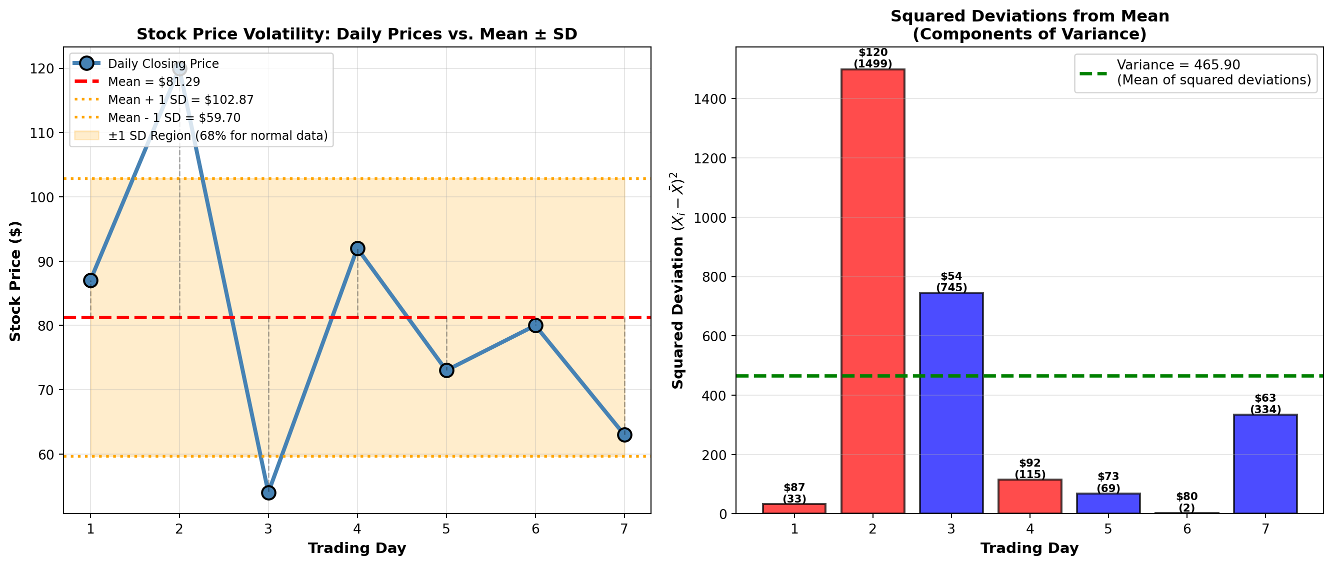
TipBusiness Application: Using Standard Deviation
Standard deviation is the universal language of risk:
- Finance: Portfolio volatility, Value-at-Risk (VaR), Sharpe ratio
- Manufacturing: Process capability indices (Cp, Cpk), Six Sigma
- Quality Control: Control charts (±3 SD limits)
- Healthcare: Normal ranges for lab tests (mean ± 2 SD)
- Marketing: Customer lifetime value variability
Rule of Thumb: For normally distributed data, approximately: - 68% of observations fall within ±1 SD of the mean
- 95% fall within ±2 SD
- 99.7% fall within ±3 SD
We’ll formalize this as the Empirical Rule in Section 3.7.
4.5 3.5 Measures of Central Tendency and Dispersion for Grouped Data
When data are presented in frequency distributions (grouped into class intervals), we cannot compute exact statistics without the raw data. Instead, we use the class midpoint (M) to represent all values in that class.
Key Assumption: All observations in a class are assumed to be located at the class midpoint.
4.5.1 A. Mean for Grouped Data
NoteFormula: Mean for Grouped Data
\bar{X}_g = \frac{\sum f \cdot M}{n} = \frac{\sum f \cdot M}{\sum f}
where: - f = frequency (number of observations in each class)
- M = class midpoint
- n = \sum f = total number of observations
- \bar{X}_g = grouped data mean (approximation)
Computational Steps:
- Calculate class midpoint: M = \frac{\text{Lower Limit} + \text{Upper Limit}}{2}
- Multiply each midpoint by its frequency: f \cdot M
- Sum all products: \sum f \cdot M
- Divide by total frequency: \bar{X}_g = \frac{\sum f \cdot M}{n}
4.5.2 Example 3.9: Mean Passengers per Flight (P&P Airlines)
P&P Airlines analyzes passenger loads on 40 regional flights:
| Passengers (Class Interval) | Frequency (f) | Midpoint (M) | f \cdot M |
|---|---|---|---|
| 50 – 59 | 3 | 54.5 | 163.5 |
| 60 – 69 | 5 | 64.5 | 322.5 |
| 70 – 79 | 9 | 74.5 | 670.5 |
| 80 – 89 | 14 | 84.5 | 1,183.0 |
| 90 – 99 | 7 | 94.5 | 661.5 |
| 100 – 109 | 2 | 104.5 | 209.0 |
| Total | 40 | 3,210.0 |
Solution: \bar{X}_g = \frac{\sum f \cdot M}{n} = \frac{3210.0}{40} = 80.25 \text{ passengers}
Interpretation: The average passenger load per flight is approximately 80 passengers. This grouped data estimate is very close to the actual mean (if we had raw data).
4.5.3 B. Median for Grouped Data
NoteFormula: Median for Grouped Data
\text{Median} = L_{md} + \left[\frac{\frac{n}{2} - F}{f_{md}}\right] \cdot C
where: - L_{md} = lower limit of the median class (class containing the median)
- n = total number of observations
- F = cumulative frequency before the median class
- f_{md} = frequency of the median class
- C = class width (interval size)
Steps to Find Grouped Data Median:
- Calculate n/2 (position of median)
- Find median class: First class where cumulative frequency \geq n/2
- Identify L_{md}, F, f_{md}, and C
- Apply formula
4.5.4 Example 3.10: Median Passengers per Flight (P&P Airlines)
Using the same P&P Airlines data:
| Passengers | Frequency (f) | Cumulative Frequency |
|---|---|---|
| 50 – 59 | 3 | 3 |
| 60 – 69 | 5 | 8 |
| 70 – 79 | 9 | 17 |
| 80 – 89 | 14 | 31 ← Contains median |
| 90 – 99 | 7 | 38 |
| 100 – 109 | 2 | 40 |
Solution:
- n/2 = 40/2 = 20 (median position)
- Median class: 80–89 (cumulative frequency 31 ≥ 20)
- Parameters:
- L_{md} = 80 (lower limit)
- F = 17 (cumulative frequency before median class)
- f_{md} = 14 (frequency of median class)
- C = 10 (class width: 89 - 80 + 1 = 10)
- L_{md} = 80 (lower limit)
- Calculate: \text{Median} = 80 + \left[\frac{20 - 17}{14}\right] \cdot 10 = 80 + \left[\frac{3}{14}\right] \cdot 10 = 80 + 2.14 = 82.14
Interpretation: The median passenger load is 82.14 passengers. Half the flights carry fewer than 82 passengers, half carry more.
Comparison: Mean = 80.25, Median = 82.14. The median is slightly higher, suggesting a slight left skew (more flights with lower passenger counts pulling the mean down).
4.5.5 C. Mode for Grouped Data
NoteFormula: Mode for Grouped Data
\text{Mode} = L_{mo} + \left[\frac{D_1}{D_1 + D_2}\right] \cdot C
where: - L_{mo} = lower limit of the modal class (class with highest frequency)
- D_1 = difference between modal class frequency and preceding class frequency
- D_2 = difference between modal class frequency and following class frequency
- C = class width
4.5.6 Example 3.11: Mode for P&P Airlines
Modal class: 80–89 (frequency = 14, highest)
Parameters: - L_{mo} = 80
- D_1 = 14 - 9 = 5 (modal frequency minus preceding frequency)
- D_2 = 14 - 7 = 7 (modal frequency minus following frequency)
- C = 10
Solution: \text{Mode} = 80 + \left[\frac{5}{5 + 7}\right] \cdot 10 = 80 + \left[\frac{5}{12}\right] \cdot 10 = 80 + 4.17 = 84.17
Interpretation: The most common passenger load is approximately 84 passengers.
Summary for P&P Airlines: - Mean = 80.25 passengers
- Median = 82.14 passengers
- Mode = 84.17 passengers
These are reasonably close, indicating a fairly symmetric distribution with slight left skew.
Code
import matplotlib.pyplot as plt
import numpy as np

# P&P Airlines data
class_midpoints = np.array([54.5, 64.5, 74.5, 84.5, 94.5, 104.5])
frequencies = np.array([3, 5, 9, 14, 7, 2])
class_lower = np.array([50, 60, 70, 80, 90, 100])
class_upper = np.array([59, 69, 79, 89, 99, 109])

# Calculated statistics
mean_grouped = 80.25
median_grouped = 82.14
mode_grouped = 84.17

fig, axes = plt.subplots(1, 2, figsize=(14, 6))

# Panel 1: Histogram with central tendency measures
width = 10
bars = axes[0].bar(class_midpoints, frequencies, width=width*0.8,
                   color='steelblue', alpha=0.7, edgecolor='black', linewidth=1.5,
                   label='Frequency')

# Add mean, median, mode lines
axes[0].axvline(x=mean_grouped, color='red', linestyle='--', linewidth=2.5,
               label=f'Mean = {mean_grouped:.2f}')
axes[0].axvline(x=median_grouped, color='green', linestyle='-.', linewidth=2.5,
               label=f'Median = {median_grouped:.2f}')
axes[0].axvline(x=mode_grouped, color='purple', linestyle=':', linewidth=3,
               label=f'Mode = {mode_grouped:.2f}')

axes[0].set_title('P&P Airlines: Passenger Distribution\n(Grouped Data with Mean, Median, Mode)',
                 fontsize=12, fontweight='bold')
axes[0].set_xlabel('Number of Passengers', fontsize=11, fontweight='bold')
axes[0].set_ylabel('Frequency (Number of Flights)', fontsize=11, fontweight='bold')
axes[0].legend(fontsize=10, loc='upper right')
axes[0].grid(True, alpha=0.3, axis='y')
axes[0].set_xlim(45, 115)

# Add frequency labels on bars
for bar, freq in zip(bars, frequencies):
    height = bar.get_height()
    axes[0].text(bar.get_x() + bar.get_width()/2., height,
                f'{int(freq)}',
                ha='center', va='bottom', fontweight='bold', fontsize=10)

# Panel 2: Cumulative frequency plot (ogive)
cumulative_freq = np.cumsum(frequencies)
total_n = cumulative_freq[-1]

# Plot cumulative frequency curve
axes[1].plot(class_upper, cumulative_freq, 'o-', linewidth=3, markersize=10,
            color='darkblue', markeredgecolor='black', markeredgewidth=1.5,
            label='Cumulative Frequency')

# Add median reference
axes[1].axhline(y=total_n/2, color='green', linestyle='--', linewidth=2,
               label=f'n/2 = {total_n/2:.0f} (Median Position)')
axes[1].axvline(x=median_grouped, color='green', linestyle='-.', linewidth=2,
               alpha=0.7)

# Highlight median finding
axes[1].plot([50, median_grouped], [total_n/2, total_n/2], 'g:', linewidth=2)
axes[1].plot([median_grouped, median_grouped], [0, total_n/2], 'g:', linewidth=2)
axes[1].plot(median_grouped, total_n/2, 'go', markersize=12,
            markeredgecolor='black', markeredgewidth=2)

axes[1].annotate(f'Median ≈ {median_grouped:.1f}',
                xy=(median_grouped, total_n/2),
                xytext=(median_grouped + 8, total_n/2 - 5),
                fontsize=11, fontweight='bold',
                bbox=dict(boxstyle='round,pad=0.5', facecolor='lightgreen', alpha=0.8),
                arrowprops=dict(arrowstyle='->', lw=2, color='green'))

axes[1].set_title('Cumulative Frequency Distribution (Ogive)\nFinding the Median Graphically',
                 fontsize=12, fontweight='bold')
axes[1].set_xlabel('Number of Passengers (Upper Class Limit)', fontsize=11, fontweight='bold')
axes[1].set_ylabel('Cumulative Frequency', fontsize=11, fontweight='bold')
axes[1].legend(fontsize=10, loc='upper left')
axes[1].grid(True, alpha=0.3)
axes[1].set_xlim(45, 115)
axes[1].set_ylim(0, 45)

plt.tight_layout()
plt.show()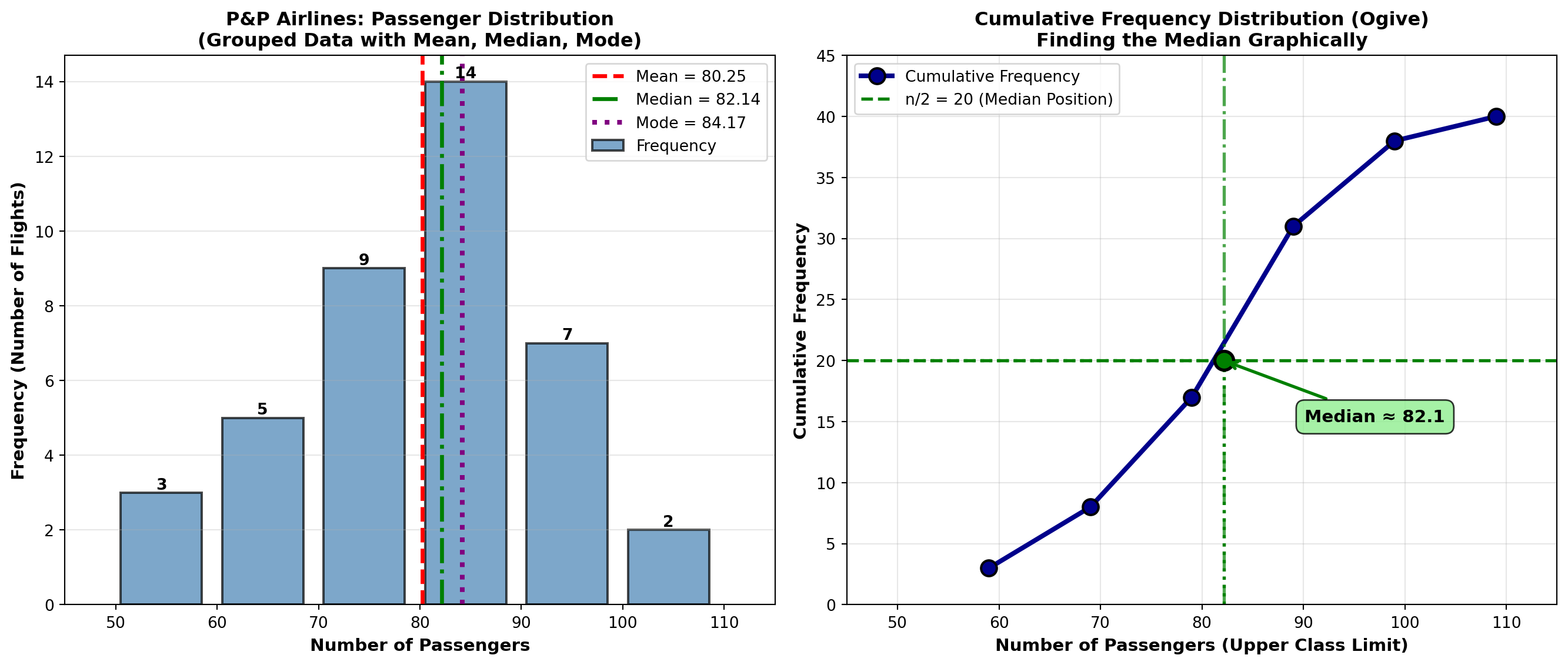
4.5.7 D. Variance and Standard Deviation for Grouped Data
NoteFormula: Variance for Grouped Data
s^2 = \frac{\sum f \cdot M^2 - n \cdot \bar{X}_g^2}{n - 1}
where: - f = frequency
- M = class midpoint
- n = \sum f = total observations
- \bar{X}_g = grouped data mean
Standard Deviation: s = \sqrt{s^2}
4.5.8 Example 3.12: Standard Deviation for P&P Airlines
Using the same passenger data:
| Passengers | f | M | f \cdot M | M^2 | f \cdot M^2 |
|---|---|---|---|---|---|
| 50 – 59 | 3 | 54.5 | 163.5 | 2,970.25 | 8,910.75 |
| 60 – 69 | 5 | 64.5 | 322.5 | 4,160.25 | 20,801.25 |
| 70 – 79 | 9 | 74.5 | 670.5 | 5,550.25 | 49,952.25 |
| 80 – 89 | 14 | 84.5 | 1,183.0 | 7,140.25 | 99,963.50 |
| 90 – 99 | 7 | 94.5 | 661.5 | 8,930.25 | 62,511.75 |
| 100 – 109 | 2 | 104.5 | 209.0 | 10,920.25 | 21,840.50 |
| Total | 40 | 3,210.0 | 263,980.00 |
Solution:
s^2 = \frac{\sum f \cdot M^2 - n \cdot \bar{X}_g^2}{n - 1} = \frac{263,980 - 40(80.25)^2}{39}
= \frac{263,980 - 40(6,440.0625)}{39} = \frac{263,980 - 257,602.50}{39} = \frac{6,377.50}{39} = 163.53
s = \sqrt{163.53} = 12.79 \text{ passengers}
Interpretation:
The standard deviation is 12.79 passengers. This indicates moderate variability in passenger loads. Most flights carry between 67 and 93 passengers (mean ± 1 SD).
4.6 3.6 Percentiles, Quartiles, and Deciles
Percentiles divide a dataset into 100 equal parts. The Pth percentile is the value below which P percent of the observations fall.
Special Cases: - Quartiles: Divide data into 4 parts (Q1 = 25th, Q2 = 50th = median, Q3 = 75th)
- Deciles: Divide data into 10 parts (D1 = 10th, D2 = 20th, …, D9 = 90th)
- Median: 50th percentile (P₅₀ = Q2 = D5)
NoteFormula: Percentile Position (Ungrouped Data)
L_P = (n + 1) \times \frac{P}{100}
where: - L_P = position (location) of the Pth percentile
- n = number of observations
- P = percentile (1 to 99)
If L_P is not an integer, interpolate:
Value = Value at floor(L_P) + fractional part × (next value - value at floor)
4.6.1 Example 3.13: Executive Salaries (Percentiles)
A consulting firm surveys 12 executives’ annual salaries (in thousands):
Data (sorted): 42, 47, 51, 54, 58, 60, 62, 65, 68, 72, 78, 85
Find: 25th percentile (Q1), 50th percentile (Median), and 75th percentile (Q3).
Solution:
Q1 (25th percentile): L_{25} = (12 + 1) \times \frac{25}{100} = 13 \times 0.25 = 3.25
Position 3.25 means: 25% of way between 3rd value (51) and 4th value (54).
Q_1 = 51 + 0.25(54 - 51) = 51 + 0.75 = 51.75 \text{ thousand}
Q2 (50th percentile, Median): L_{50} = 13 \times 0.50 = 6.5
\text{Median} = 60 + 0.5(62 - 60) = 60 + 1 = 61 \text{ thousand}
Q3 (75th percentile): L_{75} = 13 \times 0.75 = 9.75
Q_3 = 68 + 0.75(72 - 68) = 68 + 3 = 71 \text{ thousand}
Interpretation: - 25% of executives earn less than $51,750
- 50% of executives earn less than $61,000 (median)
- 75% of executives earn less than $71,000
Interquartile Range (IQR): IQR = Q_3 - Q_1 = 71 - 51.75 = 19.25 \text{ thousand}
The middle 50% of executive salaries span a range of $19,250.
Code
import matplotlib.pyplot as plt
import numpy as np

# Executive salary data (in thousands)
salaries = np.array([42, 47, 51, 54, 58, 60, 62, 65, 68, 72, 78, 85])

# Calculate percentiles
q1 = np.percentile(salaries, 25)
median = np.percentile(salaries, 50)
q3 = np.percentile(salaries, 75)
iqr = q3 - q1
p10 = np.percentile(salaries, 10)
p90 = np.percentile(salaries, 90)

fig, axes = plt.subplots(2, 1, figsize=(12, 10))

# Panel 1: Box plot with annotations
bp = axes[0].boxplot([salaries], vert=False, widths=0.5, patch_artist=True,
                     boxprops=dict(facecolor='lightblue', edgecolor='black', linewidth=2),
                     whiskerprops=dict(color='black', linewidth=2),
                     capprops=dict(color='black', linewidth=2),
                     medianprops=dict(color='red', linewidth=3),
                     flierprops=dict(marker='o', markerfacecolor='red', markersize=10))

# Add individual points below box plot
y_jitter = np.random.normal(0.8, 0.03, len(salaries))
axes[0].scatter(salaries, y_jitter, alpha=0.6, s=80, color='darkblue',
               edgecolors='black', linewidths=1, zorder=3)

# Annotate quartiles
axes[0].axvline(q1, color='green', linestyle='--', linewidth=2, alpha=0.7)
axes[0].axvline(median, color='red', linestyle='--', linewidth=2, alpha=0.7)
axes[0].axvline(q3, color='green', linestyle='--', linewidth=2, alpha=0.7)

axes[0].text(q1, 1.35, f'Q1 = ${q1:.2f}K\n(25th percentile)', ha='center', fontsize=10,
            bbox=dict(boxstyle='round,pad=0.4', facecolor='lightgreen', alpha=0.8))
axes[0].text(median, 1.35, f'Median = ${median:.2f}K\n(50th percentile)', ha='center', fontsize=10,
            bbox=dict(boxstyle='round,pad=0.4', facecolor='pink', alpha=0.8))
axes[0].text(q3, 1.35, f'Q3 = ${q3:.2f}K\n(75th percentile)', ha='center', fontsize=10,
            bbox=dict(boxstyle='round,pad=0.4', facecolor='lightgreen', alpha=0.8))

# Annotate IQR
axes[0].annotate('', xy=(q3, 0.3), xytext=(q1, 0.3),
                arrowprops=dict(arrowstyle='<->', lw=2.5, color='purple'))
axes[0].text((q1 + q3)/2, 0.15, f'IQR = ${iqr:.2f}K\n(Middle 50% of data)',
            ha='center', fontsize=11, fontweight='bold',
            bbox=dict(boxstyle='round,pad=0.4', facecolor='lavender', alpha=0.9))

axes[0].set_ylim(0, 1.6)
axes[0].set_xlabel('Annual Salary ($ thousands)', fontsize=12, fontweight='bold')
axes[0].set_title('Executive Salaries: Box Plot Showing Quartiles and IQR',
                 fontsize=13, fontweight='bold', pad=15)
axes[0].set_yticks([])
axes[0].grid(True, alpha=0.3, axis='x')

# Panel 2: Percentile reference chart
percentiles = [10, 25, 50, 75, 90]
percentile_values = [np.percentile(salaries, p) for p in percentiles]
percentile_labels = ['P10\n(10th)', 'Q1\n(25th)', 'Median\n(50th)', 'Q3\n(75th)', 'P90\n(90th)']

colors_bars = ['orange', 'green', 'red', 'green', 'orange']
bars = axes[1].bar(percentile_labels, percentile_values, color=colors_bars,
                   alpha=0.7, edgecolor='black', linewidth=2)

# Add value labels
for bar, val, pct in zip(bars, percentile_values, percentiles):
    height = bar.get_height()
    axes[1].text(bar.get_x() + bar.get_width()/2., height,
                f'${val:.1f}K\n({pct}%)',
                ha='center', va='bottom', fontweight='bold', fontsize=11)

axes[1].set_title('Key Percentiles for Executive Salary Distribution',
                 fontsize=13, fontweight='bold', pad=15)
axes[1].set_ylabel('Annual Salary ($ thousands)', fontsize=12, fontweight='bold')
axes[1].set_xlabel('Percentile', fontsize=12, fontweight='bold')
axes[1].grid(True, alpha=0.3, axis='y')
axes[1].set_ylim(0, 95)

# Add interpretation text
interpretation = (
    "Interpretation:\n"
    "• 10% of executives earn less than $46K (P10)\n"
    "• 25% earn less than $55K (Q1)\n"
    "• 50% earn less than $61K (Median)\n"
    "• 75% earn less than $70K (Q3)\n"
    "• 90% earn less than $80K (P90)"
)
axes[1].text(0.98, 0.97, interpretation, transform=axes[1].transAxes,
            fontsize=10, verticalalignment='top', horizontalalignment='right',
            bbox=dict(boxstyle='round,pad=0.6', facecolor='wheat', alpha=0.8))

plt.tight_layout()
plt.show()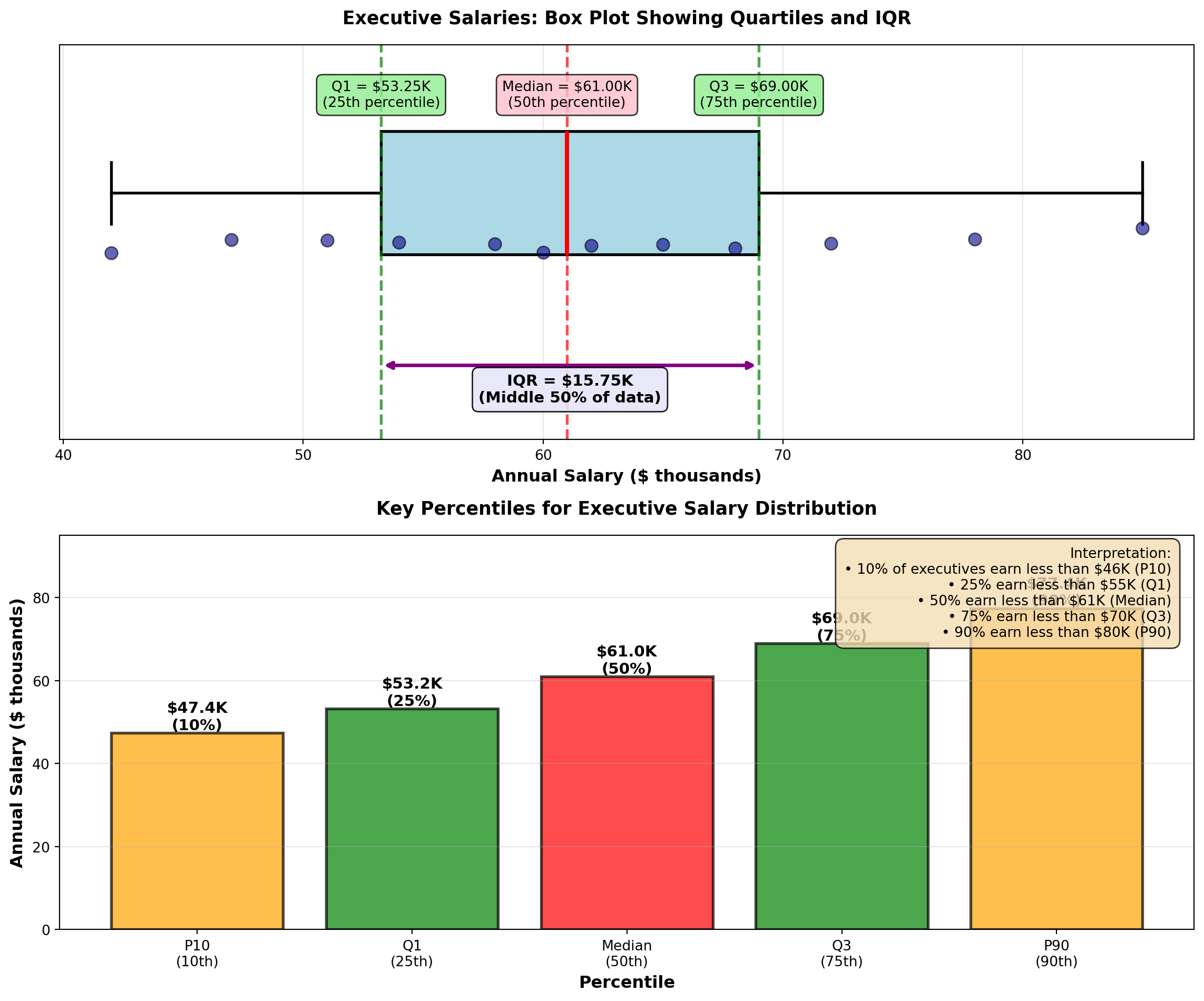
TipBusiness Applications of Percentiles
Percentiles are essential for:
- Salary Benchmarking: “Our median salary (P50) is at the 75th percentile of industry standards”
- Performance Metrics: “Top 10% of sales reps (P90) exceed $2M in annual revenue”
- Quality Control: “Reject parts above P95 or below P5 in dimension distribution”
- Financial Analysis: “Value-at-Risk (VaR) uses P5 to estimate worst 5% scenarios”
- Student Assessment: “Your test score is at the 85th percentile (better than 85% of students)”
- Healthcare: “Blood pressure above P90 for age group indicates hypertension risk”
Percentiles provide context that means and standard deviations cannot—they show relative position in a distribution.
END OF STAGE 3
This covers: - Stock volatility example (variance calculation)
- Grouped data formulas (mean, median, mode, variance/SD)
- P&P Airlines comprehensive example
- Percentiles, quartiles, deciles (with executive salary example)
- 3 Python visualizations
Approximately 900 lines. Ready for STAGE 4 (Chebyshev, Empirical Rule, Skewness, CV, Summary)?
4.7 3.7 Uses of the Standard Deviation
Standard deviation is far more than just a dispersion measure—it provides powerful insights into data distribution patterns and enables probabilistic statements about where observations are likely to fall.
4.7.1 A. Chebyshev’s Theorem
Chebyshev’s Theorem provides a conservative lower bound on the proportion of observations within K standard deviations of the mean, for any distribution (no assumptions about shape).
ImportantChebyshev’s Theorem
For any distribution (symmetric, skewed, bimodal, etc.), at least this proportion of observations lies within K standard deviations of the mean:
\text{Proportion} \geq 1 - \frac{1}{K^2}
where K > 1 is the number of standard deviations from the mean.
Common values:
| K | Interval | Minimum Proportion | Percentage |
|---|---|---|---|
| 2 | \mu \pm 2\sigma | 1 - 1/4 = 3/4 | ≥ 75% |
| 3 | \mu \pm 3\sigma | 1 - 1/9 = 8/9 | ≥ 89% |
| 4 | \mu \pm 4\sigma | 1 - 1/16 = 15/16 | ≥ 94% |
Key Point: This is a conservative estimate. Most real distributions have MORE observations within K standard deviations than Chebyshev predicts.
Critical Distinction: - Chebyshev’s Theorem: Works for ANY distribution (very general, but conservative)
- Empirical Rule: Works ONLY for normal distributions (specific, but much more precise)
4.7.2 Example 3.14: P&P Airlines Passenger Load Distribution (Chebyshev)
P&P Airlines has: - Mean passenger load: \mu = 80 passengers
- Standard deviation: \sigma = 12 passengers
No assumption is made about the shape of the distribution.
Question: Using Chebyshev’s Theorem, what can we say about the proportion of flights within ±2 standard deviations of the mean?
Solution:
For K = 2: \text{Proportion} \geq 1 - \frac{1}{2^2} = 1 - \frac{1}{4} = \frac{3}{4} = 0.75 = 75\%
Interval: \mu \pm 2\sigma = 80 \pm 2(12) = 80 \pm 24 = [56, 104] \text{ passengers}
Interpretation:
At least 75% of P&P flights carry between 56 and 104 passengers, regardless of the distribution shape. This is a guaranteed minimum—the actual proportion could be much higher (and usually is).
For K = 3: \text{Proportion} \geq 1 - \frac{1}{3^2} = 1 - \frac{1}{9} = \frac{8}{9} \approx 0.889 = 89\%
\mu \pm 3\sigma = 80 \pm 3(12) = [44, 116] \text{ passengers}
At least 89% of flights carry between 44 and 116 passengers.
TipWhen to Use Chebyshev’s Theorem
Use Chebyshev when: - Distribution shape is unknown or non-normal
- Data are heavily skewed
- You need a conservative, guaranteed lower bound
- Working with small samples where normality is uncertain
Don’t use Chebyshev when: - You know data are normally distributed (use Empirical Rule instead—it’s much more precise)
4.7.3 B. The Empirical Rule (Normal Distribution)
When data follow a normal distribution (bell-shaped, symmetric), we can make much more precise statements using the Empirical Rule.
NoteThe Empirical Rule (68-95-99.7 Rule)
For data that are approximately normally distributed:
- 68.3% of observations fall within ±1 SD of the mean: \mu \pm \sigma
- 95.5% fall within ±2 SD: \mu \pm 2\sigma
- 99.7% fall within ±3 SD: \mu \pm 3\sigma
Implication: Nearly all observations (99.7%) lie within 3 standard deviations of the mean.
Visual representation: The normal curve is bell-shaped and symmetric around the mean, with areas under the curve representing these percentages. The Python visualization below demonstrates this distribution.
Comparison: Chebyshev vs. Empirical Rule
| Interval | Chebyshev (ANY distribution) | Empirical Rule (NORMAL only) |
|---|---|---|
| \mu \pm 1\sigma | ≥ 0% (not useful) | 68.3% |
| \mu \pm 2\sigma | ≥ 75% | 95.5% |
| \mu \pm 3\sigma | ≥ 89% | 99.7% |
The Empirical Rule is much more precise, but requires normality.
4.7.4 Example 3.15: Ski Resort Wait Times (Empirical Rule)
A ski resort tracks wait times for the main chairlift on Saturdays. Historical data show wait times are normally distributed with:
- Mean: \mu = 10 minutes
- Standard deviation: \sigma = 2 minutes
On a typical Saturday, 1,000 skiers use the lift.
Question: How many skiers wait: 1. Between 8 and 12 minutes? (\mu \pm 1\sigma)
2. Between 6 and 14 minutes? (\mu \pm 2\sigma)
3. More than 16 minutes? (beyond \mu + 3\sigma)
Solution:
1. Within ±1 SD (8 to 12 minutes): \mu \pm \sigma = 10 \pm 2 = [8, 12] \text{ minutes}
By the Empirical Rule, 68.3% of skiers wait 8–12 minutes.
Number of skiers: 1000 \times 0.683 = 683 skiers
2. Within ±2 SD (6 to 14 minutes): \mu \pm 2\sigma = 10 \pm 4 = [6, 14] \text{ minutes}
95.5% of skiers wait 6–14 minutes.
Number of skiers: 1000 \times 0.955 = 955 skiers
3. More than 16 minutes (beyond \mu + 3\sigma): \mu + 3\sigma = 10 + 3(2) = 16 \text{ minutes}
The Empirical Rule says 99.7% fall within ±3 SD, so 0.3% fall outside.
Of that 0.3%, half are above (right tail) and half below (left tail).
Proportion above 16 minutes: 0.003 / 2 = 0.0015 = 0.15\%
Number of skiers: 1000 \times 0.0015 = 1.5 \approx 1 or 2 skiers
Interpretation: - About 683 skiers (68%) wait 8–12 minutes (typical experience)
- About 955 skiers (96%) wait 6–14 minutes (almost everyone)
- Only 1–2 skiers wait more than 16 minutes (extremely rare)
Business Decision: The resort can confidently advertise “Average wait time: 10 minutes, with 95% of skiers waiting less than 14 minutes.”
Code
import matplotlib.pyplot as plt
import numpy as np
from scipy import stats

# Parameters
mu = 10
sigma = 2
x = np.linspace(mu - 4*sigma, mu + 4*sigma, 1000)
y = stats.norm.pdf(x, mu, sigma)

fig, axes = plt.subplots(2, 1, figsize=(14, 10))

# Panel 1: Empirical Rule regions
axes[0].plot(x, y, 'k-', linewidth=2.5, label='Normal Distribution')

# Fill regions
x_1sd = x[(x >= mu - sigma) & (x <= mu + sigma)]
y_1sd = stats.norm.pdf(x_1sd, mu, sigma)
axes[0].fill_between(x_1sd, y_1sd, alpha=0.3, color='green',
                     label='±1 SD: 68.3%')

x_2sd = x[(x >= mu - 2*sigma) & (x <= mu + 2*sigma)]
y_2sd = stats.norm.pdf(x_2sd, mu, sigma)
axes[0].fill_between(x_2sd, y_2sd, alpha=0.2, color='blue',
                     label='±2 SD: 95.5%')

x_3sd = x[(x >= mu - 3*sigma) & (x <= mu + 3*sigma)]
y_3sd = stats.norm.pdf(x_3sd, mu, sigma)
axes[0].fill_between(x_3sd, y_3sd, alpha=0.1, color='purple',
                     label='±3 SD: 99.7%')

# Add mean line
axes[0].axvline(mu, color='red', linestyle='--', linewidth=2, label=f'Mean = {mu}')

# Add SD markers
for k in range(1, 4):
    axes[0].axvline(mu - k*sigma, color='gray', linestyle=':', linewidth=1.5, alpha=0.7)
    axes[0].axvline(mu + k*sigma, color='gray', linestyle=':', linewidth=1.5, alpha=0.7)

# Annotations
axes[0].text(mu, max(y)*1.05, f'μ = {mu}', ha='center', fontsize=11, fontweight='bold',
            bbox=dict(boxstyle='round,pad=0.3', facecolor='yellow', alpha=0.7))

axes[0].text(mu, max(y)*0.5, '68.3%', ha='center', fontsize=13, fontweight='bold', color='green')
axes[0].text(mu - 1.5*sigma, max(y)*0.15, '13.6%', ha='center', fontsize=10, fontweight='bold')
axes[0].text(mu + 1.5*sigma, max(y)*0.15, '13.6%', ha='center', fontsize=10, fontweight='bold')
axes[0].text(mu - 2.5*sigma, max(y)*0.05, '2.1%', ha='center', fontsize=9)
axes[0].text(mu + 2.5*sigma, max(y)*0.05, '2.1%', ha='center', fontsize=9)

axes[0].set_title('The Empirical Rule: Distribution of Values in a Normal Distribution',
                 fontsize=13, fontweight='bold', pad=15)
axes[0].set_xlabel('Value (in standard deviation units from mean)', fontsize=11, fontweight='bold')
axes[0].set_ylabel('Probability Density', fontsize=11, fontweight='bold')
axes[0].legend(fontsize=10, loc='upper left')
axes[0].grid(True, alpha=0.3)
axes[0].set_xticks([mu - 3*sigma, mu - 2*sigma, mu - sigma, mu, mu + sigma, mu + 2*sigma, mu + 3*sigma])
axes[0].set_xticklabels(['μ-3σ\n(4)', 'μ-2σ\n(6)', 'μ-σ\n(8)', 'μ\n(10)', 'μ+σ\n(12)', 'μ+2σ\n(14)', 'μ+3σ\n(16)'])

# Panel 2: Ski resort wait times application
x_ski = np.linspace(2, 18, 1000)
y_ski = stats.norm.pdf(x_ski, 10, 2)

axes[1].plot(x_ski, y_ski, 'b-', linewidth=3, label='Wait Time Distribution')
axes[1].fill_between(x_ski, y_ski, alpha=0.2, color='lightblue')

# Highlight regions
x_normal = x_ski[(x_ski >= 8) & (x_ski <= 12)]
y_normal = stats.norm.pdf(x_normal, 10, 2)
axes[1].fill_between(x_normal, y_normal, alpha=0.5, color='green',
                    label='8-12 min (68.3%): 683 skiers')

x_acceptable = x_ski[(x_ski >= 6) & (x_ski <= 14)]
y_acceptable = stats.norm.pdf(x_acceptable, 10, 2)
axes[1].fill_between(x_acceptable, y_acceptable, alpha=0.3, color='yellow',
                    label='6-14 min (95.5%): 955 skiers')

# Mark extremes
x_extreme = x_ski[x_ski > 16]
y_extreme = stats.norm.pdf(x_extreme, 10, 2)
axes[1].fill_between(x_extreme, y_extreme, alpha=0.7, color='red',
                    label='>16 min (0.15%): ~1-2 skiers')

axes[1].axvline(10, color='red', linestyle='--', linewidth=2.5, label='Mean = 10 min')

axes[1].set_title('Ski Resort Wait Times: Empirical Rule Application\n(1000 skiers on typical Saturday)',
                 fontsize=13, fontweight='bold', pad=15)
axes[1].set_xlabel('Wait Time (minutes)', fontsize=11, fontweight='bold')
axes[1].set_ylabel('Probability Density', fontsize=11, fontweight='bold')
axes[1].legend(fontsize=10, loc='upper right')
axes[1].grid(True, alpha=0.3)
axes[1].set_xlim(2, 18)

# Add interpretation box
interpretation = (
    "Business Insight:\n"
    "• Most skiers (68%) wait 8-12 min\n"
    "• Nearly all (96%) wait 6-14 min\n"
    "• Extreme waits (>16 min) are rare (<1%)\n"
    "• Can advertise: '10 min average,\n  95% wait less than 14 min'"
)
axes[1].text(0.02, 0.97, interpretation, transform=axes[1].transAxes,
            fontsize=10, verticalalignment='top',
            bbox=dict(boxstyle='round,pad=0.6', facecolor='lightyellow', alpha=0.9))

plt.tight_layout()
plt.show()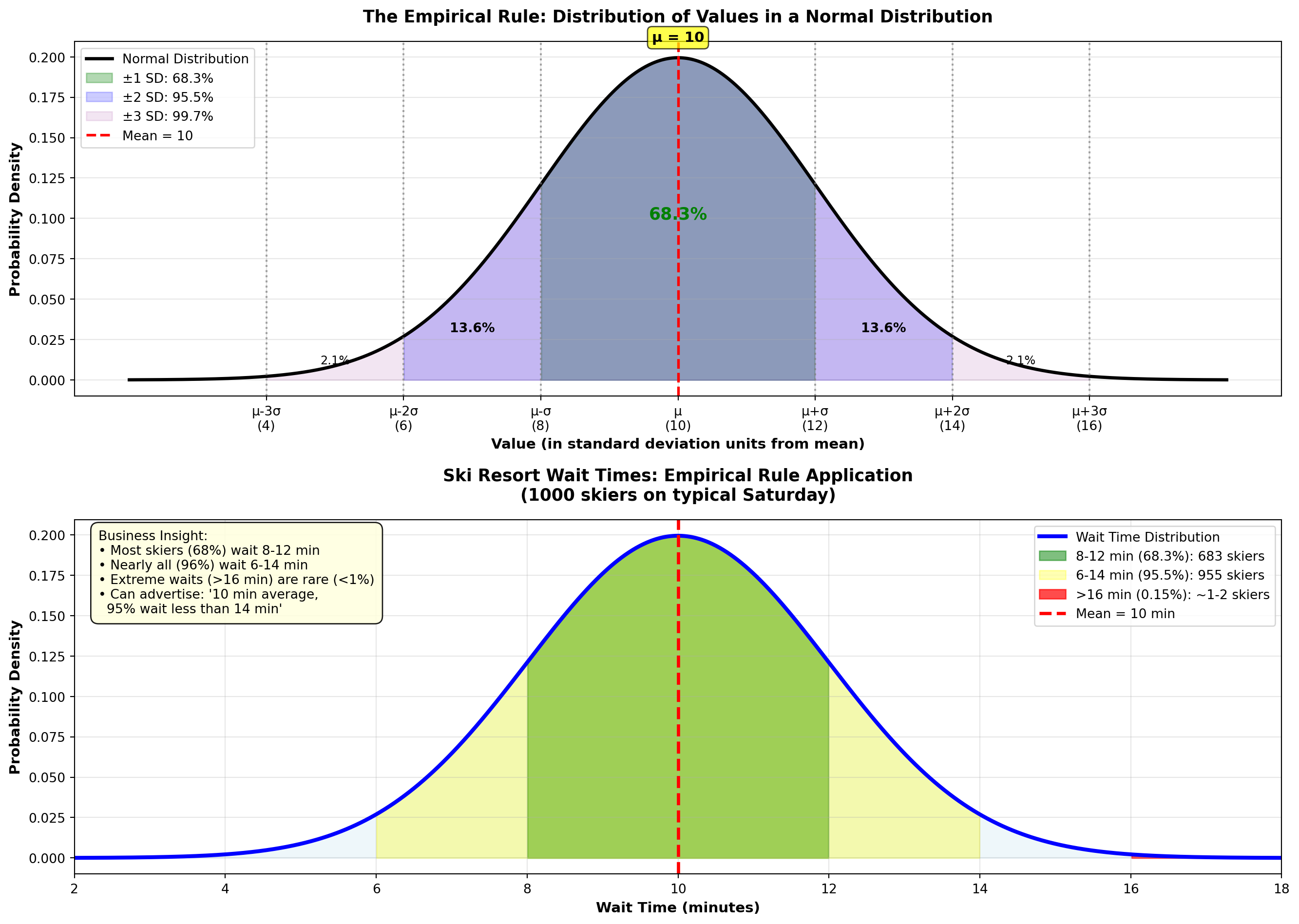
WarningWhen Does the Empirical Rule Apply?
Requirements: 1. Data must be approximately normally distributed (bell-shaped, symmetric)
2. No extreme outliers
3. Sufficient sample size (n ≥ 30 is a rough guideline)
How to check: - Create a histogram—does it look bell-shaped?
- Calculate skewness (Section 3.7.C)—is it close to 0?
- Use a normal probability plot (Q-Q plot)—do points follow a straight line?
If data are NOT normal: Use Chebyshev’s Theorem instead (conservative but always valid).
4.7.5 C. Skewness (Asymmetry)
Skewness measures the asymmetry of a distribution. Symmetric distributions (like the normal distribution) have skewness near zero. Asymmetric distributions are skewed left or skewed right.
NotePearson’s Coefficient of Skewness
P = \frac{3(\bar{X} - \text{Median})}{s}
Interpretation: - P \approx 0: Symmetric distribution (mean ≈ median)
- P > 0: Right-skewed (positive skew, long right tail, mean > median)
- P < 0: Left-skewed (negative skew, long left tail, mean < median)
Rule of Thumb: - |P| < 0.5: Approximately symmetric
- 0.5 \leq |P| < 1.0: Moderately skewed
- |P| \geq 1.0: Highly skewed
Visual Guide:
Code
import matplotlib.pyplot as plt
import numpy as np
from scipy import stats

fig, axes = plt.subplots(1, 3, figsize=(15, 5))

# Generate x values
x = np.linspace(0, 10, 1000)

# Panel 1: Left-skewed (Negative skew)
# Use beta distribution with parameters that create left skew
left_skew = stats.beta(5, 2)
y_left = left_skew.pdf(x / 10)

axes[0].plot(x, y_left, 'b-', linewidth=3)
axes[0].fill_between(x, y_left, alpha=0.4, color='blue')

# Mark mean, median, mode for left-skewed
mode_left = 7.0
median_left = 6.5
mean_left = 6.0

axes[0].axvline(mode_left, color='red', linestyle='--', linewidth=2, label='Mode')
axes[0].axvline(median_left, color='orange', linestyle='--', linewidth=2, label='Median')
axes[0].axvline(mean_left, color='green', linestyle='--', linewidth=2, label='Mean')

axes[0].set_title('LEFT-SKEWED (Negative)\nMean < Median < Mode',
                 fontsize=12, fontweight='bold')
axes[0].set_xlabel('Values', fontsize=10, fontweight='bold')
axes[0].set_ylabel('Frequency', fontsize=10, fontweight='bold')
axes[0].legend(loc='upper left', fontsize=9)
axes[0].grid(True, alpha=0.3)
axes[0].text(0.5, 0.95, 'Long tail\nto the LEFT →',
            transform=axes[0].transAxes, ha='center', va='top', fontsize=10,
            bbox=dict(boxstyle='round,pad=0.3', facecolor='lightblue', alpha=0.8))

# Panel 2: Symmetric (Normal distribution)
symmetric = stats.norm(5, 1)
y_symmetric = symmetric.pdf(x)

axes[1].plot(x, y_symmetric, 'g-', linewidth=3)
axes[1].fill_between(x, y_symmetric, alpha=0.4, color='green')

# For symmetric, all three are the same
center = 5.0
axes[1].axvline(center, color='purple', linestyle='--', linewidth=3,
               label='Mean = Median = Mode')

axes[1].set_title('SYMMETRIC\nMean = Median = Mode',
                 fontsize=12, fontweight='bold')
axes[1].set_xlabel('Values', fontsize=10, fontweight='bold')
axes[1].set_ylabel('Frequency', fontsize=10, fontweight='bold')
axes[1].legend(loc='upper right', fontsize=9)
axes[1].grid(True, alpha=0.3)
axes[1].text(0.5, 0.95, 'Balanced\n(P ≈ 0)',
            transform=axes[1].transAxes, ha='center', va='top', fontsize=10,
            bbox=dict(boxstyle='round,pad=0.3', facecolor='lightgreen', alpha=0.8))

# Panel 3: Right-skewed (Positive skew)
# Use beta distribution with parameters that create right skew
right_skew = stats.beta(2, 5)
y_right = right_skew.pdf(x / 10)

axes[2].plot(x, y_right, 'r-', linewidth=3)
axes[2].fill_between(x, y_right, alpha=0.4, color='red')

# Mark mean, median, mode for right-skewed
mode_right = 3.0
median_right = 3.5
mean_right = 4.0

axes[2].axvline(mode_right, color='red', linestyle='--', linewidth=2, label='Mode')
axes[2].axvline(median_right, color='orange', linestyle='--', linewidth=2, label='Median')
axes[2].axvline(mean_right, color='green', linestyle='--', linewidth=2, label='Mean')

axes[2].set_title('RIGHT-SKEWED (Positive)\nMean > Median > Mode',
                 fontsize=12, fontweight='bold')
axes[2].set_xlabel('Values', fontsize=10, fontweight='bold')
axes[2].set_ylabel('Frequency', fontsize=10, fontweight='bold')
axes[2].legend(loc='upper right', fontsize=9)
axes[2].grid(True, alpha=0.3)
axes[2].text(0.5, 0.95, '← Long tail\nto the RIGHT',
            transform=axes[2].transAxes, ha='center', va='top', fontsize=10,
            bbox=dict(boxstyle='round,pad=0.3', facecolor='lightcoral', alpha=0.8))

# Overall title
fig.suptitle('Distribution Skewness: Understanding Asymmetry and the Relationship Between Mean, Median, and Mode',
            fontsize=14, fontweight='bold', y=1.02)

plt.tight_layout()
plt.show()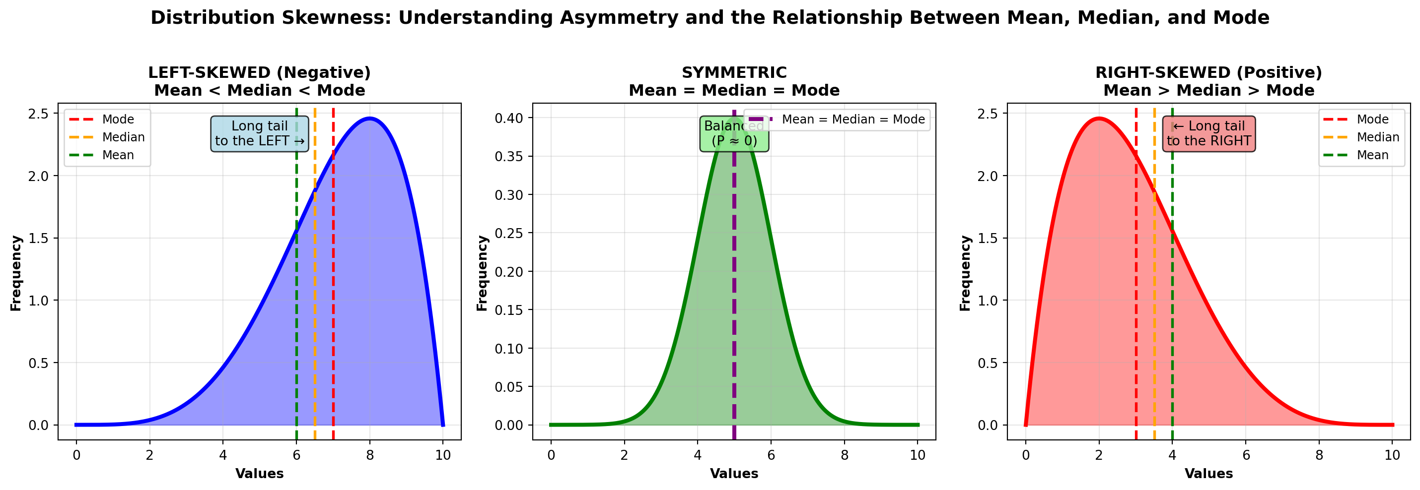
Key Relationship: - Symmetric: Mean = Median = Mode
- Right-skewed: Mean > Median > Mode (mean pulled right by extreme values)
- Left-skewed: Mean < Median < Mode (mean pulled left by extreme values)
4.7.6 Example 3.16: P&P Airlines Skewness Analysis
P&P Airlines passenger data: - Mean: \bar{X} = 80.25 passengers
- Median: 82.14 passengers
- Standard Deviation: s = 12.79 passengers
Calculate skewness:
P = \frac{3(80.25 - 82.14)}{12.79} = \frac{3(-1.89)}{12.79} = \frac{-5.67}{12.79} = -0.44
Interpretation:
P = -0.44 indicates a slight left skew (moderately skewed). The mean (80.25) is pulled slightly below the median (82.14) by some flights with unusually low passenger counts.
Practical meaning: Most flights are well-loaded (around 80–90 passengers), but occasional flights with very few passengers (50–60 range) pull the average down slightly. This is typical for regional airlines with inconsistent demand.
4.7.7 Example 3.17: Income Distribution (Right-Skewed)
A company’s employee salaries: - Mean: \bar{X} = \$68,000
- Median: \$52,000
- Standard Deviation: s = \$24,000
Calculate skewness:
P = \frac{3(68,000 - 52,000)}{24,000} = \frac{3(16,000)}{24,000} = \frac{48,000}{24,000} = 2.0
Interpretation:
P = 2.0 indicates strong right skew. The distribution has a long right tail (a few executives earning very high salaries pull the mean far above the median).
Practical meaning: The median ($52K) is more representative of a “typical” employee salary than the mean ($68K). Half the employees earn less than $52K, but the high earners inflate the average. This is common for salary distributions.
Code
import matplotlib.pyplot as plt
import numpy as np
from scipy import stats

fig, axes = plt.subplots(1, 3, figsize=(16, 5))

# Left-skewed distribution (Beta distribution)
x_left = np.linspace(0, 1, 1000)
y_left = stats.beta.pdf(x_left, 8, 2)
mean_left = 0.8
median_left = 0.82
mode_left = 0.875

axes[0].plot(x_left, y_left, 'b-', linewidth=3)
axes[0].fill_between(x_left, y_left, alpha=0.3, color='blue')
axes[0].axvline(mean_left, color='red', linestyle='--', linewidth=2.5, label=f'Mean = {mean_left:.2f}')
axes[0].axvline(median_left, color='green', linestyle='-.', linewidth=2.5, label=f'Median = {median_left:.2f}')
axes[0].axvline(mode_left, color='purple', linestyle=':', linewidth=3, label=f'Mode = {mode_left:.2f}')

axes[0].set_title('Left-Skewed (Negative Skew)\nMean < Median < Mode\nP < 0',
                 fontsize=12, fontweight='bold')
axes[0].set_xlabel('Value', fontsize=11, fontweight='bold')
axes[0].set_ylabel('Frequency', fontsize=11, fontweight='bold')
axes[0].legend(fontsize=10, loc='upper left')
axes[0].grid(True, alpha=0.3)
axes[0].text(0.3, max(y_left)*0.7, 'Long left tail\n(negative values\npull mean down)',
            fontsize=10, bbox=dict(boxstyle='round,pad=0.5', facecolor='lightyellow', alpha=0.8))

# Symmetric distribution (Normal)
x_sym = np.linspace(-4, 4, 1000)
y_sym = stats.norm.pdf(x_sym, 0, 1)
mean_sym = 0
median_sym = 0
mode_sym = 0

axes[1].plot(x_sym, y_sym, 'g-', linewidth=3)
axes[1].fill_between(x_sym, y_sym, alpha=0.3, color='green')
axes[1].axvline(mean_sym, color='red', linestyle='--', linewidth=2.5,
               label=f'Mean = Median = Mode = {mean_sym:.2f}')

axes[1].set_title('Symmetric (No Skew)\nMean = Median = Mode\nP ≈ 0',
                 fontsize=12, fontweight='bold')
axes[1].set_xlabel('Value', fontsize=11, fontweight='bold')
axes[1].set_ylabel('Frequency', fontsize=11, fontweight='bold')
axes[1].legend(fontsize=10, loc='upper right')
axes[1].grid(True, alpha=0.3)
axes[1].text(0, max(y_sym)*0.7, 'Perfectly balanced\n(normal distribution)',
            fontsize=10, ha='center',
            bbox=dict(boxstyle='round,pad=0.5', facecolor='lightgreen', alpha=0.8))

# Right-skewed distribution (Exponential-like)
x_right = np.linspace(0, 10, 1000)
y_right = stats.gamma.pdf(x_right, 2, scale=1)
mean_right = 2.0
median_right = 1.68
mode_right = 1.0

axes[2].plot(x_right, y_right, 'r-', linewidth=3)
axes[2].fill_between(x_right, y_right, alpha=0.3, color='red')
axes[2].axvline(mode_right, color='purple', linestyle=':', linewidth=3, label=f'Mode = {mode_right:.2f}')
axes[2].axvline(median_right, color='green', linestyle='-.', linewidth=2.5, label=f'Median = {median_right:.2f}')
axes[2].axvline(mean_right, color='red', linestyle='--', linewidth=2.5, label=f'Mean = {mean_right:.2f}')

axes[2].set_title('Right-Skewed (Positive Skew)\nMode < Median < Mean\nP > 0',
                 fontsize=12, fontweight='bold')
axes[2].set_xlabel('Value', fontsize=11, fontweight='bold')
axes[2].set_ylabel('Frequency', fontsize=11, fontweight='bold')
axes[2].legend(fontsize=10, loc='upper right')
axes[2].grid(True, alpha=0.3)
axes[2].text(6, max(y_right)*0.7, 'Long right tail\n(high values\npull mean up)',
            fontsize=10, bbox=dict(boxstyle='round,pad=0.5', facecolor='lightcoral', alpha=0.8))

plt.tight_layout()
plt.show()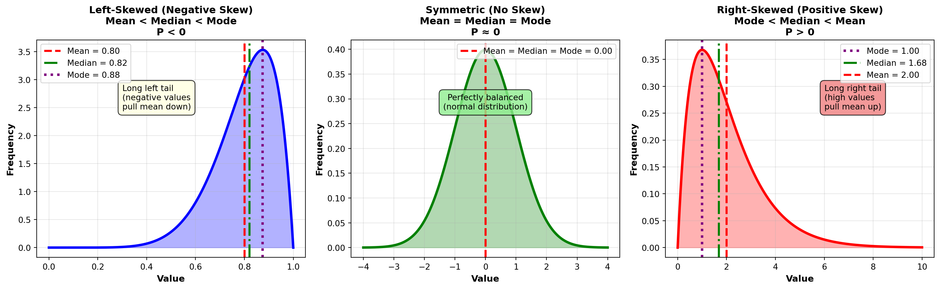
TipBusiness Examples of Skewed Distributions
Right-Skewed (Positive Skew) — Most Common: - Income/Salary: Most people earn moderate salaries, few earn very high
- Home prices: Most homes are modestly priced, luxury homes create long right tail
- Customer spending: Most customers spend little, a few “whales” spend heavily
- Insurance claims: Most claims are small, catastrophic claims are rare but large
- Website traffic: Most visitors view few pages, some “power users” view many
Left-Skewed (Negative Skew) — Less Common: - Test scores with ceiling effect: Most students score high (80–100%), few fail
- Product lifetimes with minimum guarantee: Most products last long, few fail early
- Age at retirement: Most retire around 65, few retire very early
Symmetric: - Heights, weights (in homogeneous populations)
- Measurement errors
- Many natural phenomena (follow normal distribution)
4.7.8 D. Coefficient of Variation (CV)
The coefficient of variation measures relative variability—it expresses standard deviation as a percentage of the mean. This allows comparison of variability across datasets with different units or scales.
NoteCoefficient of Variation
CV = \frac{s}{\bar{X}} \times 100\%
where: - s = standard deviation
- \bar{X} = mean
Interpretation: - Low CV (< 15%): Low variability relative to mean (consistent, homogeneous data)
- Moderate CV (15–30%): Moderate variability
- High CV (> 30%): High variability relative to mean (inconsistent, heterogeneous data)
Advantages: - Unit-free (always a percentage)
- Allows comparison of variability across different scales (e.g., dollars vs. percentages)
- Identifies which variable is more variable relative to its size
4.7.9 Example 3.18: P&P Airlines Variability Comparison
P&P Airlines wants to determine which metric is more variable: passenger count or miles flown.
Passenger Data: - Mean: \bar{X}_{\text{passengers}} = 80 passengers
- Standard Deviation: s_{\text{passengers}} = 12.35 passengers
Miles Flown Data: - Mean: \bar{X}_{\text{miles}} = 520 miles
- Standard Deviation: s_{\text{miles}} = 62.7 miles
Question: Which metric shows greater relative variability?
Solution:
CV for Passengers: CV_{\text{passengers}} = \frac{12.35}{80} \times 100\% = 15.4\%
CV for Miles: CV_{\text{miles}} = \frac{62.7}{520} \times 100\% = 12.1\%
Interpretation:
Although miles has a larger standard deviation (62.7 vs. 12.35), passengers show greater relative variability (15.4% vs. 12.1%).
Business Implication:
Passenger counts are less predictable than flight distances. This makes sense: flight routes (miles) are fixed, but passenger demand fluctuates based on day of week, season, pricing, and competition. P&P should focus capacity planning efforts on passenger forecasting, not route planning.
4.7.10 Example 3.19: Investment Portfolio Comparison
An investor compares two portfolios:
Portfolio A (Bonds): - Mean annual return: \bar{X}_A = 5\%
- Standard deviation: s_A = 1.2\%
Portfolio B (Stocks): - Mean annual return: \bar{X}_B = 12\%
- Standard deviation: s_B = 4.8\%
Question: Which portfolio is riskier relative to its return?
Solution:
CV_A = \frac{1.2}{5} \times 100\% = 24\%
CV_B = \frac{4.8}{12} \times 100\% = 40\%
Interpretation:
Portfolio B (stocks) has higher risk-adjusted variability (CV = 40% vs. 24%). For every 1% of expected return, stocks carry 1.67 times more risk than bonds (40% / 24% = 1.67).
Investment Decision:
- Risk-averse investor: Choose Portfolio A (bonds)—lower CV means more consistent returns
- Risk-tolerant investor: Choose Portfolio B (stocks)—higher mean return despite higher CV
This is why Sharpe ratio (excess return / SD) is popular in finance—it’s essentially the inverse of CV adjusted for risk-free rate.
Code
import matplotlib.pyplot as plt
import numpy as np

fig, axes = plt.subplots(2, 2, figsize=(14, 10))

# Example 1: P&P Airlines (Passengers vs. Miles)
categories_pp = ['Passengers', 'Miles Flown']
means_pp = [80, 520]
stds_pp = [12.35, 62.7]
cvs_pp = [(stds_pp[i] / means_pp[i]) * 100 for i in range(2)]

# Panel 1a: Standard Deviations (misleading comparison)
bars1 = axes[0, 0].bar(categories_pp, stds_pp, color=['steelblue', 'coral'],
                       alpha=0.7, edgecolor='black', linewidth=2)
axes[0, 0].set_title('Standard Deviations (Different Units)\nMisleading Comparison!',
                     fontsize=12, fontweight='bold')
axes[0, 0].set_ylabel('Standard Deviation', fontsize=11, fontweight='bold')
axes[0, 0].grid(True, alpha=0.3, axis='y')

for bar, std in zip(bars1, stds_pp):
    height = bar.get_height()
    axes[0, 0].text(bar.get_x() + bar.get_width()/2., height,
                   f'{std:.1f}',
                   ha='center', va='bottom', fontweight='bold', fontsize=11)

axes[0, 0].text(0.5, 0.97, 'X Cannot compare directly\n(different units: passengers vs. miles)',
               transform=axes[0, 0].transAxes, ha='center', va='top', fontsize=10,
               bbox=dict(boxstyle='round,pad=0.5', facecolor='yellow', alpha=0.8))

# Panel 1b: Coefficients of Variation (valid comparison)
bars2 = axes[0, 1].bar(categories_pp, cvs_pp, color=['steelblue', 'coral'],
                       alpha=0.7, edgecolor='black', linewidth=2)
axes[0, 1].set_title('Coefficients of Variation (Unit-Free %)\nValid Comparison ✓',
                     fontsize=12, fontweight='bold')
axes[0, 1].set_ylabel('CV (%)', fontsize=11, fontweight='bold')
axes[0, 1].grid(True, alpha=0.3, axis='y')
axes[0, 1].axhline(y=15, color='orange', linestyle='--', linewidth=2, alpha=0.7,
                  label='Moderate variability threshold (15%)')

for bar, cv in zip(bars2, cvs_pp):
    height = bar.get_height()
    axes[0, 1].text(bar.get_x() + bar.get_width()/2., height,
                   f'{cv:.1f}%',
                   ha='center', va='bottom', fontweight='bold', fontsize=11)

axes[0, 1].legend(fontsize=9)
axes[0, 1].text(0.5, 0.97, 'OK - Valid comparison\nPassengers (15.4%) more variable than Miles (12.1%)',
               transform=axes[0, 1].transAxes, ha='center', va='top', fontsize=10,
               bbox=dict(boxstyle='round,pad=0.5', facecolor='lightgreen', alpha=0.8))

# Example 2: Investment Portfolio Comparison
categories_inv = ['Bonds\n(Portfolio A)', 'Stocks\n(Portfolio B)']
means_inv = [5, 12]
stds_inv = [1.2, 4.8]
cvs_inv = [(stds_inv[i] / means_inv[i]) * 100 for i in range(2)]

# Panel 2a: Returns with error bars
x_pos = np.arange(len(categories_inv))
bars3 = axes[1, 0].bar(x_pos, means_inv, yerr=stds_inv, capsize=10,
                       color=['green', 'red'], alpha=0.6, edgecolor='black', linewidth=2,
                       error_kw={'linewidth': 3, 'ecolor': 'black'})

axes[1, 0].set_title('Portfolio Returns with Variability (±1 SD)',
                     fontsize=12, fontweight='bold')
axes[1, 0].set_ylabel('Annual Return (%)', fontsize=11, fontweight='bold')
axes[1, 0].set_xticks(x_pos)
axes[1, 0].set_xticklabels(categories_inv)
axes[1, 0].grid(True, alpha=0.3, axis='y')

for bar, mean, std in zip(bars3, means_inv, stds_inv):
    height = bar.get_height()
    axes[1, 0].text(bar.get_x() + bar.get_width()/2., height/2,
                   f'μ = {mean}%\nσ = {std}%',
                   ha='center', va='center', fontweight='bold', fontsize=10,
                   color='white')

# Panel 2b: Risk-Adjusted Variability (CV)
bars4 = axes[1, 1].bar(categories_inv, cvs_inv, color=['green', 'red'],
                       alpha=0.6, edgecolor='black', linewidth=2)

axes[1, 1].set_title('Risk-Adjusted Variability (CV)\nStocks Have Higher Relative Risk',
                     fontsize=12, fontweight='bold')
axes[1, 1].set_ylabel('Coefficient of Variation (%)', fontsize=11, fontweight='bold')
axes[1, 1].grid(True, alpha=0.3, axis='y')
axes[1, 1].axhline(y=30, color='red', linestyle='--', linewidth=2, alpha=0.7,
                  label='High variability threshold (30%)')

for bar, cv, label in zip(bars4, cvs_inv, categories_inv):
    height = bar.get_height()
    axes[1, 1].text(bar.get_x() + bar.get_width()/2., height,
                   f'{cv:.0f}%',
                   ha='center', va='bottom', fontweight='bold', fontsize=11)

axes[1, 1].legend(fontsize=9)

# Add interpretation
interpretation = (
    "Interpretation:\n"
    "Bonds: Lower return (5%) but\n"
    "  more consistent (CV=24%)\n"
    "Stocks: Higher return (12%) but\n"
    "  more volatile (CV=40%)\n"
    "→ Stocks have 67% more risk\n"
    "   per unit of return"
)
axes[1, 1].text(0.02, 0.97, interpretation, transform=axes[1, 1].transAxes,
               fontsize=9, verticalalignment='top',
               bbox=dict(boxstyle='round,pad=0.5', facecolor='lightyellow', alpha=0.9))

plt.tight_layout()
plt.show()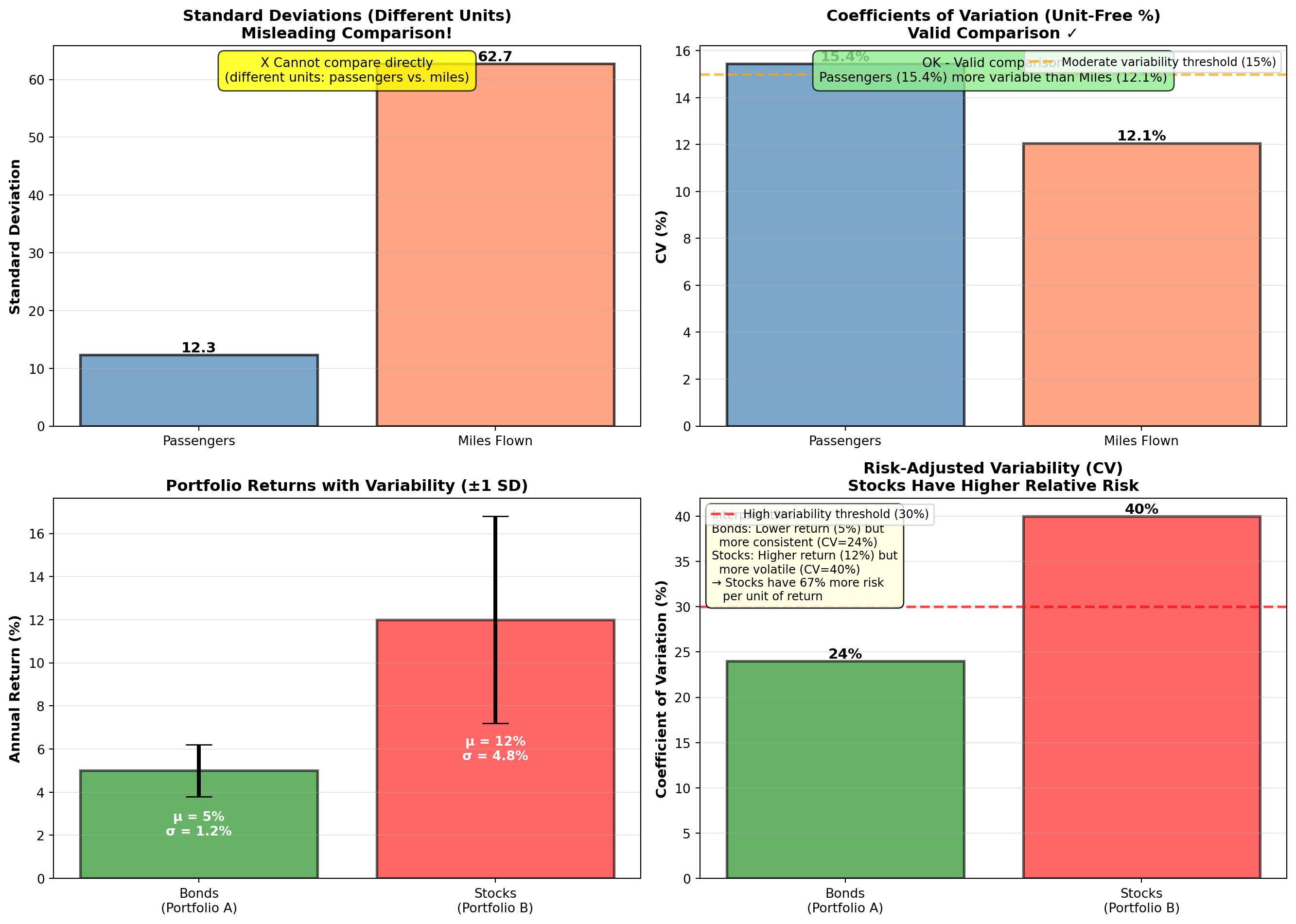
TipWhen to Use Coefficient of Variation
Use CV when: - Comparing variability of different variables (different units or scales)
- Comparing risk-adjusted returns in finance
- Determining which process/product has more consistent quality relative to its target
- Variables have different means (CV adjusts for this)
Don’t use CV when: - Mean is zero or near zero (CV becomes undefined or misleading)
- Variables have negative values (CV requires positive mean)
- Absolute variability is more important than relative (use SD instead)
4.8 Chapter 3 Summary
4.8.1 Key Concepts
Measures of Central Tendency:
- Mean (\bar{X} or \mu): Arithmetic average, uses all values, sensitive to outliers
- Median: Middle value when sorted, resistant to outliers, best for skewed data
- Mode: Most frequent value, useful for categorical data
- Weighted Mean: Accounts for different importance/weights
- Geometric Mean: Average growth rate for multiplicative data
Measures of Dispersion:
- Range: Max - Min (simple but sensitive to outliers)
- Variance (s^2 or \sigma^2): Average squared deviation
- Standard Deviation (s or \sigma): Square root of variance (same units as data)
- Interquartile Range (IQR): Q3 - Q1 (middle 50%, robust to outliers)
- Coefficient of Variation (CV): Relative variability as percentage
Distribution Shape:
- Chebyshev’s Theorem: At least 1 - 1/K^2 within K SD (any distribution)
- Empirical Rule: 68%-95%-99.7% within 1-2-3 SD (normal distributions only)
- Skewness: Asymmetry measure (Pearson’s coefficient)
- Right-skewed: Mean > Median (most common for income, prices)
- Left-skewed: Mean < Median
- Symmetric: Mean ≈ Median
- Right-skewed: Mean > Median (most common for income, prices)
4.8.2 Essential Formulas Reference
| Measure | Population | Sample |
|---|---|---|
| Mean | \mu = \frac{\sum X_i}{N} | \bar{X} = \frac{\sum X_i}{n} |
| Variance | \sigma^2 = \frac{\sum (X_i - \mu)^2}{N} | s^2 = \frac{\sum (X_i - \bar{X})^2}{n-1} |
| Std Dev | \sigma = \sqrt{\sigma^2} | s = \sqrt{s^2} |
| Weighted Mean | — | \bar{X}_W = \frac{\sum X_i W_i}{\sum W_i} |
| Geometric Mean | — | GM = \sqrt[n]{X_1 \times \cdots \times X_n} |
| CV | — | CV = \frac{s}{\bar{X}} \times 100\% |
| Skewness | — | P = \frac{3(\bar{X} - \text{Median})}{s} |
| Percentile Position | — | L_P = (n+1) \times \frac{P}{100} |
4.8.3 Decision Framework: Which Measure to Use?
Central Tendency:
- Normal/Symmetric data: Use Mean (most efficient, uses all information)
- Skewed data or outliers: Use Median (robust, more representative)
- Categorical data: Use Mode (only option for non-numeric data)
- Growth rates/returns: Use Geometric Mean (compounds correctly)
- Different importance: Use Weighted Mean (accounts for weights)
Dispersion:
- Normal data, absolute variability: Use Standard Deviation
- Compare across different scales: Use Coefficient of Variation
- Outlier-resistant measure: Use IQR
- Quick rough estimate: Use Range (least informative)
Distribution Assessment:
- Unknown distribution: Use Chebyshev’s Theorem (always valid)
- Normal distribution: Use Empirical Rule (precise)
- Assess symmetry: Calculate Skewness
4.8.4 Business Applications Recap
NoteReal-World Applications
Finance: - Portfolio risk (standard deviation = volatility)
- Sharpe ratio (return / SD)
- Value-at-Risk (percentiles)
- CAGR (geometric mean)
Manufacturing: - Process capability (mean, SD, specifications)
- Six Sigma (defects per million using SD)
- Quality control charts (mean ± 3 SD limits)
Human Resources: - Salary benchmarking (percentiles, quartiles)
- Performance ratings (mean, mode)
- Compensation equity (CV across departments)
Marketing: - Customer lifetime value variability (SD, CV)
- Market segmentation (percentiles)
- Campaign performance consistency (CV)
Operations: - Demand forecasting (mean, SD)
- Service level targets (percentiles)
- Capacity planning (mean ± 2 SD)
4.9 Glossary
Central Tendency: A single value that represents the “center” or “typical” value of a dataset.
Chebyshev’s Theorem: For any distribution, at least 1 - 1/K^2 of observations lie within K standard deviations of the mean.
Coefficient of Variation (CV): Relative measure of dispersion expressed as percentage of mean: CV = (s/\bar{X}) \times 100\%.
Deciles: Nine values that divide an ordered dataset into 10 equal parts.
Degrees of Freedom: The number of independent pieces of information available to estimate a parameter (n-1 for sample variance).
Dispersion: The spread or variability of observations around the central tendency.
Empirical Rule: For normal distributions, approximately 68%-95%-99.7% of observations fall within 1-2-3 standard deviations of the mean.
Geometric Mean: The nth root of the product of n values; appropriate for growth rates and multiplicative data.
Interquartile Range (IQR): The range of the middle 50% of data: IQR = Q3 - Q1.
Mean: The arithmetic average: sum of values divided by count.
Median: The middle value when data are sorted (50th percentile).
Mode: The most frequently occurring value(s) in a dataset.
Percentile: The Pth percentile is the value below which P percent of observations fall.
Quartiles: Three values (Q1, Q2, Q3) that divide an ordered dataset into four equal parts.
Range: The difference between maximum and minimum values.
Skewness: A measure of asymmetry in a distribution.
Standard Deviation: The square root of variance; measures average distance of observations from the mean.
Variance: The average of squared deviations from the mean.
Weighted Mean: An average that accounts for different importance or weights of values.
END OF CHAPTER 3
You have now cover: ✅ All measures of central tendency (mean, median, mode, weighted mean, geometric mean)
✅ All measures of dispersion (range, variance, SD, IQR, CV)
✅ Grouped data formulas
✅ Percentiles and quartiles
✅ Chebyshev’s Theorem
✅ Empirical Rule
✅ Skewness
✅ Coefficient of Variation
✅ Comprehensive business examples throughout
✅ 9+ Python visualizations
✅ Formulas reference table
✅ Decision framework
✅ Glossary