graph TD
    A[Time Series Analysis] --> B[Time series data]
    A --> C[Smoothing techniques]
    A --> D[Index numbers]

    B --> B1[Four components of<br/>a time series]
    B --> B2[Trend analysis]
    B --> B3[Time series<br/>decomposition]

    C --> C1[Moving averages]
    C --> C2[Exponential<br/>smoothing]

    D --> D1[Simple indices]
    D --> D2[Aggregate indices]

    D2 --> D2a[Weighted aggregate<br/>price indices]
    D2a --> D2a1[Laspeyres index]
    D2a --> D2a2[Paasche index]
14 Time Series and Index Numbers
14.1 Chapter Overview
This chapter examines the use of time series data and its application in common business situations.
It also demonstrates how index numbers are used to make time series data more comparable over time.
14.2 Business Scenario: Dickson Industries
Code
import pandas as pd
import matplotlib.pyplot as plt
import numpy as np

# Dickson Industries quarterly revenue data (illustrative)
quarters = pd.date_range(start='2020-Q1', periods=16, freq='QE')
revenue = [2.1, 2.8, 3.2, 2.5, 2.3, 3.1, 3.6, 2.9,
           2.6, 3.4, 4.0, 3.3, 2.9, 3.7, 4.3, 3.6]

df = pd.DataFrame({
    'Quarter': quarters,
    'Revenue ($ millions)': revenue
})

# Create visualization
fig, ax = plt.subplots(figsize=(10, 6))
ax.plot(df['Quarter'], df['Revenue ($ millions)'],
        marker='o', linewidth=2, markersize=8, color='#2E86AB')
ax.set_xlabel('Quarter', fontsize=12, fontweight='bold')
ax.set_ylabel('Revenue ($ millions)', fontsize=12, fontweight='bold')
ax.set_title('Dickson Industries: Quarterly Sales Revenue\nShowing Trend and Seasonal Patterns',
             fontsize=14, fontweight='bold', pad=20)
ax.grid(True, alpha=0.3, linestyle='--')
ax.tick_params(axis='x', rotation=45)

plt.tight_layout()
plt.show()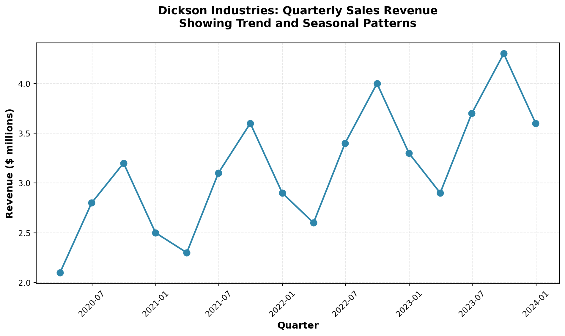
ImportantKey Business Challenge
How can Mr. Dickson:
- Identify long-term trends in his sales revenue?
- Detect seasonal patterns that recur at specific times of the year?
- Account for cyclical fluctuations over multi-year periods?
- Adjust for economic climate changes using appropriate indices?
The tools and techniques presented in this chapter will provide the analytical framework needed to address these critical forecasting questions.
14.3 13.1 Introduction
The importance of being able to forecast the future with some degree of accuracy is invaluable.
Imagine the results if you could look through a crystal ball and predict the future on the first Saturday in May when the Kentucky Derby takes place, or before the kickoff of the next football championship.
The success rate in predicting winners would undoubtedly skyrocket.
Such is the case in the business world.
The ability to project future events and trends greatly increases the probability of success.
Therefore, it is not surprising that businesses spend a considerable amount of time and effort pursuing accurate forecasts of business trends and future developments.
TipThe Value of Forecasting
Quantitative forecasting tools allow businesses to:
- Anticipate market demand and adjust production accordingly
- Optimize inventory levels to minimize costs
- Plan resource allocation for personnel, equipment, and capital
- Identify growth opportunities before competitors
- Mitigate risks by detecting downward trends early
Many quantitative tools have been developed to assist in forecasting efforts.
This chapter examines several of these approaches, with particular emphasis on time series analysis.
It also explores the use of index numbers to make comparisons more meaningful over time.
14.3.1 Why Forecasting Matters
Consider the following business scenarios where forecasting plays a critical role:
Retail Industry: A department store must predict holiday season sales to determine:
- How much inventory to stock
- How many temporary employees to hire
- What promotional budget to allocate
Manufacturing: An automobile manufacturer needs to forecast demand six months ahead to:
- Schedule production runs
- Order raw materials and components
- Plan facility capacity and workforce levels
Financial Services: A bank must project interest rates and economic conditions to:
- Set lending rates competitively
- Manage investment portfolios
- Assess credit risk
In each case, accurate forecasting based on historical data patterns provides a competitive advantage.
14.4 13.2 Time Series and Their Components
A time series consists of data collected, recorded, or observed over successive increments of time.
These increments can be annual, quarterly, monthly, weekly, daily, hourly, or even minute-by-minute in some applications.
Definition 14.1 (Time Series) A time series is a set of observations measured at successive points in time or over successive periods of time.
The data are ordered chronologically and typically displayed on a graph with time on the horizontal axis.
14.4.1 Examples of Time Series Data
| Application | Time Period | Metric |
|---|---|---|
| Stock market analysis | Daily | Closing prices, trading volume |
| Retail sales forecasting | Monthly | Total sales revenue by product category |
| Economic indicators | Quarterly | Gross Domestic Product (GDP), unemployment rate |
| Manufacturing quality control | Hourly | Units produced, defect rates |
| Website analytics | Minute-by-minute | Page views, unique visitors |
| Climate studies | Annual | Average temperatures, precipitation levels |
14.4.2 The Naive Projection Model
The simplest form of forecasting is the naive projection model, which assumes that the next period’s value will equal the current period’s value:
\hat{Y}_{t+1} = Y_t
Where:
- \hat{Y}_{t+1} = forecasted value for period t+1
- Y_t = actual value for period t
Code
import pandas as pd
import matplotlib.pyplot as plt
import numpy as np

# Generate sample data with random walk behavior
np.random.seed(42)
periods = 20
actual_values = 100 + np.cumsum(np.random.randn(periods) * 5)

# Create naive forecasts (shifted by 1 period)
naive_forecast = np.concatenate([[np.nan], actual_values[:-1]])

# Create DataFrame
df_naive = pd.DataFrame({
    'Period': range(1, periods + 1),
    'Actual': actual_values,
    'Naive Forecast': naive_forecast
})

# Visualization
fig, ax = plt.subplots(figsize=(10, 6))
ax.plot(df_naive['Period'], df_naive['Actual'],
        marker='o', label='Actual Values', linewidth=2, markersize=8, color='#A23B72')
ax.plot(df_naive['Period'], df_naive['Naive Forecast'],
        marker='s', label='Naive Forecast', linewidth=2, markersize=6,
        linestyle='--', color='#F18F01', alpha=0.7)

ax.set_xlabel('Time Period', fontsize=12, fontweight='bold')
ax.set_ylabel('Value', fontsize=12, fontweight='bold')
ax.set_title('Naive Projection Model:\nNext Period Forecast = Current Period Value',
             fontsize=14, fontweight='bold', pad=20)
ax.legend(fontsize=11, loc='best')
ax.grid(True, alpha=0.3, linestyle='--')

plt.tight_layout()
plt.show()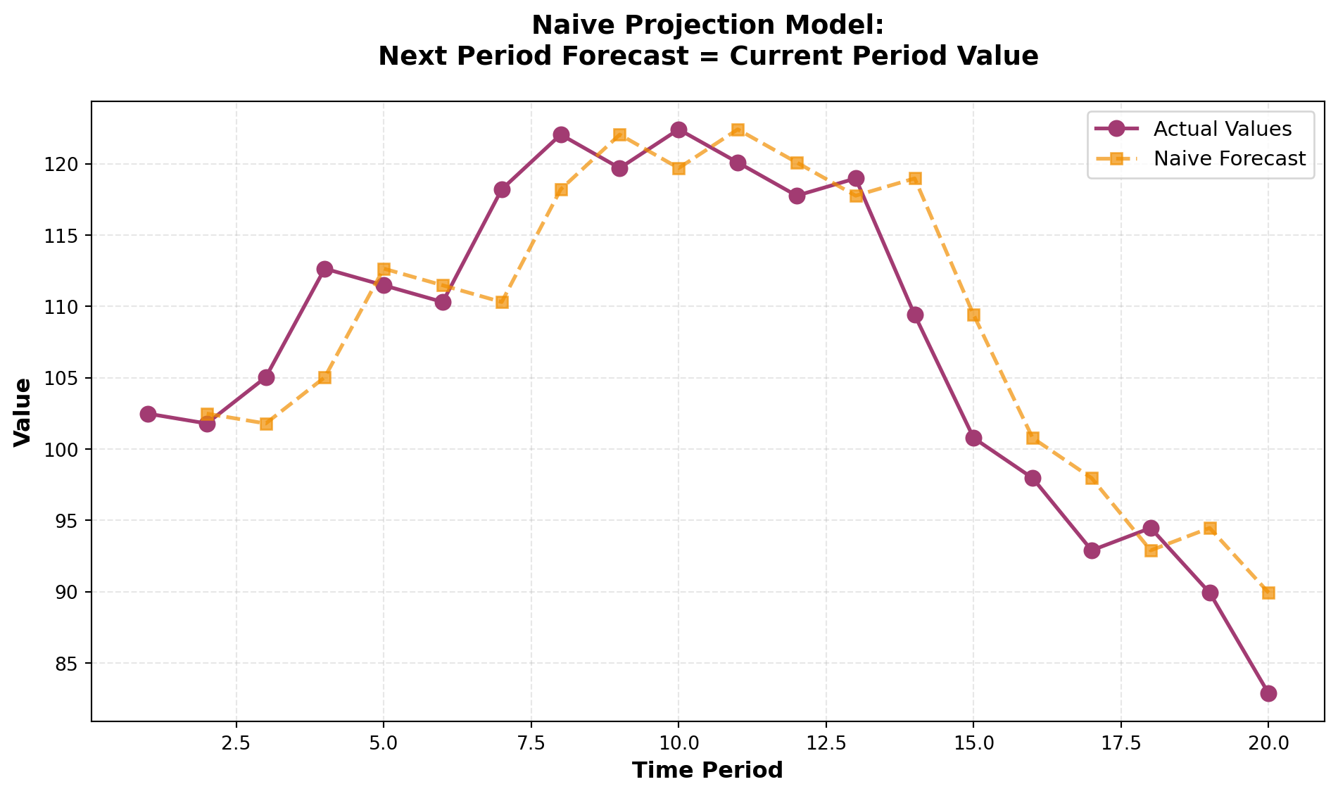
While the naive model is simple, it assumes a random walk pattern where future values are unpredictable beyond the current observation.
This approach works reasonably well for stable series but fails to capture trends, seasonality, or cyclical patterns.
14.4.3 Four Components of a Time Series
Most time series can be decomposed into four distinct components:
- Secular Trend (Trend Component)
- Seasonal Component
- Cyclical Component
- Irregular (Random) Component
Understanding these components allows businesses to:
- Separate systematic patterns from random noise
- Make more accurate forecasts
- Identify underlying drivers of change
Let’s examine each component in detail.
🎯 STAGE 1 COMPLETE
This stage introduces the chapter scenario, importance of forecasting, time series definition, and the framework for the four components.
Next in STAGE 2:
- Detailed analysis of Secular Trend
- Detailed analysis of Seasonal Component
- Detailed analysis of Cyclical Component
- Detailed analysis of Irregular Component
- Moving average techniques
## 13.2 Time Series and Their Components (Continued) {#sec-four-components}
14.4.4 The Four Components of Time Series
While the naive projection model provides a baseline, most real-world time series are far more complex. Every time series contains at least one of four fundamental components that explain the patterns and variations we observe:
- Secular Trend - Long-term directional movement
- Seasonal Variation - Regular patterns within a year
- Cyclical Variation - Multi-year business cycle fluctuations
- Irregular Variation - Random, unpredictable movements
Understanding these components allows us to decompose complex time series, identify underlying patterns, and develop more accurate forecasting models.
14.4.5 A. Secular Trend
The secular trend (or simply “trend”) represents the long-term behavior of a variable over an extended period. It reflects the general direction of the time series—whether it’s moving upward, downward, or remaining relatively stable.
NoteDefinition: Secular Trend
The continuous movement in a variable over an extended time period, showing the underlying long-term direction independent of short-term fluctuations.
Common Examples of Secular Trends:
- Upward Trends: Automobile sales in the United States over several decades
- Upward Trends: Volume of credit card transactions in recent years
- Downward Trends: Number of people living in rural areas over the past two decades
- Upward Trends: Global mobile phone adoption since the 1990s
Consider Rampart Industries’ annual production data over the past decade. Although individual data points show considerable variation above and below the trend line, the overall secular trend is unmistakably upward.
Code
import numpy as np
import matplotlib.pyplot as plt
from scipy import stats

# Rampart Industries annual production data (millions of units)
years = np.arange(1989, 1999)
production = [28, 31, 35, 33, 40, 45, 48, 52, 56, 61]

# Calculate linear trend line
slope, intercept, r_value, p_value, std_err = stats.linregress(years, production)
trend_line = intercept + slope * years

fig, ax = plt.subplots(figsize=(12, 7))

# Plot actual data
ax.plot(years, production, marker='o', linewidth=2, markersize=10,
        label='Actual Production', color='#2E86AB', zorder=3)

# Plot trend line
ax.plot(years, trend_line, linestyle='--', linewidth=2.5,
        label='Secular Trend', color='#A23B72', alpha=0.8)

# Shading to show variation around trend
ax.fill_between(years, production, trend_line, alpha=0.15, color='gray')

ax.set_xlabel('Year', fontsize=13, fontweight='bold')
ax.set_ylabel('Production (millions of units)', fontsize=13, fontweight='bold')
ax.set_title('Secular Trend Analysis: Rampart Industries Production',
             fontsize=15, fontweight='bold', pad=20)
ax.legend(fontsize=12, loc='upper left')
ax.grid(True, alpha=0.3, linestyle=':')
plt.tight_layout()
plt.show()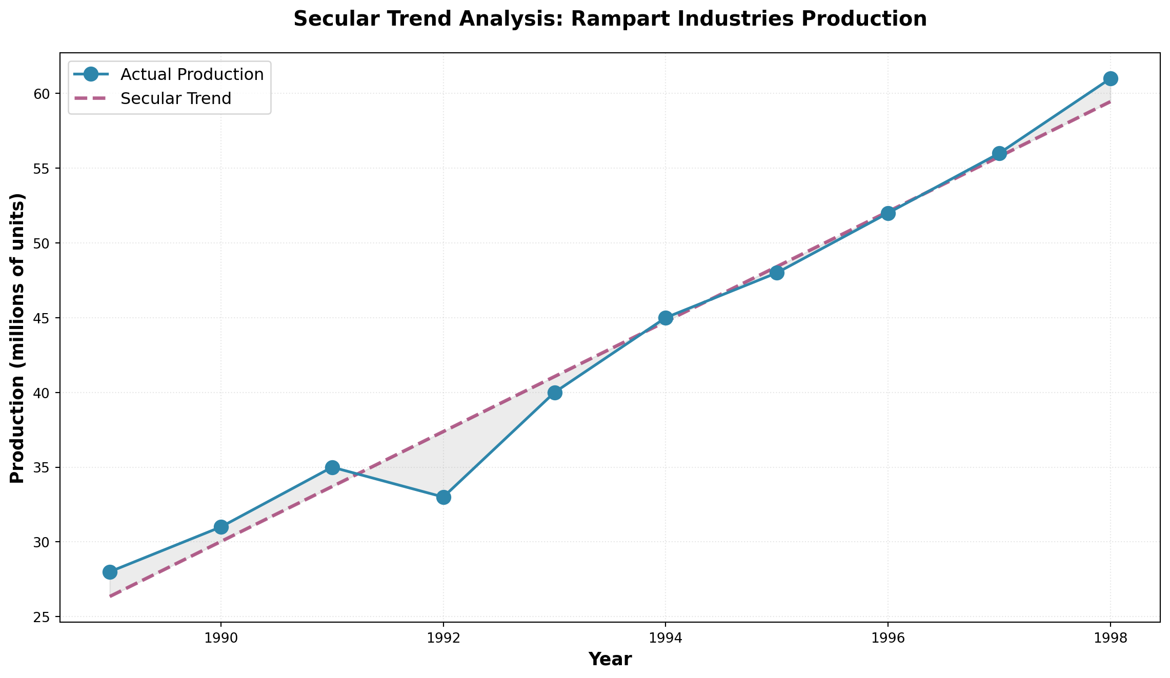
The trend line bisects the data, showing that despite year-to-year variations, production at Rampart Industries has grown consistently at approximately 3.68 million units per year.
14.4.6 B. Seasonal Component
Much of business activity is influenced by the changing seasons of the year. Seasonal variations are patterns that recur regularly at specific times during each year.
NoteDefinition: Seasonal Variations
Movements in a time series that occur repeatedly at the same time each year, driven by calendar effects, weather, holidays, or business cycles.
Classic Examples of Seasonality:
- Holiday Retail: Hallmark greeting card sales peak before Valentine’s Day and Christmas
- Recreation Equipment: Honda snowmobile sales surge in fall/winter months
- Apparel: Jantzen swimsuit sales increase dramatically before summer
- Food Service: Restaurant lunch traffic peaks around noon daily
- Tourism: Hotel occupancy rises during summer vacation months
ImportantData Collection Frequency Matters
If seasonal variation doesn’t occur annually, annual data won’t capture these patterns. To detect seasonality, data must be collected at frequencies that match the cycle:
- Quarterly data - Captures within-year seasonal patterns
- Monthly data - Reveals more detailed seasonal effects
- Daily data - Shows weekly patterns (e.g., weekend vs. weekday)
- Hourly data - Detects time-of-day patterns
Consider the unemployment rate data shown below. Each year, the rate tends to rise in May when high school students enter the summer labor market, then falls in November when retail stores hire temporary help for the holiday shopping season.
Code
import pandas as pd
import matplotlib.pyplot as plt
import numpy as np

# Create monthly unemployment data showing seasonal pattern (2020-2022)
months = pd.date_range('2020-01', periods=36, freq='M')
base_rate = 5.5
# Create seasonal pattern: higher in May, lower in November
seasonal_pattern = [
    -0.1, -0.2, -0.15, 0.0, 0.3, 0.2, 0.1, 0.15, 0.05, -0.1, -0.3, -0.2
] * 3
unemployment_rate = base_rate + np.array(seasonal_pattern) + np.random.normal(0, 0.05, 36)

fig, ax = plt.subplots(figsize=(14, 7))

ax.plot(months, unemployment_rate, marker='o', linewidth=2.5, markersize=8,
        color='#E63946', alpha=0.8)

# Highlight May and November patterns
may_mask = [m.month == 5 for m in months]
nov_mask = [m.month == 11 for m in months]

ax.scatter(months[may_mask], unemployment_rate[may_mask],
          s=200, color='orange', zorder=5, label='May (Student Influx)',
          edgecolors='black', linewidths=2)
ax.scatter(months[nov_mask], unemployment_rate[nov_mask],
          s=200, color='green', zorder=5, label='November (Holiday Hiring)',
          edgecolors='black', linewidths=2)

ax.axhline(y=base_rate, linestyle='--', color='gray', linewidth=1.5,
          alpha=0.6, label='Average Rate')

ax.set_xlabel('Month/Year', fontsize=13, fontweight='bold')
ax.set_ylabel('Unemployment Rate (%)', fontsize=13, fontweight='bold')
ax.set_title('Seasonal Unemployment Patterns: Student Labor & Holiday Hiring',
             fontsize=15, fontweight='bold', pad=20)
ax.legend(fontsize=11, loc='upper right')
ax.grid(True, alpha=0.3, linestyle=':')
plt.xticks(rotation=45)
plt.tight_layout()
plt.show()
C:\Users\patod\AppData\Local\Temp\ipykernel_22840\547285136.py:6: FutureWarning: 'M' is deprecated and will be removed in a future version, please use 'ME' instead.
months = pd.date_range('2020-01', periods=36, freq='M')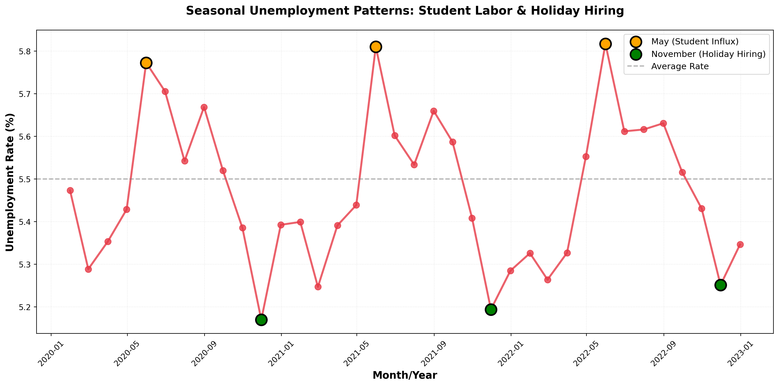
Note that while seasonal patterns are evident, there’s no clear long-term trend—the unemployment rate oscillates around its mean rather than moving consistently upward or downward.
14.4.7 C. Cyclical Variations
Many economic variables exhibit wave-like fluctuations above and below the long-term trend over extended periods. These cyclical variations (or business cycles) span much longer timeframes than seasonal patterns, typically lasting three or more years.
NoteDefinition: Cyclical Variations
Wave-like variations in the general level of business activity over relatively long periods, driven by macroeconomic conditions and business confidence.
The Four Phases of a Business Cycle:
- Expansion (Recovery): Business activity accelerates, unemployment falls, production increases
- Peak: Economic activity reaches its highest point in the cycle
- Contraction (Recession): Unemployment rises, business activity slows
- Trough (Depression): Economic activity reaches its lowest point
A complete cycle runs from one phase through all others and back to the starting phase. As illustrated below, cyclical patterns oscillate around the long-term trend in a wave-like fashion.
Code
import numpy as np
import matplotlib.pyplot as plt

# Create cyclical pattern with trend
years = np.arange(1985, 2024, 0.25)  # Quarterly data
n = len(years)

# Components
trend = 150 + 3.5 * (years - 1985)  # Upward trend
cycle = 40 * np.sin(2 * np.pi * (years - 1985) / 7)  # 7-year business cycle
noise = np.random.normal(0, 8, n)  # Random variation

auto_imports = trend + cycle + noise

fig, ax = plt.subplots(figsize=(14, 8))

# Plot actual data
ax.plot(years, auto_imports, linewidth=2, color='#1D3557', alpha=0.7,
        label='Auto Imports')

# Plot trend line
ax.plot(years, trend, linestyle='--', linewidth=2.5, color='#E63946',
        label='Long-term Trend')

# Shade regions
expansion_mask = cycle > 0
ax.fill_between(years, trend, auto_imports, where=expansion_mask,
                alpha=0.2, color='green', label='Expansion Phase')
ax.fill_between(years, trend, auto_imports, where=~expansion_mask,
                alpha=0.2, color='red', label='Contraction Phase')

# Annotate phases
ax.annotate('Peak', xy=(1992, 300), xytext=(1993, 340),
            arrowprops=dict(arrowstyle='->', lw=2), fontsize=12, fontweight='bold')
ax.annotate('Trough', xy=(1999, 240), xytext=(2000, 200),
            arrowprops=dict(arrowstyle='->', lw=2), fontsize=12, fontweight='bold')

ax.set_xlabel('Year', fontsize=13, fontweight='bold')
ax.set_ylabel('Auto Imports (thousands of units)', fontsize=13, fontweight='bold')
ax.set_title('Cyclical Pattern in Automobile Imports: Multi-Year Business Cycles',
             fontsize=15, fontweight='bold', pad=20)
ax.legend(fontsize=11, loc='upper left')
ax.grid(True, alpha=0.3, linestyle=':')
plt.tight_layout()
plt.show()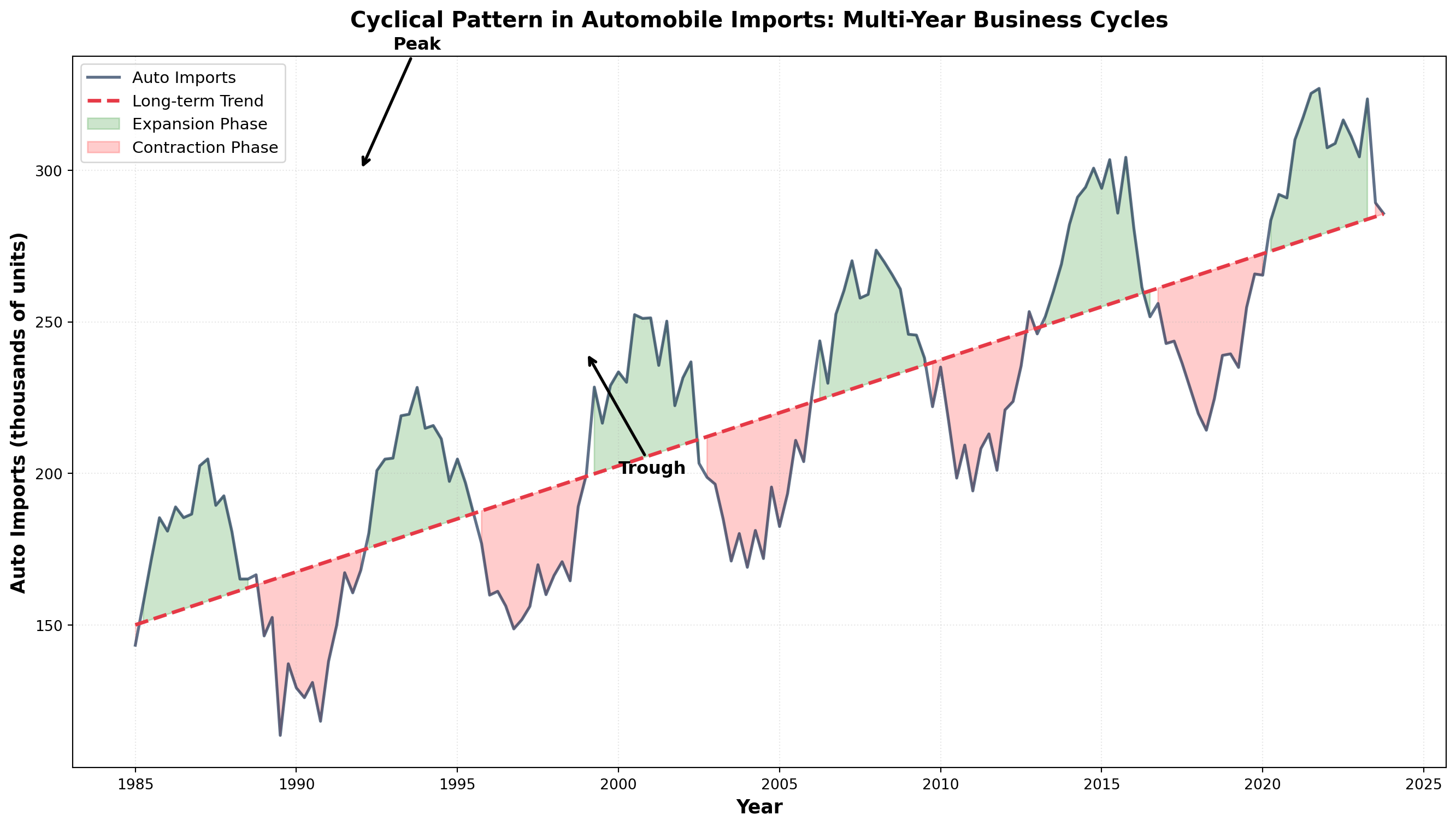
TipDistinguishing Cyclical from Seasonal
- Seasonal: Regular, predictable, occurs within one year (e.g., holiday shopping)
- Cyclical: Irregular duration (3-10+ years), driven by economic conditions (e.g., recessions)
14.4.8 D. Irregular (Random) Variations
Every time series contains irregular or random variations produced by unusual, unpredictable events. These movements have no discernible pattern and are essentially unique—like snowflakes, no two are exactly alike.
NoteDefinition: Irregular Variations
Unpredictable fluctuations caused by unusual events that produce movements without a discernible pattern. These are non-recurring and cannot be systematically forecasted.
Common Sources of Irregular Variations:
- Natural Disasters: Earthquakes, floods, hurricanes, droughts
- Political Events: Elections, policy changes, international conflicts, wars
- Economic Shocks: Oil embargoes, financial crises, supply chain disruptions
- Social Events: Strikes, pandemics, major technological breakthroughs
- Company-Specific: Product recalls, management scandals, mergers
These irregular components cannot be predicted using historical patterns. The best forecasters can do is recognize when an irregular shock occurs and adjust models accordingly.
Code
import numpy as np
import matplotlib.pyplot as plt
import pandas as pd

# Create stock price with irregular shocks
days = np.arange(0, 500)
base_price = 100 + 0.05 * days  # Slight upward trend
random_walk = np.cumsum(np.random.normal(0, 1.5, len(days)))

stock_price = base_price + random_walk

# Add irregular shocks
stock_price[100] -= 15  # Negative shock (e.g., scandal)
stock_price[250] += 20  # Positive shock (e.g., major contract won)
stock_price[380] -= 25  # Negative shock (e.g., regulatory issue)

fig, ax = plt.subplots(figsize=(14, 7))

ax.plot(days, stock_price, linewidth=2, color='#2A9D8F', alpha=0.8)

# Annotate irregular events
ax.annotate('Scandal\nAnnounced', xy=(100, stock_price[100]),
            xytext=(120, stock_price[100]-20),
            arrowprops=dict(arrowstyle='->', color='red', lw=2),
            fontsize=11, fontweight='bold', color='red',
            bbox=dict(boxstyle='round,pad=0.5', facecolor='yellow', alpha=0.7))

ax.annotate('Major Contract\nWon', xy=(250, stock_price[250]),
            xytext=(270, stock_price[250]+15),
            arrowprops=dict(arrowstyle='->', color='green', lw=2),
            fontsize=11, fontweight='bold', color='green',
            bbox=dict(boxstyle='round,pad=0.5', facecolor='lightgreen', alpha=0.7))

ax.annotate('Regulatory\nIssue', xy=(380, stock_price[380]),
            xytext=(400, stock_price[380]-20),
            arrowprops=dict(arrowstyle='->', color='red', lw=2),
            fontsize=11, fontweight='bold', color='red',
            bbox=dict(boxstyle='round,pad=0.5', facecolor='yellow', alpha=0.7))

ax.set_xlabel('Trading Day', fontsize=13, fontweight='bold')
ax.set_ylabel('Stock Price ($)', fontsize=13, fontweight='bold')
ax.set_title('Irregular Variations: Unpredictable Shocks to Stock Prices',
             fontsize=15, fontweight='bold', pad=20)
ax.grid(True, alpha=0.3, linestyle=':')
plt.tight_layout()
plt.show()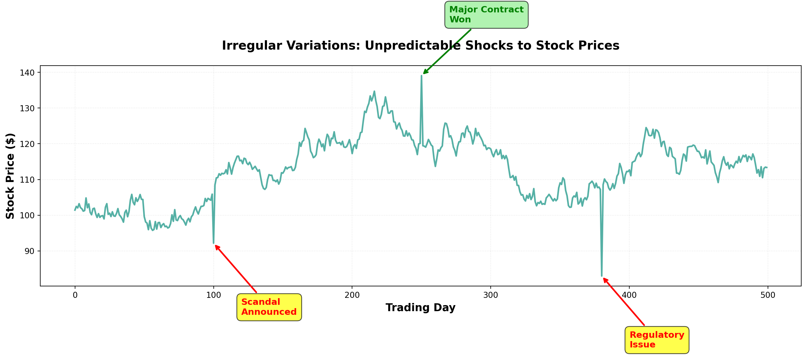
14.5 13.3 Time Series Models
A time series model mathematically expresses the relationship between the four components. Two primary models dominate time series analysis:
14.5.1 The Additive Model
In the additive model, the time series value equals the sum of all components:
Y_t = T_t + S_t + C_t + I_t
Where:
- Y_t = observed value in period t
- T_t = trend component in period t
- S_t = seasonal component in period t
- C_t = cyclical component in period t
- I_t = irregular component in period t
All components are expressed in the original units of measurement. The seasonal, cyclical, and irregular components represent deviations around the trend.
Example: Retail Sales (Additive Model)
For a local retail store, suppose we decompose monthly sales:
- T = \$500 (long-term average trend)
- S = \$100 (positive seasonal effect—holiday season)
- C = -\$25 (negative cyclical effect—economy in contraction)
- I = -\$10 (negative irregular effect—unexpected weather event)
Then actual sales would be:
\begin{aligned} Y &= \$500 + \$100 - \$25 - \$10 \\ &= \$565 \end{aligned}
ImportantLimitation of the Additive Model
The additive model assumes component independence—each component moves independently of the others. This is often unrealistic because:
- Economic forces frequently affect multiple components simultaneously
- Seasonal patterns may intensify during economic expansions
- Cyclical downturns can amplify irregular shocks
14.5.2 The Multiplicative Model (Preferred)
The multiplicative model assumes components interact with each other:
Y_t = T_t \times S_t \times C_t \times I_t
In this model:
- Only T_t uses original units (e.g., dollars, units)
- S_t, C_t, and I_t are expressed as percentages (decimal form)
Example: Bank Delinquent Loans (Multiplicative Model)
A commercial bank analyzes delinquent loans:
- T = \$10,000,000 (trend level)
- S = 1.70 (70% above trend due to seasonal tax payment period)
- C = 0.91 (9% below trend due to economic cycle)
- I = 0.87 (13% below trend due to random variation)
Delinquent loans would be:
\begin{aligned} Y &= (10,000,000) \times (1.70) \times (0.91) \times (0.87) \\ &= \$13,460,000 \end{aligned}
TipAnnual Data Simplification
When using annual data, seasonal fluctuations don’t appear (they occur within the year). The multiplicative model simplifies to:
Y_t = T_t \times C_t \times I_t
This is common in macroeconomic forecasting with yearly observations.
Code
import numpy as np
import matplotlib.pyplot as plt

# Time periods
t = np.arange(1, 49)

# Components for additive model
T_add = 100 + 2*t
S_add = 10 * np.sin(2 * np.pi * t / 12)
C_add = 15 * np.sin(2 * np.pi * t / 36)
I_add = np.random.normal(0, 3, len(t))
Y_add = T_add + S_add + C_add + I_add

# Components for multiplicative model
T_mult = 100 + 2*t
S_mult = 1 + 0.1 * np.sin(2 * np.pi * t / 12)
C_mult = 1 + 0.15 * np.sin(2 * np.pi * t / 36)
I_mult = 1 + np.random.normal(0, 0.03, len(t))
Y_mult = T_mult * S_mult * C_mult * I_mult

fig, (ax1, ax2) = plt.subplots(2, 1, figsize=(14, 10))

# Additive model
ax1.plot(t, Y_add, linewidth=2, color='#264653', label='Observed Series')
ax1.plot(t, T_add, linestyle='--', linewidth=2, color='#E76F51', label='Trend')
ax1.set_xlabel('Time Period', fontsize=12, fontweight='bold')
ax1.set_ylabel('Value (Original Units)', fontsize=12, fontweight='bold')
ax1.set_title('Additive Model: Y = T + S + C + I', fontsize=14, fontweight='bold')
ax1.legend(fontsize=11)
ax1.grid(True, alpha=0.3, linestyle=':')

# Multiplicative model
ax2.plot(t, Y_mult, linewidth=2, color='#264653', label='Observed Series')
ax2.plot(t, T_mult, linestyle='--', linewidth=2, color='#E76F51', label='Trend')
ax2.set_xlabel('Time Period', fontsize=12, fontweight='bold')
ax2.set_ylabel('Value (Original Units)', fontsize=12, fontweight='bold')
ax2.set_title('Multiplicative Model: Y = T × S × C × I', fontsize=14, fontweight='bold')
ax2.legend(fontsize=11)
ax2.grid(True, alpha=0.3, linestyle=':')

plt.tight_layout()
plt.show()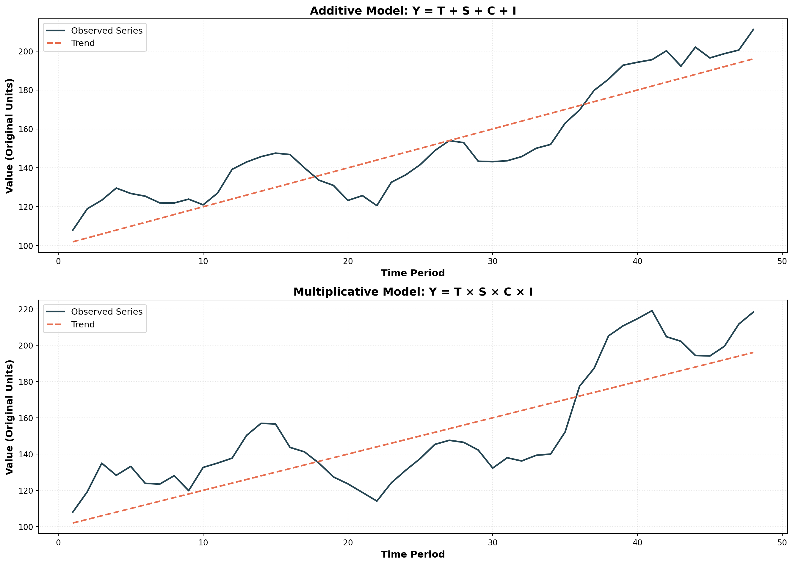
Note how in the multiplicative model, the amplitude of fluctuations grows with the trend—seasonal and cyclical variations become larger as the underlying trend increases. This reflects real-world behavior more accurately than the additive model’s constant amplitude.
Key Insight: When variance increases with the level of the series, the multiplicative model is typically more appropriate.
## 13.4 Smoothing Techniques {#sec-smoothing-techniques}
The general behavior of a time series can often be analyzed more clearly by examining its long-term trend. However, when a series contains excessive short-term variations or seasonal fluctuations, the underlying trend can become obscured and difficult to observe.
Smoothing techniques eliminate these confusing random fluctuations by averaging data across multiple periods. This provides a clearer, less distorted picture of the series’ true behavior. We’ll examine two widely-used smoothing methods: moving averages and exponential smoothing.
14.5.3 A. Moving Averages
A moving average (MA) smooths data by averaging values over a fixed number of periods. The same number of periods is maintained for each average—we drop the oldest observation and add the most recent one, creating a “moving” window.
NoteDefinition: Moving Average
A series of arithmetic means calculated over a given number of periods; represents the estimated long-term average of the variable.
Simple Example: Stock Prices
Suppose closing prices for a NYSE stock from Monday to Wednesday were $20, $22, and $18. A three-period moving average is:
\text{MA}_3 = \frac{20 + 22 + 18}{3} = \$20
This value serves as a forecast for any future period. If Thursday’s closing price is $19, we update the moving average by dropping Monday’s $20 and adding Thursday’s $19:
\text{MA}_3 = \frac{22 + 18 + 19}{3} = \$19.67
14.5.4 Moving Average Calculations: Arthur Momitor’s Snowmobiles
The table below presents monthly sales data for Arthur Momitor’s Snowmobiles, Inc., along with both 3-month and 5-month moving averages.
| Month | Sales ($1000s) | 3-Month MA | 5-Month MA |
|---|---|---|---|
| January | 52 | — | — |
| February | 81 | 60.00 | — |
| March | 47 | 64.33 | 59.00 |
| April | 65 | 54.00 | 63.20 |
| May | 50 | 62.67 | 56.00 |
| June | 73 | 56.00 | 58.60 |
| July | 45 | 59.33 | 55.60 |
| August | 60 | 51.67 | 61.40 |
| September | 50 | 63.00 | 55.80 |
| October | 79 | 58.00 | 59.20 |
| November | 45 | 62.00 | — |
| December | 62 | — | — |
Calculation Details:
3-Month Moving Average:
- First entry: (52 + 81 + 47) / 3 = 60.00, centered on February
- Second entry: (81 + 47 + 65) / 3 = 64.33, centered on March
- And so on…
5-Month Moving Average:
- First entry: (52 + 81 + 47 + 65 + 50) / 5 = 59.00, centered on March
- Second entry: (81 + 47 + 65 + 50 + 73) / 5 = 63.20, centered on April
- And so on…
Code
import pandas as pd
import numpy as np
import matplotlib.pyplot as plt

# Arthur Momitor's Snowmobile sales data
months = ['Jan', 'Feb', 'Mar', 'Apr', 'May', 'Jun',
          'Jul', 'Aug', 'Sep', 'Oct', 'Nov', 'Dec']
sales = [52, 81, 47, 65, 50, 73, 45, 60, 50, 79, 45, 62]

# Calculate moving averages
df = pd.DataFrame({'Month': months, 'Sales': sales})
df['MA_3'] = df['Sales'].rolling(window=3, center=True).mean()
df['MA_5'] = df['Sales'].rolling(window=5, center=True).mean()

fig, ax = plt.subplots(figsize=(14, 8))

# Plot actual sales
ax.plot(months, sales, marker='o', linewidth=2.5, markersize=10,
        label='Actual Sales', color='#003049', zorder=3)

# Plot moving averages
ax.plot(months, df['MA_3'], marker='s', linewidth=2.5, markersize=8,
        linestyle='--', label='3-Month MA', color='#D62828', alpha=0.8)
ax.plot(months, df['MA_5'], marker='^', linewidth=2.5, markersize=8,
        linestyle='--', label='5-Month MA', color='#F77F00', alpha=0.8)

ax.set_xlabel('Month', fontsize=13, fontweight='bold')
ax.set_ylabel('Sales ($1,000s)', fontsize=13, fontweight='bold')
ax.set_title('Smoothing Effect: Longer Moving Averages Reduce Variability',
             fontsize=15, fontweight='bold', pad=20)
ax.legend(fontsize=12, loc='upper left')
ax.grid(True, alpha=0.3, linestyle=':')
plt.xticks(rotation=45)
plt.tight_layout()
plt.show()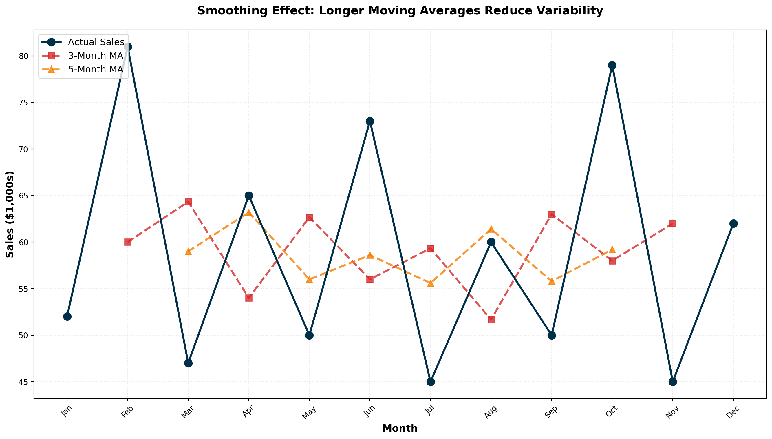
ImportantKey Observation: Smoothing Intensity
The range of variation decreases as the number of periods in the moving average increases:
- Actual Sales: Highly variable (range: 45-81)
- 3-Month MA: Moderately smooth (range: 51.67-64.33)
- 5-Month MA: Very smooth (range: 55.60-63.20)
Larger moving average windows produce smoother series but are less responsive to recent changes.
14.5.5 Centering Moving Averages
Odd-numbered periods (3, 5, 7, etc.) automatically center on the middle period. The 3-month MA for Jan-Feb-Mar naturally centers on February.
Even-numbered periods (4, 6, 8, etc.) require an additional centering step because there’s no natural middle period.
14.5.6 Example: Sun Shine Greeting Cards (4-Quarter MA)
Consider quarterly sales data for Sun Shine Greeting Cards from 1996-1998:
| Period | Sales ($1000s) | 4-Quarter MA | Centered MA |
|---|---|---|---|
| 1996-I | 40 | — | — |
| 1996-II | 45 | — | 44.13 |
| 1996-III | 38 | 42.50 | 45.00 |
| 1996-IV | 47 | 45.75 | 45.38 |
| 1997-I | 53 | 44.25 | 44.63 |
| 1997-II | 39 | 46.50 | 42.50 |
| 1997-III | 47 | 42.75 | 43.00 |
| 1997-IV | 32 | 42.25 | 42.50 |
| 1998-I | 51 | 43.75 | 44.00 |
| 1998-II | 45 | 41.25 | — |
| 1998-III | 37 | 46.75 | — |
| 1998-IV | 54 | — | — |
Centering Process:
- Calculate initial 4-quarter MA: (40 + 45 + 38 + 47) / 4 = 42.50 (falls between Q2 and Q3)
- Calculate next 4-quarter MA: (45 + 38 + 47 + 53) / 4 = 45.75 (falls between Q3 and Q4)
- Average consecutive pairs to center: (42.50 + 45.75) / 2 = 44.13 (now centered on Q3)
Code
import pandas as pd
import numpy as np
import matplotlib.pyplot as plt

# Sun Shine Greeting Cards quarterly data
quarters = ['96-I', '96-II', '96-III', '96-IV',
            '97-I', '97-II', '97-III', '97-IV',
            '98-I', '98-II', '98-III', '98-IV']
sales = [40, 45, 38, 47, 53, 39, 47, 32, 51, 45, 37, 54]

# Calculate 4-quarter moving average (uncentered)
ma_4 = []
for i in range(len(sales) - 3):
    ma_4.append(np.mean(sales[i:i+4]))

# Center the moving average
centered_ma = []
for i in range(len(ma_4) - 1):
    centered_ma.append((ma_4[i] + ma_4[i+1]) / 2)

fig, ax = plt.subplots(figsize=(14, 8))

# Plot actual sales
ax.plot(quarters, sales, marker='o', linewidth=2.5, markersize=10,
        label='Actual Quarterly Sales', color='#006D77', zorder=3)

# Plot centered MA (offset to align properly)
centered_quarters = quarters[2:2+len(centered_ma)]
ax.plot(centered_quarters, centered_ma, marker='s', linewidth=2.5,
        markersize=8, linestyle='--', label='Centered 4-Quarter MA',
        color='#E29578', alpha=0.9)

ax.set_xlabel('Quarter', fontsize=13, fontweight='bold')
ax.set_ylabel('Sales ($1,000s)', fontsize=13, fontweight='bold')
ax.set_title('Centered Moving Average: Removing Seasonal Variation',
             fontsize=15, fontweight='bold', pad=20)
ax.legend(fontsize=12, loc='upper left')
ax.grid(True, alpha=0.3, linestyle=':')
plt.xticks(rotation=45)
plt.tight_layout()
plt.show()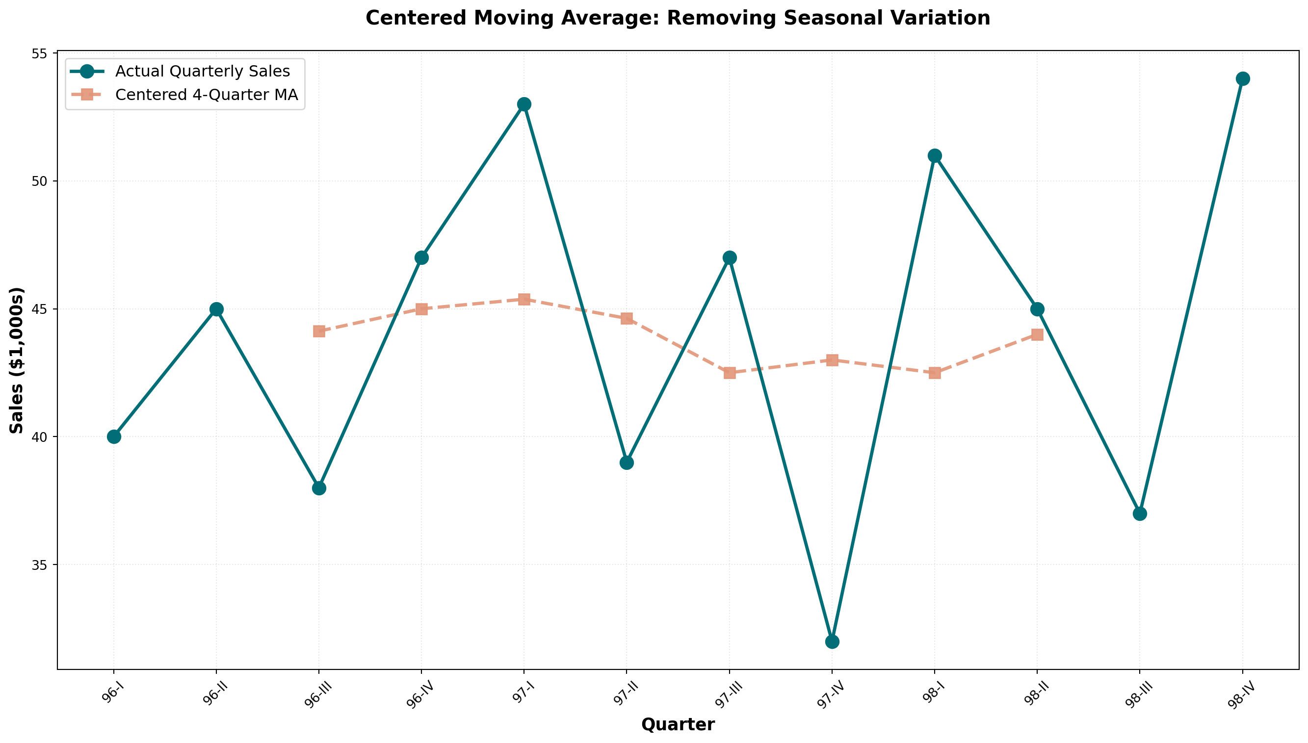
TipDeseasonalizing with Moving Averages
When a moving average spans one complete year of data:
- 12-month MA for monthly data
- 4-quarter MA for quarterly data
- 52-week MA for weekly data
The seasonal variations are averaged out and eliminated, leaving only trend and cyclical components. The data becomes deseasonalized or seasonally adjusted.
14.5.7 Choosing the Optimal Window Size
General Guidelines:
| Data Characteristic | Recommended MA Window | Reason |
|---|---|---|
| Highly volatile data | Smaller window (3-5 periods) | Stays closer to recent changes |
| Stable, low-variance data | Larger window (7-12 periods) | Smooth out minor fluctuations |
| Seasonal data | Window = seasonal period | Eliminates seasonality completely |
| Trend forecasting | Moderate window (5-7 periods) | Balances smoothness and responsiveness |
14.5.8 B. Exponential Smoothing
Exponential smoothing provides an effective forecasting method with built-in self-correction—it adjusts forecasts in the opposite direction of past errors. This technique is particularly useful when data fluctuates around a long-term average without a clear trend.
NoteDefinition: Exponential Smoothing
A forecasting tool in which the forecast is based on a weighted average of current and all previous values, with weights declining exponentially for older observations.
First-Order Exponential Smoothing Formula:
F_{t+1} = \alpha A_t + (1 - \alpha) F_t
Where:
- F_{t+1} = forecast for next period
- A_t = actual observed value in current period
- F_t = forecast made for current period
- \alpha = smoothing constant (between 0 and 1)
14.5.9 Example: Uncle Vito’s Car Sales
Uncle Vito wants to forecast sales for March. Last day of February, actual sales were $110,000. Since this is the first forecast, we use January’s actual sales ($105,000) as February’s “forecast.”
With \alpha = 0.3:
\begin{aligned} F_{\text{March}} &= \alpha A_{\text{Feb}} + (1 - \alpha) F_{\text{Feb}} \\ &= (0.3)(110) + (0.7)(105) \\ &= 33 + 73.5 \\ &= \$106.5 \text{ thousand} \end{aligned}
If actual March sales are $107,000, the forecast error is:
\text{Error} = F_t - A_t = 106.5 - 107 = -0.5 \text{ (underestimated by \$500)}
The April forecast becomes:
\begin{aligned} F_{\text{April}} &= (0.3)(107) + (0.7)(106.5) \\ &= 32.1 + 74.55 \\ &= \$106.65 \text{ thousand} \end{aligned}
| Month | Forecast | Actual | Error (F_t - A_t) |
|---|---|---|---|
| January | — | 105 | — |
| February | 105.00 | 110 | -5.00 |
| March | 106.50 | 107 | -0.50 |
| April | 106.65 | 112 | -5.35 |
| May | 108.26 | 117 | -8.74 |
14.5.10 Optimal Smoothing Constant: Minimizing MSE
The choice of \alpha is critical. We want the value that minimizes the Mean Squared Error (MSE):
\text{MSE} = \frac{\sum (F_t - A_t)^2}{n - 1}
Comparing \alpha = 0.3 vs. \alpha = 0.8:
| Month | Actual | Forecast (\alpha=0.3) | Error | Forecast (\alpha=0.8) | Error |
|---|---|---|---|---|---|
| January | 105 | — | — | — | — |
| February | 110 | 105.00 | -5.00 | 105.00 | -5.00 |
| March | 107 | 106.50 | -0.50 | 109.00 | +2.00 |
| April | 112 | 106.65 | -5.35 | 107.40 | -4.60 |
| May | 117 | 108.26 | -8.74 | 111.08 | -5.92 |
| June | 109 | 110.88 | +1.88 | 115.82 | +6.82 |
| July | 108 | 110.32 | +2.32 | 110.36 | +2.36 |
| August | — | 109.62 | — | 108.47 | — |
MSE Calculations:
For \alpha = 0.3:
\text{MSE} = \frac{(-5)^2 + (-0.5)^2 + (-5.35)^2 + (-8.74)^2 + (1.88)^2 + (2.32)^2}{6} = 23.20
For \alpha = 0.8:
\text{MSE} = \frac{(-5)^2 + (2)^2 + (-4.6)^2 + (-5.92)^2 + (6.82)^2 + (2.36)^2}{6} = 22.88
Conclusion: \alpha = 0.8 produces slightly better forecasts (lower MSE).
Code
import numpy as np
import matplotlib.pyplot as plt

# Uncle Vito actual sales data
months = ['Jan', 'Feb', 'Mar', 'Apr', 'May', 'Jun', 'Jul']
actual = [105, 110, 107, 112, 117, 109, 108]

# Exponential smoothing with alpha = 0.3
alpha_low = 0.3
forecast_low = [105]
for i in range(len(actual)):
    f_next = alpha_low * actual[i] + (1 - alpha_low) * forecast_low[-1]
    forecast_low.append(f_next)

# Exponential smoothing with alpha = 0.8
alpha_high = 0.8
forecast_high = [105]
for i in range(len(actual)):
    f_next = alpha_high * actual[i] + (1 - alpha_high) * forecast_high[-1]
    forecast_high.append(f_next)

# Extend months for forecast
months_extended = months + ['Aug']

fig, ax = plt.subplots(figsize=(14, 8))

# Plot actual sales
ax.plot(months, actual, marker='o', linewidth=3, markersize=12,
        label='Actual Sales', color='#003049', zorder=4)

# Plot forecasts
ax.plot(months_extended, forecast_low, marker='s', linewidth=2.5, markersize=9,
        linestyle='--', label=f'Forecast (α = {alpha_low})',
        color='#D62828', alpha=0.8)
ax.plot(months_extended, forecast_high, marker='^', linewidth=2.5, markersize=9,
        linestyle='--', label=f'Forecast (α = {alpha_high})',
        color='#F77F00', alpha=0.8)

ax.set_xlabel('Month', fontsize=13, fontweight='bold')
ax.set_ylabel('Sales ($1,000s)', fontsize=13, fontweight='bold')
ax.set_title('Exponential Smoothing: Effect of α on Forecast Responsiveness',
             fontsize=15, fontweight='bold', pad=20)
ax.legend(fontsize=12, loc='upper left')
ax.grid(True, alpha=0.3, linestyle=':')
plt.tight_layout()
plt.show()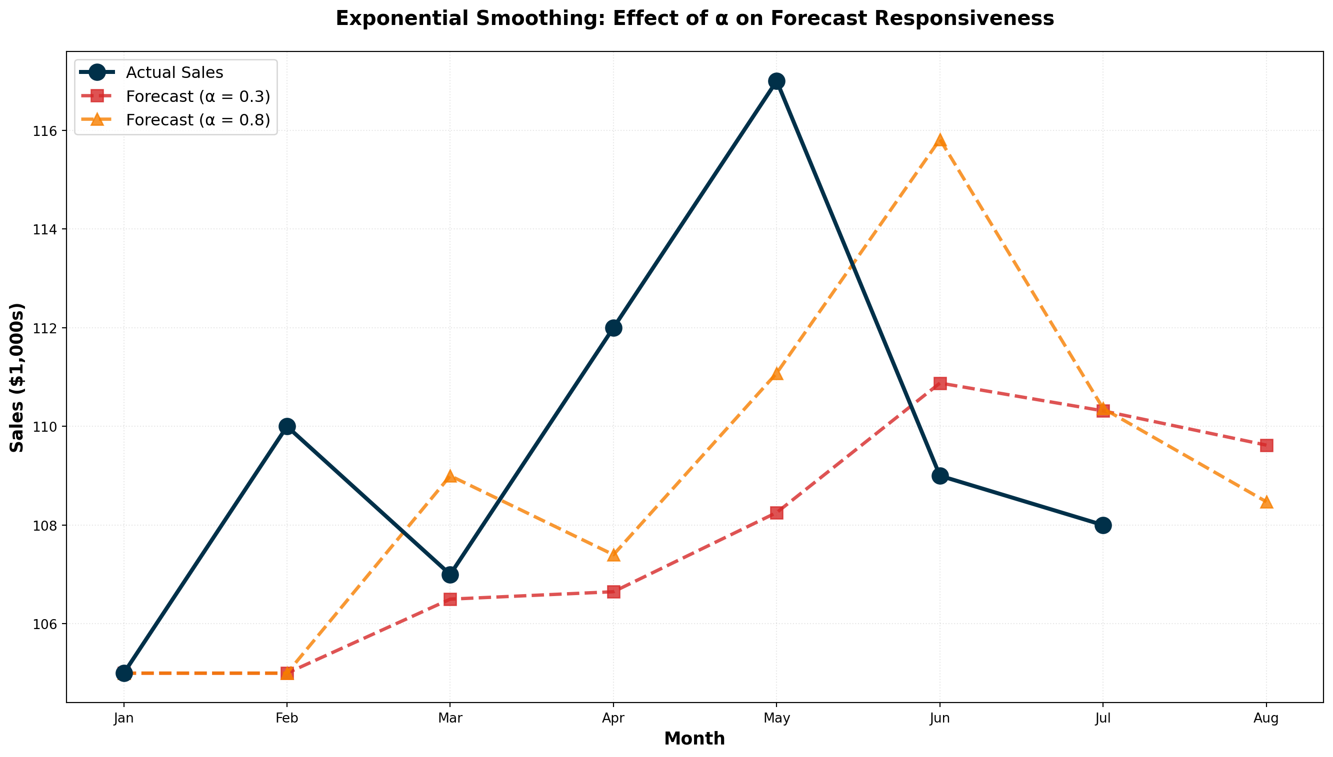
ImportantChoosing the Smoothing Constant
Lower α (0.1 - 0.3):
- More weight on past forecasts
- Smoother, less reactive to recent changes
- Best for stable, low-variance data
- Slower to detect genuine trend changes
Higher α (0.7 - 0.9):
- More weight on recent actuals
- More responsive to recent changes
- Best for volatile or rapidly changing data
- May overreact to random fluctuations
Rule of Thumb: Use trial-and-error testing to find the \alpha that minimizes MSE for your specific data.
14.5.11 Exponential Smoothing vs. Moving Averages
| Feature | Moving Average | Exponential Smoothing |
|---|---|---|
| Data used | Fixed recent periods only | All historical data (weighted) |
| Weighting | Equal weight to all periods in window | Declining weights for older data |
| Parameters | Window size (k) | Smoothing constant (\alpha) |
| Memory | Forgets data older than k periods | Never completely forgets any data |
| Computation | Requires storing k values | Only needs last forecast and actual |
| Best for | Eliminating seasonality | Quick forecasting with self-correction |
WarningWhen NOT to Use First-Order Exponential Smoothing
First-order exponential smoothing (as described here) is only appropriate when:
- Data fluctuates around a stable long-term average
- No upward or downward trend is present
If your data exhibits a clear trend, you must use:
- Second-order exponential smoothing (Holt’s method)
- Triple exponential smoothing (Holt-Winters method) for trend + seasonality
- Trend analysis with regression (covered in Section 13.5)
Code
import numpy as np
import pandas as pd
import matplotlib.pyplot as plt

# Generate sample data with fluctuations but no trend
np.random.seed(42)
periods = np.arange(1, 25)
actual = 100 + np.random.normal(0, 8, len(periods))

# Moving average (5-period)
df = pd.DataFrame({'Period': periods, 'Actual': actual})
df['MA_5'] = df['Actual'].rolling(window=5, center=False).mean()

# Exponential smoothing (alpha = 0.3)
alpha = 0.3
es_forecast = [actual[0]]  # Initialize with first actual value
for i in range(1, len(actual)):
    f_next = alpha * actual[i-1] + (1 - alpha) * es_forecast[-1]
    es_forecast.append(f_next)

fig, ax = plt.subplots(figsize=(14, 8))

ax.plot(periods, actual, marker='o', linewidth=2, markersize=8,
        label='Actual Data', color='#2B2D42', alpha=0.7)
ax.plot(periods, df['MA_5'], marker='s', linewidth=2.5, markersize=7,
        linestyle='--', label='5-Period MA', color='#8D99AE', alpha=0.9)
ax.plot(periods, es_forecast, marker='^', linewidth=2.5, markersize=7,
        linestyle='--', label='Exponential Smoothing (α=0.3)',
        color='#EF233C', alpha=0.9)

ax.axhline(y=100, linestyle=':', color='green', linewidth=2,
          alpha=0.5, label='True Long-term Average')

ax.set_xlabel('Time Period', fontsize=13, fontweight='bold')
ax.set_ylabel('Value', fontsize=13, fontweight='bold')
ax.set_title('Smoothing Techniques Comparison: No-Trend Data',
             fontsize=15, fontweight='bold', pad=20)
ax.legend(fontsize=11, loc='upper right')
ax.grid(True, alpha=0.3, linestyle=':')
plt.tight_layout()
plt.show()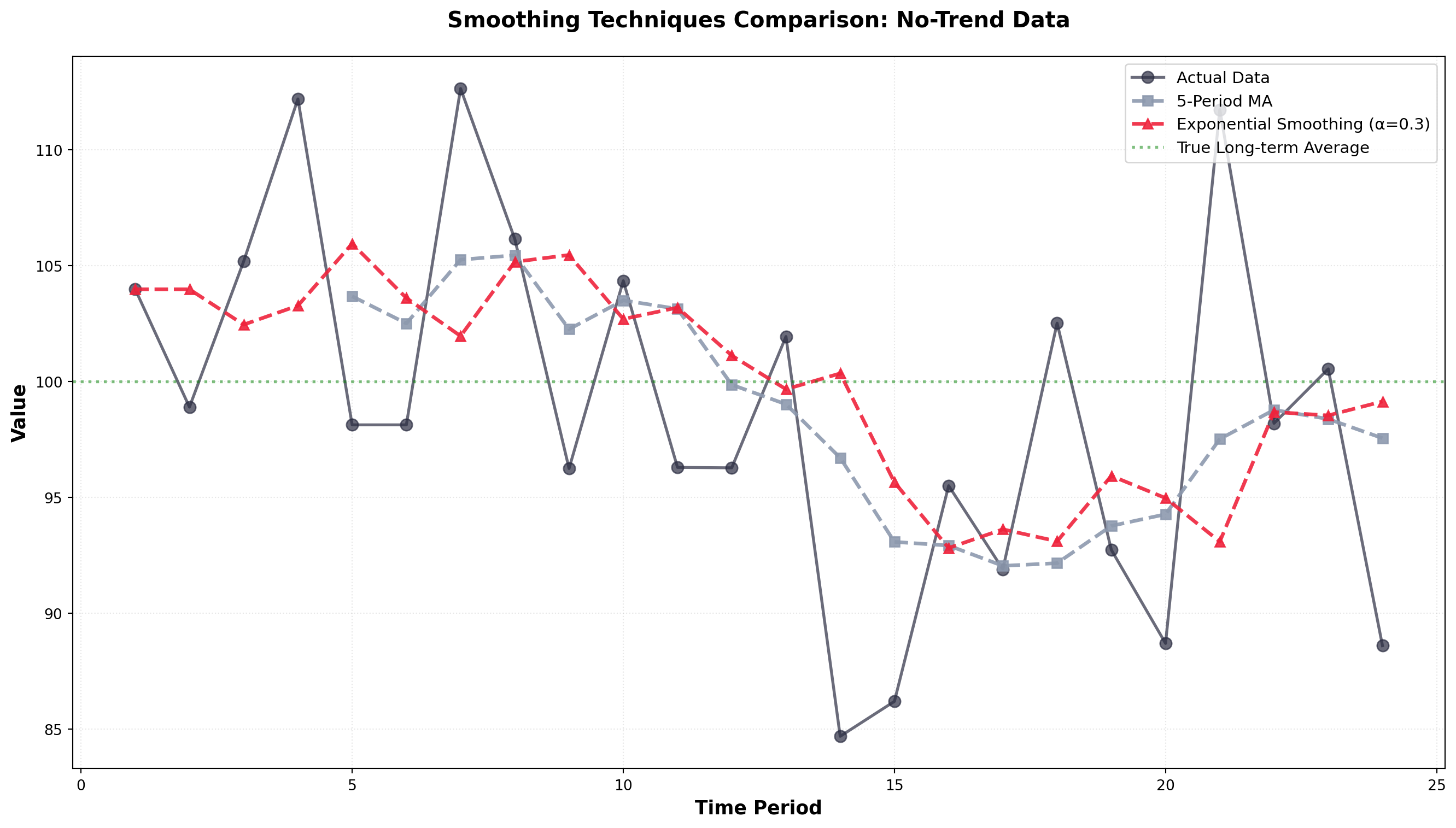
Both methods successfully smooth the random fluctuations and reveal the underlying stable average around 100. Exponential smoothing responds slightly faster to shifts while moving averages provide more aggressive smoothing.
## 13.5 Trend Analysis {#sec-trend-analysis}
When a time series exhibits a clear upward or downward long-term trend (like Rampart Industries in Figure 14.3), trend analysis becomes a powerful forecasting tool. Unlike smoothing methods, which work best for data fluctuating around a stable average, trend analysis explicitly models the directional movement over time.
We can estimate a trend line using the simple regression techniques covered in Chapter 11. The dependent variable is the time series we want to forecast, and time serves as the independent variable.
Trend Line Equation:
\hat{Y}_t = b_0 + b_1 t
Where:
- \hat{Y}_t = forecasted value for time period t
- b_0 = intercept (starting level)
- b_1 = slope (rate of change per period)
- t = time period (coded as 1, 2, 3, …)
14.5.12 Example: Happy Valley Housing Starts
Mayfield Construction wants to forecast future housing starts in Happy Valley, California. They’ve collected annual data on housing starts (in hundreds) from 1983-1998:
| Year | t | Housing Starts (Y) | XY | X^2 |
|---|---|---|---|---|
| 1983 | 1 | 7.0 | 7.0 | 1 |
| 1984 | 2 | 7.1 | 14.2 | 4 |
| 1985 | 3 | 7.9 | 23.7 | 9 |
| 1986 | 4 | 7.3 | 29.2 | 16 |
| 1987 | 5 | 8.2 | 41.0 | 25 |
| 1988 | 6 | 8.3 | 49.8 | 36 |
| 1989 | 7 | 8.1 | 56.7 | 49 |
| 1990 | 8 | 8.6 | 68.8 | 64 |
| 1991 | 9 | 8.8 | 79.2 | 81 |
| 1992 | 10 | 8.9 | 89.0 | 100 |
| 1993 | 11 | 8.7 | 95.7 | 121 |
| 1994 | 12 | 9.1 | 109.2 | 144 |
| 1995 | 13 | 9.4 | 122.2 | 169 |
| 1996 | 14 | 9.1 | 127.4 | 196 |
| 1997 | 15 | 9.5 | 142.5 | 225 |
| 1998 | 16 | 9.9 | 158.4 | 256 |
| Σ | 136 | 135.9 | 1,214.0 | 1,496 |
Time Coding: The values for t are obtained by coding periods starting with 1 for the first period, 2 for the second, and so on.
Regression Calculations:
From Chapter 11, we need the sum of squares and cross-products:
Sum of Squares of X:
\begin{aligned}
SS_x &= \sum X^2 - \frac{(\sum X)^2}{n} \\
&= 1,496 - \frac{(136)^2}{16} \\
&= 1,496 - 1,156 \\
&= 340
\end{aligned}
Sum of Cross-Products:
\begin{aligned}
SS_{xy} &= \sum XY - \frac{(\sum X)(\sum Y)}{n} \\
&= 1,214 - \frac{(136)(135.9)}{16} \\
&= 1,214 - 1,155.15 \\
&= 58.85
\end{aligned}
Slope (Rate of Increase):
b_1 = \frac{SS_{xy}}{SS_x} = \frac{58.85}{340} = 0.173
Intercept:
\begin{aligned}
b_0 &= \bar{Y} - b_1 \bar{X} \\
&= \frac{135.9}{16} - (0.173)\left(\frac{136}{16}\right) \\
&= 8.494 - (0.173)(8.5) \\
&= 8.494 - 1.471 \\
&= 7.02
\end{aligned}
Trend Line Equation:
\hat{Y}_t = 7.02 + 0.173t
Code
import numpy as np
import matplotlib.pyplot as plt
from scipy import stats

# Housing starts data
years_actual = np.arange(1983, 1999)
t_actual = np.arange(1, 17)
housing_starts = [7.0, 7.1, 7.9, 7.3, 8.2, 8.3, 8.1, 8.6,
                  8.8, 8.9, 8.7, 9.1, 9.4, 9.1, 9.5, 9.9]

# Trend line parameters
b0 = 7.02
b1 = 0.173

# Fitted values for actual years
fitted_values = b0 + b1 * t_actual

# Forecast for future years (1999-2001)
years_forecast = np.arange(1999, 2002)
t_forecast = np.arange(17, 20)
forecast_values = b0 + b1 * t_forecast

fig, ax = plt.subplots(figsize=(14, 8))

# Plot actual data
ax.scatter(years_actual, housing_starts, s=120, color='#264653',
          zorder=3, label='Actual Housing Starts', edgecolors='black', linewidths=1.5)

# Plot trend line
all_years = np.concatenate([years_actual, years_forecast])
all_t = np.concatenate([t_actual, t_forecast])
trend_line = b0 + b1 * all_t
ax.plot(all_years, trend_line, linewidth=3, color='#E76F51',
        linestyle='--', label='Trend Line: Ŷ = 7.02 + 0.173t', alpha=0.9)

# Plot forecasts
ax.scatter(years_forecast, forecast_values, s=150, marker='^',
          color='#2A9D8F', zorder=4, label='Forecasts',
          edgecolors='black', linewidths=2)

# Add forecast annotations
for year, forecast in zip(years_forecast, forecast_values):
    ax.annotate(f'{forecast:.2f}', xy=(year, forecast),
                xytext=(year, forecast + 0.3), fontsize=11,
                fontweight='bold', ha='center',
                bbox=dict(boxstyle='round,pad=0.4', facecolor='yellow', alpha=0.7))

ax.set_xlabel('Year', fontsize=13, fontweight='bold')
ax.set_ylabel('Housing Starts (1000s)', fontsize=13, fontweight='bold')
ax.set_title('Trend Analysis & Forecasting: Happy Valley Housing Construction',
             fontsize=15, fontweight='bold', pad=20)
ax.legend(fontsize=12, loc='upper left')
ax.grid(True, alpha=0.3, linestyle=':')
plt.tight_layout()
plt.show()
Making Forecasts:
For 1999 (period t = 17):
\begin{aligned}
\hat{Y}_{1999} &= 7.02 + 0.173(17) \\
&= 7.02 + 2.941 \\
&= 9.96 \text{ thousand housing starts}
\end{aligned}
For 2001 (period t = 19):
\begin{aligned}
\hat{Y}_{2001} &= 7.02 + 0.173(19) \\
&= 7.02 + 3.287 \\
&= 10.31 \text{ thousand housing starts}
\end{aligned}
WarningForecast Accuracy Limitations
Two critical cautions:
- Forecasts become less reliable the further into the future they extend
- Accuracy depends on the assumption that past trends represent future patterns
Economic conditions, market disruptions, or structural changes can invalidate trend projections. Always assess whether historical patterns remain relevant.
14.5.13 Interpreting the Slope
The slope b_1 = 0.173 means housing starts increase by 173 units (0.173 thousand) per year on average. This represents the annual rate of growth in the construction market.
TipNegative Trends
If b_1 is negative, the trend is declining. For example, b_1 = -1.27 would indicate a decrease of 1.27 units per period—signaling market contraction or declining demand.
Code
import numpy as np
import matplotlib.pyplot as plt

# Time periods
t = np.arange(1, 16)

# Positive trend (growing business)
y_positive = 40 + 2.5 * t + np.random.normal(0, 2, len(t))

# Negative trend (declining business)
y_negative = 50 - 1.3 * t + np.random.normal(0, 1.5, len(t))

fig, (ax1, ax2) = plt.subplots(1, 2, figsize=(16, 6))

# Positive trend
slope_pos, intercept_pos, _, _, _ = stats.linregress(t, y_positive)
trend_pos = intercept_pos + slope_pos * t

ax1.scatter(t, y_positive, s=100, color='#006D77', alpha=0.7,
           edgecolors='black', linewidths=1.5, zorder=3)
ax1.plot(t, trend_pos, linewidth=3, color='#E29578', linestyle='--',
         label=f'Trend: Ŷ = {intercept_pos:.2f} + {slope_pos:.2f}t')
ax1.set_xlabel('Time Period', fontsize=12, fontweight='bold')
ax1.set_ylabel('Sales (units)', fontsize=12, fontweight='bold')
ax1.set_title('Positive Trend: Growing Business', fontsize=14, fontweight='bold')
ax1.legend(fontsize=11)
ax1.grid(True, alpha=0.3, linestyle=':')

# Negative trend
slope_neg, intercept_neg, _, _, _ = stats.linregress(t, y_negative)
trend_neg = intercept_neg + slope_neg * t

ax2.scatter(t, y_negative, s=100, color='#D62828', alpha=0.7,
           edgecolors='black', linewidths=1.5, zorder=3)
ax2.plot(t, trend_neg, linewidth=3, color='#003049', linestyle='--',
         label=f'Trend: Ŷ = {intercept_neg:.2f} - {abs(slope_neg):.2f}t')
ax2.set_xlabel('Time Period', fontsize=12, fontweight='bold')
ax2.set_ylabel('Customers', fontsize=12, fontweight='bold')
ax2.set_title('Negative Trend: Declining Business', fontsize=14, fontweight='bold')
ax2.legend(fontsize=11)
ax2.grid(True, alpha=0.3, linestyle=':')

plt.tight_layout()
plt.show()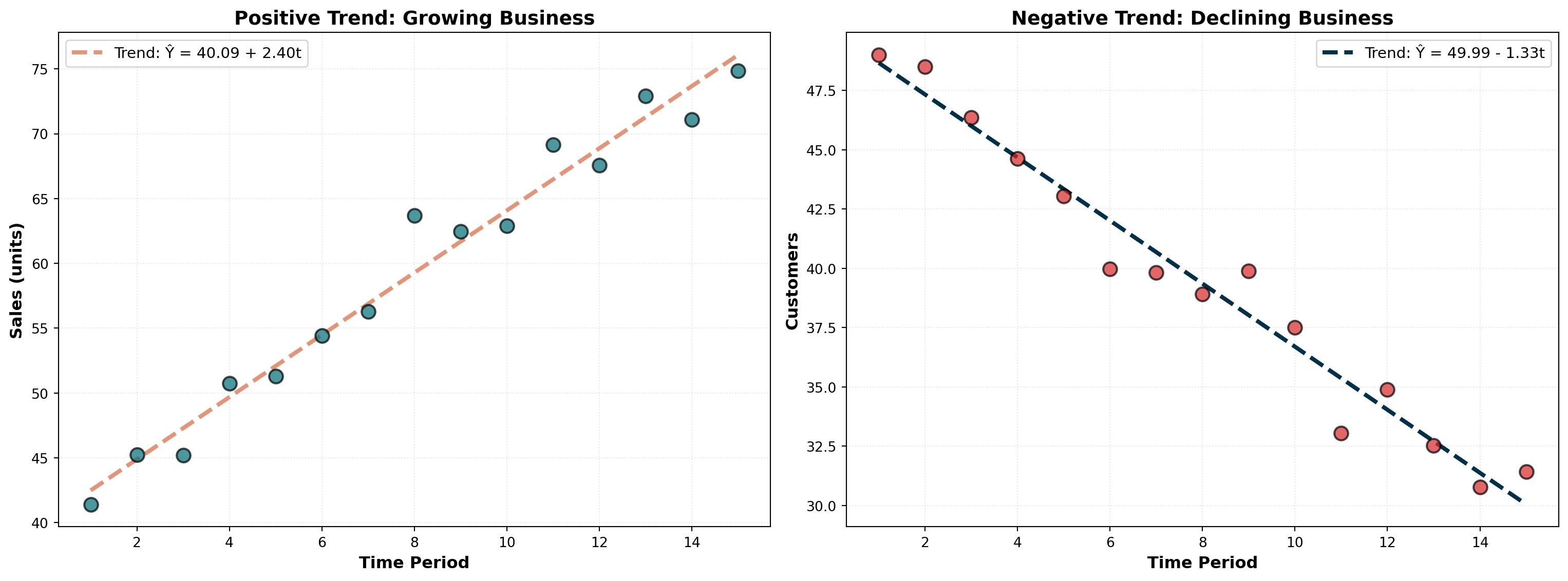
A positive slope indicates growth or expansion (left panel), while a negative slope signals contraction or decline (right panel). The magnitude of the slope reveals the rate of change.
14.6 13.6 Time Series Decomposition
It’s often useful to decompose a time series by separating each of its four components. This allows individual examination of:
- Historical trends for long-term insights
- Seasonal patterns for operational planning
- Cyclical movements for strategic positioning
- Irregular shocks for risk assessment
14.6.1 A. Isolating the Seasonal Component
The first step in decomposition is obtaining a seasonal index. Let’s examine Vinnie’s Video Village profit data, which appears to peak during summer months when schools are on vacation.
Step 1: Calculate 12-Month Moving Average
Since profits fluctuate throughout the year (monthly data), we calculate a 12-month moving average. This eliminates seasonal variations because it averages across an entire year.
Given the multiplicative model Y = T \times C \times S \times I, the moving average removes S and I, leaving only:
\text{MA} = T \times C
Step 2: Calculate Ratio-to-Moving-Average
Dividing the original time series values by the moving average isolates the seasonal and irregular components:
\frac{Y}{\text{MA}} = \frac{T \times C \times S \times I}{T \times C} = S \times I
This ratio-to-moving-average contains only seasonal and irregular factors.
Step 3: Average Ratios by Period
For each month, we average all available ratios across years. This averages out irregular variations (I), leaving the seasonal index (S).
Step 4: Normalize Seasonal Indices
The seasonal indices should sum to 12 (for monthly data) or 4 (for quarterly data). If they don’t, we normalize them:
\text{Normalization Factor} = \frac{\text{Number of Periods}}{\text{Sum of Average Ratios}}
Each average ratio is multiplied by this factor to produce the final seasonal index.
14.6.2 Example: Seasonal Indices Calculation
| Month | 1996 Ratio | 1997 Ratio | 1998 Ratio | Average Ratio | Seasonal Index |
|---|---|---|---|---|---|
| January | — | 0.5669 | 0.5897 | 0.5783 | 0.5858 |
| February | — | 0.6822 | 0.4706 | 0.5764 | 0.5839 |
| March | — | 0.6061 | 0.5897 | 0.5979 | 0.6057 |
| April | — | 0.7164 | 0.7076 | 0.7120 | 0.7213 |
| May | — | 1.1259 | 1.0988 | 1.1124 | 1.1269 |
| June | — | 1.4706 | 1.3986 | 1.4346 | 1.4533 |
| July | 1.7373 | 1.6350 | — | 1.6861 | 1.7082 |
| August | 1.6685 | 1.8191 | — | 1.7438 | 1.7665 |
| September | 1.1520 | 1.3005 | — | 1.2262 | 1.2422 |
| October | 0.8342 | 0.8867 | — | 0.8605 | 0.8717 |
| November | 0.6400 | 0.6502 | — | 0.6451 | 0.6535 |
| December | 0.6349 | 0.7094 | — | 0.6721 | 0.6809 |
| Sum | 11.8454 | 12.0000 |
Normalization:
\text{Factor} = \frac{12}{11.8454} = 1.01305
Each average ratio is multiplied by 1.01305 to produce the normalized seasonal index.
Code
import numpy as np
import matplotlib.pyplot as plt

# Seasonal indices
months = ['Jan', 'Feb', 'Mar', 'Apr', 'May', 'Jun',
          'Jul', 'Aug', 'Sep', 'Oct', 'Nov', 'Dec']
seasonal_indices = [0.5858, 0.5839, 0.6057, 0.7213, 1.1269, 1.4533,
                    1.7082, 1.7665, 1.2422, 0.8717, 0.6535, 0.6809]

fig, ax = plt.subplots(figsize=(14, 8))

# Create bar plot
colors = ['#E63946' if idx < 1.0 else '#2A9D8F' for idx in seasonal_indices]
bars = ax.bar(months, seasonal_indices, color=colors, alpha=0.8,
              edgecolor='black', linewidth=1.5)

# Add horizontal line at 1.0 (average)
ax.axhline(y=1.0, linestyle='--', color='black', linewidth=2,
          alpha=0.6, label='Average (1.0)')

# Annotate each bar
for i, (month, idx) in enumerate(zip(months, seasonal_indices)):
    ax.text(i, idx + 0.05, f'{idx:.2f}', ha='center', fontsize=10, fontweight='bold')

ax.set_xlabel('Month', fontsize=13, fontweight='bold')
ax.set_ylabel('Seasonal Index', fontsize=13, fontweight='bold')
ax.set_title('Seasonal Pattern: Video Store Profits Peak in Summer',
             fontsize=15, fontweight='bold', pad=20)
ax.legend(fontsize=12)
ax.grid(True, alpha=0.3, linestyle=':', axis='y')
plt.tight_layout()
plt.show()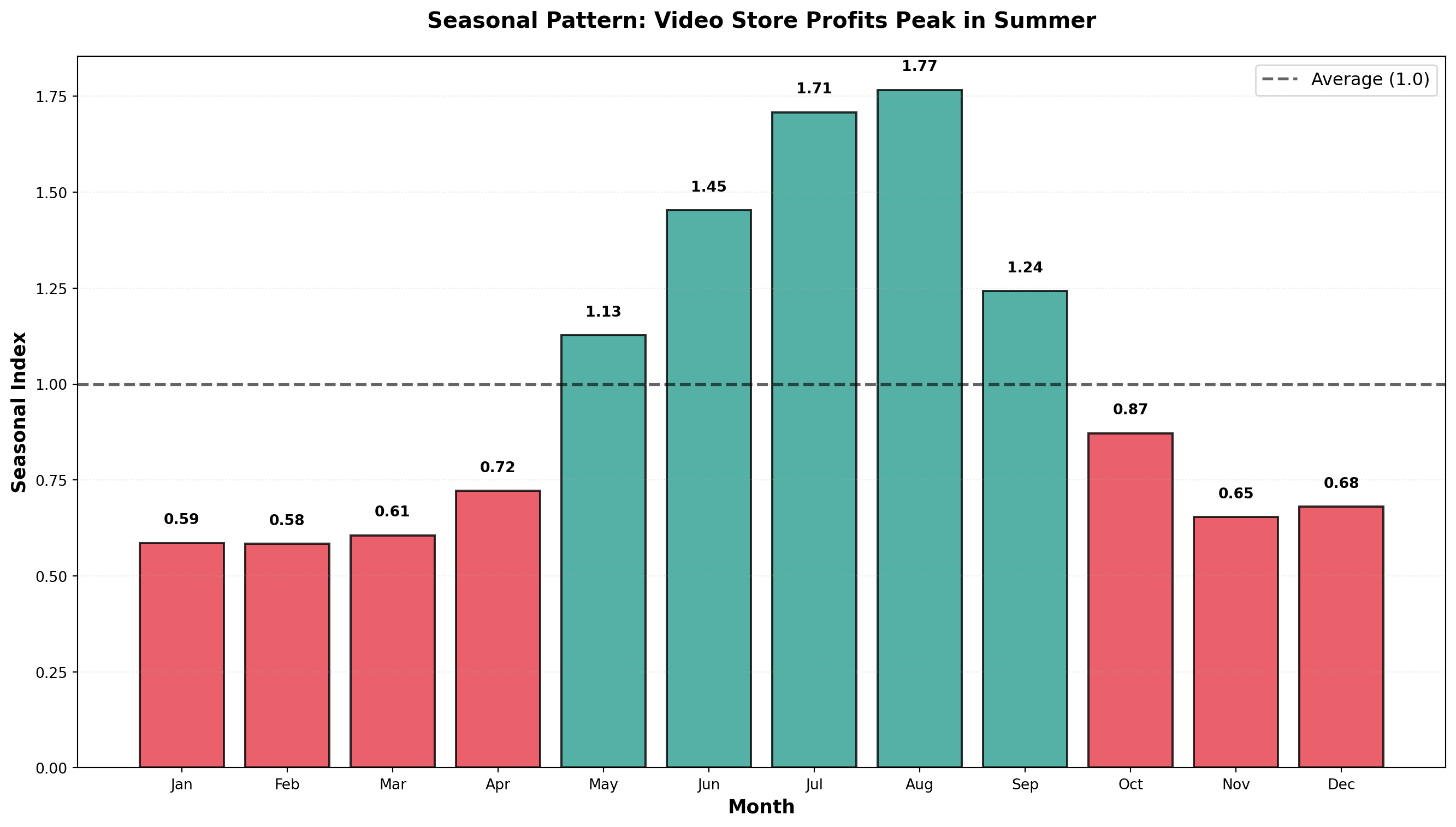
Interpretation:
- January Index = 0.5858: Profits are 58.58% of the yearly average
- January is 41.42% below average (1.000 - 0.5858)
- January is 41.42% below average (1.000 - 0.5858)
- July Index = 1.7082: Profits are 170.82% of the yearly average
- July is 70.82% above average (summer vacation effect)
- July is 70.82% above average (summer vacation effect)
- August Index = 1.7665: Peak season with profits 76.65% above average
14.6.3 Using Seasonal Indices
1. Deseasonalizing Data
Remove seasonal effects to see underlying trends:
\text{Deseasonalized Value} = \frac{\text{Actual Value}}{\text{Seasonal Index}}
For January 1996 with actual profits of $1,000:
\text{Deseasonalized} = \frac{1,000}{0.5858} = \$1,707
This tells us: “If there were no seasonal effects, January profits would have been $1,707.”
2. Seasonalizing Forecasts
Adjust trend forecasts to account for seasonal patterns:
\text{Seasonalized Forecast} = \text{Trend Forecast} \times \text{Seasonal Index}
If the trend equation predicts $2,000 for next January:
\text{Seasonalized Forecast} = 2,000 \times 0.5858 = \$1,172
This provides a more realistic forecast that incorporates typical January weakness.
Code
import numpy as np
import pandas as pd
import matplotlib.pyplot as plt

# Simulated monthly profits (3 years)
np.random.seed(42)
months_labels = ['Jan', 'Feb', 'Mar', 'Apr', 'May', 'Jun',
                 'Jul', 'Aug', 'Sep', 'Oct', 'Nov', 'Dec']
seasonal_indices_full = [0.5858, 0.5839, 0.6057, 0.7213, 1.1269, 1.4533,
                         1.7082, 1.7665, 1.2422, 0.8717, 0.6535, 0.6809]

# Repeat for 3 years
seasonal_pattern = seasonal_indices_full * 3
time_periods = np.arange(1, 37)
trend = 15 + 0.15 * time_periods
actual_profits = trend * seasonal_pattern + np.random.normal(0, 1, 36)
deseasonalized = actual_profits / seasonal_pattern

fig, (ax1, ax2) = plt.subplots(2, 1, figsize=(14, 10))

# Original data with strong seasonality
ax1.plot(time_periods, actual_profits, linewidth=2.5, color='#003049',
         marker='o', markersize=6, label='Actual Profits (Seasonal)')
ax1.set_ylabel('Profits (\$100s)', fontsize=12, fontweight='bold')
ax1.set_title('Original Data: Strong Seasonal Pattern Visible',
              fontsize=14, fontweight='bold')
ax1.legend(fontsize=11)
ax1.grid(True, alpha=0.3, linestyle=':')

# Deseasonalized data shows clear trend
ax2.plot(time_periods, deseasonalized, linewidth=2.5, color='#D62828',
         marker='s', markersize=6, label='Deseasonalized Profits')
ax2.plot(time_periods, trend, linewidth=2, linestyle='--', color='#F77F00',
         label='Underlying Trend')
ax2.set_xlabel('Month', fontsize=12, fontweight='bold')
ax2.set_ylabel('Profits (\$100s)', fontsize=12, fontweight='bold')
ax2.set_title('Deseasonalized Data: Clear Upward Trend Revealed',
              fontsize=14, fontweight='bold')
ax2.legend(fontsize=11)
ax2.grid(True, alpha=0.3, linestyle=':')

plt.tight_layout()
plt.show()
<>:24: SyntaxWarning: invalid escape sequence '\$'
<>:36: SyntaxWarning: invalid escape sequence '\$'
<>:24: SyntaxWarning: invalid escape sequence '\$'
<>:36: SyntaxWarning: invalid escape sequence '\$'
C:\Users\patod\AppData\Local\Temp\ipykernel_22840\2803583912.py:24: SyntaxWarning: invalid escape sequence '\$'
ax1.set_ylabel('Profits (\$100s)', fontsize=12, fontweight='bold')
C:\Users\patod\AppData\Local\Temp\ipykernel_22840\2803583912.py:36: SyntaxWarning: invalid escape sequence '\$'
ax2.set_ylabel('Profits (\$100s)', fontsize=12, fontweight='bold')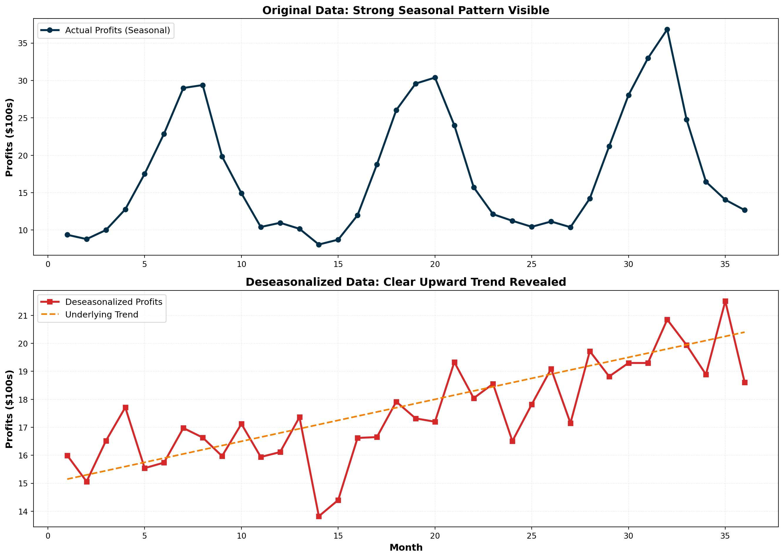
Deseasonalizing reveals the true underlying trend by removing seasonal noise. This is essential for:
- Economic analysis: Unemployment rates, retail sales
- Performance evaluation: Comparing months fairly
- Trend identification: Detecting genuine growth or decline
NoteSeasonally Adjusted Data
When you hear about “seasonally adjusted unemployment” or “seasonally adjusted GDP,” it means the data has been deseasonalized using seasonal indices. This allows fair month-to-month comparisons without seasonal distortions.
14.7 13.7 Index Numbers
In time series studies, we frequently compare data from one period with data from a different period. However, such comparisons must be made carefully because economic conditions change over time. Direct period-to-period comparisons can be misleading without accounting for these changes.
Index numbers provide decision-makers with a more accurate picture of economic variables over time and make cross-period comparisons more meaningful.
NoteDefinition: Index Number
A numerical measure that relates a value in one time period (called the reference or current period) to a value in another period (called the base period).
14.7.1 A. Simple Price Index
A simple price index characterizes the relationship between the price of a product or service in a base period and the price of that same product or service in a reference period.
Simple Price Index Formula:
PI_R = \frac{P_R}{P_B} \times 100
Where:
- PI_R = price index for reference period R
- P_R = price in reference period
- P_B = price in base period
14.7.2 Example: Nipp and Tuck Meat Packing
Jack Nipp and Harry Tuck own a meat packing plant in Duluth. They want to calculate simple price indices for their three most popular products using 1995 as the base period:
| Product | Unit | 1995 Price | 1996 Price | 1997 Price |
|---|---|---|---|---|
| Beef | 1 lb | $3.00 | $3.30 | $4.50 |
| Pork | 1 lb | $2.00 | $2.20 | $2.10 |
| Veal | 1 lb | $4.00 | $4.50 | $3.64 |
Calculating Simple Price Indices for Beef:
1995 (Base Year):
PI_{1995} = \frac{3.00}{3.00} \times 100 = 100
1996:
PI_{1996} = \frac{3.30}{3.00} \times 100 = 110
1997:
PI_{1997} = \frac{4.50}{3.00} \times 100 = 150
Interpretation:
From 1995 to 1996, the price index increased from 100 to 110, indicating:
\text{Percentage Increase} = \frac{110 - 100}{100} = 10\%
From 1995 to 1997:
\text{Percentage Increase} = \frac{150 - 100}{100} = 50\%
WarningPoint Change vs. Percentage Change
The point difference from 1996 to 1997 is 150 - 110 = 40 points.
However, the percentage change is:
\frac{150 - 110}{110} = \frac{40}{110} = 36.4\%
Don’t confuse the 40-point increase with a 40% increase!
Complete Simple Price Indices:
| Product | 1995 | 1996 | 1997 |
|---|---|---|---|
| Beef | 100 | 110 | 150 |
| Pork | 100 | 110 | 105 |
| Veal | 100 | 112 | 91 |
Note that veal’s index in 1997 is below 100, reflecting that veal prices declined by (100 - 91)/100 = 9\% from 1995 to 1997.
Code
import numpy as np
import matplotlib.pyplot as plt

years = [1995, 1996, 1997]
beef_index = [100, 110, 150]
pork_index = [100, 110, 105]
veal_index = [100, 112, 91]

fig, ax = plt.subplots(figsize=(12, 7))

ax.plot(years, beef_index, marker='o', linewidth=2.5, markersize=10,
        label='Beef', color='#A4243B')
ax.plot(years, pork_index, marker='s', linewidth=2.5, markersize=10,
        label='Pork', color='#2A9D8F')
ax.plot(years, veal_index, marker='^', linewidth=2.5, markersize=10,
        label='Veal', color='#E9C46A')

# Baseline at 100
ax.axhline(y=100, linestyle='--', color='black', linewidth=1.5,
          alpha=0.5, label='Base Year (100)')

ax.set_xlabel('Year', fontsize=13, fontweight='bold')
ax.set_ylabel('Price Index (1995 = 100)', fontsize=13, fontweight='bold')
ax.set_title('Price Trends: Beef Surges While Veal Declines',
             fontsize=15, fontweight='bold', pad=20)
ax.legend(fontsize=12, loc='upper left')
ax.grid(True, alpha=0.3, linestyle=':')
ax.set_ylim(80, 160)
plt.tight_layout()
plt.show()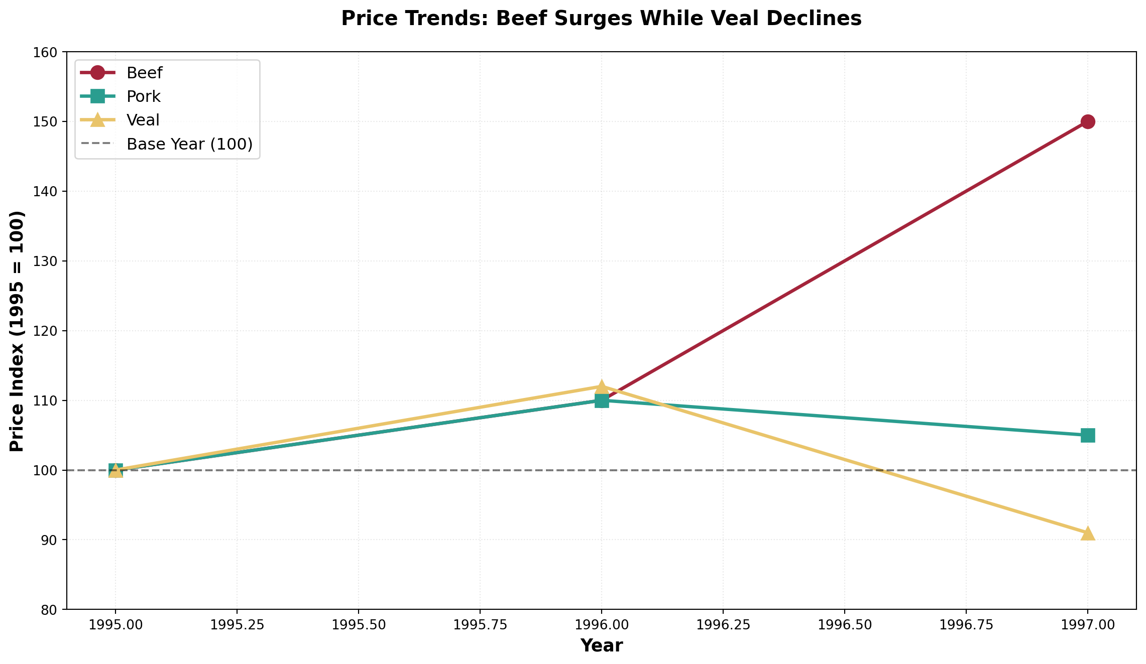
TipBase Year Property
The price index in the base year always equals 100 because:
PI_{\text{base}} = \frac{P_{\text{base}}}{P_{\text{base}}} \times 100 = 100
14.7.3 B. Aggregate Price Index
Often we want to calculate a price index for several products combined. This is called an aggregate price index.
Aggregate Price Index Formula:
PI_R^{\text{agg}} = \frac{\sum P_R}{\sum P_B} \times 100
Using Nipp and Tuck Data:
1995 (Base Year):
PI_{1995} = \frac{3.00 + 2.00 + 4.00}{3.00 + 2.00 + 4.00} \times 100 = \frac{9.00}{9.00} \times 100 = 100
1996:
PI_{1996} = \frac{3.30 + 2.20 + 4.50}{3.00 + 2.00 + 4.00} \times 100 = \frac{10.00}{9.00} \times 100 = 111.1
1997:
PI_{1997} = \frac{4.50 + 2.10 + 3.64}{3.00 + 2.00 + 4.00} \times 100 = \frac{10.24}{9.00} \times 100 = 113.8
Interpretation: In 1997, it would cost $113.80 to purchase what $100 bought in 1995.
ImportantProblems with Simple Aggregate Indices
Two major limitations:
Arbitrary unit choice: If beef were priced at $1.50 per half-pound instead of $3.00 per pound, the index would be completely different
No quantity weighting: The index gives equal importance to beef and pork, even though customers might buy twice as much beef
These issues motivate the use of weighted aggregate indices.
14.7.4 C. Weighted Aggregate Price Indices
To address the limitations of simple aggregate indices, we can calculate a weighted price index that assigns different weights to individual prices based on quantities sold.
The quantities selected as weights can come from:
1. Base period → Laspeyres Index
2. Reference period → Paasche Index
14.7.5 Laspeyres Index
The Laspeyres Index uses quantities sold in the base period as weights. The rationale: these quantities remain constant across calculations, allowing more meaningful comparisons over time.
Laspeyres Index Formula:
L = \frac{\sum (P_R \times Q_B)}{\sum (P_B \times Q_B)} \times 100
Where:
- P_R = price in reference period
- P_B = price in base period
- Q_B = quantity in base period (fixed weights)
14.7.6 Example: Laspeyres Index for Nipp and Tuck
Adding quantity data:
| Product | 1995 Price | 1996 Price | 1997 Price | 1995 Quantity (100s lb) |
|---|---|---|---|---|
| Beef | $3.00 | $3.30 | $4.50 | 250 |
| Pork | $2.00 | $2.20 | $2.10 | 150 |
| Veal | $4.00 | $4.50 | $3.64 | 80 |
Calculation Table:
| Product | P_{1995} | P_{1996} | P_{1997} | Q_{1995} | P_{1995} \times Q_{1995} | P_{1996} \times Q_{1995} | P_{1997} \times Q_{1995} |
|---|---|---|---|---|---|---|---|
| Beef | 3.00 | 3.30 | 4.50 | 250 | 750 | 825 | 1,125 |
| Pork | 2.00 | 2.20 | 2.10 | 150 | 300 | 330 | 315 |
| Veal | 4.00 | 4.50 | 3.64 | 80 | 320 | 360 | 291.2 |
| Sum | 1,370 | 1,515 | 1,731.2 |
Laspeyres Indices:
1995:
L_{1995} = \frac{1,370}{1,370} \times 100 = 100
1996:
L_{1996} = \frac{1,515}{1,370} \times 100 = 110.6
1997:
L_{1997} = \frac{1,731.2}{1,370} \times 100 = 126.4
Interpretation: From 1995 to 1997, the price of this market basket increased by 26.4%. You would spend $126.40 in 1997 to buy what $100 bought in 1995.
Note: The denominator remains constant (1,370) because Laspeyres always uses base period quantities.
14.7.7 Paasche Index
The Paasche Index uses quantities sold in each reference period as weights. This reflects current consumer behavior as purchasing patterns evolve.
Paasche Index Formula:
P = \frac{\sum (P_R \times Q_R)}{\sum (P_B \times Q_R)} \times 100
Where quantities from the reference period appear in both numerator and denominator.
14.7.8 Example: Paasche Index for Nipp and Tuck
Adding quantity data for all years:
| Product | 1995 Qty | 1996 Qty | 1997 Qty |
|---|---|---|---|
| Beef | 250 | 320 | 350 |
| Pork | 150 | 200 | 225 |
| Veal | 80 | 90 | 70 |
Calculation Table:
| Product | P_{1995} \times Q_{1995} | P_{1996} \times Q_{1996} | P_{1997} \times Q_{1997} | P_{1995} \times Q_{1996} | P_{1995} \times Q_{1997} |
|---|---|---|---|---|---|
| Beef | 750 | 1,056 | 1,575 | 960 | 1,050 |
| Pork | 300 | 440 | 472.5 | 400 | 450 |
| Veal | 320 | 405 | 254.8 | 360 | 280 |
| Sum | 1,370 | 1,901 | 2,302.3 | 1,720 | 1,780 |
Paasche Indices:
1995:
P_{1995} = \frac{1,370}{1,370} \times 100 = 100
1996:
P_{1996} = \frac{1,901}{1,720} \times 100 = 110.5
1997:
P_{1997} = \frac{2,302.3}{1,780} \times 100 = 129.3
Code
import numpy as np
import matplotlib.pyplot as plt

years = [1995, 1996, 1997]
aggregate_simple = [100, 111.1, 113.8]
laspeyres = [100, 110.6, 126.4]
paasche = [100, 110.5, 129.3]

fig, ax = plt.subplots(figsize=(14, 8))

ax.plot(years, aggregate_simple, marker='o', linewidth=3, markersize=12,
        label='Simple Aggregate', color='#264653', linestyle=':')
ax.plot(years, laspeyres, marker='s', linewidth=3, markersize=12,
        label='Laspeyres (Base Qty Weights)', color='#2A9D8F')
ax.plot(years, paasche, marker='^', linewidth=3, markersize=12,
        label='Paasche (Current Qty Weights)', color='#E76F51')

# Baseline
ax.axhline(y=100, linestyle='--', color='black', linewidth=1.5,
          alpha=0.5)

# Annotate final values
for idx, year in enumerate(years):
    if year == 1997:
        ax.annotate(f'{laspeyres[idx]:.1f}',
                   xy=(year, laspeyres[idx]), xytext=(year+0.05, laspeyres[idx]+2),
                   fontsize=11, fontweight='bold', color='#2A9D8F')
        ax.annotate(f'{paasche[idx]:.1f}',
                   xy=(year, paasche[idx]), xytext=(year+0.05, paasche[idx]+2),
                   fontsize=11, fontweight='bold', color='#E76F51')

ax.set_xlabel('Year', fontsize=13, fontweight='bold')
ax.set_ylabel('Price Index (1995 = 100)', fontsize=13, fontweight='bold')
ax.set_title('Weighted vs Unweighted Price Indices: The Impact of Quantity Weights',
             fontsize=15, fontweight='bold', pad=20)
ax.legend(fontsize=12, loc='upper left')
ax.grid(True, alpha=0.3, linestyle=':')
ax.set_ylim(95, 135)
plt.tight_layout()
plt.show()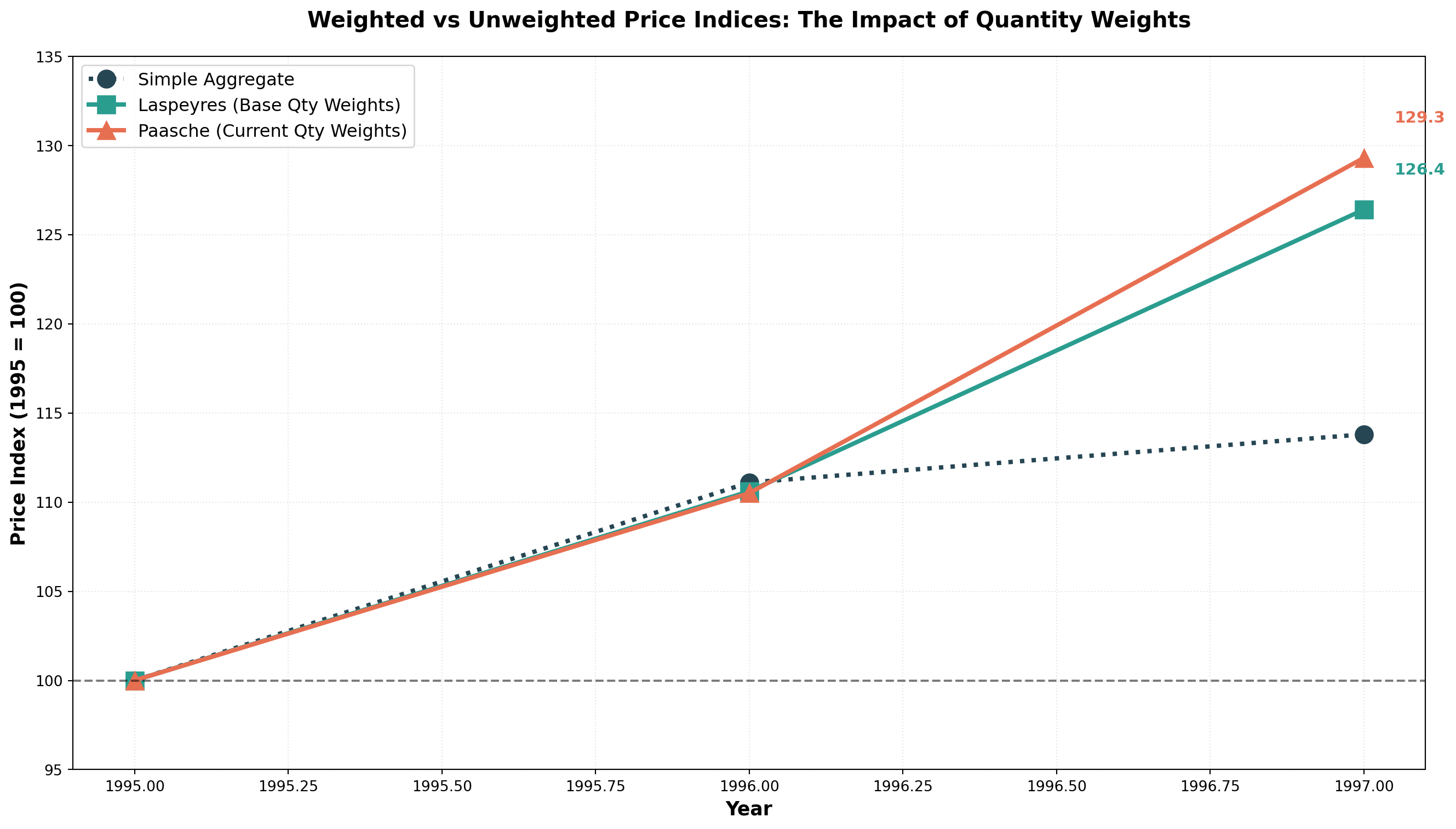
14.7.9 Comparing Laspeyres and Paasche
| Feature | Laspeyres Index | Paasche Index |
|---|---|---|
| Weights | Base period quantities (fixed) | Reference period quantities (changing) |
| Advantages | • Requires quantity data for one period only • Easier to calculate • Allows meaningful comparisons over time • Changes attributable to prices alone |
• Reflects current consumer behavior • Updates with changing purchase patterns • More relevant to current economy |
| Disadvantages | • Overweights goods with rising prices • Doesn’t reflect changing buying habits • May become outdated |
• Requires quantity data for every period • More difficult to calculate • Changes reflect both price and quantity shifts • Overweights goods with falling prices |
| Usage | More commonly used (e.g., CPI basis) | Less common due to data requirements |
TipFisher’s Ideal Index
Some economists propose Fisher’s Ideal Index, which combines Laspeyres and Paasche:
F = \sqrt{L \times P}
For our example:
F_{1997} = \sqrt{126.4 \times 129.3} = \sqrt{16,343.52} = 127.8
However, interpretation is debatable, so it’s not widely used.
14.8 13.8 Specific Index Applications
Numerous government agencies, the Federal Reserve System, and private enterprises calculate various indices for different purposes.
14.8.1 A. Consumer Price Index (CPI)
The Consumer Price Index (CPI) is reported monthly by the Bureau of Labor Statistics (BLS) of the U.S. Department of Labor. First introduced in 1914 to determine if industrial workers’ wages kept pace with WWI inflation.
Two Main CPI Measures:
- CPI-W: Traditional index for urban wage earners and clerical workers (~40% of population)
- CPI-U: Broader index for all urban consumers (~80% of population), includes ~3,000 consumer products
Both use a weighting system similar to Laspeyres:
- Food: Weight ≈ 18
- Housing: Weight ≈ 43
- Medical Care: Weight ≈ 5
- Entertainment: Weight ≈ 5
- Total weights = 100
Current Base Period: 1982-1984 = 100
Uses of CPI:
- Measuring inflation
- Deflating monetary values to remove price effects
- Cost-of-living adjustments (COLAs) in contracts
- Social Security benefit adjustments
- Wage negotiations in labor contracts
14.8.2 B. Other Important Indices
Producer Price Index (PPI): Published monthly by BLS, indicates price changes in primary markets for raw materials used in manufacturing.
Industrial Production Index: Published by Federal Reserve, measures changes in the volume of industrial production (not monetary), base year currently 1977.
Stock Market Indices:
- Dow Jones Industrial Average: 30 blue-chip industrial stocks
- S&P 500: Broader aggregate of 500 industrial stocks
- NASDAQ Composite: Technology-heavy index
14.9 13.9 Using the CPI
Movements in the CPI significantly impact business conditions and economic considerations.
14.9.1 Measuring Inflation
Annual inflation rates are measured by the percentage change in CPI year-over-year:
\text{Inflation Rate} = \frac{\text{CPI}_t - \text{CPI}_{t-1}}{\text{CPI}_{t-1}} \times 100
Example: 1987 Inflation Rate
From the table below, with CPI₁₉₈₇ = 113.6 and CPI₁₉₈₆ = 109.6:
\text{Inflation}_{1987} = \frac{113.6 - 109.6}{109.6} \times 100 = 3.6\%
| Year | CPI (1982-84=100) | Inflation Rate (%) |
|---|---|---|
| 1986 | 109.6 | — |
| 1987 | 113.6 | 3.6 |
| 1988 | 118.3 | 4.1 |
| 1989 | 124.3 | 5.1 |
| 1990 | 127.2 | 2.3 |
| 1991 | 136.2 | 7.1 |
| 1992 | 140.3 | 3.0 |
| 1993 | 145.3 | 3.6 |
| 1994 | 148.2 | 1.9 |
| 1995 | 152.4 | 2.8 |
| 1996 | 156.9 | 3.0 |
| 1997 | 158.6 | 1.1 |
Code
import numpy as np
import matplotlib.pyplot as plt

years = np.arange(1986, 1998)
cpi = [109.6, 113.6, 118.3, 124.3, 127.2, 136.2, 140.3, 145.3, 148.2, 152.4, 156.9, 158.6]
inflation = [np.nan, 3.6, 4.1, 5.1, 2.3, 7.1, 3.0, 3.6, 1.9, 2.8, 3.0, 1.1]

fig, (ax1, ax2) = plt.subplots(2, 1, figsize=(14, 10))

# CPI over time
ax1.plot(years, cpi, marker='o', linewidth=3, markersize=10, color='#2E86AB')
ax1.fill_between(years, 100, cpi, alpha=0.2, color='#2E86AB')
ax1.axhline(y=100, linestyle='--', color='gray', linewidth=1.5, alpha=0.6)
ax1.set_ylabel('CPI (1982-84 = 100)', fontsize=12, fontweight='bold')
ax1.set_title('Consumer Price Index: Rising Price Levels', fontsize=14, fontweight='bold')
ax1.grid(True, alpha=0.3, linestyle=':')

# Inflation rate
ax2.bar(years[1:], inflation[1:], color='#E63946', alpha=0.8, edgecolor='black')
ax2.axhline(y=0, color='black', linewidth=1)
ax2.set_xlabel('Year', fontsize=12, fontweight='bold')
ax2.set_ylabel('Inflation Rate (%)', fontsize=12, fontweight='bold')
ax2.set_title('Annual Inflation Rate: Year-over-Year Price Changes', fontsize=14, fontweight='bold')
ax2.grid(True, alpha=0.3, linestyle=':', axis='y')

plt.tight_layout()
plt.show()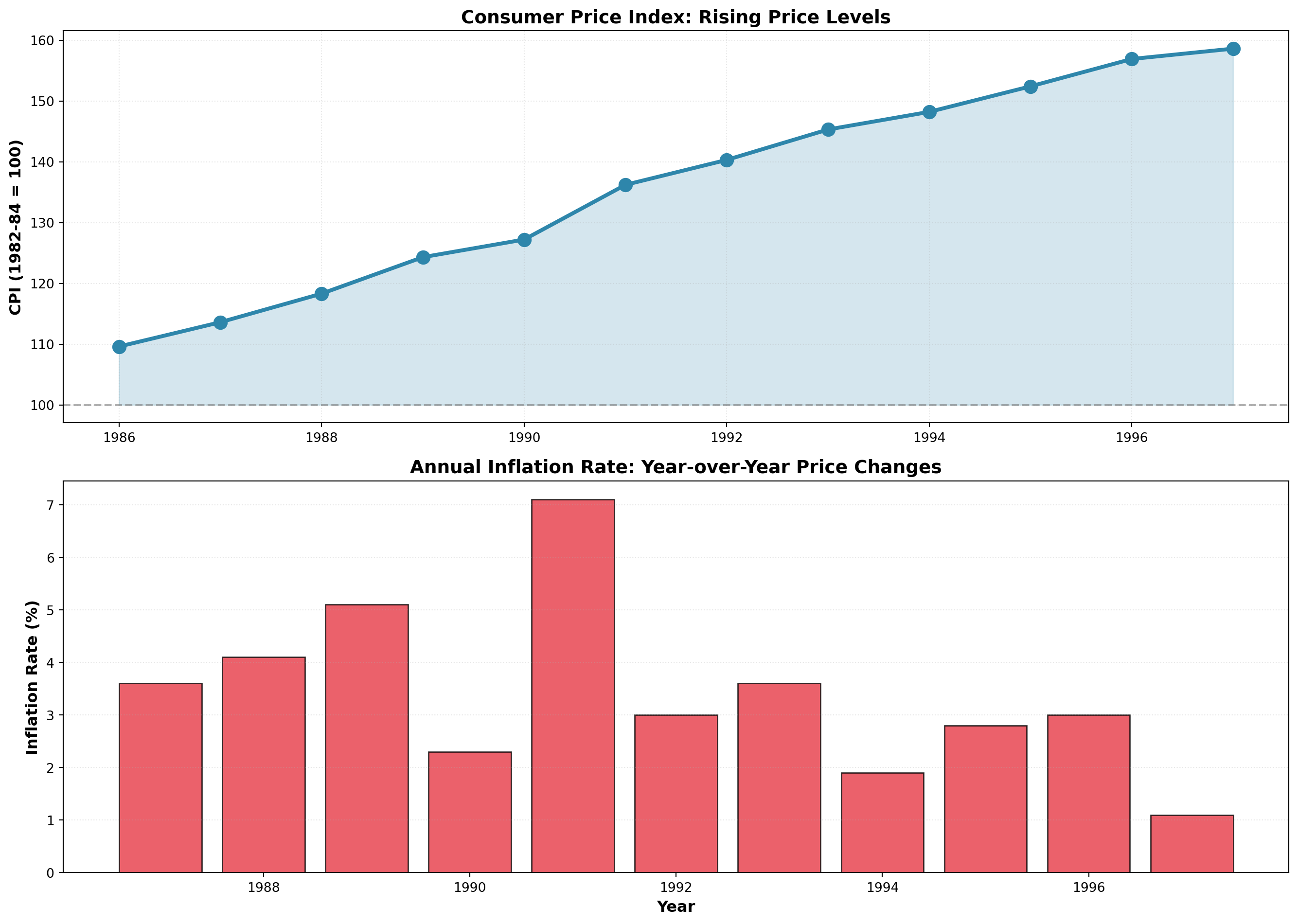
14.9.2 Deflating Time Series: Real vs. Nominal Values
Economists distinguish between:
- Nominal (Current) Dollars: Actual dollar amounts in each year
- Real (Constant) Dollars: Adjusted to remove inflation effects
Real Income Formula:
\text{Real Income} = \frac{\text{Nominal Income}}{\text{CPI}} \times 100
Example: Income Analysis
| Year | Nominal Income | CPI (1982-84=100) | Real Income (1982-84 dollars) |
|---|---|---|---|
| 1994 | $42,110 | 148.2 | $28,414 |
| 1995 | $46,000 | 152.4 | $30,183 |
| 1996 | $49,800 | 156.9 | $31,739 |
| 1997 | $53,500 | 158.6 | $33,732 |
For 1994:
\text{Real Income} = \frac{42,110}{148.2} \times 100 = \$28,414
Interpretation: Though you earned $42,110 in 1994, it had the purchasing power of only $28,414 in 1982-1984 dollars.
Real GDP:
Economists deflate Gross Domestic Product (GDP) to measure true production growth:
\text{Real GDP} = \frac{\text{Nominal GDP}}{\text{Price Deflator}} \times 100
This eliminates price increases and reveals the actual increase in goods and services available for consumption.
Code
import numpy as np
import matplotlib.pyplot as plt

years = [1994, 1995, 1996, 1997]
nominal_income = [42.110, 46.000, 49.800, 53.500]
real_income = [28.414, 30.183, 31.739, 33.732]

x = np.arange(len(years))
width = 0.35

fig, ax = plt.subplots(figsize=(12, 8))

bars1 = ax.bar(x - width/2, nominal_income, width, label='Nominal Income',
               color='#E76F51', alpha=0.9, edgecolor='black', linewidth=1.5)
bars2 = ax.bar(x + width/2, real_income, width, label='Real Income (1982-84 $)',
               color='#2A9D8F', alpha=0.9, edgecolor='black', linewidth=1.5)

# Add value labels
for bars in [bars1, bars2]:
    for bar in bars:
        height = bar.get_height()
        ax.text(bar.get_x() + bar.get_width()/2., height,
                f'${height:.1f}k', ha='center', va='bottom', fontsize=10, fontweight='bold')

ax.set_xlabel('Year', fontsize=13, fontweight='bold')
ax.set_ylabel('Income ($1000s)', fontsize=13, fontweight='bold')
ax.set_title('The Inflation Illusion: Nominal Growth vs Real Purchasing Power',
             fontsize=15, fontweight='bold', pad=20)
ax.set_xticks(x)
ax.set_xticklabels(years)
ax.legend(fontsize=12, loc='upper left')
ax.grid(True, alpha=0.3, linestyle=':', axis='y')
plt.tight_layout()
plt.show()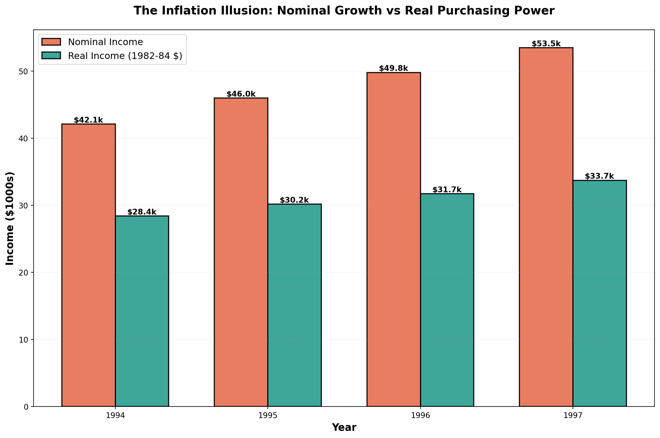
The chart dramatically illustrates how inflation erodes purchasing power. While nominal income grew from $42k to $53.5k (27% increase), real purchasing power only grew from $28.4k to $33.7k (19% increase).
14.10 Chapter Summary
This chapter explored the analysis and forecasting of time series data—sequential observations recorded over time. We examined:
The Four Components:
1. Secular Trend: Long-term directional movement
2. Seasonal Variation: Regular within-year patterns
3. Cyclical Variation: Multi-year business cycle fluctuations
4. Irregular Variation: Random, unpredictable movements
Time Series Models:
- Additive: Y_t = T_t + S_t + C_t + I_t
- Multiplicative (preferred): Y_t = T_t \times S_t \times C_t \times I_t
Smoothing Techniques:
- Moving Averages: Average over fixed number of periods, eliminates seasonality when window = seasonal cycle
- Exponential Smoothing: Weighted average giving more weight to recent observations, parameter \alpha controls responsiveness
Forecasting Methods:
- Naive Model: \hat{Y}_{t+1} = Y_t (for random walks)
- Trend Analysis: Linear regression with time as predictor
- Seasonal Decomposition: Isolate and use seasonal indices for adjusted forecasts
Index Numbers:
- Simple Price Index: Track individual product prices
- Aggregate Price Index: Combined price movements
- Laspeyres Index: Weighted by base period quantities
- Paasche Index: Weighted by current period quantities
- Consumer Price Index (CPI): Measure inflation and deflate nominal values
These tools enable businesses to identify patterns, make informed forecasts, and adjust for economic changes when comparing data across time periods.