flowchart TB
    A["Data Set Description"]
    B["Frequency Distributions"]
    C["Graphics"]
    D1["Cumulative Frequency Distribution"]
    D2["Relative Frequency Distribution"]
    D3["Contingency Tables"]
    E1["Histogram"]
    E2["Bar Chart"]
    E3["Pie Chart"]
    E4["High-Low-Close Chart"]
    E5["Stem-and-Leaf Plot"]

    A --> B
    A --> C
    B --> D1
    B --> D2
    B --> D3
    C --> E1
    C --> E2
    C --> E3
    C --> E4
    C --> E5

    style A fill:#2E86AB,stroke:#A23B72,stroke-width:3px,color:#fff
    style B fill:#A23B72,stroke:#F18F01,stroke-width:2px,color:#fff
    style C fill:#A23B72,stroke:#F18F01,stroke-width:2px,color:#fff
    style D1 fill:#F18F01,stroke:#C73E1D,stroke-width:2px,color:#fff
    style D2 fill:#F18F01,stroke:#C73E1D,stroke-width:2px,color:#fff
    style D3 fill:#F18F01,stroke:#C73E1D,stroke-width:2px,color:#fff
    style E1 fill:#F18F01,stroke:#C73E1D,stroke-width:2px,color:#fff
    style E2 fill:#F18F01,stroke:#C73E1D,stroke-width:2px,color:#fff
    style E3 fill:#F18F01,stroke:#C73E1D,stroke-width:2px,color:#fff
    style E4 fill:#F18F01,stroke:#C73E1D,stroke-width:2px,color:#fff
    style E5 fill:#F18F01,stroke:#C73E1D,stroke-width:2px,color:#fff
3 Data Set Description
3.1 Business Scenario: P&P Regional Airlines
P&P Regional Airlines operates short-haul flights connecting major business centers in the Midwest. The operations director faces a critical challenge: with limited aircraft capacity and high operational costs, understanding passenger demand patterns is essential for optimal scheduling and profitability.
Raw data alone—lists of daily passenger counts, flight frequencies, and customer ages—provides little actionable insight. The director needs organized, visual presentations of this information to make strategic decisions about fleet allocation, pricing strategies, and service expansion.
This chapter demonstrates how to transform raw business data into meaningful information through frequency distributions and graphical presentations. These fundamental tools allow executives to identify patterns, detect trends, and communicate findings effectively to stakeholders.
ImportantThe Challenge of Raw Data
In today’s complex business environment, decision-makers face overwhelming amounts of unorganized data. Simply collecting information is insufficient—success requires the ability to organize, present, and interpret data in ways that reveal actionable insights and support intelligent decision-making.
3.2 2.1 The Need for Data Organization
In business analytics, we frequently make the convenient assumption that data collection has already been completed and that data is available for analysis. However, raw data in its original form rarely provides immediate insight.
Consider P&P Airlines’ challenge: the director collected daily passenger counts for 50 days, resulting in a simple list of numbers (Table 2.1). While complete, this unorganized presentation makes it nearly impossible to detect meaningful patterns or draw strategic conclusions.
Effective data description requires two fundamental approaches:
- Frequency tables that organize data into specific classes
- Graphical displays that provide visual representation
NoteFrom Data to Information
The transformation of raw data into organized presentations is not merely cosmetic—it fundamentally changes how we can understand and act upon business information. What appears as random variation in raw form often reveals clear patterns when properly organized.
3.3 2.2 Frequency Distributions
A frequency distribution (or frequency table) organizes data by dividing observations into classes and recording the number of observations in each class.
3.3.1 A. Constructing Frequency Distributions
Key Steps in Construction:
- Determine the number of classes using the 2^k rule
- Calculate class interval (class width)
- Establish class boundaries (lower and upper limits)
- Count frequencies for each class
- Calculate class midpoints for each interval
TipThe 2^k Rule for Class Selection
Select the smallest value of k such that 2^k \geq n, where n is the number of observations.
Example: For n = 50 observations: - 2^5 = 32 (too small) - 2^6 = 64 (sufficient) ✓
Therefore, use approximately 6 classes.
Formula for Class Interval:
IC = \frac{\text{Largest value} - \text{Smallest value}}{\text{Desired number of classes}} \tag{3.1}
where IC represents the class interval (class width).
3.3.2 Example: P&P Airlines Passenger Data
Given Information: - Number of observations: n = 50 days
- Largest value: 102 passengers
- Smallest value: 50 passengers
- Desired classes: 6
Calculation:
IC = \frac{102 - 50}{6} = \frac{52}{6} = 8.67 \approx 10 \text{ (rounded for convenience)}
Using a class interval of 10 and starting at 50, we construct Table 2.2:
| Class (Passengers) | Frequency (Days) | Midpoint |
|---|---|---|
| 50–59 | 3 | 54.5 |
| 60–69 | 7 | 64.5 |
| 70–79 | 18 | 74.5 |
| 80–89 | 12 | 84.5 |
| 90–99 | 8 | 94.5 |
| 100–109 | 2 | 104.5 |
| Total | 50 |
ImportantInsights from the Frequency Distribution
The organized table immediately reveals patterns invisible in raw data:
- Peak demand: 18 days (36%) had 70–79 passengers
- Capacity planning: Passenger counts never exceeded 109
- Low-demand occurrence: Fewer than 60 passengers occurred only 6% of the time
- Operational range: Most operations (68%) fell between 70–89 passengers
These insights directly support decisions about aircraft sizing, scheduling frequency, and pricing strategies.
Code
import matplotlib.pyplot as plt
import numpy as np

fig, axes = plt.subplots(1, 2, figsize=(12, 5))

# Simulated raw data for P&P Airlines
np.random.seed(42)
raw_data = np.concatenate([
    np.random.randint(50, 60, 3),
    np.random.randint(60, 70, 7),
    np.random.randint(70, 80, 18),
    np.random.randint(80, 90, 12),
    np.random.randint(90, 100, 8),
    np.random.randint(100, 110, 2)
])

# Panel 1: Raw data scatter
axes[0].scatter(range(len(raw_data)), raw_data, alpha=0.6, s=50, color='steelblue')
axes[0].set_title('Raw Data: Unorganized Passenger Counts\n(Difficult to interpret)',
                  fontsize=11, fontweight='bold')
axes[0].set_xlabel('Day Number')
axes[0].set_ylabel('Number of Passengers')
axes[0].grid(True, alpha=0.3)
axes[0].set_ylim(40, 115)

# Panel 2: Frequency distribution
classes = ['50-59', '60-69', '70-79', '80-89', '90-99', '100-109']
frequencies = [3, 7, 18, 12, 8, 2]
colors = ['#3498db', '#2ecc71', '#e74c3c', '#f39c12', '#9b59b6', '#1abc9c']

bars = axes[1].bar(classes, frequencies, color=colors, alpha=0.7, edgecolor='black')
axes[1].set_title('Frequency Distribution: Organized Classes\n(Clear pattern emerges)',
                  fontsize=11, fontweight='bold')
axes[1].set_xlabel('Passenger Count Range')
axes[1].set_ylabel('Frequency (Number of Days)')
axes[1].grid(True, alpha=0.3, axis='y')

# Add frequency labels on bars
for bar, freq in zip(bars, frequencies):
    height = bar.get_height()
    axes[1].text(bar.get_x() + bar.get_width()/2., height,
                f'{freq}',
                ha='center', va='bottom', fontweight='bold')

plt.tight_layout()
plt.show()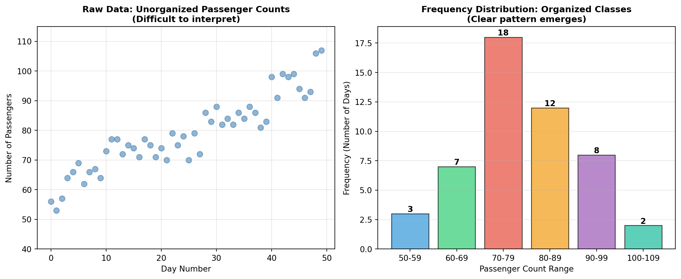
3.3.3 B. Cumulative Frequency Distributions
A cumulative frequency distribution shows the total number of observations that fall at or below (or above) specific class boundaries.
Two Types:
- “Less than” cumulative frequency: Total observations below the upper boundary
- “More than” cumulative frequency: Total observations above the lower boundary
3.3.4 Example: “Less Than” Cumulative Frequency for P&P Airlines
| Class (Passengers) | Frequency (Days) | Cumulative Frequency |
|---|---|---|
| Less than 50 | 0 | 0 |
| Less than 60 | 3 | 3 |
| Less than 70 | 7 | 10 |
| Less than 80 | 18 | 28 |
| Less than 90 | 12 | 40 |
| Less than 100 | 8 | 48 |
| Less than 110 | 2 | 50 |
Interpretation:
- On 28 days (56%), fewer than 80 passengers flew
- On 40 days (80%), fewer than 90 passengers flew
- All 50 days had fewer than 110 passengers
TipBusiness Application of Cumulative Frequencies
Cumulative distributions are particularly valuable for:
- Capacity planning: “What percentage of days require more than X passengers?”
- Service level targets: “How often do we need standby capacity?”
- Risk assessment: “What’s the probability demand exceeds our current fleet capacity?”
3.3.5 C. Relative Frequency Distributions
A relative frequency distribution expresses the frequency of each class as a percentage of the total number of observations.
Formula:
\text{Relative Frequency} = \frac{\text{Class Frequency}}{\text{Total Observations}} \times 100\%
3.3.6 Example: Relative Frequency Distribution for P&P Airlines
| Class (Passengers) | Frequency (Days) | Relative Frequency |
|---|---|---|
| 50–59 | 3 | 6% |
| 60–69 | 7 | 14% |
| 70–79 | 18 | 36% |
| 80–89 | 12 | 24% |
| 90–99 | 8 | 16% |
| 100–109 | 2 | 4% |
| Total | 50 | 100% |
Key Insight: The 70–79 passenger range represents 36% of all operating days, making it the most common demand level and suggesting optimal aircraft capacity should accommodate at least 79 passengers.
Code
import matplotlib.pyplot as plt
import numpy as np

fig, axes = plt.subplots(1, 2, figsize=(12, 5))

# Data
classes = ['50-59', '60-69', '70-79', '80-89', '90-99', '100-109']
frequencies = [3, 7, 18, 12, 8, 2]
cumulative = np.cumsum(frequencies)
relative = np.array(frequencies) / 50 * 100

# Panel 1: Cumulative frequency
axes[0].plot(range(len(classes)), cumulative, marker='o', linewidth=2,
            markersize=8, color='#e74c3c', label='Cumulative Frequency')
axes[0].fill_between(range(len(classes)), cumulative, alpha=0.3, color='#e74c3c')
axes[0].set_title('Cumulative Frequency Distribution\n("Less Than" Type)',
                 fontsize=11, fontweight='bold')
axes[0].set_xlabel('Passenger Class')
axes[0].set_ylabel('Cumulative Frequency (Days)')
axes[0].set_xticks(range(len(classes)))
axes[0].set_xticklabels(classes, rotation=45)
axes[0].grid(True, alpha=0.3)
axes[0].legend()

# Add annotations for key points
for i, (x, y) in enumerate(zip(range(len(classes)), cumulative)):
    axes[0].annotate(f'{y}', xy=(x, y), xytext=(5, 5),
                    textcoords='offset points', fontweight='bold')

# Panel 2: Relative frequency (pie chart style bar chart)
colors = plt.cm.Set3(np.linspace(0, 1, len(classes)))
bars = axes[1].bar(classes, relative, color=colors, alpha=0.8, edgecolor='black')
axes[1].set_title('Relative Frequency Distribution\n(Percentage of Total)',
                 fontsize=11, fontweight='bold')
axes[1].set_xlabel('Passenger Class')
axes[1].set_ylabel('Relative Frequency (%)')
axes[1].set_xticks(range(len(classes)))
axes[1].set_xticklabels(classes, rotation=45)
axes[1].grid(True, alpha=0.3, axis='y')

# Add percentage labels
for bar, pct in zip(bars, relative):
    height = bar.get_height()
    axes[1].text(bar.get_x() + bar.get_width()/2., height,
                f'{pct:.0f}%',
                ha='center', va='bottom', fontweight='bold')

plt.tight_layout()
plt.show()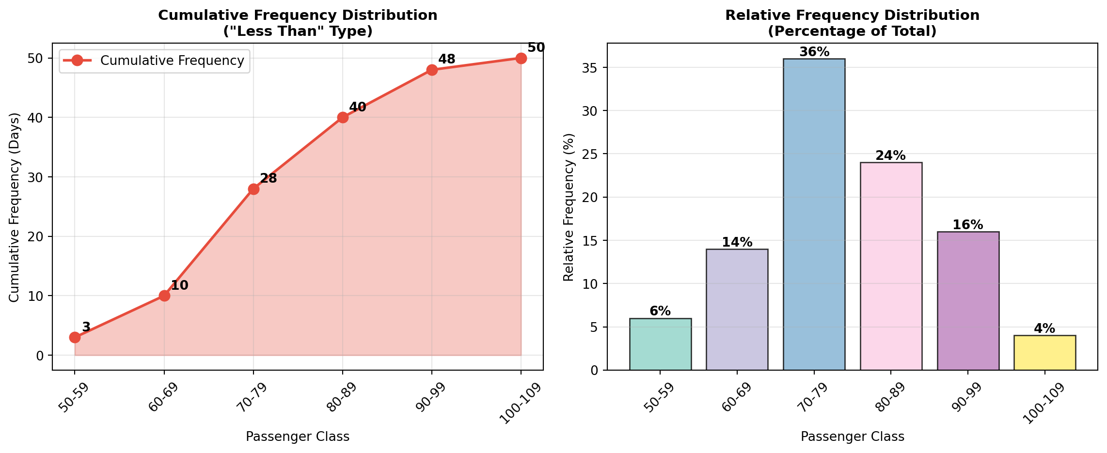
3.3.7 D. Contingency Tables (Cross-Tabulation)
While frequency tables organize one variable at a time, contingency tables allow us to examine relationships between two or more variables simultaneously.
NoteDefinition: Contingency Table
A contingency table (or cross-tabulation) displays the frequency distribution of two categorical variables in a matrix format, with one variable defining rows and the other defining columns. This allows analysis of potential relationships between the variables.
3.3.8 Example: P&P Airlines Passenger Profile
Beyond passenger counts, P&P Airlines also collected data on: - Passenger age (4 categories)
- Annual flight frequency (3 categories)
Table 2.3: Contingency Table for P&P Airlines Passengers
| Number of Flights per Year | ||||
|---|---|---|---|---|
| Age Group | 1–2 | 3–5 | More than 5 | Total |
| Under 25 | 1 (0.02) | 1 (0.02) | 2 (0.04) | 4 (0.08) |
| 25–40 | 2 (0.04) | 8 (0.16) | 10 (0.20) | 20 (0.40) |
| 40–65 | 1 (0.02) | 6 (0.12) | 15 (0.30) | 22 (0.44) |
| 65 and older | 1 (0.02) | 2 (0.04) | 1 (0.02) | 4 (0.08) |
| Total | 5 (0.10) | 17 (0.34) | 28 (0.56) | 50 (1.00) |
Critical Insights from the Contingency Table:
- Target demographic identified: The largest segment (30% of passengers) consists of ages 40–65 flying more than 5 times per year—these are high-value frequent business travelers
- Low engagement among young travelers: Only 8% of passengers are under 25
- Majority are frequent flyers: 56% of all passengers fly more than 5 times annually
- Market opportunity: The 65+ segment is underrepresented (8%), suggesting potential for senior-targeted marketing
ImportantStrategic Marketing Applications
This passenger profile enables P&P Airlines to:
- Optimize loyalty programs targeting the dominant 40–65 age group
- Develop pricing strategies for the 56% frequent-flyer segment
- Identify growth opportunities in the under-25 market
- Allocate marketing budgets based on demographic composition
Such insights are impossible to obtain from simple frequency distributions of a single variable.
Code
import matplotlib.pyplot as plt
import numpy as np

# Contingency table data
age_groups = ['Under 25', '25-40', '40-65', '65+']
flight_freq = ['1-2 flights', '3-5 flights', '>5 flights']
data = np.array([
    [1, 1, 2],
    [2, 8, 10],
    [1, 6, 15],
    [1, 2, 1]
])

fig, ax = plt.subplots(figsize=(10, 6))
im = ax.imshow(data, cmap='YlOrRd', aspect='auto')

# Set ticks and labels
ax.set_xticks(np.arange(len(flight_freq)))
ax.set_yticks(np.arange(len(age_groups)))
ax.set_xticklabels(flight_freq)
ax.set_yticklabels(age_groups)

# Rotate the tick labels for better readability
plt.setp(ax.get_xticklabels(), rotation=45, ha="right", rotation_mode="anchor")

# Create text annotations
for i in range(len(age_groups)):
    for j in range(len(flight_freq)):
        percentage = data[i, j] / 50 * 100
        text = ax.text(j, i, f'{data[i, j]}\n({percentage:.0f}%)',
                      ha="center", va="center", color="black", fontweight='bold')

ax.set_title('P&P Airlines Passenger Demographics\nAge Group × Annual Flight Frequency',
            fontsize=12, fontweight='bold', pad=20)
ax.set_xlabel('Annual Flight Frequency', fontsize=11, fontweight='bold')
ax.set_ylabel('Age Group', fontsize=11, fontweight='bold')

# Add colorbar
cbar = plt.colorbar(im, ax=ax)
cbar.set_label('Number of Passengers', rotation=270, labelpad=20, fontweight='bold')

plt.tight_layout()
plt.show()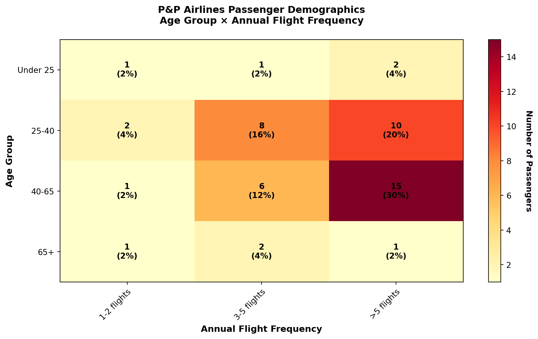
3.4 2.3 Graphics and Visual Representations
While frequency tables provide numerical organization, graphical displays offer visual patterns that the human brain processes more rapidly and intuitively than numerical tables.
TipThe Power of Visualization
Research in cognitive psychology demonstrates that the human visual system can detect patterns, trends, and outliers in graphical displays far more efficiently than in numerical tables. A well-designed chart can communicate complex relationships in seconds that might take minutes to extract from tabular data.
3.4.1 A. Histograms
A histogram is the graphical representation of a frequency distribution, displaying: - Classes on the horizontal axis (x-axis)
- Frequencies on the vertical axis (y-axis)
- Bars whose heights represent class frequencies
Unlike bar charts, histogram bars typically touch each other (no gaps) because they represent continuous numerical ranges.
Code
import matplotlib.pyplot as plt
import numpy as np

# P&P Airlines frequency data
classes = ['50-59', '60-69', '70-79', '80-89', '90-99', '100-109']
frequencies = [3, 7, 18, 12, 8, 2]
class_midpoints = [54.5, 64.5, 74.5, 84.5, 94.5, 104.5]

fig, ax = plt.subplots(figsize=(10, 6))

# Create histogram bars
colors = ['#3498db' if f < max(frequencies) else '#e74c3c' for f in frequencies]
bars = ax.bar(classes, frequencies, color=colors, alpha=0.7, edgecolor='black', linewidth=1.5)

# Add frequency labels on bars
for bar, freq in zip(bars, frequencies):
    height = bar.get_height()
    ax.text(bar.get_x() + bar.get_width()/2., height,
           f'{freq} days\n({freq/50*100:.0f}%)',
           ha='center', va='bottom', fontweight='bold', fontsize=9)

# Formatting
ax.set_title('Daily Passenger Count Distribution\nP&P Regional Airlines (50-Day Period)',
            fontsize=13, fontweight='bold', pad=15)
ax.set_xlabel('Number of Passengers (Class Interval)', fontsize=11, fontweight='bold')
ax.set_ylabel('Frequency (Number of Days)', fontsize=11, fontweight='bold')
ax.grid(True, alpha=0.3, axis='y', linestyle='--')
ax.set_ylim(0, 20)

# Add annotation for peak
peak_class = classes[frequencies.index(max(frequencies))]
ax.annotate(f'Peak Demand:\n{peak_class} passengers\noccurred most frequently',
           xy=(2, 18), xytext=(3.5, 16),
           arrowprops=dict(arrowstyle='->', lw=2, color='red'),
           fontsize=10, fontweight='bold',
           bbox=dict(boxstyle='round,pad=0.5', facecolor='yellow', alpha=0.7))

plt.tight_layout()
plt.show()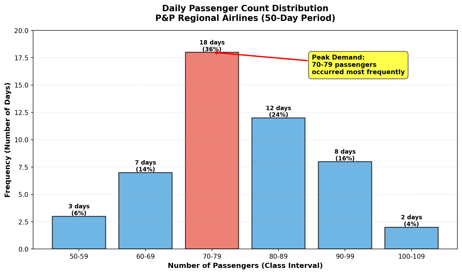
Histogram Interpretation:
- Central tendency: The distribution peaks at 70–79 passengers
- Symmetry: Moderate right skew (tail extends toward higher values)
- Range: All observations fall between 50–109 passengers
- Concentration: 68% of days fall in the 70–89 range
3.4.2 B. Bar Charts
Bar charts display categorical data using separated bars, where: - Categories appear on one axis
- Quantities or percentages appear on the other axis
- Gaps between bars emphasize that categories are discrete (not continuous ranges)
Bar charts are ideal for comparing discrete categories, such as costs versus revenues, regional sales, or product performance.
Code
import matplotlib.pyplot as plt
import numpy as np

# Financial data for P&P Airlines
quarters = ['Q1 2023', 'Q2 2023', 'Q3 2023', 'Q4 2023']
revenue = [2.8, 3.5, 4.2, 3.9]  # millions of dollars
costs = [2.3, 2.7, 3.1, 3.0]    # millions of dollars

x = np.arange(len(quarters))
width = 0.35

fig, ax = plt.subplots(figsize=(10, 6))

# Create bars
bars1 = ax.bar(x - width/2, revenue, width, label='Revenue',
              color='#2ecc71', alpha=0.8, edgecolor='black')
bars2 = ax.bar(x + width/2, costs, width, label='Costs',
              color='#e74c3c', alpha=0.8, edgecolor='black')

# Add value labels
for bars in [bars1, bars2]:
    for bar in bars:
        height = bar.get_height()
        ax.text(bar.get_x() + bar.get_width()/2., height,
               f'${height:.1f}M',
               ha='center', va='bottom', fontweight='bold')

# Formatting
ax.set_title('Quarterly Financial Performance Comparison\nP&P Regional Airlines (2023)',
            fontsize=13, fontweight='bold', pad=15)
ax.set_xlabel('Quarter', fontsize=11, fontweight='bold')
ax.set_ylabel('Amount (Millions USD)', fontsize=11, fontweight='bold')
ax.set_xticks(x)
ax.set_xticklabels(quarters)
ax.legend(loc='upper left', fontsize=10)
ax.grid(True, alpha=0.3, axis='y', linestyle='--')
ax.set_ylim(0, 5)

plt.tight_layout()
plt.show()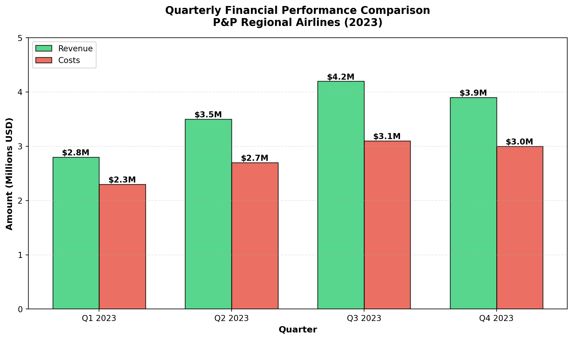
3.4.3 C. Pie Charts
Pie charts display the proportional composition of a whole, where: - The entire circle represents 100% of the total
- Each slice represents a category’s percentage
- Slice angles are proportional to category frequencies
Pie charts are most effective when: - Showing parts of a whole (percentages that sum to 100%)
- Comparing 3–7 categories (too many slices become difficult to interpret)
- Emphasizing one or two dominant categories
Code
import matplotlib.pyplot as plt

# Age distribution data
age_groups = ['Under 25', '25-40', '40-65', '65 and older']
counts = [4, 20, 22, 4]
percentages = [c/50*100 for c in counts]
colors = ['#3498db', '#2ecc71', '#e74c3c', '#f39c12']
explode = (0, 0, 0.1, 0)  # Explode the largest segment

fig, ax = plt.subplots(figsize=(10, 7))

wedges, texts, autotexts = ax.pie(percentages, explode=explode, labels=age_groups,
                                   colors=colors, autopct='%1.1f%%',
                                   shadow=True, startangle=90,
                                   textprops={'fontsize': 11, 'fontweight': 'bold'})

# Enhance autotext (percentage labels)
for autotext in autotexts:
    autotext.set_color('white')
    autotext.set_fontsize(12)
    autotext.set_fontweight('bold')

ax.set_title('Passenger Age Distribution\nP&P Regional Airlines (n=50)',
            fontsize=13, fontweight='bold', pad=20)

# Add legend with counts
legend_labels = [f'{group}: {count} passengers ({pct:.1f}%)'
                for group, count, pct in zip(age_groups, counts, percentages)]
ax.legend(legend_labels, loc='center left', bbox_to_anchor=(1, 0, 0.5, 1),
         fontsize=10)

plt.tight_layout()
plt.show()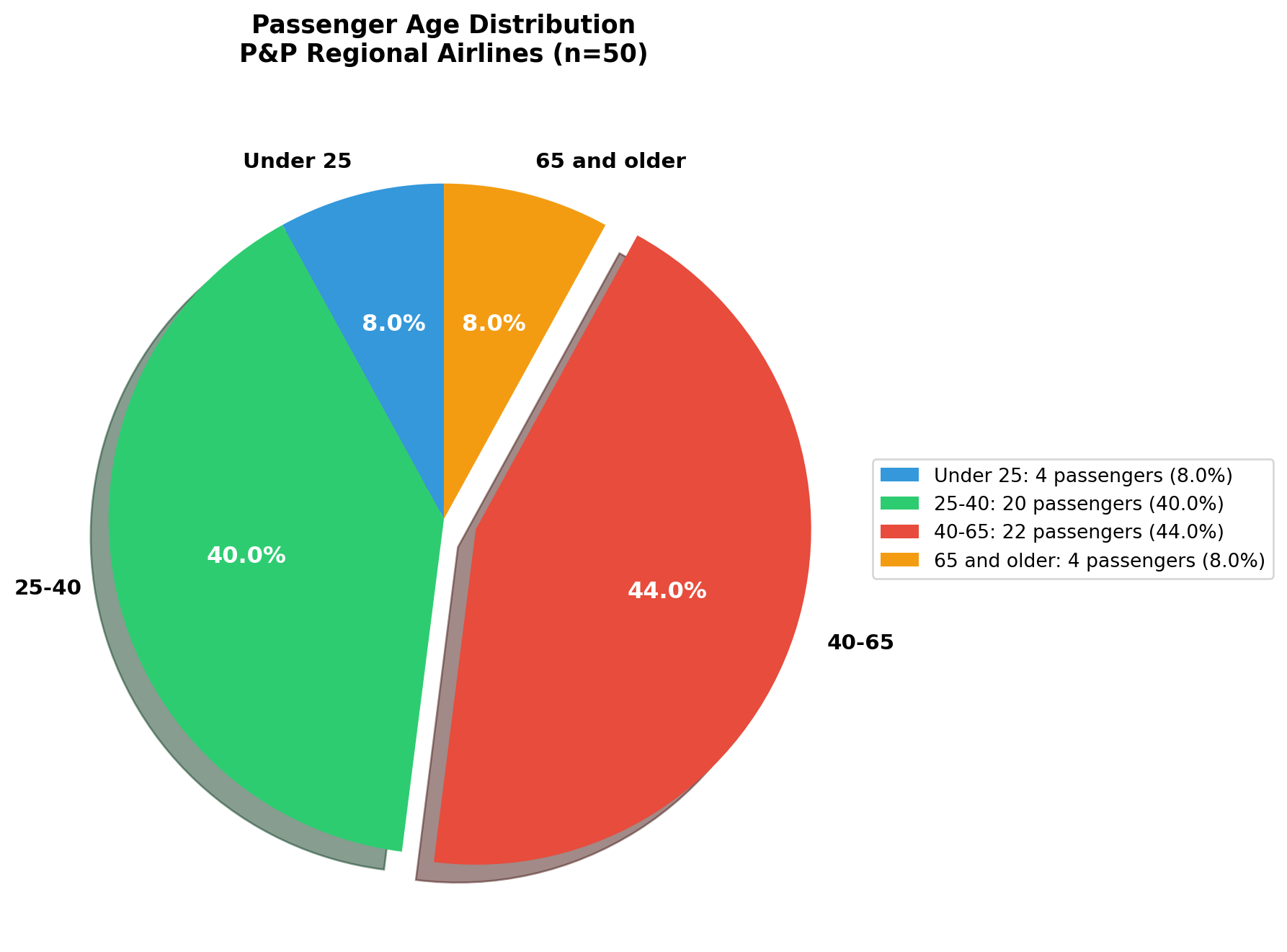
WarningPie Chart Best Practices
When to use pie charts: ✓ Displaying parts of a whole
✓ Emphasizing dominant categories
✓ Showing simple proportional relationships
When NOT to use pie charts: ✗ Comparing many categories (>7)
✗ Showing trends over time
✗ Comparing multiple datasets simultaneously
For comparisons across categories or time, prefer bar charts or line charts.
3.4.4 D. High-Low-Close Charts
High-Low-Close charts are specialized financial graphics that display three values simultaneously: - High: Maximum value during the period
- Low: Minimum value during the period
- Close: Final value at period end
These charts are ubiquitous in financial reporting for stocks, indices, commodities, and currencies.
Visual Elements: - Vertical line: Connects high (top) to low (bottom)
- Horizontal tick: Marks the closing value
Code
import matplotlib.pyplot as plt
import numpy as np

# Dow Jones data (from source material)
dates = ['June 9', 'June 10', 'June 11', 'June 12', 'June 13']
highs = [181.07, 180.65, 180.24, 182.79, 182.14]
lows = [178.17, 178.28, 178.17, 179.82, 179.53]
closes = [178.88, 179.11, 179.35, 181.37, 181.31]

fig, ax = plt.subplots(figsize=(12, 6))

x_pos = np.arange(len(dates))

# Draw vertical lines (high to low)
for i, (h, l) in enumerate(zip(highs, lows)):
    ax.plot([i, i], [l, h], color='black', linewidth=2, solid_capstyle='round')

# Draw closing ticks
for i, c in enumerate(closes):
    ax.plot([i - 0.15, i + 0.15], [c, c], color='red', linewidth=3)

# Add value annotations
for i, (h, l, c) in enumerate(zip(highs, lows, closes)):
    ax.text(i + 0.25, h, f'{h:.2f}', fontsize=9, color='green', fontweight='bold')
    ax.text(i + 0.25, l, f'{l:.2f}', fontsize=9, color='darkred', fontweight='bold')
    ax.text(i + 0.25, c, f'{c:.2f}', fontsize=9, color='blue', fontweight='bold',
           bbox=dict(boxstyle='round,pad=0.3', facecolor='yellow', alpha=0.5))

# Formatting
ax.set_title('Dow Jones Industrial Average (15 Stocks)\nHigh-Low-Close Chart: June 9-13, 1997',
            fontsize=13, fontweight='bold', pad=15)
ax.set_xlabel('Date', fontsize=11, fontweight='bold')
ax.set_ylabel('Index Value', fontsize=11, fontweight='bold')
ax.set_xticks(x_pos)
ax.set_xticklabels(dates)
ax.grid(True, alpha=0.3, linestyle='--')
ax.set_ylim(177, 184)

# Add legend
from matplotlib.lines import Line2D
legend_elements = [
    Line2D([0], [0], color='black', lw=2, label='High-Low Range'),
    Line2D([0], [0], color='red', lw=3, label='Closing Value')
]
ax.legend(handles=legend_elements, loc='upper left', fontsize=10)

plt.tight_layout()
plt.show()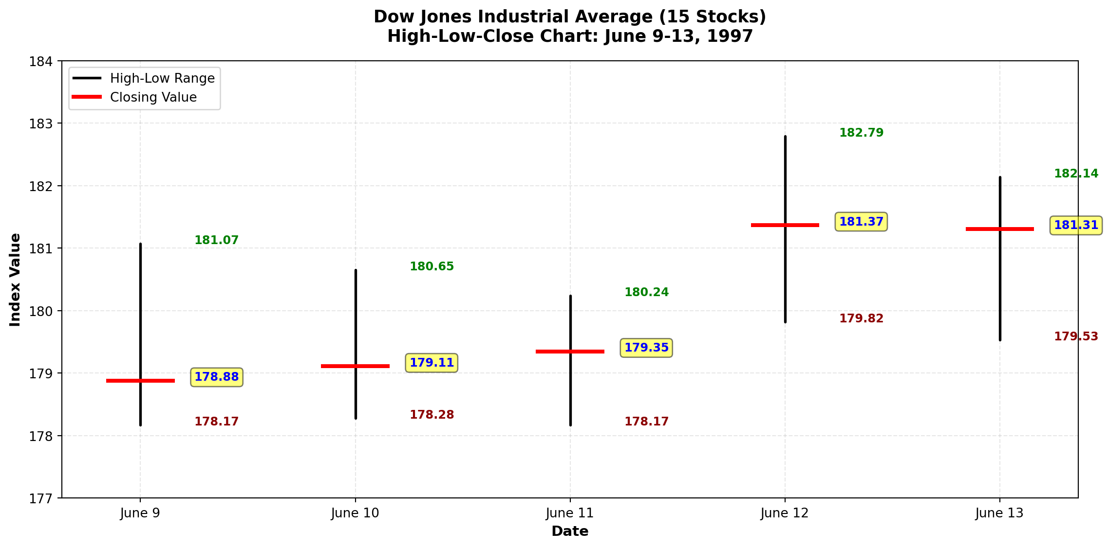
Financial Interpretation:
- Volatility: Daily trading ranges varied from 2.90 (June 9) to 2.97 (June 12) index points
- Trend: Upward trend visible—closing values increased from 178.88 to 181.31
- Momentum: June 12 showed strongest upward movement (close near the high)
3.4.5 E. Stem-and-Leaf Plots
The stem-and-leaf plot, developed by renowned statistician John Tukey, provides a quick visual impression of data distribution while retaining the actual data values.
NoteStructure of Stem-and-Leaf Plots
Each observation is split into two parts:
- Stem: Leading digit(s) shown on the left of a vertical line
- Leaf: Trailing digit(s) shown on the right
Example: The value 74 splits as: - Stem = 7
- Leaf = 4
Values are arranged in ordered series for easy pattern detection.
3.4.6 Example: P&P Airlines Passenger Stem-and-Leaf Display
Stem | Leaf
-----|------------------
  5  | 0 7 9
  6  | 0 1 2 3 4 4 7
  7  | 0 1 1 2 2 3 4 4 5 6 7 7 8 8 9 9 9
  7  | (leaf unit = 1.0)
  8  | 0 0 1 2 3 3 3 4 4 4
  8  | 5 6
  9  | 0 1 2 3 3 4
  9  | 5 7
 10  | 1 2
Interpretation:
- Shape: Distribution is roughly bell-shaped with peak in the 70s
- Median location: Falls in the stem containing 70–79 range
- Actual values preserved: Unlike histograms, we can see that three observations in the 50s were exactly 50, 57, and 59
- Outliers easily spotted: The two values in the 100s (101, 102) stand out
TipAdvantages of Stem-and-Leaf Plots
- Data retention: Unlike histograms, original values are preserved
- Quick construction: Can be drawn by hand without software
- Distribution shape: Visual pattern similar to a histogram
- Outlier detection: Unusual values immediately visible
- Median location: Easily identified from the plot structure
Best for: Small to moderate datasets (n < 200) where preserving actual values adds analytical value.
WarningModern Context: Where Stem-and-Leaf Plots Fit in 2025
Honest assessment: Stem-and-leaf plots are primarily a teaching tool rather than a modern analytics technique.
3.4.7 Where You’ll Still See Them:
1. Statistics Education - Intro statistics courses as a conceptual bridge between raw data and visualization
- Demonstrates distribution shape before students learn complex methods
- AP Statistics exams and standardized testing
- Academic homework assignments
2. Niche Situations - Pen-and-paper-only environments (rare but possible)
- Certain regulatory/compliance documentation requiring specific formats
- Old-school statisticians preferring traditional methods
- Quick manual sketches before creating formal visualizations
3.4.8 What Modern Analysts Actually Use:
Better alternatives for the same insights: - Histograms - Same distributional shape, handles larger datasets
- Box plots - Clearer outlier identification and quartile visualization
- Violin plots - Distribution shape + kernel density estimation
- Interactive dashboards - Power BI, Tableau with dynamic filtering
- Python/R visualizations - Seaborn, ggplot2 with publication-quality output
- AI-generated charts - Natural language descriptions → instant visualizations
3.4.9 Bottom Line:
If you encounter stem-and-leaf plots outside academia in 2025, it’s likely:
- Legacy documentation or traditional academic publishing
- Educational/certification requirements
- Someone being deliberately old-fashioned
- This textbook (teaching the concept for completeness)
Our approach: We teach stem-and-leaf plots because they elegantly illustrate fundamental concepts of data distribution—but in practice, you’ll use modern computational tools that provide richer, more scalable visualizations.
Code
import matplotlib.pyplot as plt
import numpy as np

# Simulated P&P Airlines passenger data
np.random.seed(42)
data = np.concatenate([
    [50, 57, 59],
    np.random.randint(60, 70, 7),
    np.random.randint(70, 80, 18),
    np.random.randint(80, 90, 12),
    np.random.randint(90, 100, 8),
    [101, 102]
])
data = np.sort(data)

fig, axes = plt.subplots(1, 2, figsize=(14, 6))

# Panel 1: Traditional histogram (data values lost)
axes[0].hist(data, bins=[50, 60, 70, 80, 90, 100, 110],
            color='steelblue', alpha=0.7, edgecolor='black')
axes[0].set_title('Traditional Histogram\n(Original values lost)',
                 fontsize=12, fontweight='bold')
axes[0].set_xlabel('Passenger Count Range')
axes[0].set_ylabel('Frequency')
axes[0].grid(True, alpha=0.3, axis='y')

# Panel 2: Visual representation of stem-and-leaf concept
stems = [5, 6, 7, 8, 9, 10]
stem_counts = [3, 7, 18, 12, 8, 2]

# Create horizontal "stem-and-leaf" style bars
colors = plt.cm.viridis(np.linspace(0.2, 0.8, len(stems)))
bars = axes[1].barh(stems, stem_counts, height=0.6, color=colors,
                   alpha=0.7, edgecolor='black')

# Add "leaf" representations (dots showing individual values)
y_offset = 0
for stem, count, bar in zip(stems, stem_counts, bars):
    # Add dots representing individual leaves
    x_positions = np.linspace(0.5, count - 0.5, min(count, 10))
    y_positions = [stem] * len(x_positions)
    axes[1].scatter(x_positions, y_positions, s=50, color='white',
                   edgecolors='black', linewidths=2, zorder=3)

    # Add count labels
    axes[1].text(count + 0.5, stem, f'{count}',
                va='center', fontweight='bold', fontsize=11)

axes[1].set_title('Stem-and-Leaf Concept\n(Original values retained as "leaves")',
                 fontsize=12, fontweight='bold')
axes[1].set_xlabel('Leaf Count (Frequency)')
axes[1].set_ylabel('Stem (Tens Digit)')
axes[1].set_yticks(stems)
axes[1].set_yticklabels([f'{s}0s' for s in stems])
axes[1].grid(True, alpha=0.3, axis='x')
axes[1].set_xlim(0, 20)

plt.tight_layout()
plt.show()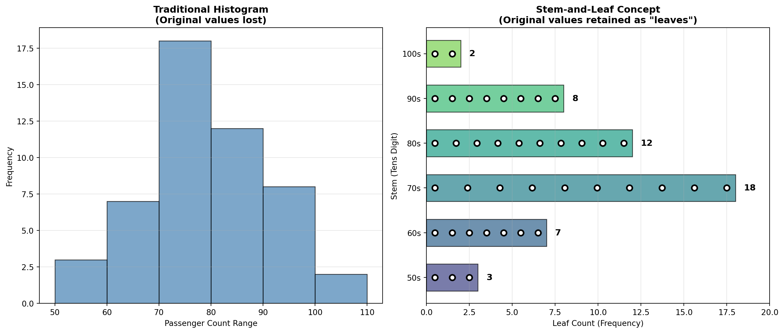
3.5 2.4 Computer-Generated Frequency Tables
Modern statistical software packages (Excel, Python, R, Python, SPSS) can generate frequency distributions automatically, saving time and reducing errors in manual calculations.
Example: Excel Frequency Table for P&P Airlines
| BIN | FREQUENCY | CUMULATIVE % |
|---|---|---|
| 59 | 3 | 6.00% |
| 69 | 7 | 20.00% |
| 79 | 18 | 56.00% |
| 89 | 12 | 80.00% |
| 99 | 8 | 96.00% |
| 109 | 2 | 100.00% |
TipSoftware Advantages
Benefits of computer-generated frequency tables:
- Speed: Instant calculations for large datasets
- Accuracy: Eliminates manual counting errors
- Flexibility: Easy to adjust class intervals and regenerate
- Integration: Automatically creates corresponding visualizations
- Reproducibility: Analysis can be repeated with updated data
Common platforms: Excel (Histogram tool), Python, R (hist function), Python (pandas, matplotlib), SPSS, SAS
3.6 2.5 Chapter Summary
This chapter introduced fundamental techniques for organizing and presenting data through frequency distributions and graphical displays.
3.6.1 Key Concepts Covered:
- Frequency Distributions
- Simple frequency tables organize data into classes
- The 2^k rule determines appropriate number of classes
- Class interval formula: IC = \frac{\text{Largest} - \text{Smallest}}{\text{Number of classes}}
- Frequency tables reveal patterns invisible in raw data
- Simple frequency tables organize data into classes
- Cumulative Frequency Distributions
- “Less than” cumulative frequencies show totals below each boundary
- “More than” cumulative frequencies show totals above each boundary
- Essential for percentile calculations and probability assessments
- “Less than” cumulative frequencies show totals below each boundary
- Relative Frequency Distributions
- Express class frequencies as percentages of the total
- Enable direct comparison between datasets of different sizes
- Formula: \text{Relative Frequency} = \frac{\text{Class Frequency}}{n} \times 100\%
- Express class frequencies as percentages of the total
- Contingency Tables
- Cross-tabulate two or more variables simultaneously
- Reveal relationships between categorical variables
- Support strategic business decisions through demographic profiling
- Cross-tabulate two or more variables simultaneously
- Graphical Representations
- Histograms: Display frequency distributions visually
- Bar charts: Compare discrete categories with separated bars
- Pie charts: Show proportional composition of a whole
- High-Low-Close charts: Display financial data ranges
- Stem-and-leaf plots: Combine visual distribution with data retention
- Histograms: Display frequency distributions visually
3.6.2 Business Applications:
Throughout the chapter, we demonstrated how P&P Regional Airlines transformed raw passenger data into actionable intelligence:
- Identified peak demand periods for scheduling optimization
- Profiled customer demographics for targeted marketing
- Assessed capacity requirements through distribution analysis
- Visualized financial performance for stakeholder communication
ImportantThe Fundamental Principle
Raw data has little value until it is organized, summarized, and presented in forms that reveal patterns and support decision-making.
The techniques in this chapter form the foundation of descriptive statistics—the essential first step in any data analysis project. Mastery of these tools enables business professionals to extract meaning from numbers and communicate findings effectively.
3.7 Glossary of Key Terms
| Term | Definition |
|---|---|
| Bar Chart | Graphical display using separated bars to compare discrete categories |
| Class Interval | The width or range of each class in a frequency distribution |
| Class Midpoint | The center value of a class interval, calculated as (Lower limit + Upper limit) / 2 |
| Contingency Table | A cross-tabulation showing the joint frequency distribution of two or more variables |
| Cumulative Frequency | The total number of observations at or below (or above) a specified class boundary |
| Frequency Distribution | A table organizing data into classes and showing the number of observations in each class |
| Histogram | A graphical representation of a frequency distribution with touching bars |
| High-Low-Close Chart | Financial graphic displaying maximum, minimum, and closing values |
| Pie Chart | Circular graph showing proportional composition where slices represent percentages |
| Relative Frequency | The frequency of a class expressed as a percentage of the total observations |
| Stem-and-Leaf Plot | A display that organizes data while retaining original values |
| 2^k Rule | Method for determining number of classes: select smallest k where 2^k \geq n |
3.8 Key Formulas
NoteEssential Formulas for Data Set Description
1. Number of Classes (2^k Rule): \text{Select smallest } k \text{ such that } 2^k \geq n
2. Class Interval: IC = \frac{\text{Largest value} - \text{Smallest value}}{\text{Desired number of classes}}
3. Class Midpoint: M = \frac{\text{Lower class limit} + \text{Upper class limit}}{2}
4. Relative Frequency: \text{Relative Frequency} = \frac{\text{Class Frequency}}{n} \times 100\%
where n = total number of observations
3.9 Looking Ahead
In Chapter 3, we build upon these descriptive techniques by introducing measures of central tendency (mean, median, mode) and measures of dispersion (range, variance, standard deviation). These numerical summaries complement the visual and tabular tools covered in this chapter, providing precise quantitative descriptions of data distributions.
The P&P Airlines case study continues, demonstrating how statistical measures enhance the insights gained from frequency distributions and graphics.