graph TD
    A[Multiple Regression<br/>and Correlation] --> B[The Multiple<br/>Regression Model]
    A --> C[Multicollinearity]
    A --> D[Dummy Variables]
    A --> E[Curvilinear Models]

    B --> B1[Standard Error<br/>of Estimation]
    B --> B2[Coefficient of<br/>Determination]
    B --> B3[Adjusted Coefficient<br/>of Determination]

    C --> C1[Problems]
    C --> C2[Detection]
    C --> C3[Treatments]

    E --> E1[Polynomial<br/>Models]
    E --> E2[Logarithmic<br/>Models]

    style A fill:#e1f5ff
    style B fill:#fff4e1
    style C fill:#ffe1e1
    style D fill:#e1ffe1
    style E fill:#f0e1ff
13 Chapter 12: Multiple Regression and Correlation
13.1 Opening Scenario: Griffen Associates’ Competitive Analysis
As you prepare for your graduation later this year, you’ve taken on an internship position with Griffen Associates, a prominent investment firm in Chicago. As a measure of your financial acumen, the company has entrusted you with the task of analyzing the market performance of mutual funds that compete with Griffen’s offerings. Data has been collected for the three-year return (R3A) and one-year return (R1A) for 15 competing funds.
Mr. Griffen has requested a comprehensive report on the performance of these competitors, based on various factors including their rates of return, total assets, and whether each fund carries a sales load charge.
There is particular interest at Griffen Associates in determining whether there has been any significant change over the past three years in the performance of these funds. Griffen is considering major changes to many of its operational procedures, and several managers who have been with the firm for years are concerned about the outcomes of such changes. By analyzing the behavior of competing firms over time, these managers hope to gain insights into the future direction of Griffen Associates.
This project will require you to configure and analyze a multiple regression model that can provide the necessary information to inform the critical operational procedures that Griffen Associates is considering implementing.
13.2 Learning Objectives
After completing this chapter, you will be able to:
- Understand multiple regression models and how they extend simple linear regression to include two or more independent variables
- Interpret partial regression coefficients and their meaning in the context of holding other variables constant
- Calculate and interpret the standard error of estimation for multiple regression models
- Evaluate model quality using the coefficient of multiple determination (R^2) and adjusted R^2
- Conduct ANOVA tests to assess overall model significance
- Perform hypothesis tests for individual regression coefficients
- Detect and address multicollinearity problems in multiple regression
- Apply dummy variables to incorporate qualitative factors into regression models
- Understand curvilinear models including polynomial and logarithmic transformations
- Make informed business decisions using multiple regression analysis results
13.3 Chapter Structure
13.4 12.1 Introduction to Multiple Regression
In Chapter 11, we examined how a single explanatory variable could be used to predict the value of a dependent variable. Consider how much more powerful the model could become if we used more explanatory variables. This is precisely what the multiple regression model accomplishes—it allows us to incorporate two or more independent variables into our analysis.
13.4.1 Why Multiple Regression?
In the real world of business, outcomes are rarely determined by a single factor. Consider these examples:
- Sales revenue might depend on advertising expenditure, number of salespeople, price levels, and economic conditions
- Housing prices are influenced by square footage, number of bedrooms, location, age of the home, and neighborhood quality
- Student performance may be affected by study hours, class attendance, previous academic achievement, and socioeconomic factors
- Employee productivity could be related to training hours, experience, compensation, and work environment
Simple regression, while useful, provides an incomplete picture when multiple factors influence the dependent variable. Multiple regression allows us to:
- Increase explanatory power: By including relevant variables, we can explain more of the variation in Y
- Control for confounding factors: We can isolate the effect of one variable while holding others constant
- Make better predictions: More information typically leads to more accurate forecasts
- Test complex hypotheses: We can examine how multiple factors work together
13.4.2 The General Multiple Regression Model
NoteThe Multiple Regression Model
The population multiple regression model with k independent variables is expressed as:
Y = \beta_0 + \beta_1X_1 + \beta_2X_2 + \cdots + \beta_kX_k + \varepsilon
Where:
- Y = Dependent variable (the outcome we want to predict) - X_1, X_2, \ldots, X_k = Independent variables (predictors or explanatory variables) - \beta_0 = Population intercept (value of Y when all X_i = 0) - \beta_1, \beta_2, \ldots, \beta_k = Population regression coefficients - \varepsilon = Random error term (captures unexplained variation) - k = Number of independent variables
Using sample data, we estimate this model as:
ImportantThe Estimated Multiple Regression Model
\hat{Y} = b_0 + b_1X_1 + b_2X_2 + \cdots + b_kX_k
Where:
- \hat{Y} = Predicted value of the dependent variable - b_0 = Sample estimate of the intercept - b_1, b_2, \ldots, b_k = Sample estimates of the regression coefficients (called partial or net regression coefficients)
13.4.3 Understanding Partial Regression Coefficients
The key concept in multiple regression is the interpretation of the partial regression coefficients. Each coefficient b_i represents:
The change in Y associated with a one-unit change in X_i, holding all other independent variables constant.
This “holding constant” or “ceteris paribus” condition is what distinguishes multiple regression from simple regression. Let’s illustrate with an example.
Example 12.1: Interpreting Partial Coefficients
Suppose a real estate model produces:
\text{Price} = 50,000 + 75 \times \text{SquareFeet} + 15,000 \times \text{Bedrooms}
Interpretation:
- Intercept (b_0 = 50,000): The base price when both square feet and bedrooms equal zero (often not meaningful in practical terms, but mathematically necessary)
- Square Feet Coefficient (b_1 = 75): For each additional square foot, the house price increases by $75, assuming the number of bedrooms remains unchanged
- Bedrooms Coefficient (b_2 = 15,000): For each additional bedroom, the house price increases by $15,000, assuming the square footage remains unchanged
This interpretation is crucial. The coefficient for square feet ($75) is not the same as it would be in a simple regression with only square feet—it has been adjusted to account for the presence of bedrooms in the model.
13.5 12.2 Assumptions of Multiple Regression
Multiple regression inherits all the assumptions from simple linear regression, plus two additional requirements critical for valid inference.
13.5.1 Standard Assumptions (from Simple Regression)
- Linearity: The relationship between Y and each X_i is linear
- Independence: Observations are independent of each other
- Homoscedasticity: The variance of errors is constant across all levels of the independent variables
- Normality: The errors (\varepsilon) are normally distributed with mean zero
13.5.2 Additional Assumptions for Multiple Regression
Assumption 5: Sufficient Sample Size
WarningSample Size Requirement
The number of observations n must exceed the number of independent variables k by at least 2:
n \geq k + 2
Why? In multiple regression, we estimate k + 1 parameters (the k coefficients plus the intercept b_0). The degrees of freedom are:
\text{df} = n - (k + 1) = n - k - 1
To retain at least one degree of freedom: n - k - 1 \geq 1, which means n \geq k + 2.
Practical Guidelines: - Minimum: n \geq k + 2 (absolute minimum) - Adequate: n \geq 5(k + 1) (at least 5 observations per parameter) - Preferred: n \geq 10(k + 1) (at least 10 observations per parameter) - Ideal: n \geq 20(k + 1) (at least 20 observations per parameter)
Assumption 6: No Perfect Multicollinearity
ImportantMulticollinearity
Multicollinearity exists when two or more independent variables are linearly related to each other.
Perfect multicollinearity examples: - X_1 = X_2 + X_3 (one variable is an exact linear combination of others) - X_1 = 0.5X_2 (one variable is a constant multiple of another) - X_3 = 100 for all observations (a variable has no variation)
Why is this a problem?
When independent variables are highly correlated with each other, the regression cannot uniquely determine each variable’s individual contribution to explaining Y. This can cause:
- Sign reversals: Coefficients may have the opposite sign from what logic dictates
- Large standard errors: Coefficients become statistically insignificant even when the model as a whole is significant
- Unstable estimates: Small changes in data can produce large changes in coefficients
- Difficulty interpreting results: The “holding other variables constant” interpretation breaks down
Example 12.2: Multicollinearity Problem
Imagine trying to predict salary (Y) using: - X_1 = Years of experience - X_2 = Age
These variables are highly correlated (older workers generally have more experience). If we include both: - The model might show a negative coefficient for experience (illogical!) - Standard errors will be inflated - Neither variable might appear significant, even though together they are
Solution: Include only one of the correlated variables, or combine them in some meaningful way.
We will explore multicollinearity detection and remedies in detail later in this chapter (Section 12.6).
13.6 12.3 The Regression Plane and Hyperplane
13.6.1 Two Independent Variables: The Regression Plane
When we have exactly two independent variables, we can visualize the regression model as a plane in three-dimensional space:
\hat{Y} = b_0 + b_1X_1 + b_2X_2
Code
import numpy as np
import matplotlib.pyplot as plt
from mpl_toolkits.mplot3d import Axes3D
from matplotlib import cm

# Set style
plt.style.use('seaborn-v0_8-darkgrid')
np.random.seed(42)

# Create figure with 3D subplot
fig = plt.figure(figsize=(14, 6))

# First subplot: Regression plane with scattered points
ax1 = fig.add_subplot(121, projection='3d')

# Generate sample data for the plane
n_points = 50
X1 = np.random.uniform(0, 10, n_points)
X2 = np.random.uniform(0, 10, n_points)

# True model: Y = 5 + 2*X1 + 3*X2 + error
Y = 5 + 2*X1 + 3*X2 + np.random.normal(0, 2, n_points)

# Create mesh for the regression plane
X1_mesh = np.linspace(0, 10, 30)
X2_mesh = np.linspace(0, 10, 30)
X1_grid, X2_grid = np.meshgrid(X1_mesh, X2_mesh)
Y_grid = 5 + 2*X1_grid + 3*X2_grid

# Plot the regression plane
surf = ax1.plot_surface(X1_grid, X2_grid, Y_grid, alpha=0.5,
                        cmap=cm.coolwarm, edgecolor='none')

# Plot the scattered data points
scatter = ax1.scatter(X1, X2, Y, c='darkblue', marker='o', s=50,
                     alpha=0.7, edgecolors='black', linewidth=0.5)

# Draw vertical lines from points to plane (residuals)
for i in range(0, n_points, 3):  # Show every 3rd residual to avoid clutter
    Y_pred_i = 5 + 2*X1[i] + 3*X2[i]
    ax1.plot([X1[i], X1[i]], [X2[i], X2[i]], [Y[i], Y_pred_i],
            'r--', alpha=0.3, linewidth=1)

ax1.set_xlabel('X₁ (First Independent Variable)', fontsize=11, labelpad=10)
ax1.set_ylabel('X₂ (Second Independent Variable)', fontsize=11, labelpad=10)
ax1.set_zlabel('Y (Dependent Variable)', fontsize=11, labelpad=10)
ax1.set_title('Regression Plane: Ŷ = 5 + 2X₁ + 3X₂', fontsize=13, fontweight='bold', pad=15)
ax1.view_init(elev=20, azim=45)

# Add colorbar
cbar = fig.colorbar(surf, ax=ax1, shrink=0.5, aspect=5)
cbar.set_label('Predicted Y', fontsize=10)

# Second subplot: Contour view (bird's eye view)
ax2 = fig.add_subplot(122)

# Create contour plot
contour = ax2.contourf(X1_grid, X2_grid, Y_grid, levels=20, cmap=cm.coolwarm, alpha=0.7)
contour_lines = ax2.contour(X1_grid, X2_grid, Y_grid, levels=10, colors='black',
                            linewidths=0.5, alpha=0.4)
ax2.clabel(contour_lines, inline=True, fontsize=8, fmt='%.0f')

# Plot data points on contour
ax2.scatter(X1, X2, c='darkblue', marker='o', s=50, alpha=0.7,
           edgecolors='black', linewidth=0.5, zorder=5)

ax2.set_xlabel('X₁ (First Independent Variable)', fontsize=11)
ax2.set_ylabel('X₂ (Second Independent Variable)', fontsize=11)
ax2.set_title('Contour View of Regression Plane\n(Lines show constant Y values)',
             fontsize=13, fontweight='bold')
ax2.grid(True, alpha=0.3)

# Add colorbar for contour plot
cbar2 = fig.colorbar(contour, ax=ax2)
cbar2.set_label('Predicted Y', fontsize=10)

plt.tight_layout()
plt.show()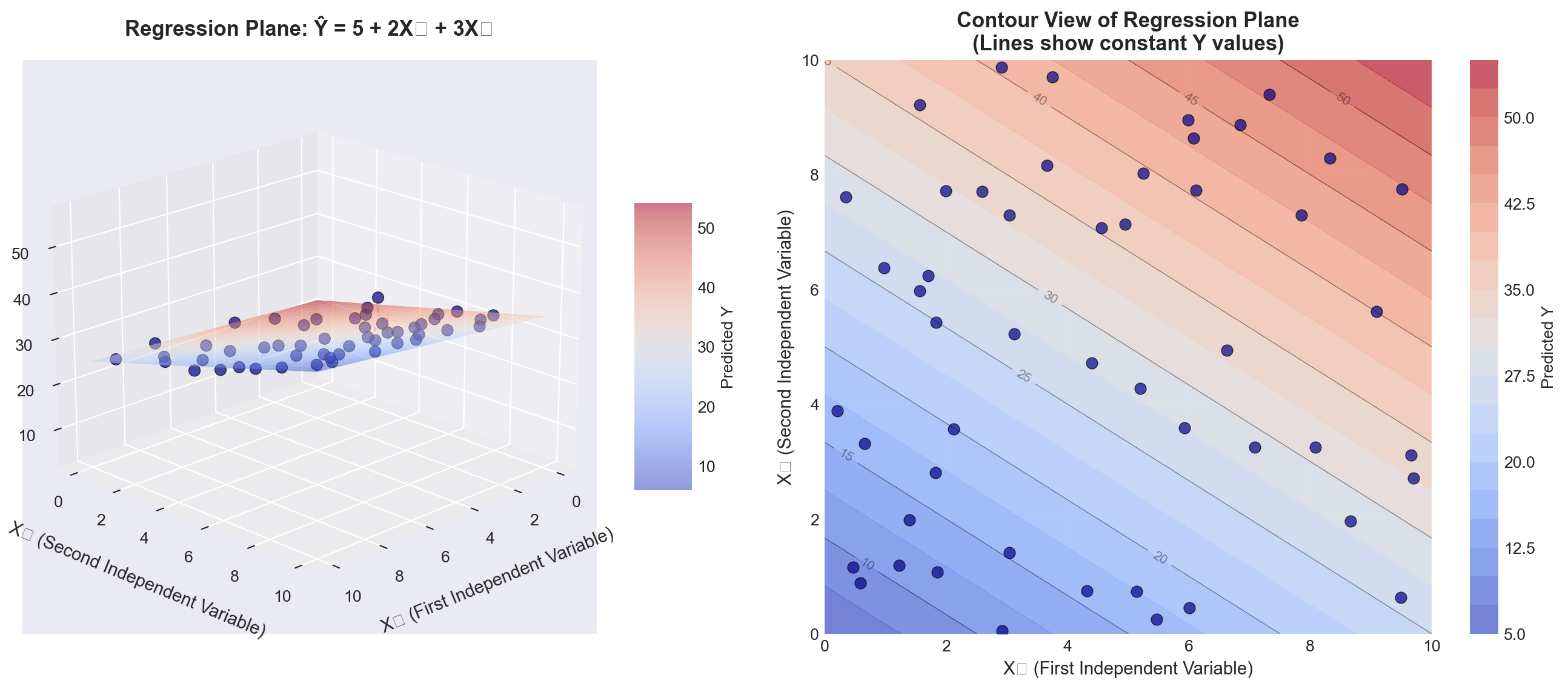
TipInterpreting the Regression Plane
Left panel (3D view): - The blue surface is the regression plane defined by \hat{Y} = b_0 + b_1X_1 + b_2X_2 - The dark blue points are actual observations - The red dashed lines represent residuals (vertical distances from points to the plane) - The plane slopes upward as both X_1 and X_2 increase (positive coefficients)
Right panel (Contour view): - Each curved line represents points on the plane with the same Y value - The spacing between contour lines shows the rate of change - This “bird’s eye view” helps visualize the joint relationship of X_1 and X_2 with Y
Key insight: The regression plane minimizes the sum of squared vertical distances (residuals) from all points to the plane, just as the regression line did in simple regression.
13.6.2 Three or More Variables: The Hyperplane
When we have three or more independent variables (k \geq 3), the model becomes:
\hat{Y} = b_0 + b_1X_1 + b_2X_2 + b_3X_3 + \cdots + b_kX_k
This represents a hyperplane in (k+1)-dimensional space: - One dimension for Y - k dimensions for the independent variables X_1, X_2, \ldots, X_k
Visualization challenge: We cannot directly visualize 4-dimensional space or higher. However: - The mathematical principles remain identical - We can visualize slices of the hyperplane (holding some variables constant) - We can examine pairwise relationships through multiple 2D plots - Statistical software handles the high-dimensional calculations
13.7 12.4 From Simple to Multiple: What Changes?
Let’s compare simple and multiple regression to understand the transition:
| Aspect | Simple Regression | Multiple Regression |
|---|---|---|
| Model form | \hat{Y} = b_0 + b_1X | \hat{Y} = b_0 + b_1X_1 + b_2X_2 + \cdots + b_kX_k |
| Geometric representation | Line in 2D space | Plane (k=2) or hyperplane (k≥3) |
| Coefficient interpretation | Change in Y per unit change in X | Change in Y per unit change in X_i, holding all other X_j constant |
| Degrees of freedom | n - 2 | n - k - 1 |
| Number of parameters | 2 (b_0, b_1) | k + 1 (b_0, b_1, \ldots, b_k) |
| Determination coefficient | r^2 | R^2 |
| Potential problems | Omitted variable bias | Multicollinearity, overfitting |
| Manual calculation | Feasible | Very tedious; computer required |
13.8 Section Exercises
12.1 Given the multiple regression model \hat{Y} = 40 + 3X_1 - 4X_2: a. Interpret each coefficient in the model
b. Estimate Y when X_1 = 5 and X_2 = 10
c. What happens to \hat{Y} if X_1 increases by 2 units while X_2 remains constant?
12.2 A marketing analyst develops a model to predict monthly sales (in thousands):
\text{Sales} = 50 + 1.2 \times \text{Advertising} + 0.8 \times \text{Salespeople} - 2.5 \times \text{Price}
- Interpret the coefficient for Advertising
- Interpret the coefficient for Price (why is it negative?)
- Predict sales when Advertising = $10,000, Salespeople = 5, and Price = $20
12.3 Explain in your own words what “holding other variables constant” means in the context of multiple regression coefficients.
12.4 A student runs a regression with 50 observations and 6 independent variables.
a. How many degrees of freedom does this model have?
b. Is the sample size adequate? Explain using the guidelines provided.
12.5 Consider the following regression equation with t-values in parentheses: \hat{Y} = 100 + 17X_1 + 80X_2 (0.73) \quad (6.21)
- Which variable appears to be statistically significant?
- How might you improve this model?
12.6 For the equation \hat{Y} = 100 - 20X_1 - 40X_2:
a. What is the estimated impact of X_1 on Y?
b. What conditions regarding X_2 must be observed when answering part (a)?
12.7 A demand function is expressed as: \hat{Q} = 10 + 12P + 8I where Q is quantity demanded, P is price, and I is consumer income.
a. Does the sign on the price coefficient make economic sense? Explain
b. What does this suggest about potential problems with this model?
12.8 Explain the difference between:
a. The population regression model and the estimated regression model
b. Simple regression coefficients and partial regression coefficients
c. Perfect multicollinearity and high multicollinearity
12.9 True or False (explain your reasoning):
a. Adding more independent variables always improves a regression model
b. In multiple regression, each coefficient measures the total effect of that variable on Y
c. You can always visualize multiple regression models in three dimensions
d. Multiple regression requires more observations than simple regression
12.10 A researcher wants to predict house prices using: - Square footage - Number of bedrooms
- Age of house - Distance from city center - School district quality (rated 1-10) - Crime rate in neighborhood
- Write out the general form of this multiple regression model
- How many parameters need to be estimated?
- What would be a reasonable minimum sample size for this study?
- Give an example of two variables that might be highly correlated (multicollinearity concern)
Key Terms Introduced: - Multiple regression model - Partial (net) regression coefficients - Regression plane - Hyperplane - Multicollinearity - Degrees of freedom in multiple regression
In Chapter 11, Hop Scotch Airlines used advertising in a simple regression model to explain and predict the number of passengers. That model achieved an impressive standard error of 0.907 and an r^2 of 94%. However, management believes they can improve the model’s explanatory power by incorporating additional relevant variables.
13.8.1 Expanding the Model
Recognizing that income is a primary determinant of demand for air travel, Hop Scotch decides to include national income as a second explanatory variable. The reasoning is sound from both a theoretical and business perspective:
- Higher national income → More disposable income for consumers
- More disposable income → Greater ability to purchase air travel
- Income and advertising may work together → Combined effect on passengers
The multiple regression model for Hop Scotch becomes:
NoteHop Scotch Airlines Multiple Regression Model
\hat{Y} = b_0 + b_1X_1 + b_2X_2
Where:
- \hat{Y} = Projected number of passengers (in thousands) - X_1 = Advertising expenditure (in hundreds of dollars) - X_2 = National income (in trillions of dollars) - b_0 = Intercept (baseline passengers when both variables equal zero) - b_1 = Partial regression coefficient for advertising - b_2 = Partial regression coefficient for national income
13.8.2 The Regression Plane Visualization
With two independent variables, we can visualize the model as a regression plane in three-dimensional space. Figure 13.2 shows this geometric interpretation:
Code
import numpy as np
import pandas as pd
import matplotlib.pyplot as plt
from mpl_toolkits.mplot3d import Axes3D
from matplotlib import cm

# Set style
plt.style.use('seaborn-v0_8-darkgrid')

# Hop Scotch Airlines data from Table 12.1
data = {
    'Month': range(1, 16),
    'Passengers': [15, 17, 13, 23, 16, 21, 14, 20, 24, 17, 16, 18, 23, 15, 16],
    'Advertising': [10, 12, 8, 17, 10, 15, 10, 14, 19, 10, 11, 13, 16, 10, 12],
    'NationalIncome': [2.40, 2.72, 2.08, 3.68, 2.56, 3.36, 2.24, 3.20, 3.84, 2.72, 2.07, 2.33, 2.98, 1.94, 2.17]
}

df = pd.DataFrame(data)

# Regression coefficients (from Python output, Screen 12.1)
b0 = 3.5284
b1 = 0.8397
b2 = 1.4410

# Create figure with two subplots
fig = plt.figure(figsize=(15, 6))

# First subplot: 3D regression plane
ax1 = fig.add_subplot(121, projection='3d')

# Create mesh for regression plane
X1_mesh = np.linspace(df['Advertising'].min() - 1, df['Advertising'].max() + 1, 30)
X2_mesh = np.linspace(df['NationalIncome'].min() - 0.2, df['NationalIncome'].max() + 0.2, 30)
X1_grid, X2_grid = np.meshgrid(X1_mesh, X2_mesh)
Y_grid = b0 + b1*X1_grid + b2*X2_grid

# Plot the regression plane
surf = ax1.plot_surface(X1_grid, X2_grid, Y_grid, alpha=0.4,
                        cmap=cm.coolwarm, edgecolor='none')

# Plot actual data points
scatter = ax1.scatter(df['Advertising'], df['NationalIncome'], df['Passengers'],
                     c='darkblue', marker='o', s=100, alpha=0.8,
                     edgecolors='black', linewidth=1.5, label='Actual Data')

# Draw residuals (vertical lines from points to plane)
for i in range(len(df)):
    Y_pred = b0 + b1*df['Advertising'].iloc[i] + b2*df['NationalIncome'].iloc[i]
    ax1.plot([df['Advertising'].iloc[i], df['Advertising'].iloc[i]],
            [df['NationalIncome'].iloc[i], df['NationalIncome'].iloc[i]],
            [df['Passengers'].iloc[i], Y_pred],
            'r--', alpha=0.4, linewidth=1)

ax1.set_xlabel('Advertising (hundreds of $)', fontsize=11, labelpad=10)
ax1.set_ylabel('National Income (trillions $)', fontsize=11, labelpad=10)
ax1.set_zlabel('Passengers (thousands)', fontsize=11, labelpad=10)
ax1.set_title('Hop Scotch Airlines Regression Plane\nŶ = 3.53 + 0.84X₁ + 1.44X₂',
             fontsize=13, fontweight='bold', pad=15)
ax1.view_init(elev=15, azim=130)
ax1.legend(loc='upper left')

# Add colorbar
cbar1 = fig.colorbar(surf, ax=ax1, shrink=0.5, aspect=5)
cbar1.set_label('Predicted Passengers', fontsize=10)

# Second subplot: Residuals over time
ax2 = fig.add_subplot(122)

# Calculate residuals
df['Predicted'] = b0 + b1*df['Advertising'] + b2*df['NationalIncome']
df['Residual'] = df['Passengers'] - df['Predicted']

# Plot residuals
ax2.axhline(y=0, color='black', linestyle='-', linewidth=1, alpha=0.5)
ax2.bar(df['Month'], df['Residual'], color=['red' if x < 0 else 'green' for x in df['Residual']],
       alpha=0.6, edgecolor='black', linewidth=1)
ax2.scatter(df['Month'], df['Residual'], c='darkblue', s=80, zorder=3,
           edgecolors='black', linewidth=1)

# Add horizontal lines at ±Se
Se = 0.8217  # From Python output
ax2.axhline(y=Se, color='orange', linestyle='--', linewidth=2, alpha=0.7, label=f'+Sₑ = +{Se:.3f}')
ax2.axhline(y=-Se, color='orange', linestyle='--', linewidth=2, alpha=0.7, label=f'-Sₑ = -{Se:.3f}')

ax2.set_xlabel('Month (Observation)', fontsize=11)
ax2.set_ylabel('Residual (Actual - Predicted)', fontsize=11)
ax2.set_title('Residual Plot: Errors from Regression Plane\nMost residuals within ±Sₑ',
             fontsize=13, fontweight='bold')
ax2.grid(True, alpha=0.3)
ax2.legend(loc='best')
ax2.set_xticks(df['Month'])

plt.tight_layout()
plt.show()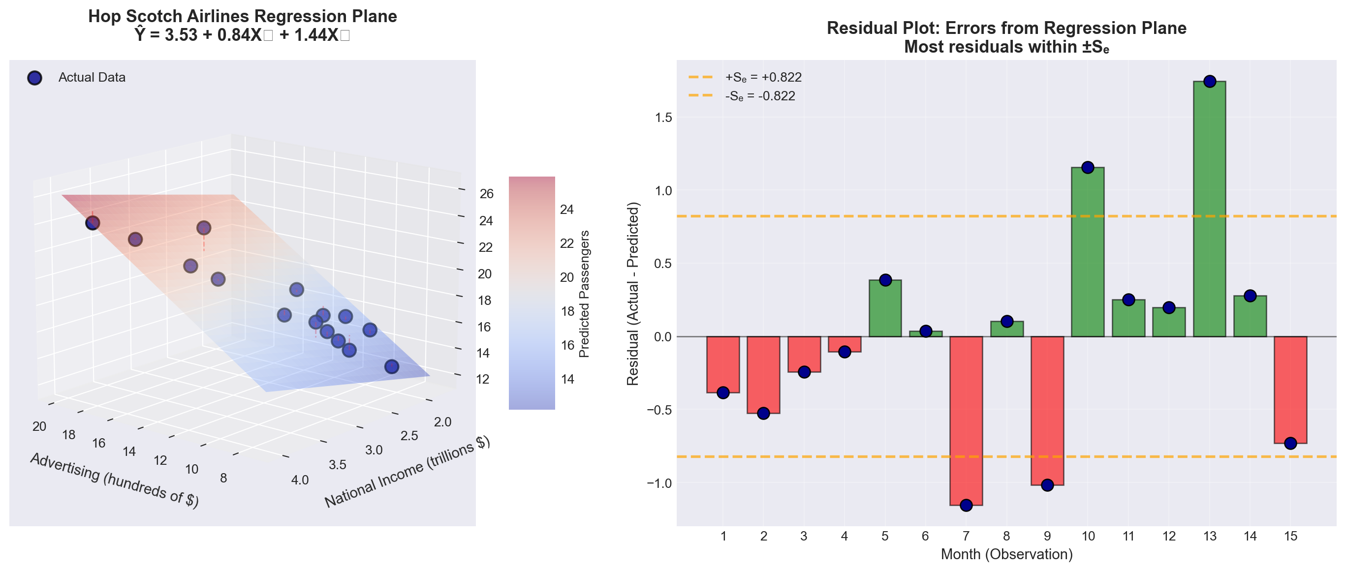
TipUnderstanding the Regression Plane
Left panel (3D visualization): - The colored surface is the regression plane: \hat{Y} = 3.53 + 0.84X_1 + 1.44X_2 - Blue points represent actual monthly passenger data - Red dashed lines show residuals (prediction errors) - The plane slopes upward in both directions (both coefficients are positive)
Right panel (Residual analysis): - Green bars = Months where model overestimated passengers - Red bars = Months where model underestimated passengers - Orange dashed lines = One standard error (\pm S_e) - Most residuals fall within \pm S_e, indicating good fit
Key insight: The regression plane represents the “best fit” surface that minimizes the sum of squared residuals \sum(Y_i - \hat{Y}_i)^2.
13.8.3 The Data: Hop Scotch Airlines Example
Table 13.1 shows the complete dataset for our analysis:
Code
import pandas as pd

# Create the data
data = {
    'Observation\n(Month)': range(1, 16),
    'Passengers (Y)\n(thousands)': [15, 17, 13, 23, 16, 21, 14, 20, 24, 17, 16, 18, 23, 15, 16],
    'Advertising (X₁)\n($100s)': [10, 12, 8, 17, 10, 15, 10, 14, 19, 10, 11, 13, 16, 10, 12],
    'National Income (X₂)\n($ trillions)': [2.40, 2.72, 2.08, 3.68, 2.56, 3.36, 2.24, 3.20, 3.84, 2.72, 2.07, 2.33, 2.98, 1.94, 2.17]
}

df = pd.DataFrame(data)

# Style the table
styled_df = df.style.set_properties(**{
    'text-align': 'center',
    'border': '1px solid black'
}).set_table_styles([
    {'selector': 'th', 'props': [('background-color', '#e1f5ff'),
                                  ('color', 'black'),
                                  ('font-weight', 'bold'),
                                  ('text-align', 'center'),
                                  ('border', '1px solid black')]},
    {'selector': 'td', 'props': [('border', '1px solid black')]}
]).hide(axis='index')

styled_df| Observation (Month) | Passengers (Y) (thousands) | Advertising (X₁) ($100s) | National Income (X₂) ($ trillions) |
|---|---|---|---|
| 1 | 15 | 10 | 2.400000 |
| 2 | 17 | 12 | 2.720000 |
| 3 | 13 | 8 | 2.080000 |
| 4 | 23 | 17 | 3.680000 |
| 5 | 16 | 10 | 2.560000 |
| 6 | 21 | 15 | 3.360000 |
| 7 | 14 | 10 | 2.240000 |
| 8 | 20 | 14 | 3.200000 |
| 9 | 24 | 19 | 3.840000 |
| 10 | 17 | 10 | 2.720000 |
| 11 | 16 | 11 | 2.070000 |
| 12 | 18 | 13 | 2.330000 |
| 13 | 23 | 16 | 2.980000 |
| 14 | 15 | 10 | 1.940000 |
| 15 | 16 | 12 | 2.170000 |
Observations about the data: - Sample size: n = 15 months - Advertising ranges from $800 to $1,900 (8 to 19 units) - National income ranges from $1.94 to $3.84 trillion - Passengers range from 13,000 to 24,000 (13 to 24 units) - We have k = 2 independent variables, so degrees of freedom = n - k - 1 = 15 - 2 - 1 = 12
13.8.4 Manual Calculation: A Cautionary Note
WarningWhy We Use Computers for Multiple Regression
Calculating a multiple regression model manually is extremely tedious and time-consuming. The procedure requires solving a system of k + 1 simultaneous equations with k + 1 unknowns.
For our Hop Scotch example with k = 2 variables: - We need to solve 3 equations with 3 unknowns (b_0, b_1, b_2) - The normal equations involve extensive matrix algebra - Manual calculation would take hours and be prone to arithmetic errors
Modern approach:
- We rely entirely on statistical software (Python, R, Python, Excel, SPSS, SAS, etc.) - Focus shifts to understanding and interpreting results rather than calculations - This allows us to concentrate on business insights and decision-making
For this reason, we will focus on understanding the fundamentals necessary to comprehend and interpret the multiple regression model, leaving the computational heavy lifting to the computer.
13.9 12.6 Computer Output and Model Interpretation
Table 13.2 shows the Python regression output for the Hop Scotch Airlines data:
Regression Analysis: PASS versus ADV, NI

The regression equation is
PASS = 3.53 + 0.840 ADV + 1.44 NI

Predictor      Coef    SE Coef      T      P    VIF
Constant     3.5284     0.9994   3.53  0.004
ADV          0.8397     0.1419   5.92  0.000   4.1
NI           1.4410     0.7360   1.96  0.074   4.1

S = 0.8217    R-Sq = 95.3%    R-Sq(adj) = 94.5%

Analysis of Variance

Source          DF      SS      MS       F      P
Regression       2  163.632  81.816  121.18  0.000
Residual Error  12    8.102   0.675
Total           14  171.733

Source  DF  Seq SS
ADV      1  161.044
NI       1    2.588
13.9.1 The Estimated Regression Equation
From the output, rounding coefficients for easier discussion:
\widehat{\text{Pass}} = 3.53 + 0.84 \times \text{Adv} + 1.44 \times \text{NI}
ImportantInterpreting the Partial Regression Coefficients
Intercept (b_0 = 3.53):
- When both advertising and national income equal zero, the model predicts 3,530 passengers - This value has limited practical meaning (baseline theoretical value)
Advertising Coefficient (b_1 = 0.84):
- For each additional unit of advertising ($100), passengers increase by 0.84 units (840 passengers) - Critical condition: This interpretation assumes national income remains constant - Business meaning: A $100 increase in advertising → 840 more passengers (holding economy constant)
National Income Coefficient (b_2 = 1.44):
- For each additional trillion dollars in national income, passengers increase by 1.44 units (1,440 passengers) - Critical condition: This interpretation assumes advertising remains constant - Business meaning: A $1 trillion increase in national income → 1,440 more passengers (holding advertising constant)
Example Prediction 12.1: What passenger volume can Hop Scotch expect if they spend $1,200 on advertising (X₁ = 12) when national income is $2.5 trillion (X₂ = 2.5)?
\begin{aligned} \widehat{\text{Pass}} &= 3.53 + 0.84(12) + 1.44(2.5) \\ &= 3.53 + 10.08 + 3.60 \\ &= 17.21 \text{ thousand passengers} \end{aligned}
Interpretation: Under these conditions, the model predicts approximately 17,210 passengers.
13.10 12.7 Evaluating the Multiple Regression Model
After estimating the model, we must evaluate its quality. Does it provide a satisfactory fit and explanation for the data? Several diagnostic tests help us make this determination.
13.10.1 A. The Standard Error of Estimation (S_e)
Just as in simple regression, the standard error of estimation measures the goodness of fit. It quantifies the typical distance of data points from the regression plane.
NoteStandard Error of Estimation (Multiple Regression)
S_e = \sqrt{\frac{\sum(Y_i - \hat{Y}_i)^2}{n - k - 1}}
Where:
- \sum(Y_i - \hat{Y}_i)^2 = Sum of squared residuals (SSE) - n = Number of observations - k = Number of independent variables - n - k - 1 = Degrees of freedom
Interpretation:
- Measures dispersion of actual values around the regression plane - Smaller S_e → Better fit → More precise predictions - Has the same units as the dependent variable Y
Table 13.3 shows the detailed calculation:
Code
import pandas as pd
import numpy as np

# Hop Scotch data
data = {
    'Month': range(1, 16),
    'Y (Actual)': [15, 17, 13, 23, 16, 21, 14, 20, 24, 17, 16, 18, 23, 15, 16],
    'Advertising': [10, 12, 8, 17, 10, 15, 10, 14, 19, 10, 11, 13, 16, 10, 12],
    'NationalIncome': [2.40, 2.72, 2.08, 3.68, 2.56, 3.36, 2.24, 3.20, 3.84, 2.72, 2.07, 2.33, 2.98, 1.94, 2.17]
}

df = pd.DataFrame(data)

# Calculate predictions
b0, b1, b2 = 3.5284, 0.8397, 1.4410
df['Ŷ (Predicted)'] = b0 + b1*df['Advertising'] + b2*df['NationalIncome']
df['Residual (Y - Ŷ)'] = df['Y (Actual)'] - df['Ŷ (Predicted)']
df['(Y - Ŷ)²'] = df['Residual (Y - Ŷ)']**2

# Format for display
display_df = df[['Month', 'Y (Actual)', 'Ŷ (Predicted)', 'Residual (Y - Ŷ)', '(Y - Ŷ)²']].copy()
display_df['Ŷ (Predicted)'] = display_df['Ŷ (Predicted)'].round(4)
display_df['Residual (Y - Ŷ)'] = display_df['Residual (Y - Ŷ)'].round(5)
display_df['(Y - Ŷ)²'] = display_df['(Y - Ŷ)²'].round(5)

# Add totals row
totals = pd.DataFrame({
    'Month': ['TOTAL'],
    'Y (Actual)': [df['Y (Actual)'].sum()],
    'Ŷ (Predicted)': [df['Ŷ (Predicted)'].sum()],
    'Residual (Y - Ŷ)': [df['Residual (Y - Ŷ)'].sum()],
    '(Y - Ŷ)²': [df['(Y - Ŷ)²'].sum()]
})

display_df = pd.concat([display_df, totals], ignore_index=True)

# Style the table
styled = display_df.style.set_properties(**{
    'text-align': 'center',
    'border': '1px solid black'
}).set_table_styles([
    {'selector': 'th', 'props': [('background-color', '#fff4e1'),
                                  ('font-weight', 'bold'),
                                  ('text-align', 'center'),
                                  ('border', '1px solid black')]},
    {'selector': 'td', 'props': [('border', '1px solid black')]},
    {'selector': 'tr:last-child', 'props': [('background-color', '#ffe1e1'),
                                             ('font-weight', 'bold')]}
]).hide(axis='index').format({
    'Ŷ (Predicted)': '{:.4f}',
    'Residual (Y - Ŷ)': '{:.5f}',
    '(Y - Ŷ)²': '{:.5f}'
})

styled| Month | Y (Actual) | Ŷ (Predicted) | Residual (Y - Ŷ) | (Y - Ŷ)² |
|---|---|---|---|---|
| 1 | 15 | 15.3838 | -0.38380 | 0.14730 |
| 2 | 17 | 17.5243 | -0.52432 | 0.27491 |
| 3 | 13 | 13.2433 | -0.24328 | 0.05919 |
| 4 | 23 | 23.1062 | -0.10618 | 0.01127 |
| 5 | 16 | 15.6144 | 0.38564 | 0.14872 |
| 6 | 21 | 20.9657 | 0.03434 | 0.00118 |
| 7 | 14 | 15.1532 | -1.15324 | 1.32996 |
| 8 | 20 | 19.8954 | 0.10460 | 0.01094 |
| 9 | 24 | 25.0161 | -1.01614 | 1.03254 |
| 10 | 17 | 15.8449 | 1.15508 | 1.33421 |
| 11 | 16 | 15.7480 | 0.25203 | 0.06352 |
| 12 | 18 | 17.8020 | 0.19797 | 0.03919 |
| 13 | 23 | 21.2578 | 1.74222 | 3.03533 |
| 14 | 15 | 14.7209 | 0.27906 | 0.07787 |
| 15 | 16 | 16.7318 | -0.73177 | 0.53549 |
| TOTAL | 268 | 268.0078 | -0.00779 | 8.10163 |
Calculating the standard error:
S_e = \sqrt{\frac{8.1016}{15 - 2 - 1}} = \sqrt{\frac{8.1016}{12}} = \sqrt{0.6751} = 0.8217
From Python output: S = 0.8217 ✓ (Our calculation matches!)
TipComparing Simple vs. Multiple Regression
Simple regression (Chapter 11):
- Model: \hat{Y} = 4.39 + 1.08X_1 (advertising only) - Standard error: S_e = 0.907
Multiple regression (current):
- Model: \hat{Y} = 3.53 + 0.84X_1 + 1.44X_2 (advertising + national income) - Standard error: S_e = 0.8217
Improvement: The standard error decreased from 0.907 to 0.822 by adding national income to the model. This represents a 9.4% reduction in prediction error—a meaningful improvement!
Business interpretation:
On average, the actual number of passengers deviates from the predicted number by approximately 822 passengers. This is our typical prediction error.
[Stage 2 continues with Sections 12.8-12.10 covering:*
- Coefficient of multiple determination (R²)
- Adjusted R²
- ANOVA F-test
- Individual t-tests for coefficients
*- Section exercises]
13.11 Section Exercises
12.11 Using the Hop Scotch Airlines data:
a. Verify the calculation of S_e = 0.8217 using the residuals from Table 13.3
b. Calculate the residual for Month 13 manually and compare to the table value
c. What percentage of residuals fall within \pm S_e?
12.12 Interpret the following regression output:
SALES = 15.2 + 2.3 PRICE + 0.85 INCOME

S = 3.45 R-Sq = 78.2% R-Sq(adj) = 76.8%- What does the coefficient 2.3 for PRICE mean?
- Does the positive coefficient for PRICE make economic sense? Explain
- What is the typical prediction error for this model?
12.13 A real estate model produces: \text{Price} = 45,000 + 120 \times \text{SqFt} + 18,000 \times \text{Bedrooms} with S_e = 15,000.
- Predict the price of a 2,000 sq ft house with 3 bedrooms
- What does S_e = 15,000 tell you about prediction accuracy?
- Construct an approximate 68% prediction interval for your answer in part (a)
12.14 True or False (explain):
a. A smaller standard error always means a better model
b. The standard error has the same units as the dependent variable
c. Adding more variables will always decrease the standard error
d. If S_e = 0, the model perfectly fits all data points
12.15 Calculate the standard error for this small dataset where the model is \hat{Y} = 10 + 2X_1 + 3X_2:
| Y | X₁ | X₂ | Ŷ |
|---|---|---|---|
| 20 | 2 | 1 | 19 |
| 25 | 3 | 2 | 22 |
| 30 | 4 | 3 | 29 |
| 35 | 5 | 3 | 31 |
| 40 | 6 | 4 | 40 |
Key Terms Introduced: - Regression plane - Partial regression coefficients - Standard error of estimation (multiple regression) - Residual analysis - Sum of squared errors (SSE)
Just as with simple regression, the coefficient of multiple determination serves as a crucial measure of goodness of fit. For convenience, the term “multiple” is often omitted when context makes it clear, and we simply refer to it as the coefficient of determination—the same term used for simple regression models.
The interpretation remains consistent across both model types: R^2 represents the proportion of variation in Y that is explained by all the independent variables in the model.
NoteCoefficient of Multiple Determination
Definition: R^2 measures the strength of the relationship between Y and the independent variables collectively.
Formula:
R^2 = \frac{SCR}{SCT} = \frac{\text{Sum of Squares Regression}}{\text{Sum of Squares Total}}
Alternatively:
R^2 = 1 - \frac{SCE}{SCT} = 1 - \frac{\text{Sum of Squares Error}}{\text{Sum of Squares Total}}
Where: - SCT = \sum(Y_i - \bar{Y})^2 = Total variation in Y - SCR = \sum(\hat{Y}_i - \bar{Y})^2 = Variation explained by the regression - SCE = \sum(Y_i - \hat{Y}_i)^2 = Unexplained variation (error) - Fundamental relationship: SCT = SCR + SCE
Properties: - Always falls between 0 and 1: 0 \leq R^2 \leq 1 - Expressed as a percentage (multiply by 100) - Higher values indicate better explanatory power - R^2 = 0: Model explains nothing (worthless) - R^2 = 1: Model explains everything (perfect fit)
Important notation distinction: - Simple regression: Use lowercase r^2 - Multiple regression: Use uppercase R^2
This helps distinguish between models with one versus multiple independent variables.
13.11.1 Calculating R^2 for Hop Scotch Airlines
From the Python output (Table 13.2 in Section 12.6), we find:
- SCR = 163.632 (Regression sum of squares)
- SCT = 171.733 (Total sum of squares)
Therefore:
\begin{aligned} R^2 &= \frac{SCR}{SCT} \\ &= \frac{163.632}{171.733} \\ &= 0.953 \end{aligned}
From Python: R-Sq = 95.3% ✓
ImportantInterpreting R^2 = 95.3\% for Hop Scotch
What it means:
95.3% of the variation in the number of passengers carried by Hop Scotch Airlines is explained by the combined effects of advertising expenditure and national income.
What it doesn’t mean: - It does NOT mean 95.3% of predictions are accurate - It does NOT mean there’s a 95.3% probability of correct prediction - It does NOT prove causation (correlation ≠ causation)
Business significance:
This is an excellent result! The model explains almost all the variation in passenger volume, leaving only 4.7% unexplained.
13.11.2 Improvement Over Simple Regression
Let’s compare the explanatory power:
Simple regression (Chapter 11):
- Model: Passengers = f(Advertising only) - r^2 = 0.937 or 93.7%
Multiple regression (current):
- Model: Passengers = f(Advertising, National Income) - R^2 = 0.953 or 95.3%
Gain from adding National Income: 95.3\% - 93.7\% = 1.6 percentage points
TipWas Adding National Income Worth It?
The question: National income only added 1.6% to explanatory power. Is this meaningful?
Considerations: 1. Absolute improvement: Small (1.6%) 2. Relative improvement: Reduced unexplained variation from 6.3% to 4.7% (a 25% reduction!) 3. Statistical significance: We’ll test this with t-tests (coming up) 4. Theoretical justification: Economic theory strongly supports income as a determinant of demand 5. Multicollinearity: High correlation between advertising and income (we’ll examine this)
Conclusion: The marginal benefit is modest but potentially valuable, especially if income data is readily available and doesn’t introduce serious multicollinearity.
13.11.3 C. The Adjusted Coefficient of Determination (\bar{R}^2)
While R^2 is the most commonly reported statistic in regression analysis, it has a serious flaw: it can be artificially inflated by adding variables—any variables, even irrelevant ones.
13.11.3.1 The Problem with R^2
WarningThe R^2 Inflation Problem
An unscrupulous (or careless) analyst could:
- Start with a basic model
- Add random, logically irrelevant variables
- Watch R^2 increase with each addition
- Report an impressive-looking R^2 near 100%
Example: Hop Scotch could “inflate” their R^2 by adding: - Trout caught off the Florida coast - Wheat production in Kansas
- Average temperature in Antarctica - Number of weddings in Las Vegas
Even though these variables have nothing to do with airline passengers, each would likely show some tiny, spurious correlation. Adding enough such variables could push R^2 toward 100%.
Why this happens:
R^2 cannot decrease when you add variables. At worst, it stays the same; usually it increases slightly, even for nonsense variables.
The result:
A model that looks statistically impressive but: - Violates economic/business theory (specification bias) - Makes no logical sense - Produces unreliable predictions - Misleads decision-makers
13.11.3.2 The Solution: Adjusted R^2
To prevent this abuse, statisticians developed the adjusted coefficient of determination, denoted \bar{R}^2 (read as “R-bar squared”). This statistic adjusts for the number of degrees of freedom.
NoteAdjusted Coefficient of Determination
\bar{R}^2 = 1 - \frac{SCE/(n-k-1)}{SCT/(n-1)}
Computational formula (easier):
\bar{R}^2 = 1 - (1 - R^2)\frac{n-1}{n-k-1}
Where: - n = Number of observations - k = Number of independent variables - n - k - 1 = Degrees of freedom for error - n - 1 = Degrees of freedom for total variation
Key properties: - \bar{R}^2 \leq R^2 (adjusted is always equal or smaller) - \bar{R}^2 can be negative (though rare) - \bar{R}^2 can decrease when you add a weak variable - Penalizes models for including unnecessary variables
The adjustment mechanism:
The formula divides SCE and SCT by their respective degrees of freedom. Adding a variable: - Increases k (more variables) - Decreases n - k - 1 (fewer degrees of freedom) - This increases the denominator penalty
If the variable doesn’t contribute enough explanatory power to justify the loss of a degree of freedom, \bar{R}^2 will decrease.
13.11.4 Calculating \bar{R}^2 for Hop Scotch
Given: - R^2 = 0.953 - n = 15 observations - k = 2 independent variables
\begin{aligned} \bar{R}^2 &= 1 - (1 - R^2)\frac{n-1}{n-k-1} \\ &= 1 - (1 - 0.953)\frac{15-1}{15-2-1} \\ &= 1 - (0.047)\frac{14}{12} \\ &= 1 - 0.0548 \\ &= 0.945 \end{aligned}
From Python: R-Sq(adj) = 94.5% ✓
Interpretation:
After adjusting for degrees of freedom, the model explains 94.5% of the variation in passengers—only 0.8 percentage points less than the unadjusted R^2.
TipWhat \bar{R}^2 Tells Us
The small difference between R^2 = 95.3\% and \bar{R}^2 = 94.5\% suggests:
- Both variables contribute meaningfully (if they didn’t, the gap would be larger)
- Sample size is adequate relative to the number of variables
- The model is appropriately specified (not overloaded with variables)
Rule of thumb:
- If R^2 - \bar{R}^2 < 0.05: Model is likely well-specified - If R^2 - \bar{R}^2 > 0.10: Too many variables for the sample size; consider removing some
Alternative interpretation:
\bar{R}^2 combines two important model quality measures: - CME (Mean Square Error): CME = SCE/(n-k-1) - R^2 (Coefficient of Determination)
Thus, \bar{R}^2 is a balanced measure that considers both fit and parsimony (simplicity).
13.11.5 D. Evaluating the Model as a Whole: ANOVA F-Test
After constructing a multiple regression model, the first critical question is:
“Does this model have any explanatory value at all?”
This is answered using Analysis of Variance (ANOVA), which tests whether at least one independent variable has a relationship with the dependent variable.
13.11.5.1 The Hypothesis Test
ImportantANOVA Test for Overall Model Significance
Hypotheses:
H_0: \beta_1 = \beta_2 = \beta_3 = \cdots = \beta_k = 0 H_A: \text{At least one } \beta_j \neq 0
What the null hypothesis means:
ALL regression coefficients are zero, meaning NONE of the independent variables have any relationship with Y. The model is completely useless.
What the alternative means:
AT LEAST ONE coefficient is non-zero, meaning AT LEAST ONE variable has a relationship with Y. The model has some value.
Decision implications: - Fail to reject H_0: The model is worthless; no variables explain Y - Reject H_0: The model has value; at least one variable explains part of Y
Important note: This test does NOT tell us: - Which variables are significant (that requires individual t-tests) - How many variables are significant - How strong the relationships are
It only tells us whether the model as a whole is better than nothing.
13.11.5.2 The ANOVA Table Structure
The general format for a multiple regression ANOVA table:
| Source of Variation | Sum of Squares | Degrees of Freedom | Mean Square | F-ratio |
|---|---|---|---|---|
| Regression | SCR | k | CMR = \frac{SCR}{k} | F = \frac{CMR}{CME} |
| Error | SCE | n-k-1 | CME = \frac{SCE}{n-k-1} | |
| Total | SCT | n-1 |
Key formulas (same as simple regression):
SCT = \sum(Y_i - \bar{Y})^2 \quad \text{(Total variation)}
SCR = \sum(\hat{Y}_i - \bar{Y})^2 \quad \text{(Explained variation)}
SCE = \sum(Y_i - \hat{Y}_i)^2 \quad \text{(Unexplained variation)}
Degrees of freedom: - Regression: k (number of independent variables) - Error: n - k - 1 (observations minus parameters estimated) - Total: n - 1 (observations minus 1)
13.11.5.3 ANOVA Results for Hop Scotch Airlines
From the Python output:
| Source | DF | SS | MS | F | p-value |
|---|---|---|---|---|---|
| Regression | 2 | 163.632 | 81.816 | 121.18 | 0.000 |
| Error | 12 | 8.102 | 0.675 | ||
| Total | 14 | 171.733 |
Calculations verified: - CMR = SCR/k = 163.632/2 = 81.816 ✓ - CME = SCE/(n-k-1) = 8.102/12 = 0.675 ✓ - F = CMR/CME = 81.816/0.675 = 121.18 ✓
13.11.5.4 Conducting the F-Test
Test setup: - H_0: \beta_1 = \beta_2 = 0 (both advertising and national income have no effect) - H_A: At least one \beta \neq 0 (at least one variable matters) - \alpha = 0.05 (5% significance level) - Degrees of freedom: df_1 = 2, df_2 = 12
Critical value from F-table:
F_{0.05, 2, 12} = 3.89
Decision rule:
Reject H_0 if F_{calculated} > 3.89
Code
import numpy as np
import matplotlib.pyplot as plt
from scipy import stats

# Set style
plt.style.use('seaborn-v0_8-darkgrid')

# Create figure
fig, ax = plt.subplots(figsize=(12, 6))

# F-distribution parameters
df1, df2 = 2, 12
x = np.linspace(0, 8, 1000)
y = stats.f.pdf(x, df1, df2)

# Plot the F-distribution
ax.plot(x, y, 'b-', linewidth=2.5, label=f'F-distribution (df₁={df1}, df₂={df2})')
ax.fill_between(x, 0, y, alpha=0.3, color='lightblue')

# Critical value
F_critical = 3.89
F_calculated = 121.18

# Shade rejection region
x_reject = x[x >= F_critical]
y_reject = stats.f.pdf(x_reject, df1, df2)
ax.fill_between(x_reject, 0, y_reject, alpha=0.6, color='red',
                label=f'Rejection region (α=0.05)')

# Mark critical value
ax.axvline(F_critical, color='orange', linestyle='--', linewidth=2.5,
          label=f'Critical value F₀.₀₅,₂,₁₂ = {F_critical}')
ax.plot(F_critical, stats.f.pdf(F_critical, df1, df2), 'o',
       color='orange', markersize=10)

# Mark calculated F (off the chart, so show with annotation)
ax.annotate(f'F = {F_calculated:.2f}\n(far beyond scale)',
           xy=(7, 0.4), fontsize=12, fontweight='bold',
           bbox=dict(boxstyle='round,pad=0.5', facecolor='yellow', alpha=0.7),
           arrowprops=dict(arrowstyle='->', lw=2, color='darkred'))

# Add text annotations
ax.text(2, 0.5, 'Do not reject H₀\n(Model has no value)',
       fontsize=11, ha='center',
       bbox=dict(boxstyle='round', facecolor='lightgreen', alpha=0.3))

ax.text(5, 0.3, 'Reject H₀\n(Model is significant)',
       fontsize=11, ha='center',
       bbox=dict(boxstyle='round', facecolor='lightcoral', alpha=0.5))

# Labels and formatting
ax.set_xlabel('F-statistic', fontsize=12, fontweight='bold')
ax.set_ylabel('Probability Density', fontsize=12, fontweight='bold')
ax.set_title('F-Test for Overall Model Significance\nHop Scotch Airlines Multiple Regression',
            fontsize=14, fontweight='bold', pad=15)
ax.set_xlim(0, 8)
ax.set_ylim(0, 0.7)
ax.legend(loc='upper right', fontsize=10, framealpha=0.9)
ax.grid(True, alpha=0.3)

# Add decision box
decision_text = (
    'Decision: Reject H₀\n'
    'F = 121.18 >> 3.89\n'
    'p-value = 0.000 < 0.05\n'
    'Conclusion: Model is\n'
    'highly significant'
)
ax.text(0.5, 0.6, decision_text, fontsize=10, fontweight='bold',
       bbox=dict(boxstyle='round,pad=0.7', facecolor='lightyellow',
                edgecolor='black', linewidth=2))

plt.tight_layout()
plt.show()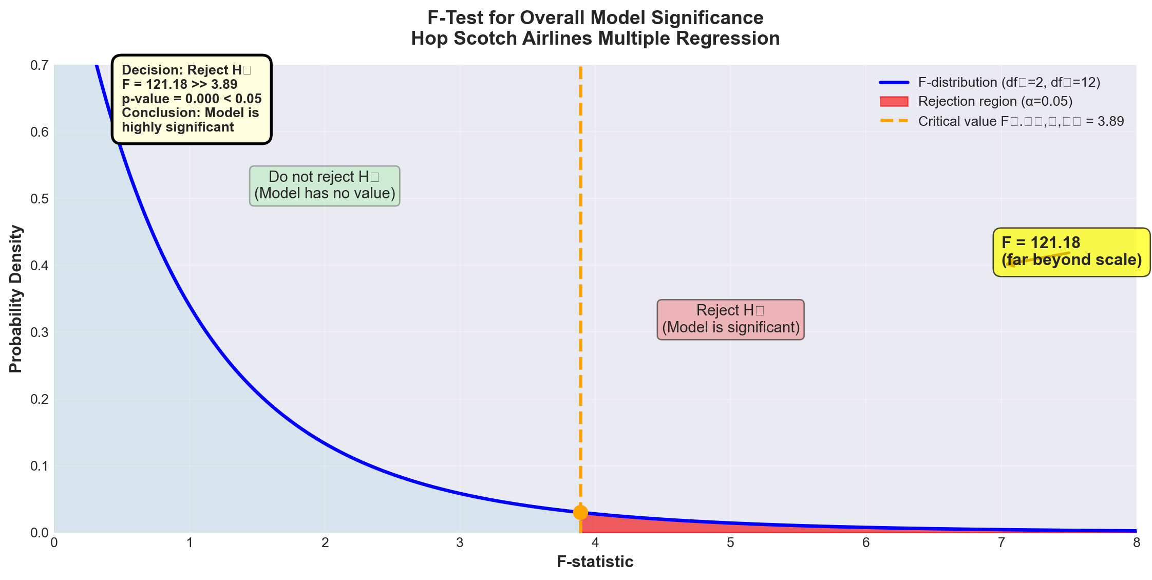
ImportantTest Results and Conclusion
Calculated F-statistic: F = 121.18
Critical value: F_{0.05, 2, 12} = 3.89
p-value: p = 0.000
Decision: Since F = 121.18 > 3.89, we reject the null hypothesis at the 5% significance level.
Conclusion:
At least one of the independent variables (advertising or national income) has a statistically significant linear relationship with the number of passengers. The model as a whole is highly significant.
Business interpretation:
The regression model has substantial explanatory value. We can be extremely confident (p < 0.001) that advertising and/or national income genuinely affect passenger volume—this is not just random chance.
Note on the p-value:
The p-value of 0.000 doesn’t mean exactly zero—it means p < 0.0005, which rounds to 0.000 in the output. This represents overwhelming evidence against the null hypothesis.
13.11.6 E. Testing Individual Regression Coefficients
The ANOVA F-test told us the model as a whole is significant, but it didn’t tell us which variables are significant. The next logical step is to test each coefficient individually.
13.11.6.1 Testing the Advertising Coefficient (\beta_1)
NoteHypothesis Test for \beta_1 (Advertising)
Hypotheses: H_0: \beta_1 = 0 H_A: \beta_1 \neq 0
What the null hypothesis means:
Advertising has no effect on passengers, given that national income is already in the model.
Critical insight:
This is NOT the same as testing advertising alone (which gave t = 13.995 in Chapter 11). This tests advertising’s additional contribution after accounting for national income.
Test statistic:
t = \frac{b_1 - \beta_1}{S_{b_1}}
With n - k - 1 degrees of freedom.
From Python output: - b_1 = 0.8397 - S_{b_1} = 0.1419 (standard error of b_1) - Under H_0: \beta_1 = 0
t = \frac{0.8397 - 0}{0.1419} = 5.92
Test at \alpha = 0.01 (1% level): - Degrees of freedom: n - k - 1 = 15 - 2 - 1 = 12 - Critical value: t_{0.01, 12} = \pm 3.055 (two-tailed)
Decision rule:
Reject H_0 if |t| > 3.055
Code
import numpy as np
import matplotlib.pyplot as plt
from scipy import stats

# Set style
plt.style.use('seaborn-v0_8-darkgrid')

# Create figure
fig, ax = plt.subplots(figsize=(12, 6))

# t-distribution parameters
df = 12
x = np.linspace(-6, 6, 1000)
y = stats.t.pdf(x, df)

# Plot the t-distribution
ax.plot(x, y, 'b-', linewidth=2.5, label=f't-distribution (df={df})')
ax.fill_between(x, 0, y, alpha=0.3, color='lightblue')

# Critical values
t_critical = 3.055
t_calculated = 5.92

# Shade rejection regions
x_left = x[x <= -t_critical]
y_left = stats.t.pdf(x_left, df)
ax.fill_between(x_left, 0, y_left, alpha=0.6, color='red', label='Rejection region')

x_right = x[x >= t_critical]
y_right = stats.t.pdf(x_right, df)
ax.fill_between(x_right, 0, y_right, alpha=0.6, color='red')

# Mark critical values
ax.axvline(-t_critical, color='orange', linestyle='--', linewidth=2,
          label=f'Critical values: ±{t_critical}')
ax.axvline(t_critical, color='orange', linestyle='--', linewidth=2)

# Mark calculated t-value
ax.axvline(t_calculated, color='darkred', linestyle='-', linewidth=3,
          label=f'Calculated t = {t_calculated}')
ax.plot(t_calculated, stats.t.pdf(t_calculated, df), 'o',
       color='darkred', markersize=12)

# Add annotations
ax.text(0, 0.3, 'Do not reject H₀\n(β₁ = 0)',
       fontsize=11, ha='center',
       bbox=dict(boxstyle='round', facecolor='lightgreen', alpha=0.3))

ax.text(-4, 0.15, 'Reject H₀\nα/2 = 0.005',
       fontsize=10, ha='center',
       bbox=dict(boxstyle='round', facecolor='lightcoral', alpha=0.5))

ax.text(4, 0.15, 'Reject H₀\nα/2 = 0.005',
       fontsize=10, ha='center',
       bbox=dict(boxstyle='round', facecolor='lightcoral', alpha=0.5))

# Labels and formatting
ax.set_xlabel('t-statistic', fontsize=12, fontweight='bold')
ax.set_ylabel('Probability Density', fontsize=12, fontweight='bold')
ax.set_title('t-Test for Advertising Coefficient (β₁)\nTwo-tailed test at α = 0.01',
            fontsize=14, fontweight='bold', pad=15)
ax.set_xlim(-6, 6)
ax.set_ylim(0, 0.4)
ax.legend(loc='upper left', fontsize=10, framealpha=0.9)
ax.grid(True, alpha=0.3)

# Add decision box
decision_text = (
    'Decision: Reject H₀\n'
    't = 5.92 > 3.055\n'
    'p-value = 0.000\n\n'
    'Advertising is\n'
    'highly significant'
)
ax.text(5.5, 0.32, decision_text, fontsize=10, fontweight='bold',
       bbox=dict(boxstyle='round,pad=0.6', facecolor='lightyellow',
                edgecolor='black', linewidth=2),
       verticalalignment='top', horizontalalignment='right')

plt.tight_layout()
plt.show()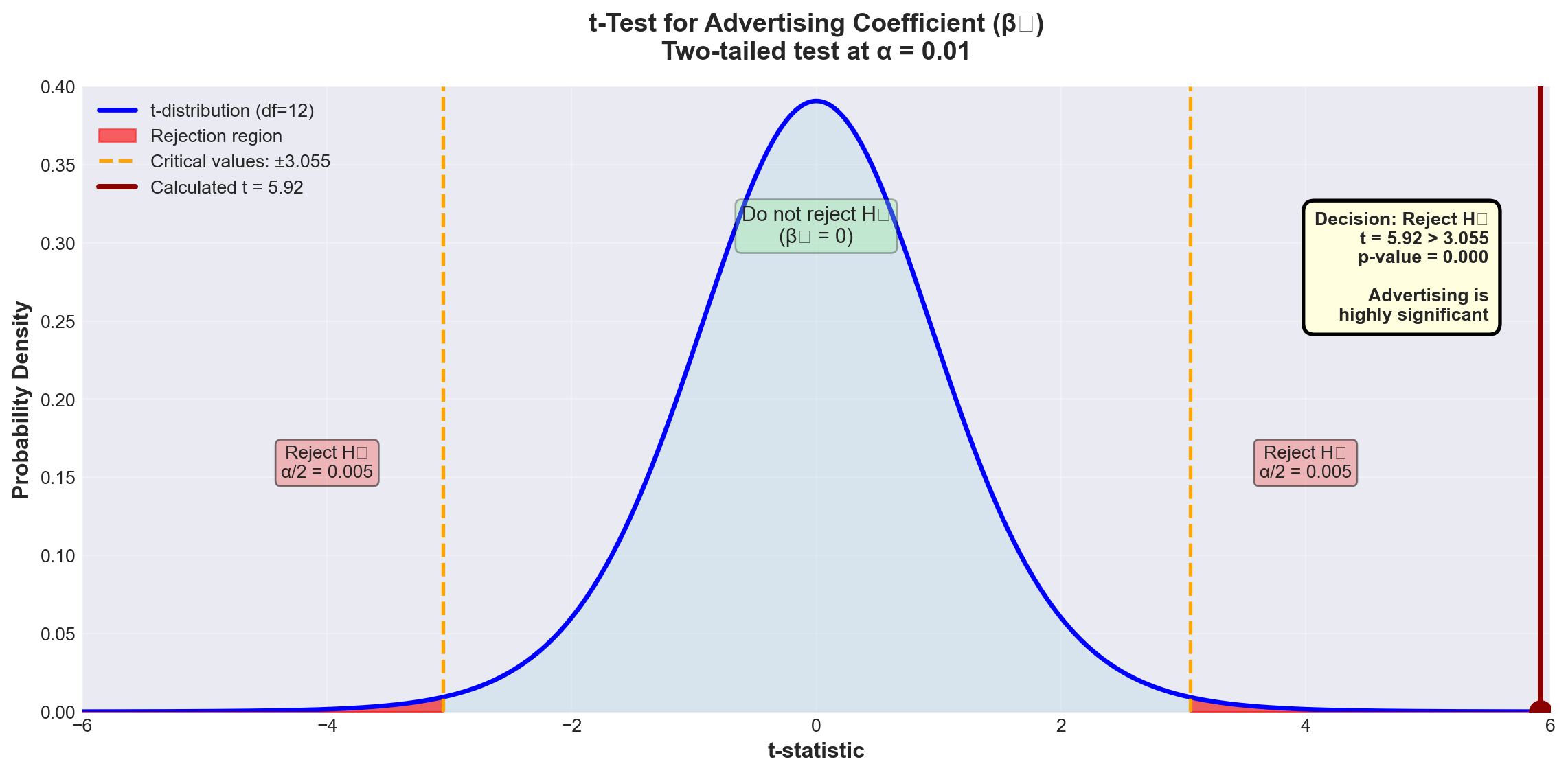
ImportantResults for Advertising Coefficient
Decision: Since t = 5.92 > 3.055, we reject H_0 at the 1% significance level.
Conclusion:
Advertising contributes significantly to explaining passenger volume, even after national income is already included in the model.
p-value = 0.000 confirms this: We could lower \alpha all the way to 0.000 and still reject H_0.
Business interpretation:
Advertising expenditure has a genuine, statistically significant effect on passenger numbers, independent of economic conditions (national income). This justifies continued investment in advertising.
Why is the t-value different from Chapter 11?
In Chapter 11, when advertising was the ONLY variable, we found t = 13.995. Now, with national income in the model, t = 5.92 for advertising.
Explanation:
- Chapter 11 t-value (13.995): Advertising’s total effect on passengers - Chapter 12 t-value (5.92): Advertising’s additional contribution beyond what national income already explains
The difference reflects the fact that advertising and national income are correlated (we’ll examine this multicollinearity issue in the next stage).
13.11.6.2 Testing the National Income Coefficient (\beta_2)
NoteHypothesis Test for \beta_2 (National Income)
Hypotheses: H_0: \beta_2 = 0 H_A: \beta_2 \neq 0
What it tests:
Does national income contribute to explaining passengers, given that advertising is already in the model?
From Python output: - b_2 = 1.4410 - S_{b_2} = 0.7360
t = \frac{1.4410 - 0}{0.7360} = 1.96
Test at \alpha = 0.05 (5% level): - Critical value: t_{0.05, 12} = \pm 2.179
Decision rule:
Reject H_0 if |t| > 2.179
Code
import numpy as np
import matplotlib.pyplot as plt
from scipy import stats

# Set style
plt.style.use('seaborn-v0_8-darkgrid')

# Create figure
fig, ax = plt.subplots(figsize=(12, 6))

# t-distribution parameters
df = 12
x = np.linspace(-5, 5, 1000)
y = stats.t.pdf(x, df)

# Plot the t-distribution
ax.plot(x, y, 'b-', linewidth=2.5, label=f't-distribution (df={df})')
ax.fill_between(x, 0, y, alpha=0.3, color='lightblue')

# Critical values
t_critical = 2.179
t_calculated = 1.96

# Shade rejection regions
x_left = x[x <= -t_critical]
y_left = stats.t.pdf(x_left, df)
ax.fill_between(x_left, 0, y_left, alpha=0.6, color='red', label='Rejection region (α = 0.05)')

x_right = x[x >= t_critical]
y_right = stats.t.pdf(x_right, df)
ax.fill_between(x_right, 0, y_right, alpha=0.6, color='red')

# Mark critical values
ax.axvline(-t_critical, color='orange', linestyle='--', linewidth=2,
          label=f'Critical values: ±{t_critical}')
ax.axvline(t_critical, color='orange', linestyle='--', linewidth=2)

# Mark calculated t-value
ax.axvline(t_calculated, color='green', linestyle='-', linewidth=3,
          label=f'Calculated t = {t_calculated}')
ax.plot(t_calculated, stats.t.pdf(t_calculated, df), 'o',
       color='green', markersize=12)

# Add shaded region for α = 0.10 test (wider)
t_critical_10 = 1.782
ax.axvline(t_critical_10, color='purple', linestyle=':', linewidth=2, alpha=0.7,
          label=f'For α = 0.10: t = ±{t_critical_10}')
ax.axvline(-t_critical_10, color='purple', linestyle=':', linewidth=2, alpha=0.7)

# Add annotations
ax.text(0, 0.3, 'Do not reject H₀\n(β₂ = 0)',
       fontsize=11, ha='center',
       bbox=dict(boxstyle='round', facecolor='lightgreen', alpha=0.3))

ax.text(3.5, 0.15, 'Reject H₀\nα/2 = 0.025',
       fontsize=10, ha='center',
       bbox=dict(boxstyle='round', facecolor='lightcoral', alpha=0.5))

# Labels and formatting
ax.set_xlabel('t-statistic', fontsize=12, fontweight='bold')
ax.set_ylabel('Probability Density', fontsize=12, fontweight='bold')
ax.set_title('t-Test for National Income Coefficient (β₂)\nTwo-tailed test at α = 0.05',
            fontsize=14, fontweight='bold', pad=15)
ax.set_xlim(-5, 5)
ax.set_ylim(0, 0.4)
ax.legend(loc='upper left', fontsize=9, framealpha=0.9)
ax.grid(True, alpha=0.3)

# Add decision box
decision_text = (
    'At α = 0.05:\n'
    'Decision: Do NOT reject H₀\n'
    't = 1.96 < 2.179\n'
    'p-value = 0.074 > 0.05\n\n'
    'At α = 0.10:\n'
    'Decision: Reject H₀\n'
    't = 1.96 > 1.782\n\n'
    'National income is\n'
    'marginally significant'
)
ax.text(4.5, 0.38, decision_text, fontsize=9, fontweight='bold',
       bbox=dict(boxstyle='round,pad=0.6', facecolor='lightyellow',
                edgecolor='black', linewidth=2),
       verticalalignment='top', horizontalalignment='right')

plt.tight_layout()
plt.show()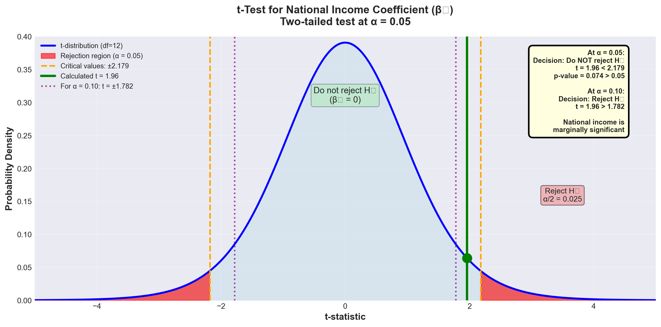
WarningResults for National Income Coefficient
At \alpha = 0.05:
Since t = 1.96 < 2.179, we fail to reject H_0.
Conclusion at 5% level:
We cannot conclude that national income significantly contributes to explaining passengers, given that advertising is already in the model.
However, examining the p-value:
p = 0.074 means we could lower \alpha to 7.4% and reject H_0.
At \alpha = 0.10:
Critical value: t_{0.10, 12} = \pm 1.782
Since t = 1.96 > 1.782, we reject H_0 at the 10% level.
Business interpretation:
National income shows marginal significance. While not significant at the conventional 5% level, it contributes at the 10% level. The decision to keep it in the model depends on: - Business theory (income should matter for air travel demand) - Cost of collecting the data - Multicollinearity concerns (coming in next stage) - Management’s tolerance for Type I error risk
13.12 Section Exercises
12.16 Using the ANOVA results for Hop Scotch Airlines:
a. Calculate the F-ratio manually and verify it equals 121.18
b. What would the conclusion be at \alpha = 0.01? At \alpha = 0.001?
c. Explain in business terms what rejecting H_0 means
12.17 For a regression with n = 25, k = 3, R^2 = 0.78:
a. Calculate \bar{R}^2
b. Is the difference between R^2 and \bar{R}^2 concerning? Why or why not?
12.18 Interpret the following regression results:
SALES = 50 + 3.2 PRICE + 0.85 INCOME + 1.5 COMPETITORS

            Coef    SE Coef     T      P
Constant   50.00    12.50    4.00  0.001
PRICE       3.20     0.45    7.11  0.000
INCOME      0.85     0.22    3.86  0.002
COMPETITORS 1.50     1.20    1.25  0.225

S = 5.2 R-Sq = 82.5% R-Sq(adj) = 80.1% F = 34.6 p = 0.000- Is the overall model significant at \alpha = 0.01?
- Which variables are significant at \alpha = 0.05?
- Does the positive coefficient for PRICE make economic sense? Explain
- Should COMPETITORS be removed from the model? Justify your answer
12.19 Given: SCT = 450, SCR = 360, n = 20, k = 4
a. Calculate R^2 and \bar{R}^2
b. Calculate the F-statistic
c. Is the model significant at \alpha = 0.05?
12.20 True or False (explain each):
a. R^2 can never decrease when you add a variable
b. \bar{R}^2 can be negative
c. If the F-test rejects H_0, all coefficients must be significant
d. A high R^2 proves the model is correctly specified
e. The p-value for the F-test can be different from p-values for individual t-tests
Key Terms Introduced: - Coefficient of multiple determination (R^2) - Adjusted coefficient of determination (\bar{R}^2) - ANOVA F-test for overall model - Partial regression coefficient tests - Marginal significance - p-value interpretation
Earlier we identified the danger of multicollinearity—one of the most insidious problems in multiple regression analysis. This issue arises when one or more independent variables are linearly related to each other, violating a fundamental assumption of multiple regression.
WarningDefinition: Multicollinearity
Multicollinearity exists when two or more independent variables are highly correlated with each other.
Simple example:
If X_3 = X_1 + X_2 or X_1 = 0.5X_2, then a linear relationship exists between independent variables.
Why it matters:
Multicollinearity can cause coefficients to have signs opposite to what logic dictates, while vastly inflating the standard errors of the coefficients—making good variables appear insignificant.
13.12.1 Understanding the Problem
Consider a demand model where you’re trying to predict consumer demand for your product. Recognizing that the number of consumers affects demand, you include three explanatory variables:
- X_1 = All males in the market area
- X_2 = All females in the market area
- X_3 = Total population in the market area
The problem: Obviously, X_3 = X_1 + X_2. The total population is an exact linear combination of males and females! The correlations between these variables will be extremely high: - r_{13} (correlation between X_1 and X_3) ≈ very high - r_{23} (correlation between X_2 and X_3) ≈ very high
This guarantees the presence of multicollinearity and creates serious problems for regression analysis.
13.12.2 Multicollinearity in the Hop Scotch Model
Let’s examine whether multicollinearity affects our Hop Scotch Airlines model. From the Python output, we can calculate the correlation matrix:
Correlations: PASS, ADV, NI

         ADV    PASS
PASS   0.968
NI     0.870   0.903
Key observations: - Correlation between PASS and ADV: r = 0.968 (very strong, as expected)
- Correlation between PASS and NI: r = 0.903 (very strong, as expected)
- Correlation between ADV and NI: r = 0.870 ⚠️ (concerningly high!)
The high correlation (0.870) between the two independent variables suggests multicollinearity may be present.
13.12.3 A. Problems Caused by Multicollinearity
ImportantSeven Major Problems Multicollinearity Creates
1. Inability to Separate Individual Effects
When multicollinearity is present, it’s impossible to untangle the individual effects of each X_i on Y. The regression cannot determine how much of the change in Y is due to X_1 versus X_2.
Example: In a model \hat{Y} = 40 + 10X_1 + 80X_2 where X_1 and X_2 are highly correlated, the coefficient of 10 for X_1 may not represent its true effect on Y. The coefficients become unreliable estimates.
2. Inflated Standard Errors
Standard errors of coefficients (S_{b_i}) become excessively large. Taking multiple samples of the same size would show huge variation in the estimated coefficients. One sample might give b_1 = 10, another might give b_1 = 15 or 20.
3. Wrong Signs on Coefficients
Multicollinearity can cause coefficient signs to contradict logic and theory. For example, if price is included in a demand model, you might find it has a positive coefficient—implying consumers buy MORE as price increases! This violates basic economic theory.
4. High Correlations Between Independent Variables
The correlation matrix reveals high values of r_{ij} between independent variables, and the Variance Inflation Factor (VIF) becomes elevated.
5. Coefficient Instability
Large changes in coefficients or their signs occur when the number of observations changes by just one observation. The model becomes extremely sensitive to small data changes.
6. Significant F-ratio with Insignificant t-ratios
The overall F-test shows the model is significant, but individual t-tests show none (or few) of the coefficients are significant. This paradox is a classic symptom of multicollinearity.
7. Large Changes from Adding/Removing Variables
Adding or deleting a single variable produces drastic changes in the remaining coefficients or their signs.
13.12.4 B. Detecting Multicollinearity
There are several methods to detect multicollinearity. Let’s examine each using the Hop Scotch example.
13.12.4.1 Method 1: Correlation Matrix Analysis
The most direct approach is to examine the correlation matrix for all variables in the model.
From Table 13.6, we found r_{12} = 0.870 between advertising (ADV) and national income (NI).
Question: Is 0.870 high enough to indicate problematic multicollinearity?
Unfortunately, there’s no magic cutoff value. Multicollinearity is a matter of degree. Some general guidelines:
- |r_{ij}| < 0.50: Probably not a concern
- 0.50 \leq |r_{ij}| < 0.70: Monitor the situation
- 0.70 \leq |r_{ij}| < 0.85: Likely problematic
- |r_{ij}| \geq 0.85: Almost certainly problematic
For Hop Scotch: r = 0.870 is in the “likely problematic” range, suggesting multicollinearity is present.
13.12.4.2 Method 2: Hypothesis Test for Correlation
We can formally test whether the population correlation \rho_{12} between the two independent variables differs significantly from zero.
NoteTesting for Significant Correlation Between Independent Variables
Hypotheses: H_0: \rho_{12} = 0 \quad \text{(no correlation)} H_A: \rho_{12} \neq 0 \quad \text{(correlation exists)}
Test statistic: t = \frac{r_{12}}{S_r}
Where: S_r = \sqrt{\frac{1 - r_{12}^2}{n - 2}}
Degrees of freedom: n - 2 (NOT n - k - 1)
Why? We’re testing correlation between just two variables, not testing the full regression model.
For Hop Scotch:
\begin{aligned} S_r &= \sqrt{\frac{1 - (0.870)^2}{15 - 2}} \\ &= \sqrt{\frac{1 - 0.7569}{13}} \\ &= \sqrt{\frac{0.2431}{13}} \\ &= \sqrt{0.0187} \\ &= 0.1367 \end{aligned}
t = \frac{0.870}{0.1367} = 6.36
Test at \alpha = 0.05: - Critical value: t_{0.05, 13} = \pm 2.16 - Decision rule: Reject H_0 if |t| > 2.16
Code
import numpy as np
import matplotlib.pyplot as plt
from scipy import stats

# Set style
plt.style.use('seaborn-v0_8-darkgrid')

# Create figure
fig, ax = plt.subplots(figsize=(12, 6))

# t-distribution parameters
df = 13
x = np.linspace(-8, 8, 1000)
y = stats.t.pdf(x, df)

# Plot the t-distribution
ax.plot(x, y, 'b-', linewidth=2.5, label=f't-distribution (df={df})')
ax.fill_between(x, 0, y, alpha=0.3, color='lightblue')

# Critical values
t_critical = 2.16
t_calculated = 6.36

# Shade rejection regions
x_left = x[x <= -t_critical]
y_left = stats.t.pdf(x_left, df)
ax.fill_between(x_left, 0, y_left, alpha=0.6, color='red', label='Rejection region')

x_right = x[x >= t_critical]
y_right = stats.t.pdf(x_right, df)
ax.fill_between(x_right, 0, y_right, alpha=0.6, color='red')

# Mark critical values
ax.axvline(-t_critical, color='orange', linestyle='--', linewidth=2,
          label=f'Critical values: ±{t_critical}')
ax.axvline(t_critical, color='orange', linestyle='--', linewidth=2)

# Mark calculated t-value
ax.axvline(t_calculated, color='darkred', linestyle='-', linewidth=3,
          label=f'Calculated t = {t_calculated}')
ax.plot(t_calculated, stats.t.pdf(t_calculated, df), 'o',
       color='darkred', markersize=12)

# Add annotations
ax.text(0, 0.3, 'Do not reject H₀\n(No correlation)',
       fontsize=11, ha='center',
       bbox=dict(boxstyle='round', facecolor='lightgreen', alpha=0.3))

ax.text(4.5, 0.15, 'Reject H₀\n(Correlation exists)',
       fontsize=11, ha='center',
       bbox=dict(boxstyle='round', facecolor='lightcoral', alpha=0.5))

# Labels and formatting
ax.set_xlabel('t-statistic', fontsize=12, fontweight='bold')
ax.set_ylabel('Probability Density', fontsize=12, fontweight='bold')
ax.set_title('Testing Correlation Between ADV and NI\nEvidence of Multicollinearity',
            fontsize=14, fontweight='bold', pad=15)
ax.set_xlim(-8, 8)
ax.set_ylim(0, 0.4)
ax.legend(loc='upper left', fontsize=10, framealpha=0.9)
ax.grid(True, alpha=0.3)

# Add decision box
decision_text = (
    'Decision: Reject H₀\n'
    't = 6.36 > 2.16\n\n'
    'Conclusion:\n'
    'Significant correlation\n'
    'between ADV and NI\n\n'
    'Multicollinearity\n'
    'is present!'
)
ax.text(7, 0.35, decision_text, fontsize=10, fontweight='bold',
       bbox=dict(boxstyle='round,pad=0.6', facecolor='lightyellow',
                edgecolor='red', linewidth=3),
       verticalalignment='top', horizontalalignment='right')

plt.tight_layout()
plt.show()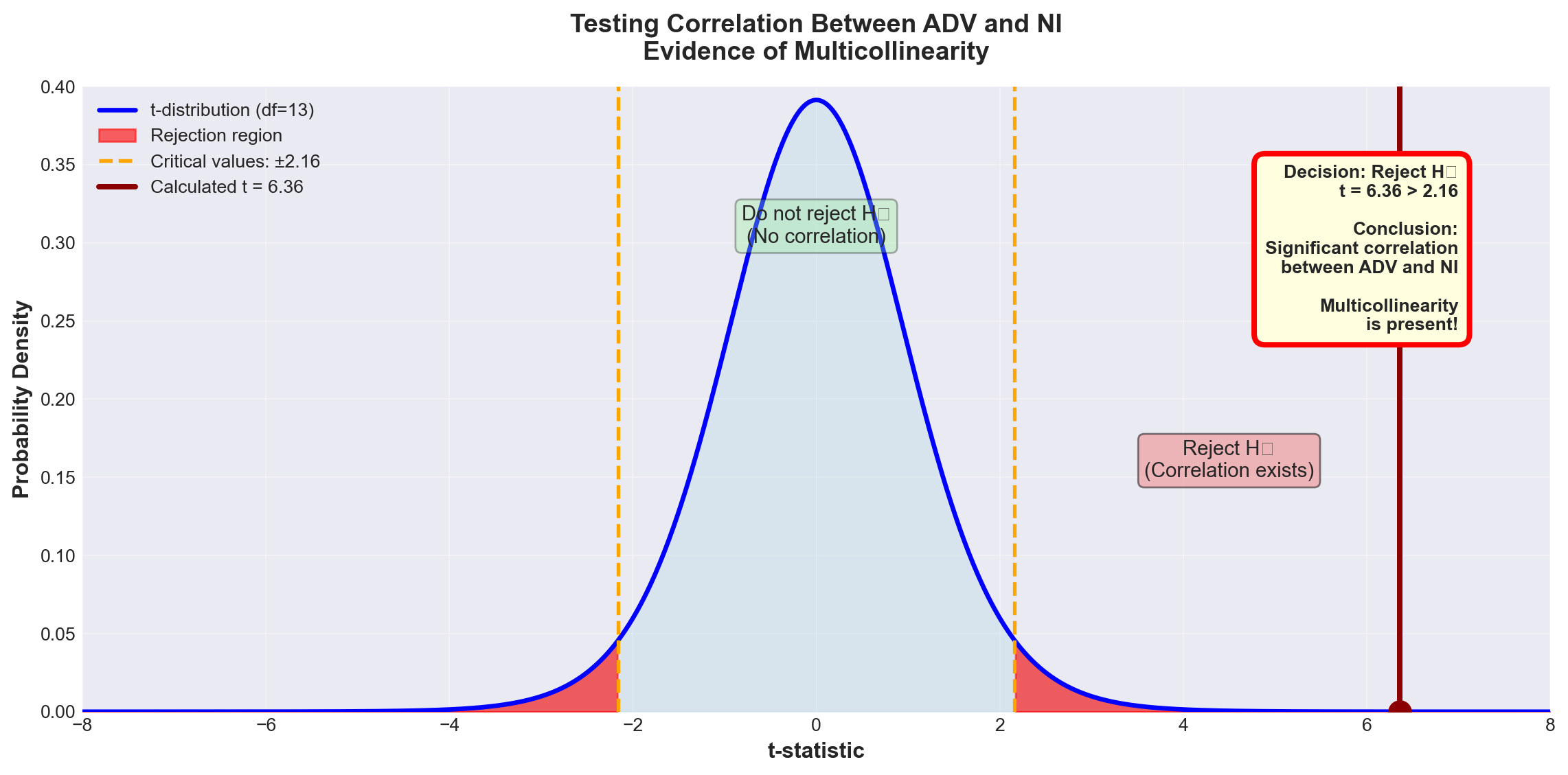
ImportantTest Results
Decision: Since t = 6.36 > 2.16, we reject H_0 at the 5% significance level.
Conclusion:
There is statistically significant correlation between advertising and national income (\rho_{12} \neq 0). Some degree of multicollinearity exists in the model.
Important note:
This doesn’t mean the model is fatally flawed. Very few models are completely free of multicollinearity. The question is whether the multicollinearity is severe enough to undermine the model’s usefulness.
13.12.4.3 Method 3: Comparing r^2 Values
Another detection method compares the coefficients of determination between Y and each independent variable individually.
From the correlation matrix: - Passengers and Advertising: r^2 = (0.968)^2 = 0.937 (93.7%) - Passengers and National Income: r^2 = (0.903)^2 = 0.815 (81.5%)
However, when both variables are in the model together: - Multiple regression: R^2 = 0.953 (95.3%)
Analysis:
Taken independently, the two variables explain 93.7% and 81.5% of passenger variation. But together they only explain 95.3%—barely more than advertising alone!
What this means:
There’s substantial overlap in their explanatory power. Much of the information about passengers already provided by advertising is simply duplicated by national income. This overlap is a telltale sign of multicollinearity.
13.12.4.4 Method 4: Variance Inflation Factor (VIF)
The Variance Inflation Factor is a quantitative measure of how much multicollinearity inflates the variance of a regression coefficient.
NoteVariance Inflation Factor (VIF)
For independent variable X_i:
\text{VIF}(X_i) = \frac{1}{1 - R_i^2}
Where:
R_i^2 = Coefficient of determination from regressing X_i on all other independent variables
Interpretation:
The VIF measures how much the variance of b_i is inflated above what it would be if there were no multicollinearity.
Rules of thumb: - VIF = 1: No correlation with other variables (ideal) - VIF < 5: Low multicollinearity (acceptable) - 5 ≤ VIF < 10: Moderate multicollinearity (concerning) - VIF ≥ 10: High multicollinearity (serious problem) - Sum of all VIFs ≥ 10: Overall model multicollinearity concern
For Hop Scotch:
Since we have only two independent variables, regressing each on the other gives the same r = 0.870.
Therefore: R^2 = (0.870)^2 = 0.7569
\text{VIF}(\text{ADV}) = \text{VIF}(\text{NI}) = \frac{1}{1 - 0.7569} = \frac{1}{0.2431} = 4.1
From Python output (Screen 12.6):
Both VIF values show 4.1 ✓
Code
import numpy as np
import matplotlib.pyplot as plt

# Set style
plt.style.use('seaborn-v0_8-darkgrid')

# Create figure with two subplots
fig, (ax1, ax2) = plt.subplots(1, 2, figsize=(15, 6))

# Left plot: VIF vs R²
r_squared = np.linspace(0, 0.99, 100)
vif = 1 / (1 - r_squared)

ax1.plot(r_squared, vif, 'b-', linewidth=3, label='VIF = 1/(1-R²)')
ax1.axhline(y=1, color='green', linestyle='--', linewidth=2, alpha=0.7, label='VIF=1 (No multicollinearity)')
ax1.axhline(y=5, color='orange', linestyle='--', linewidth=2, alpha=0.7, label='VIF=5 (Moderate concern)')
ax1.axhline(y=10, color='red', linestyle='--', linewidth=2, alpha=0.7, label='VIF=10 (Serious problem)')

# Mark Hop Scotch point
hop_scotch_r2 = 0.7569
hop_scotch_vif = 4.1
ax1.plot(hop_scotch_r2, hop_scotch_vif, 'ro', markersize=15,
        markeredgecolor='black', markeredgewidth=2, label='Hop Scotch (VIF=4.1)', zorder=5)
ax1.annotate('Hop Scotch\nR² = 0.757\nVIF = 4.1',
            xy=(hop_scotch_r2, hop_scotch_vif), xytext=(0.5, 8),
            fontsize=11, fontweight='bold',
            bbox=dict(boxstyle='round,pad=0.5', facecolor='yellow', alpha=0.7),
            arrowprops=dict(arrowstyle='->', lw=2, color='darkred'))

# Add shaded regions
ax1.fill_between(r_squared[vif <= 5], 0, 5, alpha=0.2, color='green', label='Acceptable range')
ax1.fill_between(r_squared[(vif > 5) & (vif <= 10)], 5, 10, alpha=0.2, color='orange', label='Caution zone')

ax1.set_xlabel('R² (Correlation with other X variables)', fontsize=12, fontweight='bold')
ax1.set_ylabel('Variance Inflation Factor (VIF)', fontsize=12, fontweight='bold')
ax1.set_title('VIF as a Function of R²\nExponential growth as correlation increases',
             fontsize=13, fontweight='bold', pad=15)
ax1.set_ylim(0, 12)
ax1.set_xlim(0, 1)
ax1.legend(loc='upper left', fontsize=9)
ax1.grid(True, alpha=0.3)

# Right plot: Variance inflation visualization
categories = ['No Multicollinearity\n(VIF=1)', 'Hop Scotch ADV/NI\n(VIF=4.1)',
             'Moderate Problem\n(VIF=7)', 'Serious Problem\n(VIF=15)']
vif_values = [1, 4.1, 7, 15]
colors = ['green', 'yellow', 'orange', 'red']

bars = ax2.bar(categories, vif_values, color=colors, edgecolor='black', linewidth=2, alpha=0.7)

# Add value labels on bars
for bar, val in zip(bars, vif_values):
    height = bar.get_height()
    ax2.text(bar.get_x() + bar.get_width()/2., height,
            f'{val}×',
            ha='center', va='bottom', fontsize=12, fontweight='bold')

# Add reference lines
ax2.axhline(y=5, color='orange', linestyle='--', linewidth=2, alpha=0.5, label='VIF=5 threshold')
ax2.axhline(y=10, color='red', linestyle='--', linewidth=2, alpha=0.5, label='VIF=10 threshold')

ax2.set_ylabel('Variance Inflation (multiple of ideal)', fontsize=12, fontweight='bold')
ax2.set_title('How Much VIF Inflates Coefficient Variance\nHigher VIF = Less reliable coefficients',
             fontsize=13, fontweight='bold', pad=15)
ax2.set_ylim(0, 17)
ax2.legend(loc='upper left', fontsize=10)
ax2.grid(True, alpha=0.3, axis='y')

# Rotate x-axis labels
ax2.set_xticks(range(len(categories)))
ax2.set_xticklabels(categories, rotation=15, ha='right')

plt.tight_layout()
plt.show()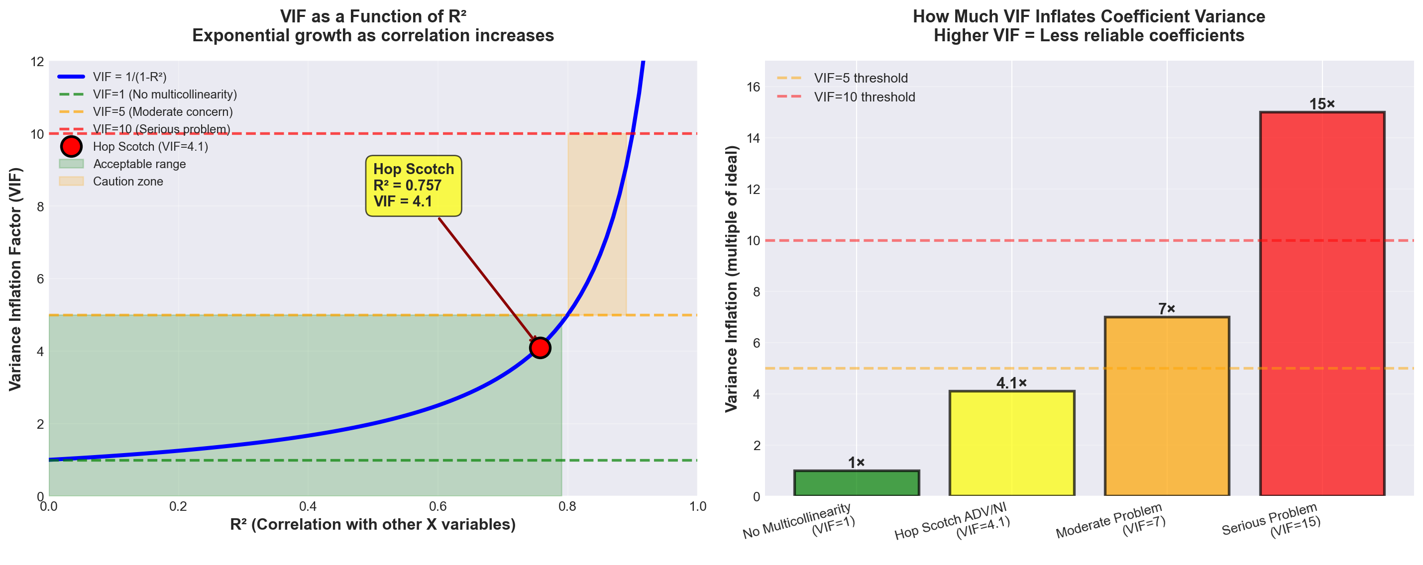
TipInterpreting VIF = 4.1 for Hop Scotch
What it means:
The variance of the coefficient estimates for advertising and national income is 4.1 times larger than it would be if there were no multicollinearity.
Is this a problem?
VIF = 4.1 is in the low to moderate range: - Below the VIF = 5 “concern” threshold - Well below the VIF = 10 “serious problem” threshold - Sum of VIFs = 4.1 + 4.1 = 8.2 (below the 10 threshold)
Verdict:
While multicollinearity is present, it’s not severe enough to completely undermine the model. We should be aware of it and monitor for its effects, but it’s not a fatal flaw.
13.12.5 Other Indicators of Multicollinearity
Beyond the formal detection methods, watch for these warning signs:
5. Large coefficient changes from small sample changes
If adding or removing just one observation causes dramatic shifts in coefficient values or signs, multicollinearity is likely present.
6. Significant F-ratio with insignificant t-ratios
In our Hop Scotch model: - Overall F-test: F = 121.18 (highly significant, p < 0.001) - Advertising t-test: t = 5.92 (significant, p < 0.001) - National Income t-test: t = 1.96 (not significant at α = 0.05, p = 0.074)
The fact that national income appears marginally significant despite the strong overall F-test is consistent with multicollinearity between ADV and NI.
7. Large changes when adding/removing variables
Recall from Chapter 11 that advertising alone had t = 13.995. Now, with national income added, advertising’s t-value dropped to t = 5.92. This substantial change suggests the two variables share overlapping information.
13.12.6 C. Correcting Multicollinearity
What can be done to eliminate or mitigate multicollinearity? Several strategies exist:
ImportantSolutions for Multicollinearity
Solution 1: Remove One of the Correlated Variables ⭐ (Most common)
If X_i and X_j are highly correlated, simply drop one of them from the model. After all, if they largely provide the same information (due to their correlation), including the second adds little value.
For Hop Scotch: Consider dropping National Income because: - Its correlation with Passengers (0.903) is lower than Advertising’s (0.968)
- Its t-test shows marginal significance (p = 0.074)
- The gain in R^2 from adding it is small (1.6 percentage points)
Caution: This may cause specification bias.
Solution 2: Transform the Variables
Sometimes you can reduce multicollinearity by transforming variables: - Per capita conversion: Divide by population to get per-person values
- Deflation: Divide monetary values by a price index (like CPI) to get “real” values
- Differencing: Use changes rather than levels
For Hop Scotch: Could divide national income by population to get “per capita income.”
Solution 3: Combine Variables
If variables are conceptually related, combine them into a single index.
Example: In our earlier consumer demand example with males, females, and total population, we could: - Drop males and females, keep only total population, OR
- Create a “gender ratio” variable: males/females
Solution 4: Collect More Data
More observations can sometimes reduce multicollinearity’s effects. With a larger sample: - Standard errors decrease
- VIF values may improve
- Statistical power increases
Solution 5: Accept It (Sometimes)
If: - The model is for prediction (not explanation)
- The multicollinear variables remain correlated in future data
- Overall model performance is good
Then multicollinearity may not be a fatal flaw. It inflates individual coefficient standard errors, but the combined effect of the multicollinear variables remains reliable for prediction.
13.12.7 Specification Bias Warning
WarningSpecification Bias
Definition: Specification bias occurs when the model’s structure contradicts theoretical principles, usually from incorrectly including or excluding variables.
Example: Removing income from a consumer demand model would create specification bias, even if it reduces multicollinearity. Economic theory REQUIRES income in demand models—it’s a fundamental determinant.
The trade-off:
Multicollinearity causes statistical problems (inflated standard errors).
Specification bias causes theoretical problems (wrong model).
Which is worse?
Specification bias is generally more serious—a theoretically incorrect model can’t be trusted, even if the statistics look good.
13.12.8 Summary: Multicollinearity in Perspective
For the Hop Scotch model:
Evidence of multicollinearity: - ✓ Correlation between ADV and NI: r = 0.870 (high)
- ✓ Hypothesis test: t = 6.36 confirms significant correlation
- ✓ Overlapping r^2 values (small gain from adding NI)
- ✓ VIF = 4.1 (moderate level)
- ✓ National income’s marginal significance despite strong theory
- ✓ Large drop in advertising’s t-value (from 13.995 to 5.92)
Is it a fatal problem?
No, for these reasons: - VIF = 4.1 is below serious thresholds
- Overall model is highly significant (F = 121.18)
- Advertising remains strongly significant
- R^2 = 95.3\% is excellent
- Both variables have strong theoretical justification
Recommendation:
Keep both variables. The benefits of including national income (theoretical completeness, slightly higher R^2) outweigh the costs of moderate multicollinearity. However, interpret the national income coefficient cautiously, recognizing its p-value (0.074) is marginal.
[Stage 4 continues with Sections 12.9-12.11 covering:*
- Comparing regression coefficients
- Dummy variables
- Curvilinear models
*- Section exercises]
13.13 12.9 Comparing Regression Coefficients
WarningThe Temptation to Compare Coefficients Directly
After developing a complete multiple regression model, there is often a strong temptation to compare the regression coefficients directly to determine which independent variable exerts the most influence on Y. This dangerous temptation must be avoided.
13.13.1 Why Direct Comparison Fails
Consider the production function model:
\hat{Y} = 40 + 10X_1 + 200X_2
where:
- Y = tons of production
- X_1 = units of labor input
- X_2 = units of capital input
One might be tempted to conclude that capital is more important than labor in determining production because it has the larger coefficient (200 vs. 10). After all, a one-unit increase in capital, holding labor constant, results in a 200-unit increase in production. However, such a comparison is not valid.
NoteThe Fundamental Problem
All variables are measured in completely different units: - Production measured in weight (tons) - Labor measured in number of people - Capital measured in number of machines
Comparing coefficients across different measurement units is like comparing apples to oranges.
13.13.2 The Units Problem Illustrated
Even when all variables are measured in the same type of units, direct comparison can be misleading. Suppose we specify a model in monetary terms:
\hat{Y} = 50 + 10,000X_1 + 20X_2
where:
- Y is measured in dollars
- X_1 is measured in units of $1,000
- X_2 is measured in cents
Despite the large coefficient for X_1 (10,000), we cannot conclude it has greater impact. Consider what happens with a $1,000 change in each variable:
For X_1: An increase of $1,000 equals 1 unit
\Delta Y = 10,000 \times 1 = 10,000 \text{ units (dollars)}
For X_2: An increase of $1,000 equals 100,000 units (100,000 cents)
\Delta Y = 20 \times 100,000 = 2,000,000 \text{ units (dollars)}
The variable with the smaller coefficient actually has a much larger economic impact!
13.13.3 The Variance Factor
Even if we express Y, X_1, and X_2 all in the same units (such as dollars), we still cannot compare the relative impact of X_1 and X_2 on changes in Y based solely on their coefficients.
ImportantWhy Variance Matters
Factors other than a variable’s coefficient determine its total impact on Y. The variance of a variable is critically important in determining its influence on Y.
Key Insight: Variance measures how frequently and how much a variable changes.
Example Scenario:
A variable may have a large coefficient, and each time it changes, it affects Y dramatically. However, if its variance is very small and it changes only once in a millennium, its overall impact on Y will be insignificant.
Conversely: A variable with a modest coefficient but high variance (changes frequently and substantially) may have a much greater cumulative impact on Y.
13.13.4 Solution: Standardized Regression Coefficients (Beta Weights)
To compensate for these deficiencies, we sometimes measure the response of Y to changes using standardized regression coefficients, also called beta coefficients or beta weights.
NoteBeta Coefficients Defined
Standardized regression coefficients reflect the change in the mean response of Y, measured in number of standard deviations of Y, resulting from changes in X_i, measured in number of standard deviations of X_i.
The intent is to make the coefficients “dimensionless” by expressing everything in standard deviation units.
Formula for Beta Coefficient:
\text{Beta}_i = \frac{b_i}{s_Y / s_{X_i}} = b_i \cdot \frac{s_{X_i}}{s_Y} \tag{13.1}
where:
- b_i = unstandardized regression coefficient for X_i
- s_Y = standard deviation of dependent variable Y
- s_{X_i} = standard deviation of independent variable X_i
13.13.5 Calculating Beta Coefficients: Hop Scotch Example
Let’s calculate the standardized coefficients for our Hop Scotch Airlines model:
\hat{PASS} = 3.53 + 0.840\,ADV + 1.441\,NI
From our earlier analysis, we have:
- Standard deviation of Passengers: s_Y = s_{PASS} = 3.502
- Standard deviation of Advertising: s_{X_1} = s_{ADV} = 3.204
- Standard deviation of National Income: s_{X_2} = s_{NI} = 0.605
Beta for National Income (X_2):
\begin{aligned} \text{Beta}_{NI} &= \frac{b_2}{s_Y / s_{X_2}} \\[8pt] &= \frac{1.441}{3.502 / 0.605} \\[8pt] &= \frac{1.441}{5.788} \\[8pt] &= 0.2489 \end{aligned}
Interpretation: A change of one standard deviation in national income produces a change of 0.2489 standard deviations in the number of passengers.
Beta for Advertising (X_1):
\begin{aligned} \text{Beta}_{ADV} &= \frac{b_1}{s_Y / s_{X_1}} \\[8pt] &= \frac{0.840}{3.502 / 3.204} \\[8pt] &= \frac{0.840}{1.093} \\[8pt] &= 0.7687 \end{aligned}
Interpretation: A change of one standard deviation in advertising produces a change of 0.7687 standard deviations in the number of passengers.
Code
import numpy as np
import matplotlib.pyplot as plt

# Set style
plt.style.use('seaborn-v0_8-darkgrid')
fig, (ax1, ax2) = plt.subplots(1, 2, figsize=(14, 6))

# Data
variables = ['Advertising\n(ADV)', 'National Income\n(NI)']
unstandardized = [0.840, 1.441]
standardized = [0.7687, 0.2489]

# Colors
colors = ['#2E86AB', '#A23B72']

# Plot 1: Unstandardized Coefficients
x_pos = np.arange(len(variables))
bars1 = ax1.bar(x_pos, unstandardized, color=colors, alpha=0.8, edgecolor='black', linewidth=1.5)
ax1.set_ylabel('Coefficient Value', fontsize=12, fontweight='bold')
ax1.set_title('Unstandardized Coefficients\n(Original Scale)', fontsize=13, fontweight='bold', pad=15)
ax1.set_xticks(x_pos)
ax1.set_xticklabels(variables, fontsize=11)
ax1.grid(axis='y', alpha=0.3)
ax1.set_ylim(0, 1.6)

# Add value labels
for i, (bar, val) in enumerate(zip(bars1, unstandardized)):
    height = bar.get_height()
    ax1.text(bar.get_x() + bar.get_width()/2., height + 0.05,
             f'{val:.3f}',
             ha='center', va='bottom', fontweight='bold', fontsize=11)

# Add warning text
ax1.text(0.5, -0.25, '⚠️ Cannot compare directly\n(different units & variances)',
         transform=ax1.transAxes, ha='center', fontsize=10,
         style='italic', color='red', bbox=dict(boxstyle='round', facecolor='wheat', alpha=0.3))

# Plot 2: Standardized Coefficients (Beta weights)
bars2 = ax2.bar(x_pos, standardized, color=colors, alpha=0.8, edgecolor='black', linewidth=1.5)
ax2.set_ylabel('Beta Coefficient (Standard Deviations)', fontsize=12, fontweight='bold')
ax2.set_title('Standardized Coefficients (Beta Weights)\n(Comparable Scale)',
              fontsize=13, fontweight='bold', pad=15)
ax2.set_xticks(x_pos)
ax2.set_xticklabels(variables, fontsize=11)
ax2.grid(axis='y', alpha=0.3)
ax2.set_ylim(0, 0.9)

# Add value labels
for i, (bar, val) in enumerate(zip(bars2, standardized)):
    height = bar.get_height()
    ax2.text(bar.get_x() + bar.get_width()/2., height + 0.02,
             f'β = {val:.4f}',
             ha='center', va='bottom', fontweight='bold', fontsize=11)

# Add interpretation
ax2.text(0.5, -0.25, '✓ Advertising has ~3x stronger impact\nthan National Income',
         transform=ax2.transAxes, ha='center', fontsize=10,
         style='italic', color='green', bbox=dict(boxstyle='round', facecolor='lightgreen', alpha=0.3))

plt.tight_layout()
plt.show()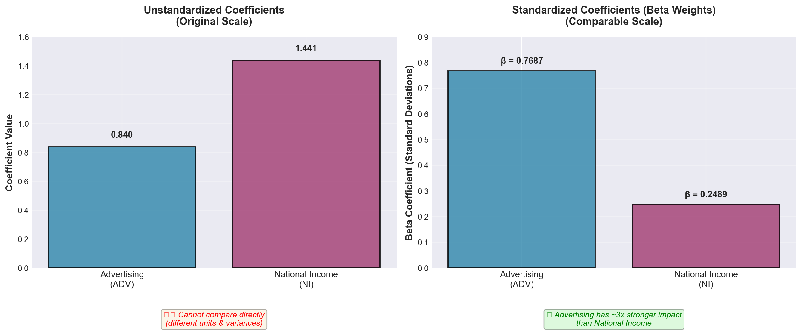
13.13.6 Interpretation of Beta Coefficients
Based on the standardized coefficients:
- Beta for Advertising = 0.7687: Suggests advertising has a stronger impact on passenger volume
- Beta for National Income = 0.2489: Suggests national income has a weaker impact
The ratio of these beta coefficients (0.7687 / 0.2489 ≈ 3.09) suggests that advertising has approximately three times the standardized impact of national income on passenger volume.
WarningCritical Limitation: Multicollinearity Problem
However, in the presence of multicollinearity, even these standardized coefficients suffer from many of the same deficiencies as normal coefficients.
Recall from Section 12.8 that our Hop Scotch model exhibits moderate multicollinearity: - Correlation between ADV and NI: r = 0.870 - VIF = 4.1 for both variables
When multicollinearity is present: 1. Beta coefficients become unstable across different samples 2. The interpretation of “relative importance” becomes questionable 3. Small changes in data can produce large changes in beta values
Professional Practice: It is considered poor practice to measure the importance of a variable based solely on its beta coefficient, especially when multicollinearity is present.
13.13.7 Alternative Approaches for Assessing Variable Importance
When you need to assess the relative importance of independent variables, consider these alternatives:
1. Hypothesis Testing Approach
- Use the t-tests for individual coefficients (Section 12.7, Part E) - Significant variables are clearly important - Our example: ADV (t = 5.92, p < 0.001) vs. NI (t = 1.96, p = 0.074)
2. Partial R² Contribution
- Measure how much R² increases when adding each variable - Compare model with and without each variable - Accounts for the variable’s unique contribution
3. Domain Knowledge and Theory
- Economic theory may dictate which variables are theoretically important - Specification bias warnings apply (Section 12.8, Part C) - Statistical measures should support, not replace, theoretical reasoning
4. Practical Significance
- Consider the actual range of variation in each variable - A large coefficient for a rarely-changing variable may be less important practically - A smaller coefficient for a highly variable predictor may have greater real-world impact
13.13.8 Summary: Comparing Regression Coefficients
| Comparison Method | Valid? | Notes |
|---|---|---|
| Direct comparison of b_i | ❌ No | Different units make comparison meaningless |
| Beta coefficients (no multicollinearity) | ⚠️ Sometimes | Valid only if variables are uncorrelated |
| Beta coefficients (with multicollinearity) | ❌ No | Unreliable and unstable |
| t-test significance | ✅ Yes | Shows statistical significance of each variable |
| Partial R² contribution | ✅ Yes | Shows unique explanatory power |
| Theoretical reasoning | ✅ Yes | Should guide statistical interpretation |
13.14 12.10 Dummy Variables: Incorporating Qualitative Factors
13.14.1 The Need for Dummy Variables
In regression analysis, we often find many variables useful for explaining the value of the dependent variable. Variables like years of education, training, and experience are instrumental in determining a person’s income level. These variables can be measured numerically and lend themselves readily to statistical analysis.
However, many other variables that are also useful in explaining outcomes cannot be measured numerically. Research has shown that gender and geography also have considerable explanatory power for income. A woman who has completed the same number of years of education and training as a man will not earn the same income. A worker in the Northeast may not earn the same as a worker in the South doing similar work.
NoteThe Qualitative Variable Problem
Both gender and geography can be highly useful explanatory variables in predicting income, but neither variable can be expressed immediately in numerical form. Therefore, they cannot be included directly in a regression model.
Solution: We must modify the form of these non-numerical variables so they can be included in the model and gain the additional explanatory power they offer.
Definition:
TipDummy Variable
A dummy variable (also called a qualitative variable or indicator variable) accounts for the nature of a qualitative characteristic and incorporates its explanatory power within the regression model.
Dummy variables are typically coded as 0 or 1 to represent the presence or absence of a particular characteristic.
13.14.2 Examples of Qualitative Variables
Many business and economic phenomena depend on qualitative factors:
Seasonal Effects:
- Bathing suits sell better in spring than in fall or winter - Snow shovels sell more in December than in July - Holiday decorations peak in November-December
Personal Characteristics:
- Marital status (single, married, divorced, widowed) affects recreational spending - Education level impacts earning potential - Geographic region influences housing prices
Business Factors:
- Industry type affects profit margins - Company size influences economies of scale - Market conditions (recession vs. expansion) impact sales
In all these cases, the variables we wish to measure are not expressed numerically. Dummy variables must be used to obtain a more complete description of the impact of these non-numerical measures.
13.14.3 Basic Dummy Variable Example: Customer Spending by Gender
As regional manager of a department store chain, suppose you want to study the relationship between customer spending and selected explanatory variables. Besides the logical choice of income, you believe customer gender also plays a part in explaining spending patterns.
You collect n = 15 observations for three variables:
- Spending (in dollars) — dependent variable Y
- Income (in thousands of dollars) — independent variable X_1
- Gender — independent variable X_2 (qualitative)
The Coding Challenge:
How do we code the data for gender in the model? We cannot simply specify M and F for male and female because letters cannot be manipulated mathematically.
The Solution:
Assign values of 0 or 1 to each observation based on gender:
Coding Scheme A: - Code 0 if male - Code 1 if female
(The reverse coding is equally valid and will be discussed shortly)
13.14.4 The Customer Spending Dataset
| Observation | Spending (Y) |
Income (X_1) |
Gender (X_2) |
|---|---|---|---|
| 1 | $51 | $40 | 1 (Female) |
| 2 | $30 | $25 | 0 (Male) |
| 3 | $32 | $27 | 0 (Male) |
| 4 | $45 | $32 | 1 (Female) |
| 5 | $51 | $45 | 1 (Female) |
| 6 | $31 | $29 | 0 (Male) |
| 7 | $50 | $42 | 1 (Female) |
| 8 | $47 | $38 | 1 (Female) |
| 9 | $45 | $30 | 0 (Male) |
| 10 | $39 | $29 | 1 (Female) |
| 11 | $50 | $41 | 1 (Female) |
| 12 | $35 | $23 | 1 (Female) |
| 13 | $40 | $36 | 0 (Male) |
| 14 | $45 | $42 | 0 (Male) |
| 15 | $50 | $48 | 0 (Male) |
Note that X_2 contains only values of 0 for male and 1 for female.
13.14.5 The Regression Model with Dummy Variable
Using the OLS procedures from Chapter 11, the regression equation is:
\hat{Y} = 12.21 + 0.791X_1 + 5.11X_2
with p-values:
\begin{aligned} \hat{Y} &= 12.21 + 0.791X_1 + 5.11X_2 \\ &\quad (0.000) \quad (0.010) \end{aligned}
Interpretation of Coefficients:
- Intercept (b_0 = 12.21): Baseline spending for males with zero income
- Income coefficient (b_1 = 0.791): Each $1,000 increase in income increases spending by $0.791 (both genders)
- Gender coefficient (b_2 = 5.11): Females spend $5.11 more than males, on average, for any given income level
13.14.6 How Dummy Variables Create Parallel Regression Lines
The dummy variable actually produces two regression lines: one for men and one for women. These lines have the same slope but different intercepts.
For Males (X_2 = 0):
\begin{aligned} \hat{Y} &= 12.21 + 0.791X_1 + 5.11(0) \\ &= 12.21 + 0.791X_1 \end{aligned}
This line has:
- Intercept: 12.21
- Slope: 0.791
For Females (X_2 = 1):
\begin{aligned} \hat{Y} &= 12.21 + 0.791X_1 + 5.11(1) \\ &= (12.21 + 5.11) + 0.791X_1 \\ &= 17.32 + 0.791X_1 \end{aligned}
This line has:
- Intercept: 17.32
- Slope: 0.791 (same as males)
ImportantKey Insight: Parallel Lines
The two regression lines are parallel because they share the same slope (0.791) but have different intercepts. The vertical distance between the lines equals the dummy variable coefficient: $5.11.
This means: For any given income level, female customers spend $5.11 more on average than male customers.
13.14.7 Numerical Example
Let income equal $30,000 (X_1 = 30):
For Females: \begin{aligned} \hat{Y} &= 12.21 + 0.791(30) + 5.11(1) \\ &= 12.21 + 23.73 + 5.11 \\ &= \$41.05 \end{aligned}
For Males: \begin{aligned} \hat{Y} &= 12.21 + 0.791(30) + 5.11(0) \\ &= 12.21 + 23.73 + 0 \\ &= \$35.94 \end{aligned}
Difference: $41.05 - $35.94 = $5.11 ✓
The $5.11 difference occurs because:
- The coded value of 0 for males cancels the b_2 coefficient of 5.11
- The coded value of 1 for females adds 5.11 to the equation
Code
import numpy as np
import matplotlib.pyplot as plt
import pandas as pd

# Set style
plt.style.use('seaborn-v0_8-whitegrid')
fig, ax = plt.subplots(figsize=(12, 8))

# Data from table
income = np.array([40, 25, 27, 32, 45, 29, 42, 38, 30, 29, 41, 23, 36, 42, 48])
spending = np.array([51, 30, 32, 45, 51, 31, 50, 47, 45, 39, 50, 35, 40, 45, 50])
gender = np.array([1, 0, 0, 1, 1, 0, 1, 1, 0, 1, 1, 1, 0, 0, 0])  # 1=Female, 0=Male

# Separate by gender
male_income = income[gender == 0]
male_spending = spending[gender == 0]
female_income = income[gender == 1]
female_spending = spending[gender == 1]

# Plot data points
ax.scatter(male_income, male_spending, s=150, color='#2E86AB',
           label='Male Customers', alpha=0.7, edgecolors='black', linewidth=1.5, marker='s')
ax.scatter(female_income, female_spending, s=150, color='#A23B72',
           label='Female Customers', alpha=0.7, edgecolors='black', linewidth=1.5, marker='o')

# Regression lines
x_range = np.linspace(20, 50, 100)

# Male regression line: Y = 12.21 + 0.791*X
y_male = 12.21 + 0.791 * x_range
ax.plot(x_range, y_male, color='#2E86AB', linewidth=3,
        label='Male: Ŷ = 12.21 + 0.791X₁', linestyle='--')

# Female regression line: Y = 17.32 + 0.791*X
y_female = 17.32 + 0.791 * x_range
ax.plot(x_range, y_female, color='#A23B72', linewidth=3,
        label='Female: Ŷ = 17.32 + 0.791X₁', linestyle='--')

# Highlight the $5.11 difference at X=30
x_point = 30
y_male_point = 12.21 + 0.791 * x_point
y_female_point = 17.32 + 0.791 * x_point

# Draw vertical line showing difference
ax.plot([x_point, x_point], [y_male_point, y_female_point],
        color='red', linewidth=2.5, linestyle='-', alpha=0.7)
ax.plot(x_point, y_male_point, 'o', color='#2E86AB', markersize=10,
        markeredgecolor='black', markeredgewidth=2)
ax.plot(x_point, y_female_point, 'o', color='#A23B72', markersize=10,
        markeredgecolor='black', markeredgewidth=2)

# Annotate the difference
ax.annotate('', xy=(x_point + 0.5, y_female_point), xytext=(x_point + 0.5, y_male_point),
            arrowprops=dict(arrowstyle='<->', color='red', lw=2))
ax.text(x_point + 1.5, (y_male_point + y_female_point)/2,
        'Difference = $5.11\n(Gender Effect)',
        fontsize=11, fontweight='bold', color='red',
        bbox=dict(boxstyle='round', facecolor='wheat', alpha=0.8))

# Labels and formatting
ax.set_xlabel('Income (in $1,000s)', fontsize=13, fontweight='bold')
ax.set_ylabel('Spending (dollars)', fontsize=13, fontweight='bold')
ax.set_title('Customer Spending Model with Gender Dummy Variable\nŶ = 12.21 + 0.791X₁ + 5.11X₂',
             fontsize=14, fontweight='bold', pad=20)
ax.legend(loc='upper left', fontsize=11, framealpha=0.95)
ax.grid(True, alpha=0.3)

# Add note about parallel lines
ax.text(0.98, 0.05, 'Note: Lines are parallel (same slope = 0.791)\nDifferent intercepts (12.21 vs 17.32)',
        transform=ax.transAxes, fontsize=10, style='italic',
        ha='right', va='bottom',
        bbox=dict(boxstyle='round', facecolor='lightblue', alpha=0.6))

plt.tight_layout()
plt.show()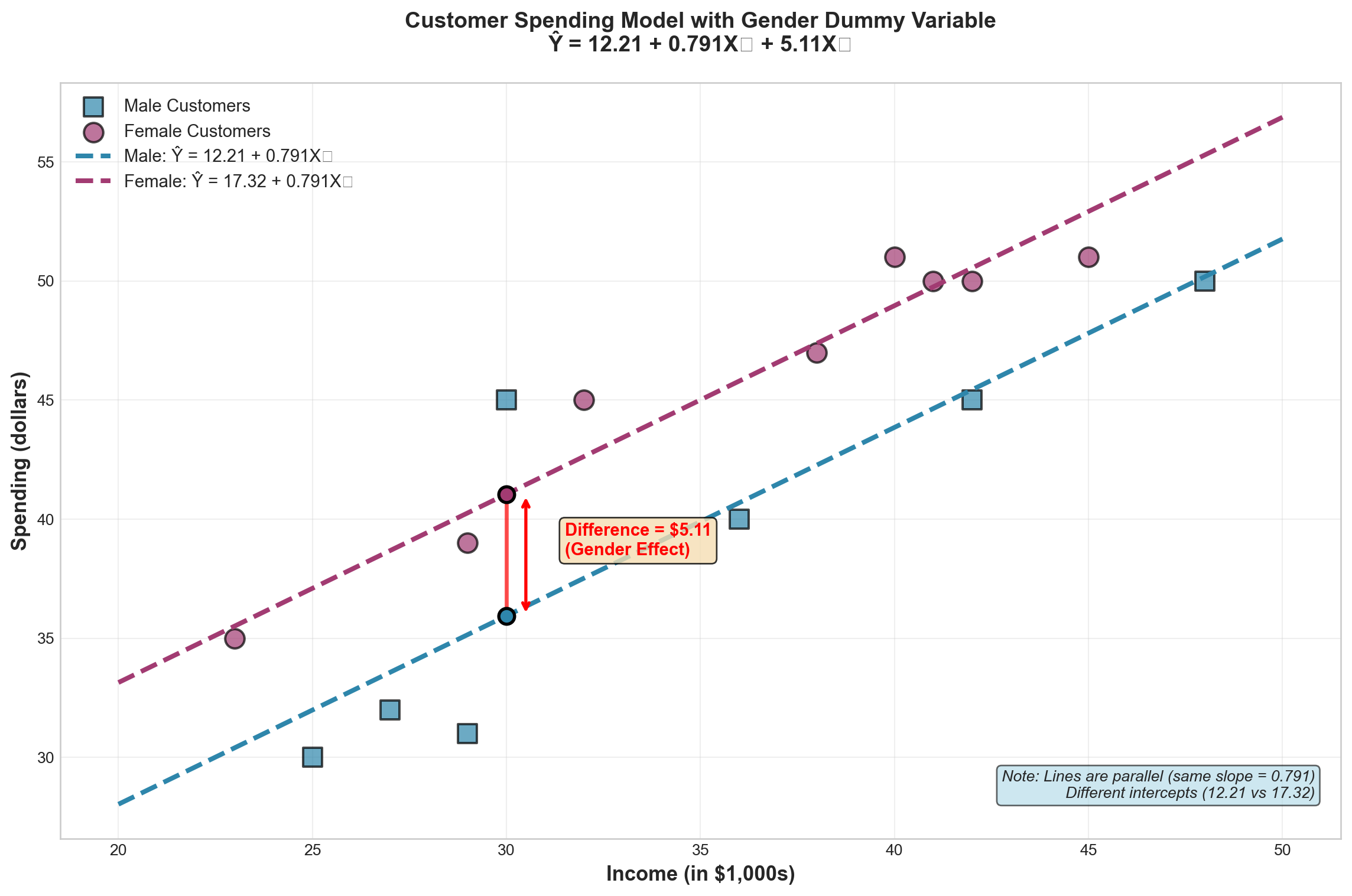
13.14.8 Alternative Coding: Does It Matter?
What if we had coded the dummy variable oppositely, assigning 1 to male and 0 to female?
Alternative Coding: - Code 1 if male - Code 0 if female
A computer analysis shows the regression equation would be:
\hat{Y} = 17.32 + 0.791X_1 - 5.11X_2
For Females (X_2 = 0): \begin{aligned} \hat{Y} &= 17.32 + 0.791X_1 - 5.11(0) \\ &= 17.32 + 0.791X_1 \end{aligned}
For Males (X_2 = 1): \begin{aligned} \hat{Y} &= 17.32 + 0.791X_1 - 5.11(1) \\ &= 12.21 + 0.791X_1 \end{aligned}
TipCoding Direction Doesn’t Matter
The final results are identical! Coding the dummy variable either way produces the same two regression equations: - Males: \hat{Y} = 12.21 + 0.791X_1 - Females: \hat{Y} = 17.32 + 0.791X_1
The only difference is whether the gender coefficient is positive (+5.11) or negative (-5.11), but the interpretation and predictions remain the same.
13.15 Section Exercises
1. Why is it invalid to compare regression coefficients directly when variables are measured in different units? Provide a specific example.
2. Calculate the beta coefficient for a variable where: - Unstandardized coefficient: b_i = 2.5 - Standard deviation of Y: s_Y = 8.4 - Standard deviation of X_i: s_{X_i} = 3.2
3. A production function is estimated as: \hat{Y} = 100 + 15X_1 + 250X_2
where Y = units produced, X_1 = labor hours, X_2 = capital (in $10,000s)
- Can you conclude that capital is more important than labor because b_2 > b_1? Explain.
- What additional information would you need to assess relative importance?
4. For the Hop Scotch Airlines model, the beta coefficients are 0.7687 (advertising) and 0.2489 (national income). Does this definitively prove advertising is more important? Why or why not?
5. A coal mining company wants to build a regression model to predict output (Y) using work hours (X_1) and whether a strike occurred during the study period (X_2). Design the model and explain how to code the strike variable.
6. Given the model in Exercise 5, should b_2 be positive or negative? Explain your reasoning.
7. For the customer spending model \hat{Y} = 12.21 + 0.791X_1 + 5.11X_2:
- Predict spending for a male customer with income $35,000
- Predict spending for a female customer with income $35,000
- What is the gender effect on spending?
8. If the dummy variable in Exercise 7 were recoded as 1 for male and 0 for female, what would the new regression equation be? Show that predictions remain unchanged.
9. Studies show that states with more liberal unemployment compensation regulations have higher unemployment rates. If a regression model for unemployment rates uses a dummy variable coded 1 for liberal regulations and 0 otherwise, should the coefficient be greater than or less than zero according to these studies? Explain.
10. A marketing analyst wants to include “season” as a variable in a sales regression model. The four seasons are Spring, Summer, Fall, and Winter. How many dummy variables are needed? Show how you would code the data for an observation from the Fall season.
13.16 12.10 Dummy Variables (Continued)
13.16.1 Scatter Plot Interpretation with Dummy Variables
If we plotted the customer spending data in a scatter diagram, the pattern might appear as shown in Figure 13.10. In an extreme case, we might observe two almost completely independent clusters: one for male observations and another for female observations.
Code
import numpy as np
import matplotlib.pyplot as plt

# Set style
plt.style.use('seaborn-v0_8-whitegrid')
fig, (ax1, ax2) = plt.subplots(1, 2, figsize=(15, 6))

# Data from table
income = np.array([40, 25, 27, 32, 45, 29, 42, 38, 30, 29, 41, 23, 36, 42, 48])
spending = np.array([51, 30, 32, 45, 51, 31, 50, 47, 45, 39, 50, 35, 40, 45, 50])
gender = np.array([1, 0, 0, 1, 1, 0, 1, 1, 0, 1, 1, 1, 0, 0, 0])

# Separate by gender
male_income = income[gender == 0]
male_spending = spending[gender == 0]
female_income = income[gender == 1]
female_spending = spending[gender == 1]

# LEFT PLOT: Without dummy variable (single regression line)
ax1.scatter(male_income, male_spending, s=150, color='#2E86AB',
           label='Male', alpha=0.7, edgecolors='black', linewidth=1.5, marker='s')
ax1.scatter(female_income, female_spending, s=150, color='#A23B72',
           label='Female', alpha=0.7, edgecolors='black', linewidth=1.5, marker='o')

# Overall regression (ignoring gender) - steeper slope
x_range = np.linspace(20, 50, 100)
# Overall regression would be approximately: Y* = 7.5 + 0.85*X (steeper)
y_overall = 7.5 + 0.85 * x_range
ax1.plot(x_range, y_overall, color='red', linewidth=3, linestyle='--',
        label="Y* (Ignoring Gender)\nIncorrect slope!", alpha=0.8)

ax1.set_xlabel('Income (in $1,000s)', fontsize=12, fontweight='bold')
ax1.set_ylabel('Spending (dollars)', fontsize=12, fontweight='bold')
ax1.set_title('Without Dummy Variable\n(Gender Effect Confounded with Income)',
             fontsize=13, fontweight='bold', pad=15)
ax1.legend(loc='upper left', fontsize=10)
ax1.grid(True, alpha=0.3)
ax1.text(0.5, 0.05, '❌ Single line misrepresents both groups',
        transform=ax1.transAxes, ha='center', fontsize=10,
        color='red', fontweight='bold',
        bbox=dict(boxstyle='round', facecolor='wheat', alpha=0.6))

# RIGHT PLOT: With dummy variable (parallel regression lines)
ax2.scatter(male_income, male_spending, s=150, color='#2E86AB',
           label='Male', alpha=0.7, edgecolors='black', linewidth=1.5, marker='s')
ax2.scatter(female_income, female_spending, s=150, color='#A23B72',
           label='Female', alpha=0.7, edgecolors='black', linewidth=1.5, marker='o')

# Correct parallel regression lines
y_male = 12.21 + 0.791 * x_range
y_female = 17.32 + 0.791 * x_range
ax2.plot(x_range, y_male, color='#2E86AB', linewidth=3,
        label='Male: Ŷ = 12.21 + 0.791X₁', linestyle='--')
ax2.plot(x_range, y_female, color='#A23B72', linewidth=3,
        label='Female: Ŷ = 17.32 + 0.791X₁', linestyle='--')

ax2.set_xlabel('Income (in $1,000s)', fontsize=12, fontweight='bold')
ax2.set_ylabel('Spending (dollars)', fontsize=12, fontweight='bold')
ax2.set_title('With Dummy Variable\n(Correct Parallel Lines)',
             fontsize=13, fontweight='bold', pad=15)
ax2.legend(loc='upper left', fontsize=10)
ax2.grid(True, alpha=0.3)
ax2.text(0.5, 0.05, '✅ Separate lines correctly model each group',
        transform=ax2.transAxes, ha='center', fontsize=10,
        color='green', fontweight='bold',
        bbox=dict(boxstyle='round', facecolor='lightgreen', alpha=0.6))

plt.tight_layout()
plt.show()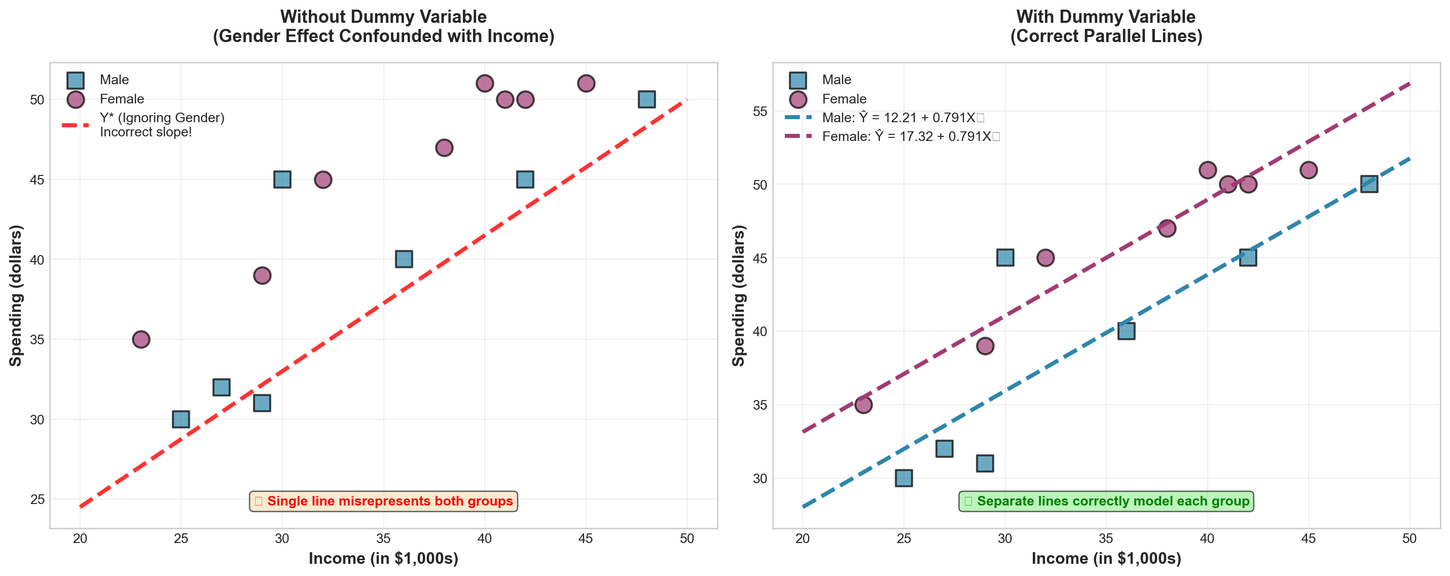
WarningThe Problem of Ignoring the Dummy Variable
If we ignore the dummy variable and fit only a single regression line (shown as Y^* in the left panel), its slope would be much steeper than the two correct parallel lines.
Consequence: The effect attributed solely to income would actually be partly due to gender. We would be confounding the income effect with the gender effect, leading to biased and misleading conclusions.
The dummy variable allows us to properly separate these effects.
13.16.2 Dummy Variables with More Than Two Categories
So far, we’ve examined dummy variables with only two possible responses (male/female, yes/no, etc.). But what if a qualitative variable has more than two categories?
ImportantThe r - 1 Rule
A variable with r possible responses requires r - 1 dummy variables.
Why? The last category is identified by process of elimination when all other dummy variables equal zero.
13.16.3 Example: Marital Status
Suppose we want to include marital status as a third variable in our customer spending model to study its effect on spending. Marital status has four possible responses:
- Married
- Single
- Divorced
- Widowed
Besides X_1 (income) and X_2 (gender), we need three additional dummy variables (X_3, X_4, X_5) to code marital status.
Coding Scheme:
\begin{aligned} X_3 &= \begin{cases} 1 & \text{if married} \\ 0 & \text{if not married} \end{cases} \\[10pt] X_4 &= \begin{cases} 1 & \text{if single} \\ 0 & \text{if not single} \end{cases} \\[10pt] X_5 &= \begin{cases} 1 & \text{if divorced} \\ 0 & \text{if not divorced} \end{cases} \end{aligned}
Note: No separate variable is needed for “widowed” because if X_3 = X_4 = X_5 = 0, the process of elimination reveals the observation must be widowed.
13.16.4 Coding Examples
Assuming X_2 is coded 0 for male and 1 for female, here are three sample observations:
| OBS | Y | X_1 | X_2 | X_3 | X_4 | X_5 | Description |
|---|---|---|---|---|---|---|---|
| 1 | 30 | 40 | 0 | 1 | 0 | 0 | Married male, income $40k, spending $30 |
| 2 | 35 | 38 | 1 | 0 | 0 | 1 | Divorced female, income $38k, spending $35 |
| 3 | 20 | 45 | 0 | 0 | 0 | 0 | Widowed male, income $45k, spending $20 |
Observation 1: X_2 = 0 (male), X_3 = 1 (married), X_4 = 0 and X_5 = 0 (not single, not divorced)
Observation 2: X_2 = 1 (female), X_3 = 0 and X_4 = 0 (not married, not single), X_5 = 1 (divorced)
Observation 3: X_2 = 0 (male), X_3 = X_4 = X_5 = 0 (must be widowed by elimination)
13.16.5 General Model with Multiple Dummy Variables
The complete model would be:
\hat{Y} = b_0 + b_1X_1 + b_2X_2 + b_3X_3 + b_4X_4 + b_5X_5
Interpretation of coefficients:
- b_1: Effect of $1,000 increase in income (holding all else constant)
- b_2: Spending difference between females and males (holding all else constant)
- b_3: Spending difference between married and widowed (the reference category)
- b_4: Spending difference between single and widowed (the reference category)
- b_5: Spending difference between divorced and widowed (the reference category)
TipReference Category
The category not explicitly coded (widowed, in this example) becomes the reference category or baseline category. All dummy variable coefficients measure differences relative to this baseline.
You can choose any category as the reference by deciding which (r-1) categories to code explicitly.
13.16.6 Common Mistakes with Dummy Variables
WarningThe Dummy Variable Trap
WRONG: Coding categories as 0, 1, 2, 3, etc.
Students sometimes attempt to code marital status as: - 0 = Married - 1 = Single - 2 = Divorced - 3 = Widowed
This is incorrect! This coding implies an ordinal relationship (married < single < divorced < widowed) and treats the variable as quantitative rather than qualitative.
CORRECT: Use (r-1) separate binary (0/1) dummy variables as shown above.
13.16.7 Summary: Dummy Variable Guidelines
| Situation | Number of Dummies Needed | Example |
|---|---|---|
| Two categories | 1 dummy | Gender (male/female) |
| Three categories | 2 dummies | Education (HS/College/Graduate) |
| Four categories | 3 dummies | Marital status (4 types) |
| r categories | (r-1) dummies | General rule |
Key Principles: 1. Always use binary (0/1) coding 2. Use r - 1 dummies for r categories 3. One category becomes the reference (all dummies = 0) 4. Coefficients measure differences from the reference category 5. Coding direction (which category = 1) doesn’t affect final results
13.17 12.11 Curvilinear Regression Models
13.17.1 When Linear Models Are Inadequate
Throughout this chapter, we have assumed that the relationship between X and Y can be expressed as a straight line—that is, the relationship is linear. However, this is not always the case.
We may find that a curvilinear model (nonlinear model) provides a better fit to the data.
13.17.2 Mayor Jorden’s Tax Revenue Problem
Suppose Mayor Sam Jorden of Plattsburg wants to predict tax revenues based on population. He collects the data shown in Table 13.9. Both tax revenues and population are measured in millions.
| Tax Revenue (millions) |
Population (millions) |
|---|---|
| $85 | 2.68 |
| $118 | 2.98 |
| $164 | 3.50 |
| $228 | 3.79 |
| $31 | 1.57 |
| $43 | 2.01 |
| $61 | 2.15 |
| $611 | 4.90 |
| $316 | 4.16 |
| $444 | 4.50 |
A scatter plot of these data (Figure 13.11) suggests that a curvilinear model is necessary. A straight line does not appear to provide an adequate fit.
Code
import numpy as np
import matplotlib.pyplot as plt
from scipy import stats

# Data
population = np.array([2.68, 2.98, 3.50, 3.79, 1.57, 2.01, 2.15, 4.90, 4.16, 4.50])
tax_revenue = np.array([85, 118, 164, 228, 31, 43, 61, 611, 316, 444])

# Set style
plt.style.use('seaborn-v0_8-whitegrid')
fig, ax = plt.subplots(figsize=(12, 8))

# Scatter plot
ax.scatter(population, tax_revenue, s=200, color='#E63946',
          alpha=0.7, edgecolors='black', linewidth=2, zorder=3)

# Try to fit a straight line (will be poor)
slope, intercept, r_value, p_value, std_err = stats.linregress(population, tax_revenue)
x_line = np.linspace(1.5, 5.0, 100)
y_line = intercept + slope * x_line
ax.plot(x_line, y_line, 'b--', linewidth=2, alpha=0.6,
       label=f'Linear Fit: Ŷ = {intercept:.1f} + {slope:.1f}X\n(Poor fit - misses curvature)')

# Fit a quadratic curve (will be good)
coeffs = np.polyfit(population, tax_revenue, 2)
y_quad = coeffs[0] * x_line**2 + coeffs[1] * x_line + coeffs[2]
ax.plot(x_line, y_quad, 'g-', linewidth=3, alpha=0.8,
       label=f'Quadratic Fit: Ŷ = {coeffs[0]:.1f}X² + {coeffs[1]:.1f}X + {coeffs[2]:.1f}\n(Better fit - captures curvature)')

# Formatting
ax.set_xlabel('Population (millions)', fontsize=13, fontweight='bold')
ax.set_ylabel('Tax Revenue ($ millions)', fontsize=13, fontweight='bold')
ax.set_title('Tax Revenue vs. Population: Need for Curvilinear Model',
            fontsize=14, fontweight='bold', pad=20)
ax.legend(loc='upper left', fontsize=11, framealpha=0.95)
ax.grid(True, alpha=0.3)

# Add annotation showing increasing rate
ax.annotate('', xy=(4.5, 444), xytext=(3.0, 118),
           arrowprops=dict(arrowstyle='->', color='red', lw=2.5,
                          connectionstyle="arc3,rad=.3"))
ax.text(3.8, 250, 'Rate of increase\naccelerates!', fontsize=11, color='red',
       fontweight='bold', bbox=dict(boxstyle='round', facecolor='yellow', alpha=0.6))

plt.tight_layout()
plt.show()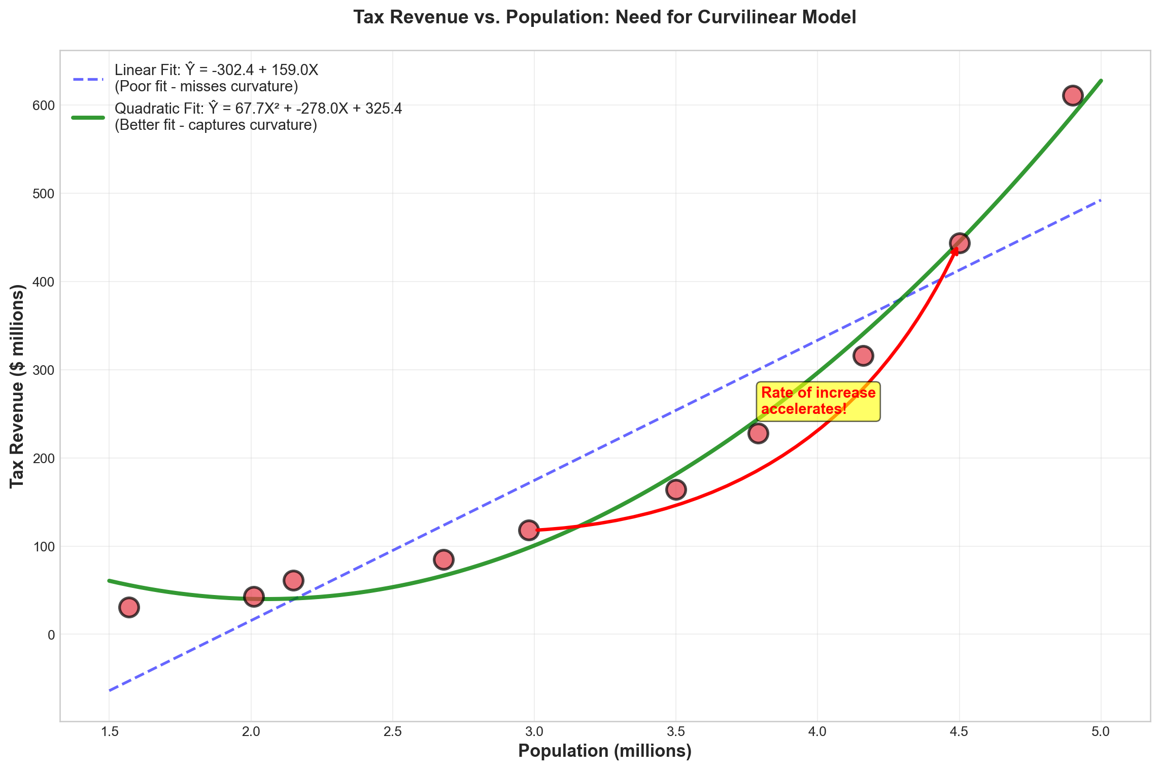
NoteCharacteristics of Curvilinear Relationships
In a simple linear regression model, the change in Y is constant as X changes. The slope remains the same throughout the range of X.
In a curvilinear model, as X changes, Y changes by different amounts. Figure 13.11 shows that as population increases, tax revenue increases at an accelerating rate—the relationship curves upward.
13.17.3 Polynomial Regression Models
Curvilinear models often fit well using a polynomial function of the general form:
TipGeneral Polynomial Model
Y = \beta_0 + \beta_1X + \beta_2X^2 + \cdots + \beta_kX^k + \varepsilon \tag{13.2}
This is called a polynomial of degree k because k is the highest power of any explanatory variable.
13.17.4 Quadratic Model (Second-Order Polynomial)
Mayor Jorden’s model may fit best using a polynomial of degree 2 (second-order polynomial), also called the quadratic form:
\hat{Y} = b_0 + b_1X + b_2X^2 \tag{13.3}
For the tax revenue example:
\widehat{TAX} = b_0 + b_1(POP) + b_2(POP)^2
where:
- TAX = tax revenue (in millions)
- POP = population (in millions)
Note: The second explanatory variable is simply the square of the first.
13.17.5 Comparing Linear vs. Quadratic Models
Let’s compare the results of fitting a simple linear model versus a quadratic model to Mayor Jorden’s data.
Linear Model Results:
Making a regression of TAX on POP yields:
\widehat{TAX} = -302.39 + 158.96\,POP
Model Statistics: - R^2 = 86.1\% - \bar{R}^2 = 84.3\% - S_e = 76.38
Quadratic Model Results:
Making a regression of TAX on POP and POP² yields:
\widehat{TAX} = 325.36 - 277.98\,POP + 67.692\,POP^2
Model Statistics: - R^2 = 99.0\% - \bar{R}^2 = 98.7\% - S_e = 22.20
Code
import numpy as np
import matplotlib.pyplot as plt

# Set style
plt.style.use('seaborn-v0_8-whitegrid')
fig, ((ax1, ax2), (ax3, ax4)) = plt.subplots(2, 2, figsize=(14, 12))

# Model comparison data
models = ['Linear Model', 'Quadratic Model']
r_squared = [86.1, 99.0]
adj_r_squared = [84.3, 98.7]
std_error = [76.38, 22.20]

colors = ['#3498db', '#2ecc71']
x_pos = np.arange(len(models))

# Plot 1: R-squared comparison
bars1 = ax1.bar(x_pos, r_squared, color=colors, alpha=0.8, edgecolor='black', linewidth=2)
ax1.set_ylabel('R² (%)', fontsize=12, fontweight='bold')
ax1.set_title('Coefficient of Determination (R²)', fontsize=13, fontweight='bold')
ax1.set_xticks(x_pos)
ax1.set_xticklabels(models)
ax1.set_ylim([0, 105])
ax1.grid(axis='y', alpha=0.3)
for bar, val in zip(bars1, r_squared):
    height = bar.get_height()
    ax1.text(bar.get_x() + bar.get_width()/2., height + 1,
            f'{val:.1f}%', ha='center', va='bottom', fontweight='bold', fontsize=11)

# Plot 2: Adjusted R-squared comparison
bars2 = ax2.bar(x_pos, adj_r_squared, color=colors, alpha=0.8, edgecolor='black', linewidth=2)
ax2.set_ylabel('Adjusted R² (%)', fontsize=12, fontweight='bold')
ax2.set_title('Adjusted Coefficient of Determination', fontsize=13, fontweight='bold')
ax2.set_xticks(x_pos)
ax2.set_xticklabels(models)
ax2.set_ylim([0, 105])
ax2.grid(axis='y', alpha=0.3)
for bar, val in zip(bars2, adj_r_squared):
    height = bar.get_height()
    ax2.text(bar.get_x() + bar.get_width()/2., height + 1,
            f'{val:.1f}%', ha='center', va='bottom', fontweight='bold', fontsize=11)

# Plot 3: Standard Error comparison
bars3 = ax3.bar(x_pos, std_error, color=colors, alpha=0.8, edgecolor='black', linewidth=2)
ax3.set_ylabel('Standard Error ($millions)', fontsize=12, fontweight='bold')
ax3.set_title('Standard Error of Estimate', fontsize=13, fontweight='bold')
ax3.set_xticks(x_pos)
ax3.set_xticklabels(models)
ax3.set_ylim([0, 85])
ax3.grid(axis='y', alpha=0.3)
for bar, val in zip(bars3, std_error):
    height = bar.get_height()
    ax3.text(bar.get_x() + bar.get_width()/2., height + 2,
            f'${val:.2f}M', ha='center', va='bottom', fontweight='bold', fontsize=11)
# Add note that lower is better
ax3.text(0.5, 0.95, '(Lower is better)', transform=ax3.transAxes,
        ha='center', va='top', fontsize=10, style='italic')

# Plot 4: Summary table
ax4.axis('off')
summary_data = [
    ['Metric', 'Linear Model', 'Quadratic Model', 'Winner'],
    ['R²', '86.1%', '99.0%', '✅ Quadratic'],
    ['Adjusted R²', '84.3%', '98.7%', '✅ Quadratic'],
    ['Std. Error', '$76.38M', '$22.20M', '✅ Quadratic'],
    ['Equation', 'Ŷ = -302 + 159·POP', 'Ŷ = 325 - 278·POP + 67.7·POP²', '']
]

table = ax4.table(cellText=summary_data, cellLoc='center', loc='center',
                 colWidths=[0.25, 0.25, 0.30, 0.20])
table.auto_set_font_size(False)
table.set_fontsize(10)
table.scale(1, 2.5)

# Style header row
for i in range(4):
    cell = table[(0, i)]
    cell.set_facecolor('#34495e')
    cell.set_text_props(weight='bold', color='white')

# Style winner column
for i in range(1, 4):
    cell = table[(i, 3)]
    cell.set_facecolor('#d4edda')
    cell.set_text_props(weight='bold', color='#155724')

# Alternate row colors
for i in range(1, 5):
    for j in range(3):
        cell = table[(i, j)]
        if i % 2 == 0:
            cell.set_facecolor('#ecf0f1')

ax4.set_title('Model Performance Summary', fontsize=13, fontweight='bold', pad=20)

plt.tight_layout()
plt.show()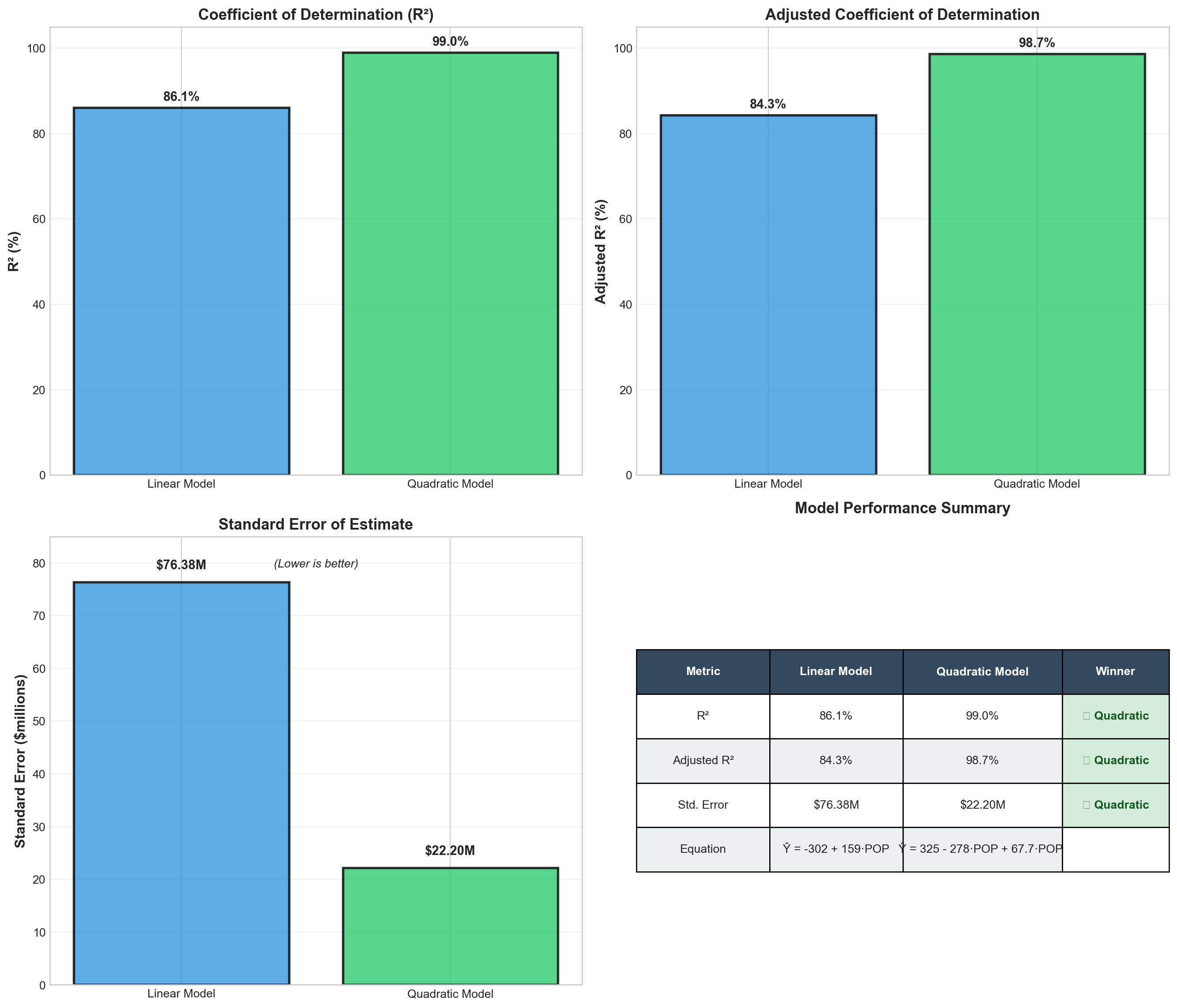
ImportantClear Winner: Quadratic Model
The quadratic model dramatically outperforms the linear model:
- Explanatory power: \bar{R}^2 improves from 84.3% to 98.7% (+14.4 percentage points)
- Prediction accuracy: Standard error decreases from $76.38M to $22.20M (71% reduction!)
- Better fit: The quadratic form captures the accelerating relationship between population and tax revenue
Conclusion: The quadratic model provides a substantially better fit for Mayor Jorden’s data.
13.17.6 Making Predictions with the Quadratic Model
Using the quadratic model, we can predict tax revenue for any population level:
\widehat{TAX} = 325.36 - 277.98\,POP + 67.692\,POP^2
Example: If population = 3.2 million:
\begin{aligned} \widehat{TAX} &= 325.36 - 277.98(3.2) + 67.692(3.2)^2 \\ &= 325.36 - 889.54 + 692.65 \\ &= 128.47 \end{aligned}
Predicted tax revenue: $128.47 million
13.18 12.12 Logarithmic Transformations
13.18.1 An Alternative Approach to Curvilinearity
An alternative method for handling curvilinear relationships can be achieved through transformation of the data. A common transformation method involves the use of logarithms.
This logarithmic transformation can make data that are linear in the logarithm rather than in the original values.
13.18.2 Transforming Mayor Jorden’s Data
Table 13.10 shows Mayor Jorden’s original data in the first two columns and their natural logarithms in the last two columns.
| Tax Revenue | Population | LOGTAX | LOGPOP |
|---|---|---|---|
| 85 | 2.68 | 4.44265 | 0.98582 |
| 118 | 2.98 | 4.77068 | 1.09102 |
| 164 | 3.50 | 5.09987 | 1.25276 |
| 228 | 3.79 | 5.42935 | 1.33237 |
| 31 | 1.57 | 3.43399 | 0.45108 |
| 43 | 2.01 | 3.76120 | 0.69813 |
| 61 | 2.15 | 4.11087 | 0.76547 |
| 611 | 4.90 | 6.41510 | 1.58924 |
| 316 | 4.16 | 5.75574 | 1.42552 |
| 444 | 4.50 | 6.09582 | 1.50408 |
Mayor Jorden now performs a simple regression of LOGTAX on LOGPOP:
\widehat{LOGTAX} = 2.0302 + 2.6147\,LOGPOP
Model Statistics: - R^2 = 97.5\% - \bar{R}^2 = 82.2\% (Note: This seems inconsistent; likely \bar{R}^2 = 97.2\%) - S_e = 0.1680 (in log units)
Code
import numpy as np
import matplotlib.pyplot as plt
from scipy import stats

# Original data
population = np.array([2.68, 2.98, 3.50, 3.79, 1.57, 2.01, 2.15, 4.90, 4.16, 4.50])
tax_revenue = np.array([85, 118, 164, 228, 31, 43, 61, 611, 316, 444])

# Log transformation
log_pop = np.log(population)
log_tax = np.log(tax_revenue)

# Set style
plt.style.use('seaborn-v0_8-whitegrid')
fig, (ax1, ax2) = plt.subplots(1, 2, figsize=(15, 6))

# LEFT PLOT: Original data (curvilinear)
ax1.scatter(population, tax_revenue, s=180, color='#E63946',
           alpha=0.7, edgecolors='black', linewidth=2)
coeffs = np.polyfit(population, tax_revenue, 2)
x_curve = np.linspace(1.5, 5.0, 100)
y_curve = coeffs[0] * x_curve**2 + coeffs[1] * x_curve + coeffs[2]
ax1.plot(x_curve, y_curve, 'b-', linewidth=3, alpha=0.7,
        label='Quadratic: Ŷ = 325 - 278·POP + 67.7·POP²')
ax1.set_xlabel('Population (millions)', fontsize=12, fontweight='bold')
ax1.set_ylabel('Tax Revenue ($ millions)', fontsize=12, fontweight='bold')
ax1.set_title('Original Data: Curvilinear Relationship', fontsize=13, fontweight='bold')
ax1.legend(loc='upper left', fontsize=10)
ax1.grid(True, alpha=0.3)
ax1.text(0.5, 0.05, 'Requires quadratic model', transform=ax1.transAxes,
        ha='center', fontsize=10, style='italic',
        bbox=dict(boxstyle='round', facecolor='wheat', alpha=0.6))

# RIGHT PLOT: Log-transformed data (linear)
ax2.scatter(log_pop, log_tax, s=180, color='#2A9D8F',
           alpha=0.7, edgecolors='black', linewidth=2)
slope, intercept, r_value, p_value, std_err = stats.linregress(log_pop, log_tax)
x_line = np.linspace(log_pop.min(), log_pop.max(), 100)
y_line = intercept + slope * x_line
ax2.plot(x_line, y_line, 'r-', linewidth=3, alpha=0.7,
        label=f'Linear: log(Ŷ) = {intercept:.3f} + {slope:.3f}·log(X)\nR² = {r_value**2:.3f}')
ax2.set_xlabel('log(Population)', fontsize=12, fontweight='bold')
ax2.set_ylabel('log(Tax Revenue)', fontsize=12, fontweight='bold')
ax2.set_title('Log-Transformed Data: Linear Relationship', fontsize=13, fontweight='bold')
ax2.legend(loc='upper left', fontsize=10)
ax2.grid(True, alpha=0.3)
ax2.text(0.5, 0.05, 'Simple linear regression works!', transform=ax2.transAxes,
        ha='center', fontsize=10, style='italic',
        bbox=dict(boxstyle='round', facecolor='lightgreen', alpha=0.6))

plt.tight_layout()
plt.show()13.18.3 Making Predictions with Log-Transformed Model
Step 1: Make prediction in log scale
If population = 3.2 million, then:
LOGPOP = \ln(3.2) = 1.163
\begin{aligned} \widehat{LOGTAX} &= 2.0302 + 2.6147(1.163) \\ &= 2.0302 + 3.041 \\ &= 5.071 \end{aligned}
Step 2: Transform back to original scale
Take the antilogarithm (exponential) of 5.071:
\widehat{TAX} = e^{5.071} = 159.33
Since the data were originally in millions:
Predicted tax revenue = $159.33 million
TipRemember: Transform Predictions Back!
When using logarithmic transformations: 1. Make prediction in log scale 2. Transform back using antilog (e^{\text{log prediction}}) to get results in original units 3. Don’t forget to account for the original units (millions, thousands, etc.)
13.19 12.13 Choosing Between Models: Explanation vs. Prediction
13.19.1 The Model Selection Dilemma
It may be necessary to experiment with different functional forms to determine which provides the best fit. In the search for the optimal model, results from different logarithmic models can be compared with those obtained using polynomial functions.
Computer technology makes such comparisons practical and efficient.
13.19.2 When Models Disagree
However, the results of such comparisons may be inconsistent. Consider this scenario:
- Model A: Higher R^2 (better explanation) BUT higher S_e (worse prediction)
- Model B: Lower R^2 (worse explanation) BUT lower S_e (better prediction)
ImportantThe Critical Question
Which model should you use when performance metrics give contradictory signals?
The answer depends on the purpose for which the model is intended.
13.19.3 Two Purposes of Regression Models
1. Explanation Models
Purpose: To understand and explain current or past values of Y
Goal: Understand why Y behaves as it does
Best metric: Coefficient of determination (R^2 or \bar{R}^2)
Decision rule: Use the model with the highest R^2 or \bar{R}^2
Example applications: - Understanding what factors drive employee turnover - Explaining variations in student test scores - Analyzing determinants of economic growth
2. Prediction Models
Purpose: To forecast future values of Y
Goal: Make accurate predictions with minimal error
Best metric: Standard error of estimate (S_e)
Decision rule: Use the model with the lowest S_e
Example applications: - Forecasting next quarter’s sales - Predicting future housing prices - Projecting demand for products
Code
import matplotlib.pyplot as plt
import matplotlib.patches as mpatches

# Set style
plt.style.use('seaborn-v0_8-whitegrid')
fig, (ax1, ax2) = plt.subplots(1, 2, figsize=(15, 7))

# Decision tree for explanation
ax1.text(0.5, 0.95, 'EXPLANATION PURPOSE', ha='center', va='top',
        fontsize=16, fontweight='bold', transform=ax1.transAxes,
        bbox=dict(boxstyle='round', facecolor='#3498db', alpha=0.7, edgecolor='black', linewidth=2))

ax1.text(0.5, 0.85, '▼', ha='center', va='top', fontsize=20, transform=ax1.transAxes)

ax1.text(0.5, 0.78, 'Goal: Understand WHY', ha='center', va='top',
        fontsize=13, fontweight='bold', transform=ax1.transAxes, style='italic')

ax1.text(0.5, 0.70, '▼', ha='center', va='top', fontsize=20, transform=ax1.transAxes)

ax1.text(0.5, 0.60, 'Maximize Explanatory Power', ha='center', va='top',
        fontsize=12, fontweight='bold', transform=ax1.transAxes,
        bbox=dict(boxstyle='round', facecolor='yellow', alpha=0.5))

ax1.text(0.5, 0.50, '▼', ha='center', va='top', fontsize=20, transform=ax1.transAxes)

ax1.text(0.5, 0.38, 'Choose Model with\nHighest R² or Adjusted R²', ha='center', va='top',
        fontsize=14, fontweight='bold', transform=ax1.transAxes,
        bbox=dict(boxstyle='round', facecolor='#2ecc71', alpha=0.7, edgecolor='black', linewidth=2))

ax1.text(0.5, 0.22, 'Examples:', ha='center', va='top',
        fontsize=11, fontweight='bold', transform=ax1.transAxes)
ax1.text(0.5, 0.15, '• Understanding employee turnover\n• Analyzing sales drivers\n• Explaining market share changes',
        ha='center', va='top', fontsize=10, transform=ax1.transAxes,
        bbox=dict(boxstyle='round', facecolor='wheat', alpha=0.5))

ax1.axis('off')

# Decision tree for prediction
ax2.text(0.5, 0.95, 'PREDICTION PURPOSE', ha='center', va='top',
        fontsize=16, fontweight='bold', transform=ax2.transAxes,
        bbox=dict(boxstyle='round', facecolor='#e74c3c', alpha=0.7, edgecolor='black', linewidth=2))

ax2.text(0.5, 0.85, '▼', ha='center', va='top', fontsize=20, transform=ax2.transAxes)

ax2.text(0.5, 0.78, 'Goal: Forecast FUTURE values', ha='center', va='top',
        fontsize=13, fontweight='bold', transform=ax2.transAxes, style='italic')

ax2.text(0.5, 0.70, '▼', ha='center', va='top', fontsize=20, transform=ax2.transAxes)

ax2.text(0.5, 0.60, 'Minimize Prediction Error', ha='center', va='top',
        fontsize=12, fontweight='bold', transform=ax2.transAxes,
        bbox=dict(boxstyle='round', facecolor='yellow', alpha=0.5))

ax2.text(0.5, 0.50, '▼', ha='center', va='top', fontsize=20, transform=ax2.transAxes)

ax2.text(0.5, 0.38, 'Choose Model with\nLowest Standard Error (Sₑ)', ha='center', va='top',
        fontsize=14, fontweight='bold', transform=ax2.transAxes,
        bbox=dict(boxstyle='round', facecolor='#9b59b6', alpha=0.7, edgecolor='black', linewidth=2))

ax2.text(0.5, 0.22, 'Examples:', ha='center', va='top',
        fontsize=11, fontweight='bold', transform=ax2.transAxes)
ax2.text(0.5, 0.15, '• Forecasting quarterly sales\n• Predicting housing prices\n• Projecting demand',
        ha='center', va='top', fontsize=10, transform=ax2.transAxes,
        bbox=dict(boxstyle='round', facecolor='wheat', alpha=0.5))

ax2.axis('off')

plt.tight_layout()
plt.show()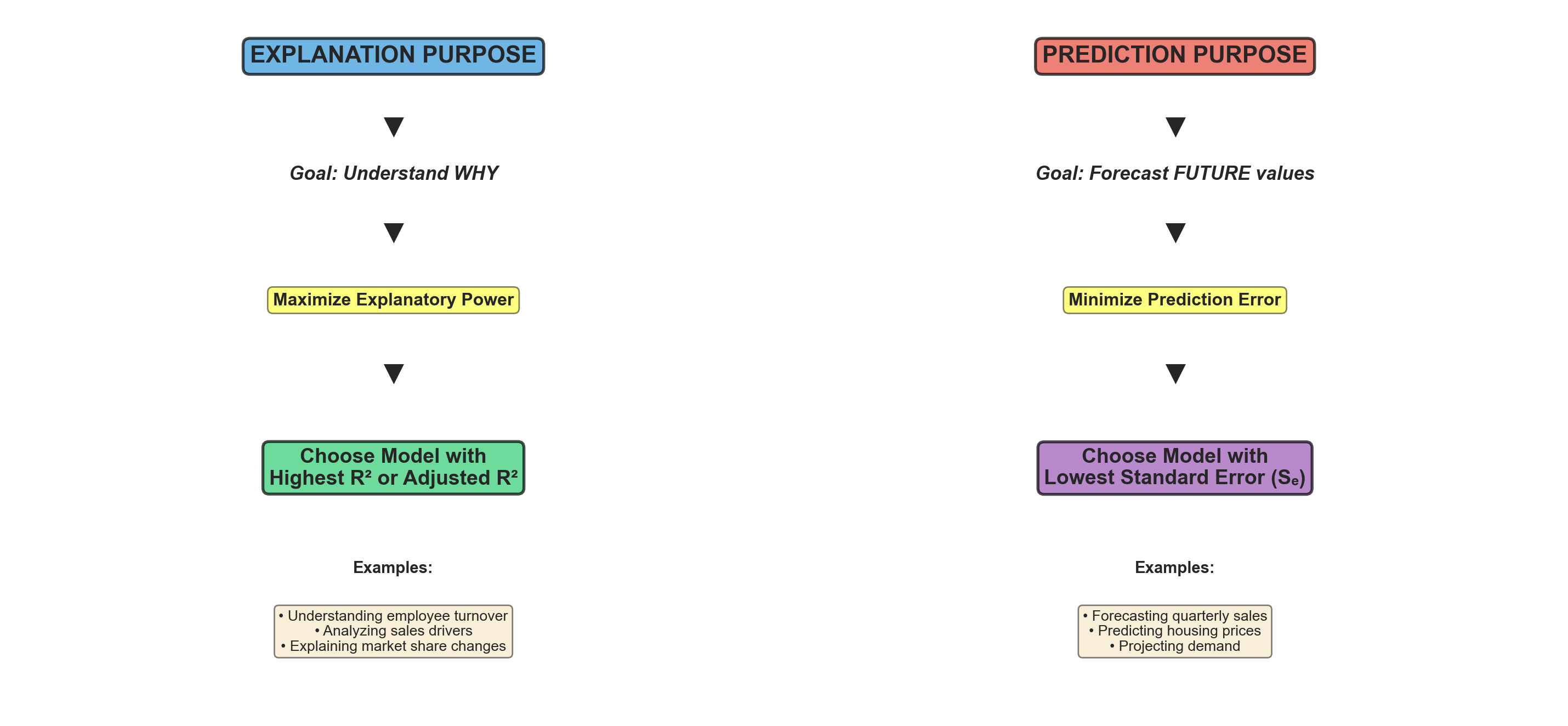
13.19.4 Ethical Considerations: The “Dartboard” Problem
WarningAvoid Excessive Experimentation
Such experimentation should be kept to a minimum. It is considered questionable, even unethical, to experiment wildly with one model after another without theoretical justification.
You should know from the beginning, given the nature of the research investigation, what procedure to follow.
The Dartboard Analogy: Randomly searching for the best model is similar to shooting an arrow at a target and then painting the bullseye around wherever the arrow lands. This practice: - Undermines scientific integrity - Leads to overfitting and poor out-of-sample performance - Violates the principles of hypothesis testing - Results in models that capitalize on random noise rather than true relationships
Best Practices:
- Theory first: Let economic/business theory guide model specification
- Pre-specify: Decide on model form before examining the data
- Limited comparisons: Compare only 2-3 theoretically justified alternatives
- Transparent reporting: Report all models tested, not just the “best” one
- Cross-validation: Test model performance on hold-out samples
13.20 Chapter 12 Summary
13.20.1 Key Concepts Covered
1. Comparing Regression Coefficients - Direct comparison of b_i coefficients is invalid (different units) - Standardized coefficients (beta weights) make variables comparable - Beta coefficients unreliable with multicollinearity - Use t-tests, partial R^2, and theory to assess importance
2. Dummy Variables - Allow incorporation of qualitative variables - Code as 0/1 (binary) - Use r-1 dummies for r categories - Create parallel regression lines with different intercepts - One category becomes reference (all dummies = 0)
3. Curvilinear Models - Polynomial regression: Y = b_0 + b_1X + b_2X^2 + \cdots + b_kX^k - Quadratic form: Common second-order model - Logarithmic transformation: Makes data linear in logs - Remember to transform predictions back to original scale
4. Model Selection - Explanation purpose → Maximize R^2 or \bar{R}^2 - Prediction purpose → Minimize S_e - Avoid excessive experimentation (“dartboard” problem) - Let theory guide model specification
13.21 Section Exercises (Continued)
11. For the marital status dummy variable example, write out the complete regression equation for: a. A married person b. A single person c. A divorced person d. A widowed person
12. Plot the following data and compare a linear model with a quadratic form. Provide a comparative evaluation of each. Using the best model, forecast Y if X = 22.
| Y | X | Y | X |
|---|---|---|---|
| 2170 | 31 | 731 | 18 |
| 2312 | 32 | 730 | 18 |
| 2877 | 36 | 815 | 19 |
| 7641 | 48 | 1408 | 25 |
| 2929 | 36 | 2768 | 35 |
| 1297 | 24 |
13. Using the data from Exercise 12, perform a logarithmic transformation and test the regression results. What are your observations?
14. Mayor Jorden wants to estimate tax revenues based on new business formations. He collects data from 22 similar cities:
- Create a scatter plot
- Compare a linear model with a quadratic form. Which provides the best fit?
- Predict tax revenue if there are 68 new businesses
15. Using the data from Exercise 14, calculate the logarithmic regression model. How does it compare with models from Exercise 14? Calculate predicted taxes if there are 68 new businesses.
16. Explain the difference between using a model for explanation versus prediction. Which performance metric should guide model selection in each case?
17. A researcher tests 15 different model specifications and reports only the best one. Explain why this practice is problematic from both statistical and ethical perspectives.