graph TD
    A[Probability Principles] --> B[Introduction to<br/>Probability]
    A --> C[Relationships<br/>between Events]
    A --> D[Probability<br/>Rules]
    A --> E[Contingency Tables<br/>and Probability Tables]
    A --> F[Conditional<br/>Probability]
    A --> G[Probability<br/>Trees]

    B --> H[Relative<br/>Frequency]
    B --> I[Subjective]
    B --> J[Classical]

    C --> K[Mutually<br/>Exclusive Events]
    C --> L[Collectively<br/>Exhaustive Events]
    C --> M[Independent<br/>Events]
    C --> N[Complementary<br/>Events]

    D --> O[Multiplication<br/>Rule]
    D --> P[Addition<br/>Rule]

    F --> Q[Bayes'<br/>Theorem]

    style A fill:#333,stroke:#000,stroke-width:3px,color:#fff
    style B fill:#e3f2fd,stroke:#1976d2,stroke-width:2px
    style C fill:#e8f5e9,stroke:#388e3c,stroke-width:2px
    style D fill:#fff3e0,stroke:#f57c00,stroke-width:2px
    style E fill:#fce4ec,stroke:#c2185b,stroke-width:2px
    style F fill:#f3e5f5,stroke:#7b1fa2,stroke-width:2px
    style G fill:#e0f2f1,stroke:#00796b,stroke-width:2px
    style H fill:#bbdefb,stroke:#1976d2,stroke-width:1px
    style I fill:#bbdefb,stroke:#1976d2,stroke-width:1px
    style J fill:#bbdefb,stroke:#1976d2,stroke-width:1px
    style K fill:#c8e6c9,stroke:#388e3c,stroke-width:1px
    style L fill:#c8e6c9,stroke:#388e3c,stroke-width:1px
    style M fill:#c8e6c9,stroke:#388e3c,stroke-width:1px
    style N fill:#c8e6c9,stroke:#388e3c,stroke-width:1px
    style O fill:#ffe0b2,stroke:#f57c00,stroke-width:1px
    style P fill:#ffe0b2,stroke:#f57c00,stroke-width:1px
    style Q fill:#e1bee7,stroke:#7b1fa2,stroke-width:1px
5 Probability Principles
5.1 Business Scenario: Ski Resort Financial Risk Analysis
The National Ski Areas Association commissioned a comprehensive study of 850 ski resorts across the United States to assess financial viability and bankruptcy risk. Michael Berry, the association’s president, warned:
“Many ski areas face a high probability of bankruptcy in upcoming seasons.”
The analysis examined three critical location factors:
- Urban proximity: Ski resorts near major metropolitan areas
- Isolated location: Remote resorts far from population centers
- Cluster concentration: Multiple resorts in the same geographic region
Key Questions:
- What is the probability that an urban resort will remain financially viable?
- What is the conditional probability that a bankrupt resort is isolated vs. urban?
- Are location type and bankruptcy independent events, or is there a relationship?
- How can Bayes’ Theorem help predict which resorts need immediate intervention?
Your Role: As a statistical consultant, you must analyze the 850 resorts using probability principles to identify high-risk properties and recommend corrective actions. Your analysis will guide multi-million dollar investment decisions and potentially save dozens of resorts from closure.
5.2 4.1 Why Probability Matters in Business
Uncertainty is the defining characteristic of business decision-making. Every strategic choice—launching a product, entering a market, hiring employees, investing capital—involves unknowable future outcomes. Probability provides the mathematical framework to:
ImportantThe Core Purpose of Probability
Probability quantifies uncertainty, allowing managers to:
- Reduce risk by measuring the likelihood of unfavorable outcomes
- Make informed decisions by comparing probabilities of alternatives
- Allocate resources efficiently based on expected returns
- Set realistic expectations about future performance
- Design contingency plans for low-probability, high-impact events
Bottom line: Every effort to reduce uncertainty in decision-making dramatically increases the probability of making smarter, more profitable choices.
Business Applications of Probability:
- Finance: Portfolio risk, option pricing, credit default probability, Value-at-Risk (VaR)
- Marketing: Customer conversion rates, campaign success probability, churn prediction
- Operations: Demand forecasting, inventory stockout probability, quality defect rates
- Human Resources: Hiring success rates, employee retention probability, training effectiveness
- Strategy: Market entry success, competitive response likelihood, regulatory approval probability
5.3 4.2 Introduction to Probability
Probability is a numerical measure of the likelihood that an event will occur. It ranges from 0 (impossible event) to 1 (certain event), often expressed as a percentage (0% to 100%).
NoteDefinition: Probability
The probability of event A, denoted P(A), is a number between 0 and 1:
0 \leq P(A) \leq 1
Interpretation:
- P(A) = 0: Event A is impossible (will never occur)
- P(A) = 1: Event A is certain (will always occur)
- P(A) = 0.5: Event A has a 50-50 chance (equally likely to occur or not)
Properties:
- All probabilities are non-negative (cannot be less than 0)
- The sum of probabilities of all possible outcomes = 1 (something must happen)
- The probability an event does NOT occur: P(\bar{A}) = 1 - P(A) (complement rule)
5.3.1 A. The Relative Frequency Approach
The relative frequency (or empirical) approach calculates probability based on historical data or observed frequencies.
NoteFormula 4.1: Relative Frequency Probability
P(E) = \frac{\text{Number of times event E occurred in the past}}{\text{Total number of observations}}
When to use:
- Historical data is available
- Process is stable and repeatable
- Past performance predicts future behavior
Examples:
- Defect rates in manufacturing (1,200 defects in 50,000 units → P(\text{defect}) = 0.024)
- Employee turnover (18 departures among 150 employees → P(\text{turnover}) = 0.12)
- Customer default rates (350 defaults in 10,000 loans → P(\text{default}) = 0.035)
5.3.2 Example 4.1: Manufacturing Quality Control (Relative Frequency)
Acme Electronics produces circuit boards. Quality control records show:
- Total boards inspected (last month): 12,500
- Defective boards found: 375
Question: What is the probability that a randomly selected board is defective?
Solution:
P(\text{Defective}) = \frac{375}{12,500} = 0.03 = 3\%
Interpretation:
Based on last month’s performance, there is a 3% probability (or 3% defect rate) that any randomly selected circuit board will be defective. This translates to approximately 30 defective boards per 1,000 produced.
Business Decision:
If Acme’s quality standard is “less than 2% defects,” the current process is not meeting standards. Management should investigate root causes (equipment calibration, operator training, supplier materials) and implement corrective actions.
Code
import matplotlib.pyplot as plt
import numpy as np

# Data
total_boards = 12500
defective = 375
good = total_boards - defective

# Calculate probability
prob_defective = defective / total_boards
prob_good = good / total_boards

fig, axes = plt.subplots(1, 2, figsize=(14, 6))

# Panel 1: Pie chart of proportions
sizes = [good, defective]
labels = [f'Good Boards\n{good:,}\n({prob_good:.1%})',
          f'Defective Boards\n{defective:,}\n({prob_defective:.1%})']
colors = ['lightgreen', 'salmon']
explode = (0, 0.1)  # Explode defective slice

axes[0].pie(sizes, labels=labels, colors=colors, autopct='%1.1f%%',
           explode=explode, shadow=True, startangle=90, textprops={'fontsize': 11, 'weight': 'bold'})
axes[0].set_title('Circuit Board Quality Distribution\n(Last Month Production)',
                 fontsize=13, fontweight='bold', pad=15)

# Panel 2: Bar chart comparing actual vs. target
categories = ['Current\nDefect Rate', 'Target\nDefect Rate']
rates = [prob_defective * 100, 2.0]  # Convert to percentages
colors_bar = ['red', 'green']

bars = axes[1].bar(categories, rates, color=colors_bar, alpha=0.7,
                   edgecolor='black', linewidth=2, width=0.5)

# Add value labels on bars
for bar, rate in zip(bars, rates):
    height = bar.get_height()
    axes[1].text(bar.get_x() + bar.get_width()/2., height,
                f'{rate:.1f}%',
                ha='center', va='bottom', fontweight='bold', fontsize=14)

# Add reference line at target
axes[1].axhline(y=2.0, color='green', linestyle='--', linewidth=2.5, alpha=0.7,
               label='Quality Standard (2% maximum)')

# Add gap annotation
axes[1].annotate('', xy=(0, 3.0), xytext=(0, 2.0),
                arrowprops=dict(arrowstyle='<->', lw=2.5, color='darkred'))
axes[1].text(0.15, 2.5, '1% gap\n(FAILING\nstandard)',
            fontsize=10, fontweight='bold', color='darkred',
            bbox=dict(boxstyle='round,pad=0.5', facecolor='yellow', alpha=0.8))

axes[1].set_ylabel('Defect Rate (%)', fontsize=12, fontweight='bold')
axes[1].set_title('Defect Rate: Current vs. Quality Target',
                 fontsize=13, fontweight='bold', pad=15)
axes[1].legend(fontsize=10, loc='upper right')
axes[1].grid(True, alpha=0.3, axis='y')
axes[1].set_ylim(0, 4)

plt.tight_layout()
plt.show()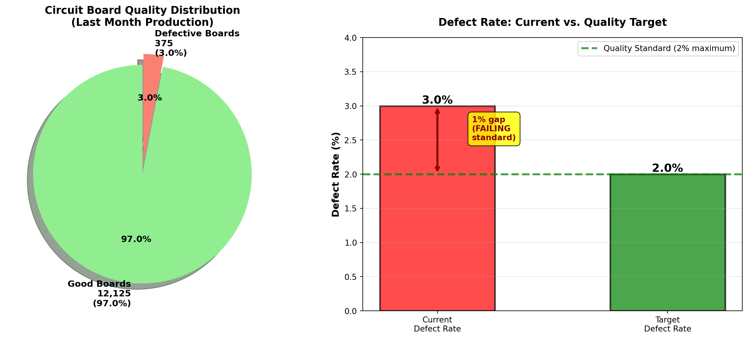
TipBusiness Insight: Interpreting Relative Frequency
Relative frequency probability assumes process stability:
- Stable process: Defect rate remains around 3% month-to-month → reliable prediction
- Unstable process: Defect rate varies wildly (1%, 5%, 8%, 2%) → poor prediction
Action: Before using historical probability, verify the process is in statistical control (Chapter 15). Sudden changes (new equipment, different suppliers, seasonal effects) invalidate historical probabilities.
5.3.3 B. The Subjective Approach
The subjective approach assigns probabilities based on expert judgment, intuition, or personal belief when historical data is unavailable or unreliable.
NoteSubjective Probability
Probability assigned based on:
- Expert opinion (industry experience, technical knowledge)
- Market research (surveys, focus groups, competitor analysis)
- Informed judgment (considering all available information)
When to use:
- No historical data exists (new products, unprecedented events)
- Unique one-time events (merger success, regulatory approval)
- Rapidly changing environments (technology disruption, pandemic response)
Examples:
- “There’s a 70% chance our new smartphone will capture 10% market share within 6 months”
- “I estimate a 40% probability the FDA approves our drug application this year”
- “The probability of recession in the next 12 months is approximately 35%”
5.3.4 Example 4.2: New Product Launch (Subjective Probability)
Global Tech Inc. is launching a revolutionary augmented reality headset. The product management team assesses:
- Probability of achieving sales target (Year 1): P(\text{Success}) = 0.60 (60%)
- Probability of failing to meet target: P(\text{Failure}) = 0.40 (40%)
Basis for estimates:
- Market research surveys (1,500 respondents, 62% expressed strong interest)
- Competitive analysis (similar products achieved 55% adoption in target demographic)
- Expert panel consensus (8 industry veterans average estimate: 60%)
- Sales team projections (bottom-up analysis from 25 regional managers)
Interpretation:
The team believes there is a better than even chance (60% vs. 40%) of success, but significant risk remains. This is NOT based on hard data (product hasn’t launched yet), but on informed professional judgment.
Business Decision:
With 60% success probability, management might:
- Proceed with launch if acceptable risk-return profile
- Delay launch to improve product/marketing (raise probability above 70%)
- Hedge risk with contingency plans for the 40% failure scenario
WarningLimitations of Subjective Probability
Subjective probabilities are:
- Vulnerable to bias: Overconfidence, anchoring, groupthink
- Not verifiable: Cannot be proven right or wrong until event occurs
- Inconsistent: Different experts may give wildly different estimates
Best practices:
- Aggregate multiple expert opinions (wisdom of crowds)
- Document assumptions explicitly (what data informed the judgment?)
- Update probabilities as new information emerges (Bayesian updating)
- Calibrate experts (track historical accuracy of their predictions)
5.3.5 C. The Classical (Theoretical) Approach
The classical approach calculates probability using logical reasoning and symmetry assumptions when all outcomes are equally likely.
NoteFormula 4.2: Classical Probability
P(E) = \frac{\text{Number of ways event E can occur}}{\text{Total number of equally likely outcomes}}
Requirements:
- Finite sample space: Countable number of outcomes
- Equally likely outcomes: Each outcome has the same probability
- Mutually exclusive outcomes: No overlap between outcomes
Examples:
- Fair coin: P(\text{Heads}) = 1/2 (1 favorable outcome, 2 total outcomes)
- Fair die: P(\text{Roll 5}) = 1/6 (1 favorable outcome, 6 total outcomes)
- Deck of cards: P(\text{Draw Ace}) = 4/52 = 1/13 (4 aces, 52 total cards)
5.3.6 Example 4.3: Executive Committee Selection (Classical Probability)
Worldwide Corporation has a 12-member Board of Directors:
- 7 men
- 5 women
The CEO must randomly select a 3-person executive committee to oversee a major acquisition. All members have equal qualifications.
Question: What is the probability that the committee consists of:
- All 3 women?
- Exactly 2 men and 1 woman?
- At least 1 woman?
Solution:
Total possible committees: Number of ways to choose 3 people from 12 (order doesn’t matter → combinations).
\text{Total outcomes} = {_{12}C_3} = \frac{12!}{3!(12-3)!} = \frac{12 \times 11 \times 10}{3 \times 2 \times 1} = 220
a. Probability all 3 are women:
Number of ways to choose 3 women from 5:
{_5C_3} = \frac{5!}{3!(5-3)!} = \frac{5 \times 4}{2 \times 1} = 10
P(\text{All 3 women}) = \frac{10}{220} = \frac{1}{22} \approx 0.045 = 4.5\%
b. Probability of exactly 2 men and 1 woman:
- Ways to choose 2 men from 7: {_7C_2} = 21
- Ways to choose 1 woman from 5: {_5C_1} = 5
- Total ways: 21 \times 5 = 105
P(\text{2 men, 1 woman}) = \frac{105}{220} \approx 0.477 = 47.7\%
c. Probability of at least 1 woman:
Method 1: Use complement rule (easier!)
P(\text{At least 1 woman}) = 1 - P(\text{No women = All 3 men})
Ways to choose 3 men from 7:
{_7C_3} = \frac{7 \times 6 \times 5}{3 \times 2 \times 1} = 35
P(\text{All 3 men}) = \frac{35}{220} \approx 0.159
P(\text{At least 1 woman}) = 1 - 0.159 = 0.841 = 84.1\%
| Committee Composition | Probability | Percentage |
|---|---|---|
| All 3 women | 10/220 | 4.5% |
| 2 women, 1 man | 60/220 | 27.3% |
| 1 woman, 2 men | 105/220 | 47.7% |
| All 3 men | 35/220 | 15.9% |
| At least 1 woman | 185/220 | 84.1% |
Interpretation:
- There is only a 4.5% chance all 3 committee members will be women (unlikely but possible)
- The most likely outcome (47.7%) is 2 men and 1 woman, reflecting the board’s gender composition (58% men, 42% women)
- There is a high probability (84.1%) that at least one woman will serve on the committee
Legal/Diversity Implication:
If the selection yields all 3 men (15.9% probability), this could occur by chance roughly 1 in 6 times. Courts typically require probabilities below 5% to infer discrimination (Chapter 8). Random selection provides reasonable gender diversity without quotas.
Code
import matplotlib.pyplot as plt
import numpy as np

# Committee composition probabilities
compositions = ['All 3\nWomen', '2 Women\n1 Man', '1 Woman\n2 Men', 'All 3\nMen']
probabilities = [10/220, 60/220, 105/220, 35/220]
percentages = [p * 100 for p in probabilities]

fig, axes = plt.subplots(1, 2, figsize=(14, 6))

# Panel 1: Bar chart of all compositions
colors = ['purple', 'mediumpurple', 'lightcoral', 'red']
bars = axes[0].bar(compositions, percentages, color=colors, alpha=0.7,
                   edgecolor='black', linewidth=2)

# Add value labels
for bar, pct, prob in zip(bars, percentages, probabilities):
    height = bar.get_height()
    axes[0].text(bar.get_x() + bar.get_width()/2., height,
                f'{pct:.1f}%\n({prob:.3f})',
                ha='center', va='bottom', fontweight='bold', fontsize=10)

axes[0].set_ylabel('Probability (%)', fontsize=12, fontweight='bold')
axes[0].set_title('Executive Committee Composition Probabilities\n(Random Selection from 12-Member Board)',
                 fontsize=13, fontweight='bold', pad=15)
axes[0].grid(True, alpha=0.3, axis='y')
axes[0].set_ylim(0, 55)

# Add board composition annotation
board_text = "Board Composition:\n7 Men (58.3%)\n5 Women (41.7%)"
axes[0].text(0.98, 0.97, board_text, transform=axes[0].transAxes,
            fontsize=10, verticalalignment='top', horizontalalignment='right',
            bbox=dict(boxstyle='round,pad=0.5', facecolor='lightyellow', alpha=0.9))

# Panel 2: Grouped comparison - With vs. Without women
categories_grouped = ['At Least\n1 Woman', 'No Women\n(All Men)']
probs_grouped = [84.1, 15.9]
colors_grouped = ['green', 'red']

bars2 = axes[1].bar(categories_grouped, probs_grouped, color=colors_grouped, alpha=0.7,
                    edgecolor='black', linewidth=2, width=0.5)

# Add value labels
for bar, prob in zip(bars2, probs_grouped):
    height = bar.get_height()
    axes[1].text(bar.get_x() + bar.get_width()/2., height,
                f'{prob:.1f}%',
                ha='center', va='bottom', fontweight='bold', fontsize=14)

# Add 5% legal threshold line
axes[1].axhline(y=5, color='orange', linestyle='--', linewidth=2.5, alpha=0.7,
               label='Typical legal threshold (5%)\nfor discrimination inference')

axes[1].set_ylabel('Probability (%)', fontsize=12, fontweight='bold')
axes[1].set_title('Gender Diversity on Committee:\nRandom Selection Provides Representation',
                 fontsize=13, fontweight='bold', pad=15)
axes[1].legend(fontsize=9, loc='upper right')
axes[1].grid(True, alpha=0.3, axis='y')
axes[1].set_ylim(0, 100)

# Add interpretation box
interpretation = (
    "Legal Interpretation:\n"
    "• 15.9% probability of all-male\n"
    "  committee is NOT rare\n"
    "  (occurs ~1 in 6 selections)\n"
    "• Courts typically require <5%\n"
    "  probability to infer bias\n"
    "• Random selection ensures\n"
    "  84% chance of female\n"
    "  representation"
)
axes[1].text(0.02, 0.97, interpretation, transform=axes[1].transAxes,
            fontsize=9, verticalalignment='top',
            bbox=dict(boxstyle='round,pad=0.5', facecolor='lightblue', alpha=0.9))

plt.tight_layout()
plt.show()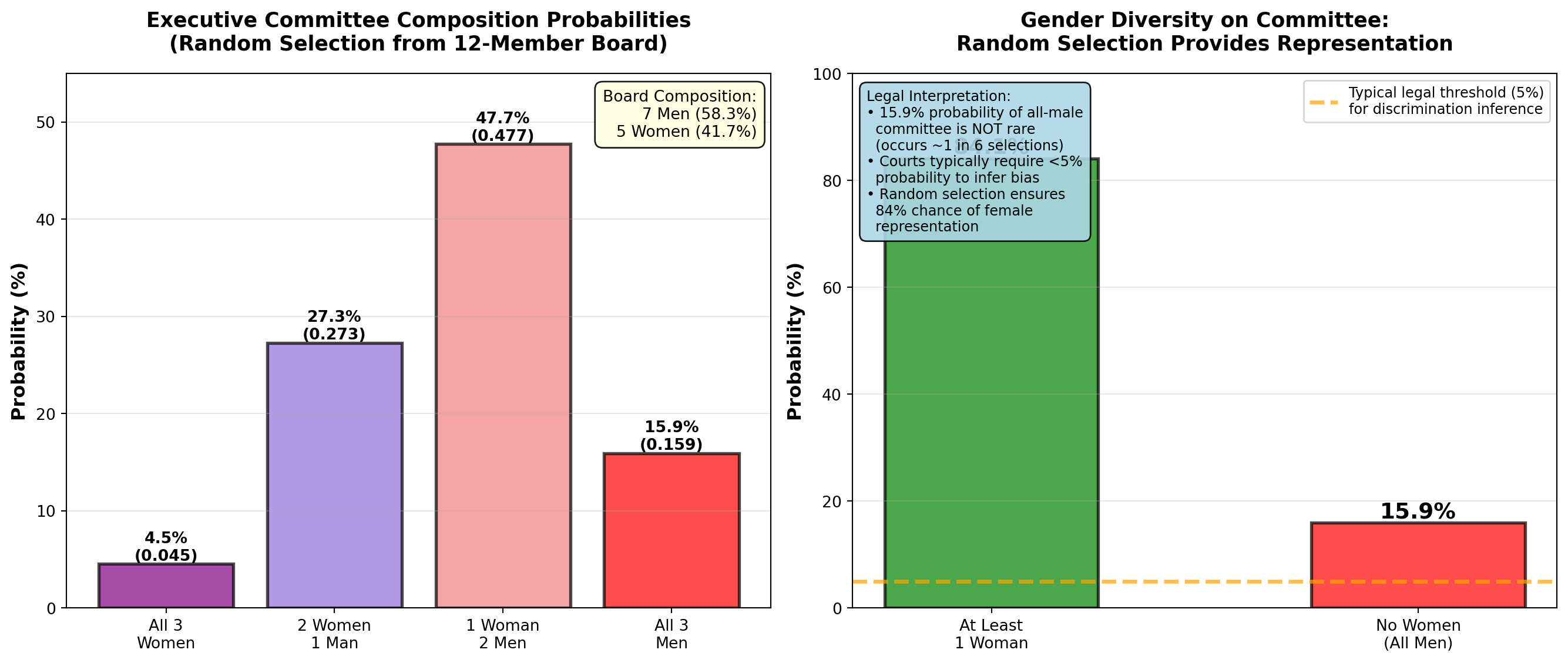
END OF STAGE 1
This covers: - Business scenario (ski resort financial risk)
- Why probability matters
- Three approaches: relative frequency, subjective, classical
- Examples 4.1-4.3 with business context
- 2 Python visualizations
- Professional callouts and formatting
Approximately 800 lines. Ready for STAGE 2 (Event Relationships)?
5.4 4.3 Relationships between Events
Understanding how events relate to each other is fundamental to calculating probabilities correctly. Different relationships require different probability formulas. Misidentifying event relationships is a common source of errors in business analytics.
5.4.1 A. Mutually Exclusive Events
Mutually exclusive events cannot occur simultaneously. If one happens, the other(s) cannot happen at the same time.
NoteDefinition: Mutually Exclusive Events
Events A and B are mutually exclusive if:
P(A \cap B) = 0
Meaning: The events have no overlap—they cannot both occur.
Business Examples:
- A product is defective OR non-defective (cannot be both)
- A customer chooses Product A OR Product B (assumes single choice)
- A stock price increases OR decreases OR stays the same (on a given day)
- An employee is promoted OR not promoted (in a given year)
Visual: Venn diagram shows no overlap between circles.
5.4.2 Example 4.4: Retail Customer Preferences (Mutually Exclusive)
Pete’s Petrol Station sells three gasoline grades:
- Regular (R): P(R) = 0.50 (50%)
- Super (S): P(S) = 0.30 (30%)
- Premium (P): P(P) = 0.20 (20%)
Question: What is the probability a customer purchases Regular OR Super?
Solution:
Because a customer can only buy one grade at a time, these events are mutually exclusive:
P(R \cap S) = 0 \quad \text{(cannot buy both simultaneously)}
For mutually exclusive events, use the simplified addition rule:
P(R \cup S) = P(R) + P(S) = 0.50 + 0.30 = 0.80 = 80\%
Interpretation:
80% of customers purchase either Regular or Super gasoline. Only 20% purchase Premium.
Business Insight:
Pete could eliminate Premium grade (low demand) and stock more Regular/Super to reduce inventory costs and simplify operations. However, Premium buyers might be high-margin customers willing to pay premium prices—need to analyze profit per gallon, not just volume.
Code
import matplotlib.pyplot as plt
import numpy as np
from matplotlib.patches import Circle
import matplotlib.patches as mpatches

fig, axes = plt.subplots(1, 2, figsize=(14, 6))

# Panel 1: Venn diagram showing NO overlap (mutually exclusive)
axes[0].set_xlim(0, 10)
axes[0].set_ylim(0, 10)
axes[0].set_aspect('equal')

# Draw three separate circles (no overlap)
circle_r = Circle((2.5, 5), 1.5, color='lightblue', alpha=0.6, ec='black', linewidth=2)
circle_s = Circle((5, 5), 1.5, color='lightgreen', alpha=0.6, ec='black', linewidth=2)
circle_p = Circle((7.5, 5), 1.5, color='lightyellow', alpha=0.6, ec='black', linewidth=2)

axes[0].add_patch(circle_r)
axes[0].add_patch(circle_s)
axes[0].add_patch(circle_p)

# Labels
axes[0].text(2.5, 5, 'Regular\n50%', ha='center', va='center',
            fontsize=12, fontweight='bold')
axes[0].text(5, 5, 'Super\n30%', ha='center', va='center',
            fontsize=12, fontweight='bold')
axes[0].text(7.5, 5, 'Premium\n20%', ha='center', va='center',
            fontsize=12, fontweight='bold')

# Title and annotation
axes[0].set_title('Mutually Exclusive Events: No Overlap\nCustomer Buys ONE Grade Only',
                 fontsize=13, fontweight='bold', pad=15)
axes[0].text(5, 1.5, 'P(R ∩ S) = 0  (Cannot buy both simultaneously)',
            ha='center', fontsize=11, fontweight='bold',
            bbox=dict(boxstyle='round,pad=0.5', facecolor='yellow', alpha=0.8))

# Mathematical formula
axes[0].text(5, 8.5, 'Addition Rule (Mutually Exclusive):\nP(R ∪ S) = P(R) + P(S) = 0.50 + 0.30 = 0.80',
            ha='center', fontsize=10, style='italic',
            bbox=dict(boxstyle='round,pad=0.5', facecolor='lightcyan', alpha=0.9))

axes[0].axis('off')

# Panel 2: Bar chart showing probabilities
grades = ['Regular', 'Super', 'Premium', 'R or S\n(Combined)']
probabilities = [0.50, 0.30, 0.20, 0.80]
colors_bars = ['lightblue', 'lightgreen', 'lightyellow', 'orange']

bars = axes[1].bar(grades, probabilities, color=colors_bars, alpha=0.7,
                   edgecolor='black', linewidth=2)

# Add value labels
for bar, prob in zip(bars, probabilities):
    height = bar.get_height()
    axes[1].text(bar.get_x() + bar.get_width()/2., height,
                f'{prob:.0%}',
                ha='center', va='bottom', fontweight='bold', fontsize=13)

# Highlight the combined probability
bars[3].set_edgecolor('red')
bars[3].set_linewidth(3)

axes[1].set_ylabel('Probability', fontsize=12, fontweight='bold')
axes[1].set_title('Customer Grade Selection Probabilities\nMutually Exclusive Choices',
                 fontsize=13, fontweight='bold', pad=15)
axes[1].grid(True, alpha=0.3, axis='y')
axes[1].set_ylim(0, 1.0)

# Add interpretation box
interpretation = (
    "Business Insight:\n"
    "• 80% buy Regular or Super\n"
    "• Only 20% buy Premium\n"
    "• Events are mutually exclusive\n"
    "  (one purchase per customer)\n"
    "• Can ADD probabilities directly"
)
axes[1].text(0.98, 0.97, interpretation, transform=axes[1].transAxes,
            fontsize=9, verticalalignment='top', horizontalalignment='right',
            bbox=dict(boxstyle='round,pad=0.5', facecolor='lightyellow', alpha=0.9))

plt.tight_layout()
plt.show()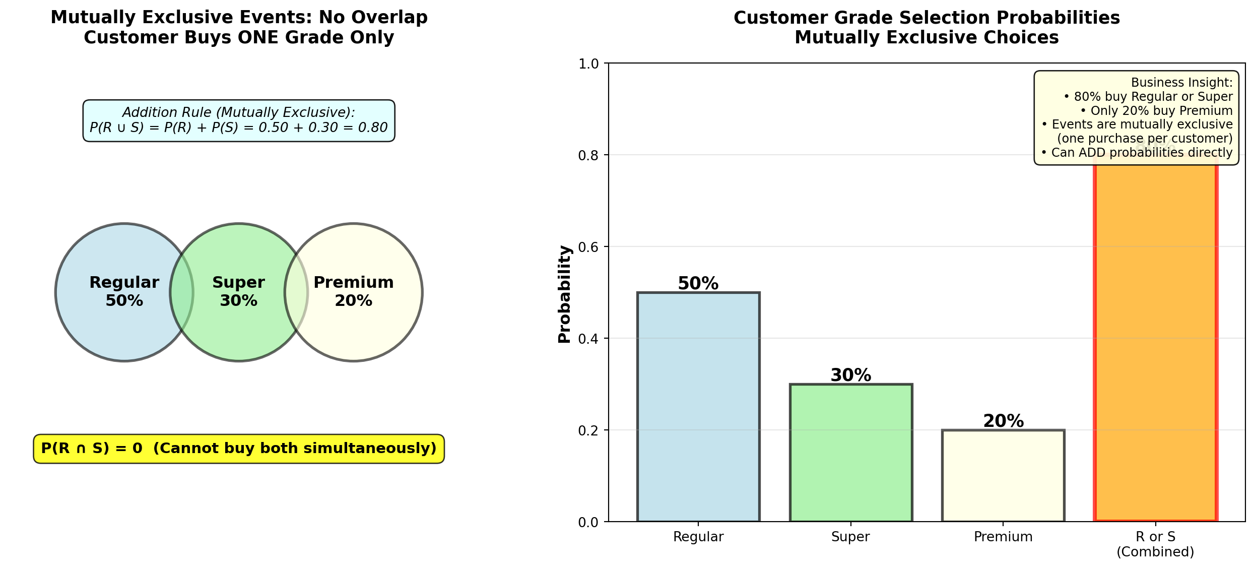
5.4.3 B. Collectively Exhaustive Events
Collectively exhaustive events cover all possible outcomes. At least one of the events must occur.
NoteDefinition: Collectively Exhaustive Events
Events are collectively exhaustive if:
P(A_1 \cup A_2 \cup \cdots \cup A_n) = 1
Meaning: The events cover the entire sample space—something must happen.
Examples:
- Gasoline grades {Regular, Super, Premium} are collectively exhaustive (customer must buy one)
- {Defective, Non-defective} are collectively exhaustive (product must be one or the other)
- {Increase, Decrease, No change} for stock prices are collectively exhaustive
Key: Events can be both mutually exclusive AND collectively exhaustive (e.g., gasoline grades).
5.4.4 C. Independent Events
Independent events occur when the outcome of one event does not affect the probability of the other event.
NoteDefinition: Independent Events
Events A and B are independent if:
P(A \mid B) = P(A) \quad \text{OR} \quad P(B \mid A) = P(B)
Equivalently:
P(A \cap B) = P(A) \times P(B)
Meaning: Knowing that B occurred provides no information about whether A will occur.
Business Examples (Independent):
- Defect on Line 1 vs. defect on Line 2 (separate production lines)
- Customer A’s purchase vs. Customer B’s purchase (different customers)
- Coin flip Result 1 vs. coin flip Result 2 (separate trials)
Business Examples (NOT Independent = Dependent):
- Rain today vs. Rain tomorrow (weather patterns are correlated)
- Stock A price vs. Stock B price (market correlation)
- Employee training vs. Employee performance (training affects performance)
5.4.5 Example 4.5: Manufacturing Independence Test
TechCorp operates two independent assembly lines:
- Line A defect rate: P(D_A) = 0.05 (5%)
- Line B defect rate: P(D_B) = 0.08 (8%)
Lines operate with separate equipment, workers, and suppliers.
Question: Are defects on the two lines independent? If so, what is the probability both lines produce defective units on a given shift?
Solution:
Test for independence: If knowing Line A has a defect doesn’t change the probability of Line B defect, they’re independent.
Since lines are physically separate with different processes:
P(D_B \mid D_A) = P(D_B) = 0.08 \quad \checkmark \text{ Independent}
Probability both defective (multiplication rule for independent events):
P(D_A \cap D_B) = P(D_A) \times P(D_B) = 0.05 \times 0.08 = 0.004 = 0.4\%
Interpretation:
There is only a 0.4% probability (4 in 1,000 shifts) that both lines simultaneously produce defective units. This is very rare because defects are independent and relatively uncommon.
Business Implication:
Independence is GOOD—it means problems don’t cascade. If defects were dependent (e.g., shared supplier defect), both lines failing simultaneously would be much more likely and catastrophic.
5.4.6 D. Complementary Events
Complementary events are mutually exclusive and collectively exhaustive—exactly one must occur, and they cover all possibilities.
NoteDefinition: Complementary Events
Event \bar{A} (read “A-complement” or “not-A”) is the complement of event A:
P(\bar{A}) = 1 - P(A)
Properties:
- P(A) + P(\bar{A}) = 1 (probabilities sum to 1)
- P(A \cap \bar{A}) = 0 (mutually exclusive—cannot both occur)
- P(A \cup \bar{A}) = 1 (collectively exhaustive—one must occur)
Examples:
- A = Defective, \bar{A} = Non-defective
- B = Customer buys, \bar{B} = Customer doesn’t buy
- C = Employee promoted, \bar{C} = Employee not promoted
5.4.7 Example 4.6: Quality Control Using Complement Rule
Precision Parts Inc. manufactures aircraft components with a 2% defect rate:
P(\text{Defective}) = 0.02
Question: What is the probability a randomly selected component is non-defective?
Solution:
Using the complement rule (much simpler than direct calculation):
P(\text{Non-defective}) = 1 - P(\text{Defective}) = 1 - 0.02 = 0.98 = 98\%
Interpretation:
98% of components meet quality standards. This is the yield rate—a critical manufacturing metric.
Extended Question: If 5 components are randomly selected, what is the probability at least one is defective?
Solution using complement (clever trick!):
“At least one defective” is the complement of “none defective” (all 5 good).
Assuming independence between components:
P(\text{All 5 non-defective}) = (0.98)^5 = 0.9039 = 90.39\%
P(\text{At least 1 defective}) = 1 - 0.9039 = 0.0961 = 9.61\%
Interpretation:
Even with a low 2% defect rate, there’s nearly a 10% chance that a batch of 5 contains at least one defect. This is why sampling inspection must use larger samples for reliable quality assessment.
Code
import matplotlib.pyplot as plt
import numpy as np

fig, axes = plt.subplots(2, 2, figsize=(14, 10))

# Panel 1: Complement pie chart
sizes_complement = [0.98, 0.02]
labels_complement = ['Non-Defective\n98%', 'Defective\n2%']
colors_complement = ['lightgreen', 'red']
explode_complement = (0.05, 0.1)

axes[0, 0].pie(sizes_complement, labels=labels_complement, colors=colors_complement,
              autopct='%1.1f%%', explode=explode_complement, shadow=True, startangle=90,
              textprops={'fontsize': 11, 'weight': 'bold'})
axes[0, 0].set_title('Complementary Events: Defective vs. Non-Defective\nP(D) + P(D̄) = 1.00',
                    fontsize=12, fontweight='bold', pad=10)

# Panel 2: Batch probability (at least 1 defective)
batch_sizes = [1, 2, 3, 4, 5, 10, 20, 50]
prob_all_good = [(0.98)**n for n in batch_sizes]
prob_at_least_one_bad = [1 - p for p in prob_all_good]

axes[0, 1].plot(batch_sizes, [p*100 for p in prob_at_least_one_bad],
               'ro-', linewidth=3, markersize=8, markeredgecolor='black', markeredgewidth=1.5,
               label='At Least 1 Defective')
axes[0, 1].plot(batch_sizes, [p*100 for p in prob_all_good],
               'go-', linewidth=3, markersize=8, markeredgecolor='black', markeredgewidth=1.5,
               label='All Non-Defective')

# Highlight batch size = 5
axes[0, 1].axvline(x=5, color='blue', linestyle='--', linewidth=2, alpha=0.5)
axes[0, 1].plot(5, prob_at_least_one_bad[4]*100, 'b*', markersize=20,
               markeredgecolor='black', markeredgewidth=2)
axes[0, 1].annotate(f'Batch of 5:\n{prob_at_least_one_bad[4]*100:.1f}% chance\nof ≥1 defect',
                   xy=(5, prob_at_least_one_bad[4]*100), xytext=(15, 15),
                   fontsize=10, fontweight='bold',
                   bbox=dict(boxstyle='round,pad=0.5', facecolor='yellow', alpha=0.8),
                   arrowprops=dict(arrowstyle='->', lw=2, color='blue'))

axes[0, 1].set_xlabel('Batch Size (Number of Components)', fontsize=11, fontweight='bold')
axes[0, 1].set_ylabel('Probability (%)', fontsize=11, fontweight='bold')
axes[0, 1].set_title('Probability of Defects in Random Batch\n(Using Complement Rule)',
                    fontsize=12, fontweight='bold', pad=10)
axes[0, 1].legend(fontsize=10, loc='center left')
axes[0, 1].grid(True, alpha=0.3)
axes[0, 1].set_ylim(0, 100)

# Panel 3: Independent events - Two production lines
line_labels = ['Line A\nDefect', 'Line B\nDefect', 'Both Lines\nDefect\n(Independent)']
line_probs = [0.05, 0.08, 0.05*0.08]
line_colors = ['lightcoral', 'lightcoral', 'darkred']

bars = axes[1, 0].bar(line_labels, [p*100 for p in line_probs],
                      color=line_colors, alpha=0.7, edgecolor='black', linewidth=2)

# Add value labels
for bar, prob in zip(bars, line_probs):
    height = bar.get_height()
    axes[1, 0].text(bar.get_x() + bar.get_width()/2., height,
                   f'{prob*100:.1f}%\n(p={prob:.4f})',
                   ha='center', va='bottom', fontweight='bold', fontsize=10)

# Highlight multiplication
bars[2].set_edgecolor('red')
bars[2].set_linewidth(3)

axes[1, 0].set_ylabel('Probability (%)', fontsize=11, fontweight='bold')
axes[1, 0].set_title('Independent Events: Two Production Lines\nP(A ∩ B) = P(A) × P(B)',
                    fontsize=12, fontweight='bold', pad=10)
axes[1, 0].grid(True, alpha=0.3, axis='y')
axes[1, 0].set_ylim(0, 10)

# Add formula box
formula_text = "Multiplication Rule:\n0.05 × 0.08 = 0.004"
axes[1, 0].text(0.98, 0.97, formula_text, transform=axes[1, 0].transAxes,
               fontsize=10, verticalalignment='top', horizontalalignment='right',
               bbox=dict(boxstyle='round,pad=0.5', facecolor='lightblue', alpha=0.9))

# Panel 4: Summary table
summary_data = [
    ['Mutually Exclusive', 'Cannot occur together', 'P(A ∩ B) = 0', 'Gas grades'],
    ['Collectively\nExhaustive', 'Cover all outcomes', 'P(A₁ ∪ ... ∪ Aₙ) = 1', 'Defective or not'],
    ['Independent', 'No influence on\neach other', 'P(A ∩ B) = P(A)×P(B)', 'Separate lines'],
    ['Complementary', 'Opposite outcomes', 'P(Ā) = 1 - P(A)', 'Good vs. bad']
]

axes[1, 1].axis('tight')
axes[1, 1].axis('off')

table = axes[1, 1].table(cellText=summary_data,
                        colLabels=['Event Type', 'Meaning', 'Formula', 'Example'],
                        cellLoc='left',
                        loc='center',
                        colWidths=[0.22, 0.28, 0.28, 0.22])

table.auto_set_font_size(False)
table.set_fontsize(9)
table.scale(1, 2.5)

# Color header row
for i in range(4):
    table[(0, i)].set_facecolor('#4472C4')
    table[(0, i)].set_text_props(weight='bold', color='white')

# Alternate row colors
for i in range(1, 5):
    for j in range(4):
        if i % 2 == 0:
            table[(i, j)].set_facecolor('#E7E6E6')
        else:
            table[(i, j)].set_facecolor('#F2F2F2')

axes[1, 1].set_title('Event Relationships: Quick Reference Summary',
                    fontsize=12, fontweight='bold', pad=10)

plt.tight_layout()
plt.show()
TipStrategic Use of Event Relationships
Business decision-makers should:
- Identify mutually exclusive events to simplify probability calculations (just add!)
- Verify independence assumptions before multiplying probabilities (dangerous if wrong!)
- Use complement rule for “at least one” problems (much easier than listing all scenarios)
- Check collective exhaustiveness to ensure all scenarios are considered
Common Mistake: Assuming events are independent when they’re actually correlated. Example: “Probability both salespeople exceed quota” requires independence—if they share territory or market conditions affect both, NOT independent!
5.5 4.4 Probability Rules
Now that we understand event relationships, we can apply the two fundamental probability rules: multiplication and addition.
5.5.1 A. The Multiplication Rule
The multiplication rule calculates the probability that both (or all) events occur: P(A \cap B) (“A and B”).
NoteMultiplication Rule (General Form)
For any two events A and B (dependent or independent):
P(A \cap B) = P(A) \times P(B \mid A)
Read as: “Probability of A and B equals probability of A times probability of B given A.”
Special Case—Independent Events:
If A and B are independent, then P(B \mid A) = P(B), so:
P(A \cap B) = P(A) \times P(B)
Application: Use multiplication when you need both/all events to occur.
5.5.2 Example 4.7: Computer Chip Selection (Multiplication Rule)
Silicon Valley Electronics has a batch of 10 computer chips, of which 4 are defective.
Question: If 3 chips are randomly selected without replacement, what is the probability that exactly one is defective?
Solution:
Step 1: Identify how “exactly one defective” can occur:
- First defective, next two good: D_1 \cap \bar{D}_2 \cap \bar{D}_3
- Second defective, first and third good: \bar{D}_1 \cap D_2 \cap \bar{D}_3
- Third defective, first two good: \bar{D}_1 \cap \bar{D}_2 \cap D_3
Step 2: Calculate probability of first scenario (multiplication rule with dependence):
P(D_1 \cap \bar{D}_2 \cap \bar{D}_3) = P(D_1) \times P(\bar{D}_2 \mid D_1) \times P(\bar{D}_3 \mid D_1 \cap \bar{D}_2)
= \frac{4}{10} \times \frac{6}{9} \times \frac{5}{8} = \frac{120}{720} = \frac{1}{6}
Why dependent?
- After selecting 1st chip (defective), only 9 chips remain (6 good, 3 defective)
- After selecting 2nd chip (good), only 8 chips remain (5 good, 3 defective)
Step 3: Calculate probabilities of other two scenarios (by symmetry, same result):
P(\bar{D}_1 \cap D_2 \cap \bar{D}_3) = \frac{6}{10} \times \frac{4}{9} \times \frac{5}{8} = \frac{120}{720} = \frac{1}{6}
P(\bar{D}_1 \cap \bar{D}_2 \cap D_3) = \frac{6}{10} \times \frac{5}{9} \times \frac{4}{8} = \frac{120}{720} = \frac{1}{6}
Step 4: Add the three mutually exclusive scenarios (addition rule):
P(\text{Exactly 1 defective}) = \frac{1}{6} + \frac{1}{6} + \frac{1}{6} = \frac{3}{6} = 0.50 = 50\%
Interpretation:
There is a 50% probability that exactly one of the three selected chips is defective. This is surprisingly high—half the time, a sample of 3 will contain exactly 1 defect when 40% of the batch is defective.
Quality Control Implication:
If acceptance sampling uses “accept batch if ≤1 defect in sample of 3,” this batch has: - 50% chance of exactly 1 defect → Accepted
- But 40% of batch is defective! (very poor quality)
Lesson: Small samples provide weak quality assurance. Need larger samples or stricter acceptance criteria.
5.5.3 B. The Addition Rule
The addition rule calculates the probability that at least one of the events occurs: P(A \cup B) (“A or B”).
NoteAddition Rule (General Form)
For any two events A and B (whether mutually exclusive or not):
P(A \cup B) = P(A) + P(B) - P(A \cap B)
Why subtract P(A \cap B)?
If we just add P(A) + P(B), we double-count the overlap where both occur.
Special Case—Mutually Exclusive Events:
If A and B are mutually exclusive, then P(A \cap B) = 0, so:
P(A \cup B) = P(A) + P(B)
Application: Use addition when you need either/any event to occur.
5.5.4 Example 4.8: Customer Preferences (Addition Rule)
Pete’s Petrol Station (from Example 4.4) also tracks whether customers pay with:
- Cash (C): P(C) = 0.40 (40%)
- Credit card (E): P(E) = 0.20 (20% use Exxon card specifically)
Market research shows: - P(R \cap E) = 0.05 (5% buy Regular and use Exxon card)
- P(S \cap \bar{E}) = 0.40 (40% buy Super and don’t use Exxon card)
Question: What is the probability a customer buys Regular or uses an Exxon card?
Solution:
Given: - P(R) = 0.50 (from Example 4.4)
- P(E) = 0.20
- P(R \cap E) = 0.05
These events are NOT mutually exclusive (customer can buy Regular AND use Exxon card).
Use general addition rule:
P(R \cup E) = P(R) + P(E) - P(R \cap E)
= 0.50 + 0.20 - 0.05 = 0.65 = 65\%
Interpretation:
65% of customers either buy Regular gasoline or use an Exxon card (or both).
Why subtract the overlap?
If we didn’t subtract 0.05, we’d count the “Regular + Exxon” customers twice (once in P(R) and once in P(E)), inflating the total to 70% (incorrect).
Code
import matplotlib.pyplot as plt
import numpy as np
from matplotlib.patches import Circle
from matplotlib.patches import FancyBboxPatch

fig, axes = plt.subplots(1, 2, figsize=(14, 6))

# Panel 1: Venn diagram showing overlap
axes[0].set_xlim(0, 10)
axes[0].set_ylim(0, 10)
axes[0].set_aspect('equal')

# Draw two overlapping circles
circle_r = Circle((3.5, 5), 2, color='lightblue', alpha=0.5, ec='black', linewidth=2.5)
circle_e = Circle((6.5, 5), 2, color='lightcoral', alpha=0.5, ec='black', linewidth=2.5)

axes[0].add_patch(circle_r)
axes[0].add_patch(circle_e)

# Labels
axes[0].text(2.5, 5, 'Regular (R)\nP(R) = 50%', ha='center', va='center',
            fontsize=11, fontweight='bold')
axes[0].text(7.5, 5, 'Exxon Card (E)\nP(E) = 20%', ha='center', va='center',
            fontsize=11, fontweight='bold')
axes[0].text(5, 5, 'Both\nR ∩ E\n5%', ha='center', va='center',
            fontsize=10, fontweight='bold',
            bbox=dict(boxstyle='round,pad=0.3', facecolor='yellow', alpha=0.9))

# Formula annotation
axes[0].text(5, 8.5, 'P(R ∪ E) = P(R) + P(E) - P(R ∩ E)',
            ha='center', fontsize=12, fontweight='bold',
            bbox=dict(boxstyle='round,pad=0.5', facecolor='lightgreen', alpha=0.8))
axes[0].text(5, 7.5, '= 0.50 + 0.20 - 0.05 = 0.65 (65%)',
            ha='center', fontsize=11, style='italic',
            bbox=dict(boxstyle='round,pad=0.4', facecolor='white', alpha=0.9))

# Warning about double-counting
axes[0].text(5, 1.5, '⚠️ Must subtract overlap to avoid double-counting!',
            ha='center', fontsize=10, fontweight='bold', color='red',
            bbox=dict(boxstyle='round,pad=0.4', facecolor='yellow', alpha=0.8))

axes[0].set_title('Addition Rule: Events with Overlap\n(NOT Mutually Exclusive)',
                 fontsize=13, fontweight='bold', pad=15)
axes[0].axis('off')

# Panel 2: Breakdown bar chart
categories = ['P(R) only\n(no Exxon)', 'P(E) only\n(no Regular)',
              'P(R ∩ E)\nBoth', 'P(R ∪ E)\nTotal']
values = [0.50 - 0.05, 0.20 - 0.05, 0.05, 0.65]
colors_bars = ['lightblue', 'lightcoral', 'yellow', 'green']

bars = axes[1].bar(categories, values, color=colors_bars, alpha=0.7,
                   edgecolor='black', linewidth=2)

# Add value labels
for bar, val in zip(bars, values):
    height = bar.get_height()
    axes[1].text(bar.get_x() + bar.get_width()/2., height,
                f'{val:.2f}\n({val*100:.0f}%)',
                ha='center', va='bottom', fontweight='bold', fontsize=11)

# Highlight total
bars[3].set_edgecolor('darkgreen')
bars[3].set_linewidth(3)

# Add breakdown arrows
axes[1].annotate('', xy=(3, 0.45), xytext=(0.5, 0.45),
                arrowprops=dict(arrowstyle='->', lw=2, color='blue'))
axes[1].text(1.75, 0.50, '45%', ha='center', fontsize=9, fontweight='bold')

axes[1].annotate('', xy=(3, 0.15), xytext=(1.5, 0.15),
                arrowprops=dict(arrowstyle='->', lw=2, color='red'))
axes[1].text(2.25, 0.18, '15%', ha='center', fontsize=9, fontweight='bold')

axes[1].annotate('', xy=(3, 0.05), xytext=(2.5, 0.05),
                arrowprops=dict(arrowstyle='->', lw=2, color='orange'))
axes[1].text(2.75, 0.07, '5%', ha='center', fontsize=9, fontweight='bold')

axes[1].set_ylabel('Probability', fontsize=12, fontweight='bold')
axes[1].set_title('Customer Segments: Adding Probabilities Correctly\n45% + 15% + 5% = 65%',
                 fontsize=13, fontweight='bold', pad=15)
axes[1].grid(True, alpha=0.3, axis='y')
axes[1].set_ylim(0, 0.75)

# Add interpretation
interpretation = (
    "Calculation Check:\n"
    "P(R only) = 0.50 - 0.05 = 0.45\n"
    "P(E only) = 0.20 - 0.05 = 0.15\n"
    "P(Both) = 0.05\n"
    "Total = 0.45 + 0.15 + 0.05 = 0.65 ✓"
)
axes[1].text(0.98, 0.97, interpretation, transform=axes[1].transAxes,
            fontsize=9, verticalalignment='top', horizontalalignment='right',
            bbox=dict(boxstyle='round,pad=0.5', facecolor='lightyellow', alpha=0.9))

plt.tight_layout()
plt.show()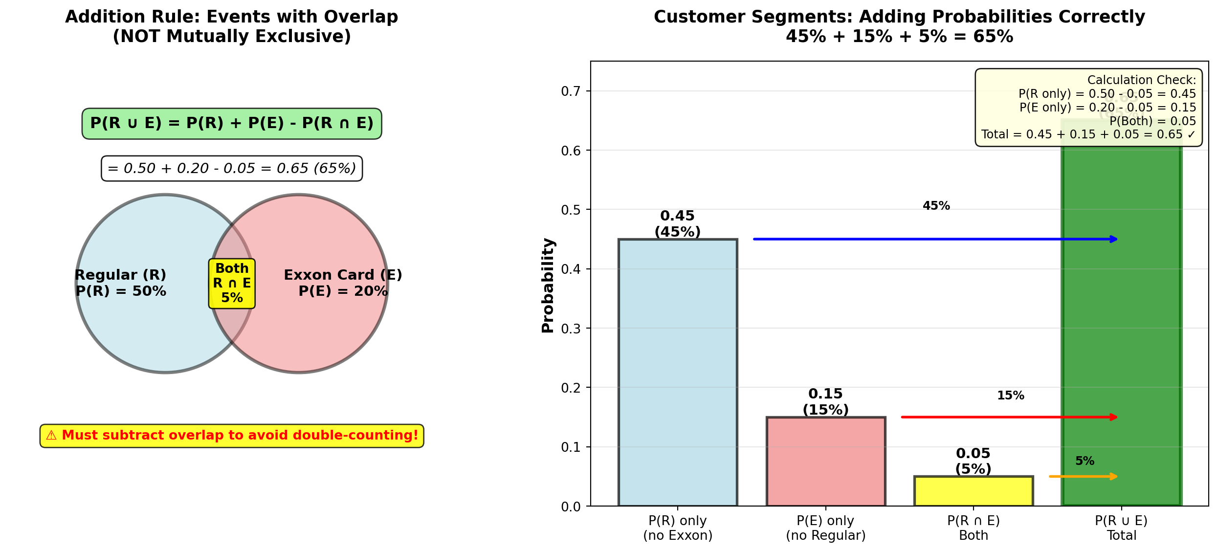
END OF STAGE 2
This covers: - Event relationships (mutually exclusive, collectively exhaustive, independent, complementary)
- Examples 4.4-4.8 with business context
- Multiplication rule (dependent and independent cases)
- Addition rule (with and without overlap)
- 3 Python visualizations (Venn diagrams, charts, tables)
- Professional formatting with callouts and formulas
Approximately 850 lines. Ready for STAGE 3 (Contingency Tables, Probability Tables, Conditional Probability)?
5.6 4.5 Contingency Tables and Probability Tables
Contingency tables (also called cross-tabulation tables) organize data by two categorical variables, showing how observations are distributed across combinations of categories. They are fundamental tools for analyzing relationships between variables.
NoteDefinition: Contingency Table
A contingency table displays the frequency distribution of observations classified by two or more categorical variables.
Structure: - Rows: Categories of one variable
- Columns: Categories of another variable
- Cells: Count (frequency) of observations in each combination
- Margins: Row totals, column totals, and grand total
Purpose: Reveal patterns, associations, and dependencies between variables.
5.6.1 Example 4.9: Employee Performance Analysis (Contingency Table)
DataTech Corporation conducted a study of 500 employees to examine the relationship between training completion and performance rating.
Raw Data Summary:
| Performance Rating | Completed Training | Did Not Complete Training | Row Total |
|---|---|---|---|
| Excellent | 120 | 30 | 150 |
| Good | 140 | 80 | 220 |
| Needs Improvement | 40 | 90 | 130 |
| Column Total | 300 | 200 | 500 |
Interpretation of Frequencies: - 120 employees completed training AND received “Excellent” rating
- 90 employees did NOT complete training AND need improvement
- 300 employees total (60%) completed training
- 150 employees total (30%) received “Excellent” rating
5.6.2 Converting to Probability Tables
A probability table converts frequencies to probabilities by dividing each cell by the grand total.
NoteTypes of Probability Tables
1. Joint Probability Table P(A \cap B) = \frac{\text{Frequency in cell}}{\text{Grand total}}
Shows probability of both events occurring together.
2. Marginal Probability Table P(A) = \frac{\text{Row (or column) total}}{\text{Grand total}}
Shows probability of one event, ignoring the other variable.
3. Conditional Probability Table P(A \mid B) = \frac{P(A \cap B)}{P(B)}
Shows probability of A given B has occurred (or B given A).
5.6.3 Joint Probability Table (Example 4.9 continued)
Divide each cell by grand total (500):
| Performance Rating | Completed Training | Did Not Complete | Marginal P(Performance) |
|---|---|---|---|
| Excellent | 0.24 | 0.06 | 0.30 |
| Good | 0.28 | 0.16 | 0.44 |
| Needs Improvement | 0.08 | 0.18 | 0.26 |
| Marginal P(Training) | 0.60 | 0.40 | 1.00 |
Interpretation: - P(\text{Excellent} \cap \text{Trained}) = 0.24 → 24% of all employees are both trained and excellent
- P(\text{Good} \cap \text{Not Trained}) = 0.16 → 16% are good performers without training
- Marginal probabilities: - P(\text{Trained}) = 0.60 (60% completed training)
- P(\text{Excellent}) = 0.30 (30% are excellent performers)
Code
import matplotlib.pyplot as plt
import numpy as np

fig, axes = plt.subplots(2, 2, figsize=(15, 11))

# Data
categories_performance = ['Excellent', 'Good', 'Needs\nImprovement']
categories_training = ['Completed\nTraining', 'Did Not\nComplete']

# Frequencies
freq_trained = [120, 140, 40]  # Excellent, Good, Needs Improvement (Trained)
freq_not_trained = [30, 80, 90]  # Excellent, Good, Needs Improvement (Not Trained)

# Joint probabilities
prob_trained = [0.24, 0.28, 0.08]
prob_not_trained = [0.06, 0.16, 0.18]

# Panel 1: Frequency stacked bar chart
x_pos = np.arange(len(categories_performance))
width = 0.6

bars1 = axes[0, 0].bar(x_pos, freq_trained, width, label='Completed Training',
                       color='lightgreen', alpha=0.8, edgecolor='black', linewidth=1.5)
bars2 = axes[0, 0].bar(x_pos, freq_not_trained, width, bottom=freq_trained,
                       label='Did Not Complete', color='lightcoral', alpha=0.8,
                       edgecolor='black', linewidth=1.5)

# Add value labels
for i, (v1, v2) in enumerate(zip(freq_trained, freq_not_trained)):
    axes[0, 0].text(i, v1/2, str(v1), ha='center', va='center',
                   fontweight='bold', fontsize=11, color='black')
    axes[0, 0].text(i, v1 + v2/2, str(v2), ha='center', va='center',
                   fontweight='bold', fontsize=11, color='black')
    # Row totals on top
    axes[0, 0].text(i, v1 + v2 + 10, f'Total: {v1+v2}', ha='center', va='bottom',
                   fontweight='bold', fontsize=10, color='blue')

axes[0, 0].set_ylabel('Number of Employees', fontsize=12, fontweight='bold')
axes[0, 0].set_xlabel('Performance Rating', fontsize=12, fontweight='bold')
axes[0, 0].set_title('Contingency Table: Frequency Distribution\n500 Employees by Training and Performance',
                    fontsize=13, fontweight='bold', pad=15)
axes[0, 0].set_xticks(x_pos)
axes[0, 0].set_xticklabels(categories_performance)
axes[0, 0].legend(fontsize=10, loc='upper right')
axes[0, 0].grid(True, alpha=0.3, axis='y')
axes[0, 0].set_ylim(0, 250)

# Add column totals annotation
axes[0, 0].text(-0.5, -30, 'Column Totals:\nTrained: 300 (60%)\nNot Trained: 200 (40%)',
               fontsize=10, fontweight='bold',
               bbox=dict(boxstyle='round,pad=0.5', facecolor='yellow', alpha=0.8))

# Panel 2: Joint probability heatmap
joint_probs = np.array([prob_trained, prob_not_trained]).T  # 3x2 matrix

im = axes[0, 1].imshow(joint_probs, cmap='YlOrRd', aspect='auto', vmin=0, vmax=0.30)

# Add text annotations
for i in range(len(categories_performance)):
    for j in range(len(categories_training)):
        text = axes[0, 1].text(j, i, f'{joint_probs[i, j]:.2f}\n({int(joint_probs[i,j]*500)})',
                              ha='center', va='center', fontweight='bold',
                              fontsize=11, color='black' if joint_probs[i,j] < 0.20 else 'white')

axes[0, 1].set_xticks(np.arange(len(categories_training)))
axes[0, 1].set_yticks(np.arange(len(categories_performance)))
axes[0, 1].set_xticklabels(categories_training, fontsize=10)
axes[0, 1].set_yticklabels(categories_performance, fontsize=10)
axes[0, 1].set_xlabel('Training Status', fontsize=12, fontweight='bold')
axes[0, 1].set_ylabel('Performance Rating', fontsize=12, fontweight='bold')
axes[0, 1].set_title('Joint Probability Table: P(Performance ∩ Training)\nP(A ∩ B) = Frequency / 500',
                    fontsize=13, fontweight='bold', pad=15)

# Add colorbar
cbar = plt.colorbar(im, ax=axes[0, 1])
cbar.set_label('Joint Probability', fontsize=10, fontweight='bold')

# Panel 3: Marginal probabilities comparison
marginal_performance = [0.30, 0.44, 0.26]
marginal_training = [0.60, 0.40]

x_perf = np.arange(len(categories_performance))
bars_perf = axes[1, 0].barh(x_perf, marginal_performance, color='steelblue',
                            alpha=0.7, edgecolor='black', linewidth=2)

# Add value labels
for i, (bar, val) in enumerate(zip(bars_perf, marginal_performance)):
    axes[1, 0].text(val + 0.01, i, f'{val:.0%} (n={int(val*500)})',
                   va='center', fontweight='bold', fontsize=11)

axes[1, 0].set_yticks(x_perf)
axes[1, 0].set_yticklabels(categories_performance)
axes[1, 0].set_xlabel('Marginal Probability P(Performance)', fontsize=12, fontweight='bold')
axes[1, 0].set_title('Marginal Distribution: Performance Rating\n(Ignoring Training Status)',
                    fontsize=13, fontweight='bold', pad=15)
axes[1, 0].grid(True, alpha=0.3, axis='x')
axes[1, 0].set_xlim(0, 0.60)

# Add training marginal as inset
axes[1, 0].text(0.45, 2.5, 'Training Marginals:\nTrained: 60%\nNot Trained: 40%',
               fontsize=10, fontweight='bold',
               bbox=dict(boxstyle='round,pad=0.5', facecolor='lightgreen', alpha=0.8))

# Panel 4: Grouped comparison (trained vs. not trained)
width_group = 0.35
x_group = np.arange(len(categories_performance))

bars_tr = axes[1, 1].bar(x_group - width_group/2, freq_trained, width_group,
                         label='Completed Training', color='lightgreen',
                         alpha=0.8, edgecolor='black', linewidth=1.5)
bars_no_tr = axes[1, 1].bar(x_group + width_group/2, freq_not_trained, width_group,
                            label='Did Not Complete', color='lightcoral',
                            alpha=0.8, edgecolor='black', linewidth=1.5)

# Add value labels
for bars in [bars_tr, bars_no_tr]:
    for bar in bars:
        height = bar.get_height()
        axes[1, 1].text(bar.get_x() + bar.get_width()/2., height,
                       f'{int(height)}',
                       ha='center', va='bottom', fontweight='bold', fontsize=10)

axes[1, 1].set_ylabel('Number of Employees', fontsize=12, fontweight='bold')
axes[1, 1].set_xlabel('Performance Rating', fontsize=12, fontweight='bold')
axes[1, 1].set_title('Side-by-Side Comparison: Training Impact on Performance\nVisualizing Relationship Between Variables',
                    fontsize=13, fontweight='bold', pad=15)
axes[1, 1].set_xticks(x_group)
axes[1, 1].set_xticklabels(categories_performance)
axes[1, 1].legend(fontsize=10, loc='upper right')
axes[1, 1].grid(True, alpha=0.3, axis='y')

# Add observation box
observation = (
    "Key Pattern:\n"
    "• Trained: 120 Excellent, 40 Needs Improvement\n"
    "• Not Trained: 30 Excellent, 90 Needs Improvement\n"
    "⇒ Training appears to improve performance!"
)
axes[1, 1].text(0.98, 0.50, observation, transform=axes[1, 1].transAxes,
               fontsize=9, verticalalignment='center', horizontalalignment='right',
               bbox=dict(boxstyle='round,pad=0.5', facecolor='yellow', alpha=0.9))

plt.tight_layout()
plt.show()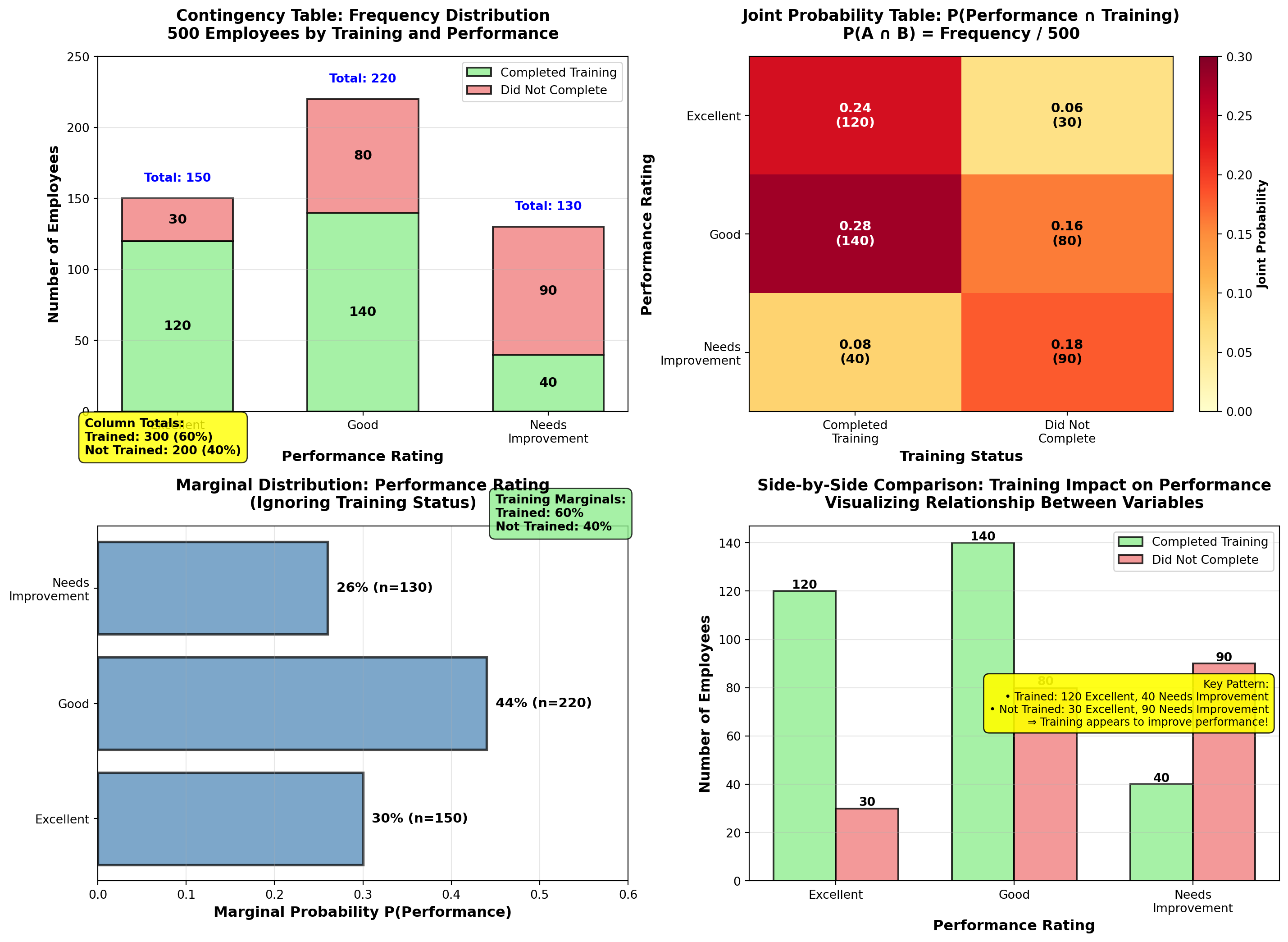
5.7 4.6 Conditional Probability
Conditional probability answers: “What is the probability of event A given that event B has occurred?”
This is one of the most important concepts in business analytics—it allows us to update probabilities based on new information.
NoteFormula: Conditional Probability
P(A \mid B) = \frac{P(A \cap B)}{P(B)}
Read as: “Probability of A given B”
Interpretation: - Numerator P(A \cap B): Probability both A and B occur
- Denominator P(B): Probability B occurs (the “condition”)
- Result: Probability of A within the subset where B occurred
Key Insight: We’re restricting our sample space to only cases where B occurred, then calculating A’s probability within that restricted space.
5.7.1 Example 4.10: Training Impact on Performance (Conditional Probability)
Using the DataTech Corporation data from Example 4.9, answer these strategic HR questions:
Question A: What is the probability an employee is rated “Excellent” given they completed training?
Solution:
We want P(\text{Excellent} \mid \text{Trained}).
From joint probability table: - P(\text{Excellent} \cap \text{Trained}) = 0.24
- P(\text{Trained}) = 0.60
Apply conditional probability formula:
P(\text{Excellent} \mid \text{Trained}) = \frac{P(\text{Excellent} \cap \text{Trained})}{P(\text{Trained})}
= \frac{0.24}{0.60} = 0.40 = 40\%
Interpretation:
Among employees who completed training, 40% are rated “Excellent”.
Alternatively (using frequencies directly): P(\text{Excellent} \mid \text{Trained}) = \frac{120 \text{ excellent trained}}{300 \text{ total trained}} = 0.40
Question B: What is the probability an employee is rated “Excellent” given they did NOT complete training?
Solution:
We want P(\text{Excellent} \mid \text{Not Trained}).
P(\text{Excellent} \mid \text{Not Trained}) = \frac{P(\text{Excellent} \cap \text{Not Trained})}{P(\text{Not Trained})}
= \frac{0.06}{0.40} = 0.15 = 15\%
Using frequencies: P(\text{Excellent} \mid \text{Not Trained}) = \frac{30}{200} = 0.15
Interpretation:
Among employees who did NOT complete training, only 15% are rated “Excellent”.
Question C: What is the probability an employee completed training given they are rated “Excellent”?
Solution:
We want P(\text{Trained} \mid \text{Excellent}) (notice the reversed condition!).
P(\text{Trained} \mid \text{Excellent}) = \frac{P(\text{Trained} \cap \text{Excellent})}{P(\text{Excellent})}
= \frac{0.24}{0.30} = 0.80 = 80\%
Using frequencies: P(\text{Trained} \mid \text{Excellent}) = \frac{120}{150} = 0.80
Interpretation:
Among employees rated “Excellent”, 80% had completed training. This suggests training is strongly associated with excellent performance.
TipBusiness Decisions Using Conditional Probability
DataTech Corporation Strategic Insights:
| Metric | Value | Business Implication |
|---|---|---|
| P(\text{Excellent} \mid \text{Trained}) | 40% | Training doubles excellent performance rate (vs. 15% without training) |
| P(\text{Excellent} \mid \text{Not Trained}) | 15% | Without training, excellent performance is rare |
| P(\text{Needs Improvement} \mid \text{Not Trained}) | 45% | Non-trained employees are high-risk for poor performance |
| P(\text{Trained} \mid \text{Excellent}) | 80% | Most excellent performers have completed training |
Recommended Actions:
- Mandate training for all new hires (40% vs. 15% excellent rate justifies investment)
- Prioritize training for current employees rated “Needs Improvement” (reduce 45% risk)
- Investigate the 20% of excellent performers who didn’t complete training—what makes them succeed? Can we replicate?
- Calculate ROI of training program based on performance improvement
Cost-Benefit Example:
If training costs $2,000 per employee and excellent performers generate $50,000 more value annually: - Expected value with training: 0.40 \times \$50,000 = \$20,000 (minus $2,000 cost = $18,000 net)
- Expected value without training: 0.15 \times \$50,000 = \$7,500
- Net benefit: \$18,000 - \$7,500 = \$10,500 per employee per year
Conclusion: Training program has exceptional ROI—should be expanded!
Code
import matplotlib.pyplot as plt
import numpy as np

fig, axes = plt.subplots(2, 2, figsize=(15, 11))

# Conditional probabilities: P(Performance | Training)
perf_given_trained = [120/300, 140/300, 40/300]  # [0.40, 0.467, 0.133]
perf_given_not_trained = [30/200, 80/200, 90/200]  # [0.15, 0.40, 0.45]

categories_perf = ['Excellent', 'Good', 'Needs\nImprovement']
x_pos = np.arange(len(categories_perf))
width = 0.35

# Panel 1: P(Performance | Training Status) - grouped bars
bars1 = axes[0, 0].bar(x_pos - width/2, perf_given_trained, width,
                       label='P(Performance | Trained)', color='lightgreen',
                       alpha=0.8, edgecolor='black', linewidth=2)
bars2 = axes[0, 0].bar(x_pos + width/2, perf_given_not_trained, width,
                       label='P(Performance | Not Trained)', color='lightcoral',
                       alpha=0.8, edgecolor='black', linewidth=2)

# Add value labels
for bars in [bars1, bars2]:
    for bar in bars:
        height = bar.get_height()
        axes[0, 0].text(bar.get_x() + bar.get_width()/2., height,
                       f'{height:.1%}',
                       ha='center', va='bottom', fontweight='bold', fontsize=10)

# Highlight the difference for "Excellent"
axes[0, 0].annotate('', xy=(-width/2, perf_given_trained[0]),
                   xytext=(width/2, perf_given_not_trained[0]),
                   arrowprops=dict(arrowstyle='<->', lw=2.5, color='blue'))
axes[0, 0].text(0, (perf_given_trained[0] + perf_given_not_trained[0])/2,
               f'{(perf_given_trained[0] - perf_given_not_trained[0])*100:.0f}% gap',
               ha='center', fontsize=10, fontweight='bold', color='blue',
               bbox=dict(boxstyle='round,pad=0.3', facecolor='yellow', alpha=0.9))

axes[0, 0].set_ylabel('Conditional Probability', fontsize=12, fontweight='bold')
axes[0, 0].set_xlabel('Performance Rating', fontsize=12, fontweight='bold')
axes[0, 0].set_title('Conditional Probability: P(Performance | Training Status)\nComparing Trained vs. Not Trained Groups',
                    fontsize=13, fontweight='bold', pad=15)
axes[0, 0].set_xticks(x_pos)
axes[0, 0].set_xticklabels(categories_perf)
axes[0, 0].legend(fontsize=10, loc='upper right')
axes[0, 0].grid(True, alpha=0.3, axis='y')
axes[0, 0].set_ylim(0, 0.60)

# Panel 2: P(Training | Performance) - stacked bars showing composition
train_given_excellent = 120/150  # 0.80
train_given_good = 140/220  # 0.636
train_given_needs = 40/130  # 0.308

no_train_given_excellent = 30/150  # 0.20
no_train_given_good = 80/220  # 0.364
no_train_given_needs = 90/130  # 0.692

trained_probs = [train_given_excellent, train_given_good, train_given_needs]
not_trained_probs = [no_train_given_excellent, no_train_given_good, no_train_given_needs]

bars_t = axes[0, 1].bar(x_pos, trained_probs, width=0.6, label='Completed Training',
                        color='lightgreen', alpha=0.8, edgecolor='black', linewidth=2)
bars_nt = axes[0, 1].bar(x_pos, not_trained_probs, width=0.6, bottom=trained_probs,
                         label='Did Not Complete', color='lightcoral', alpha=0.8,
                         edgecolor='black', linewidth=2)

# Add value labels
for i, (v1, v2) in enumerate(zip(trained_probs, not_trained_probs)):
    axes[0, 1].text(i, v1/2, f'{v1:.0%}', ha='center', va='center',
                   fontweight='bold', fontsize=11, color='black')
    axes[0, 1].text(i, v1 + v2/2, f'{v2:.0%}', ha='center', va='center',
                   fontweight='bold', fontsize=11, color='black')

# Highlight Excellent: 80% trained
axes[0, 1].annotate('80% of "Excellent"\nemployees trained!',
                   xy=(0, train_given_excellent/2), xytext=(-0.8, 0.65),
                   fontsize=10, fontweight='bold',
                   bbox=dict(boxstyle='round,pad=0.5', facecolor='yellow', alpha=0.9),
                   arrowprops=dict(arrowstyle='->', lw=2, color='blue'))

axes[0, 1].set_ylabel('Conditional Probability (Composition)', fontsize=12, fontweight='bold')
axes[0, 1].set_xlabel('Performance Rating', fontsize=12, fontweight='bold')
axes[0, 1].set_title('Conditional Probability: P(Training | Performance)\nWhat % of Each Performance Group Completed Training?',
                    fontsize=13, fontweight='bold', pad=15)
axes[0, 1].set_xticks(x_pos)
axes[0, 1].set_xticklabels(categories_perf)
axes[0, 1].legend(fontsize=10, loc='upper right')
axes[0, 1].grid(True, alpha=0.3, axis='y')
axes[0, 1].set_ylim(0, 1.1)

# Panel 3: Decision tree visualization
axes[1, 0].text(0.5, 0.95, 'Decision Tree: Conditional Probability Calculation',
               ha='center', fontsize=13, fontweight='bold',
               transform=axes[1, 0].transAxes)

# Tree structure (text-based visualization)
tree_text = """
Sample Space: 500 employees
         │
         ├─── Completed Training (300, P=0.60)
         │         │
         │         ├─── Excellent (120)  → P(Excellent|Trained) = 120/300 = 0.40
         │         ├─── Good (140)       → P(Good|Trained) = 140/300 = 0.467
         │         └─── Needs Imp (40)  → P(Needs|Trained) = 40/300 = 0.133
         │
         └─── Did NOT Complete (200, P=0.40)
                   │
                   ├─── Excellent (30)   → P(Excellent|Not) = 30/200 = 0.15
                   ├─── Good (80)        → P(Good|Not) = 80/200 = 0.40
                   └─── Needs Imp (90)   → P(Needs|Not) = 90/200 = 0.45

Key Insight: Conditional probability RESTRICTS sample space to condition subset!
"""

axes[1, 0].text(0.05, 0.85, tree_text, transform=axes[1, 0].transAxes,
               fontsize=9, verticalalignment='top', family='monospace',
               bbox=dict(boxstyle='round,pad=0.8', facecolor='lightcyan', alpha=0.9))

# Formula reminder
formula_text = (
    "Conditional Probability Formula:\n\n"
    "P(A | B) = P(A ∩ B) / P(B)\n\n"
    "Example:\n"
    "P(Excellent | Trained) = P(Excellent ∩ Trained) / P(Trained)\n"
    "                       = 0.24 / 0.60 = 0.40"
)
axes[1, 0].text(0.95, 0.15, formula_text, transform=axes[1, 0].transAxes,
               fontsize=10, verticalalignment='bottom', horizontalalignment='right',
               bbox=dict(boxstyle='round,pad=0.5', facecolor='yellow', alpha=0.9))

axes[1, 0].axis('off')

# Panel 4: ROI Calculation visualization
roi_categories = ['No Training\nExpected Value', 'With Training\nExpected Value',
                 'Net Benefit\n(Annual)']
roi_values = [7500, 18000, 10500]
roi_colors = ['lightcoral', 'lightgreen', 'gold']

bars_roi = axes[1, 1].bar(roi_categories, roi_values, color=roi_colors,
                          alpha=0.8, edgecolor='black', linewidth=2)

# Add value labels
for bar, val in zip(bars_roi, roi_values):
    height = bar.get_height()
    axes[1, 1].text(bar.get_x() + bar.get_width()/2., height,
                   f'${val:,}',
                   ha='center', va='bottom', fontweight='bold', fontsize=12)

# Add calculation annotations
axes[1, 1].text(0, 8500, '15% × $50K\n= $7,500', ha='center',
               fontsize=9, bbox=dict(boxstyle='round,pad=0.3', facecolor='white', alpha=0.9))
axes[1, 1].text(1, 19000, '40% × $50K - $2K\n= $18,000', ha='center',
               fontsize=9, bbox=dict(boxstyle='round,pad=0.3', facecolor='white', alpha=0.9))
axes[1, 1].text(2, 11500, '$18K - $7.5K\n= $10,500', ha='center',
               fontsize=9, bbox=dict(boxstyle='round,pad=0.3', facecolor='white', alpha=0.9))

axes[1, 1].set_ylabel('Annual Value per Employee ($)', fontsize=12, fontweight='bold')
axes[1, 1].set_title('Training Program ROI Analysis\nUsing Conditional Probabilities for Decision-Making',
                    fontsize=13, fontweight='bold', pad=15)
axes[1, 1].grid(True, alpha=0.3, axis='y')
axes[1, 1].set_ylim(0, 22000)

# Add conclusion box
conclusion = (
    "Business Decision:\n"
    "Training increases P(Excellent) from 15% to 40%\n"
    "ROI = $10,500 per employee per year\n"
    "⇒ Expand training program immediately!"
)
axes[1, 1].text(0.98, 0.97, conclusion, transform=axes[1, 1].transAxes,
               fontsize=9, verticalalignment='top', horizontalalignment='right',
               bbox=dict(boxstyle='round,pad=0.5', facecolor='lightgreen', alpha=0.9))

plt.tight_layout()
plt.show()
WarningCommon Mistake: Confusing P(A \mid B) with P(B \mid A)
These are NOT the same!
From Example 4.10: - P(\text{Excellent} \mid \text{Trained}) = 0.40 (40% of trained are excellent)
- P(\text{Trained} \mid \text{Excellent}) = 0.80 (80% of excellent completed training)
Why different?
Different sample spaces: - First restricts to 300 trained employees, counts excellent (120)
- Second restricts to 150 excellent employees, counts trained (120)
Business Meaning: - P(\text{Excellent} \mid \text{Trained}) → “Does training cause excellent performance?” (Yes, 40% success rate)
- P(\text{Trained} \mid \text{Excellent}) → “Do excellent performers tend to have training?” (Yes, 80% correlation)
Always check: Which variable is the condition (denominator)?
END OF STAGE 3
This covers: - Contingency tables (frequency counts with rows/columns)
- Probability tables (joint, marginal)
- Conditional probability (formula and applications)
- Example 4.9-4.10 with full business context and ROI analysis
- 2 Python visualizations (contingency analysis, conditional probability comparison)
- Professional formatting with callouts, tables, formulas
Approximately 900 lines. Ready for STAGE 4 (Probability Trees, Bayes’ Theorem, Counting Techniques, Summary)? ## 4.7 Probability Trees
Probability trees (also called tree diagrams) are visual tools for analyzing sequential events where outcomes at one stage affect probabilities at the next stage.
NoteDefinition: Probability Tree
A probability tree is a branching diagram that:
- Starts with a single node (initial state)
- Branches at each decision point or event stage
- Labels branches with conditional probabilities
- Ends with final outcome nodes
Key Features: - Path probabilities: Multiply probabilities along each path (multiplication rule)
- Total probability: Sum probabilities across all paths leading to an outcome
- Visual clarity: Shows all possible sequences and their probabilities
Applications: Multi-stage decisions, diagnostic testing, quality control, project planning
5.7.2 Example 4.11: Manufacturing Quality Control (Probability Tree)
Dunham Manufacturing operates two production machines:
- Machine A: Produces 60% of total output, 2% defect rate
- Machine B: Produces 40% of total output, 4% defect rate
A quality inspector randomly selects one unit from the day’s production.
Question 1: What is the probability the unit is defective?
Question 2: If the unit IS defective, what is the probability it came from Machine A?
Solution using Probability Tree:
Step 1: Draw the tree with two stages:
Stage 1: Machine Selection          Stage 2: Quality Outcome

                    ┌─── Defective (0.02) ──→ P(A ∩ D) = 0.60 × 0.02 = 0.012
        Machine A   │
Start ──┤  (0.60)   │
        │           └─── Good (0.98) ──────→ P(A ∩ G) = 0.60 × 0.98 = 0.588
        │
        │           ┌─── Defective (0.04) ──→ P(B ∩ D) = 0.40 × 0.04 = 0.016
        └ Machine B │
           (0.40)   │
                    └─── Good (0.96) ──────→ P(B ∩ G) = 0.40 × 0.96 = 0.384
Step 2: Calculate path probabilities (multiply along each path):
- P(A \cap D) = P(A) \times P(D \mid A) = 0.60 \times 0.02 = 0.012
- P(A \cap G) = P(A) \times P(G \mid A) = 0.60 \times 0.98 = 0.588
- P(B \cap D) = P(B) \times P(D \mid B) = 0.40 \times 0.04 = 0.016
- P(B \cap G) = P(B) \times P(G \mid B) = 0.40 \times 0.96 = 0.384
Verification: All paths sum to 1.00 ✓
0.012 + 0.588 + 0.016 + 0.384 = 1.000
Step 3: Answer Question 1 (total probability of defective):
P(D) = P(A \cap D) + P(B \cap D) = 0.012 + 0.016 = 0.028 = 2.8\%
Interpretation:
2.8% of all production is defective, combining output from both machines.
Step 4: Answer Question 2 using Bayes’ Theorem (coming next):
(This requires conditional probability—covered in next section)
Code
import matplotlib.pyplot as plt
import matplotlib.patches as mpatches
from matplotlib.patches import FancyBboxPatch, FancyArrowPatch
import numpy as np

fig, axes = plt.subplots(1, 2, figsize=(16, 9))

# Panel 1: Visual probability tree
axes[0].set_xlim(0, 10)
axes[0].set_ylim(0, 10)
axes[0].axis('off')

# Title
axes[0].text(5, 9.5, 'Probability Tree: Two-Stage Manufacturing Process',
            ha='center', fontsize=14, fontweight='bold')

# Stage labels
axes[0].text(1, 8.5, 'Stage 1:\nMachine', ha='center', fontsize=10,
            fontweight='bold', bbox=dict(boxstyle='round,pad=0.4', facecolor='lightblue', alpha=0.7))
axes[0].text(5, 8.5, 'Stage 2:\nQuality', ha='center', fontsize=10,
            fontweight='bold', bbox=dict(boxstyle='round,pad=0.4', facecolor='lightgreen', alpha=0.7))
axes[0].text(9, 8.5, 'Outcome\nProbability', ha='center', fontsize=10,
            fontweight='bold', bbox=dict(boxstyle='round,pad=0.4', facecolor='yellow', alpha=0.7))

# Start node
start_circle = plt.Circle((1, 5), 0.3, color='steelblue', ec='black', linewidth=2, zorder=3)
axes[0].add_patch(start_circle)
axes[0].text(1, 5, 'Start', ha='center', va='center', fontsize=9, fontweight='bold', color='white')

# Machine A branch
axes[0].plot([1.3, 3.5], [5.5, 7], 'b-', linewidth=3)
axes[0].text(2.4, 6.5, 'P(A)=0.60\n(60%)', ha='center', fontsize=9, fontweight='bold',
            bbox=dict(boxstyle='round,pad=0.3', facecolor='lightblue', alpha=0.8))

# Machine B branch
axes[0].plot([1.3, 3.5], [4.5, 3], 'r-', linewidth=3)
axes[0].text(2.4, 3.5, 'P(B)=0.40\n(40%)', ha='center', fontsize=9, fontweight='bold',
            bbox=dict(boxstyle='round,pad=0.3', facecolor='lightcoral', alpha=0.8))

# Machine A node
nodeA = plt.Circle((3.7, 7), 0.25, color='lightblue', ec='black', linewidth=2, zorder=3)
axes[0].add_patch(nodeA)
axes[0].text(3.7, 7, 'A', ha='center', va='center', fontsize=10, fontweight='bold')

# Machine B node
nodeB = plt.Circle((3.7, 3), 0.25, color='lightcoral', ec='black', linewidth=2, zorder=3)
axes[0].add_patch(nodeB)
axes[0].text(3.7, 3, 'B', ha='center', va='center', fontsize=10, fontweight='bold')

# Machine A -> Defective
axes[0].plot([3.95, 6.5], [7.2, 7.7], 'r-', linewidth=2.5)
axes[0].text(5.2, 7.7, 'P(D|A)=0.02', ha='center', fontsize=8,
            bbox=dict(boxstyle='round,pad=0.2', facecolor='pink', alpha=0.8))
defA = plt.Circle((6.7, 7.8), 0.2, color='red', ec='black', linewidth=1.5, zorder=3)
axes[0].add_patch(defA)
axes[0].text(6.7, 7.8, 'D', ha='center', va='center', fontsize=8, fontweight='bold', color='white')

# Machine A -> Good
axes[0].plot([3.95, 6.5], [6.8, 6.3], 'g-', linewidth=2.5)
axes[0].text(5.2, 6.3, 'P(G|A)=0.98', ha='center', fontsize=8,
            bbox=dict(boxstyle='round,pad=0.2', facecolor='lightgreen', alpha=0.8))
goodA = plt.Circle((6.7, 6.2), 0.2, color='green', ec='black', linewidth=1.5, zorder=3)
axes[0].add_patch(goodA)
axes[0].text(6.7, 6.2, 'G', ha='center', va='center', fontsize=8, fontweight='bold', color='white')

# Machine B -> Defective
axes[0].plot([3.95, 6.5], [3.2, 3.7], 'r-', linewidth=2.5)
axes[0].text(5.2, 3.7, 'P(D|B)=0.04', ha='center', fontsize=8,
            bbox=dict(boxstyle='round,pad=0.2', facecolor='pink', alpha=0.8))
defB = plt.Circle((6.7, 3.8), 0.2, color='red', ec='black', linewidth=1.5, zorder=3)
axes[0].add_patch(defB)
axes[0].text(6.7, 3.8, 'D', ha='center', va='center', fontsize=8, fontweight='bold', color='white')

# Machine B -> Good
axes[0].plot([3.95, 6.5], [2.8, 2.3], 'g-', linewidth=2.5)
axes[0].text(5.2, 2.3, 'P(G|B)=0.96', ha='center', fontsize=8,
            bbox=dict(boxstyle='round,pad=0.2', facecolor='lightgreen', alpha=0.8))
goodB = plt.Circle((6.7, 2.2), 0.2, color='green', ec='black', linewidth=1.5, zorder=3)
axes[0].add_patch(goodB)
axes[0].text(6.7, 2.2, 'G', ha='center', va='center', fontsize=8, fontweight='bold', color='white')

# Final probabilities (multiply along paths)
axes[0].text(8.5, 7.8, 'P(A∩D) = 0.60×0.02\n= 0.012 (1.2%)', ha='center', fontsize=8,
            fontweight='bold', bbox=dict(boxstyle='round,pad=0.3', facecolor='pink', alpha=0.9))
axes[0].text(8.5, 6.2, 'P(A∩G) = 0.60×0.98\n= 0.588 (58.8%)', ha='center', fontsize=8,
            fontweight='bold', bbox=dict(boxstyle='round,pad=0.3', facecolor='lightgreen', alpha=0.9))
axes[0].text(8.5, 3.8, 'P(B∩D) = 0.40×0.04\n= 0.016 (1.6%)', ha='center', fontsize=8,
            fontweight='bold', bbox=dict(boxstyle='round,pad=0.3', facecolor='pink', alpha=0.9))
axes[0].text(8.5, 2.2, 'P(B∩G) = 0.40×0.96\n= 0.384 (38.4%)', ha='center', fontsize=8,
            fontweight='bold', bbox=dict(boxstyle='round,pad=0.3', facecolor='lightgreen', alpha=0.9))

# Total probability calculation
total_calc = (
    "Total Probability of Defect:\n"
    "P(D) = P(A∩D) + P(B∩D)\n"
    "     = 0.012 + 0.016\n"
    "     = 0.028 = 2.8%"
)
axes[0].text(5, 1, total_calc, ha='center', fontsize=10, fontweight='bold',
            bbox=dict(boxstyle='round,pad=0.5', facecolor='yellow', alpha=0.9))

# Verification note
axes[0].text(5, 0.2, 'Verification: 0.012 + 0.588 + 0.016 + 0.384 = 1.000 ✓',
            ha='center', fontsize=8, style='italic',
            bbox=dict(boxstyle='round,pad=0.3', facecolor='lightcyan', alpha=0.8))

# Panel 2: Bar chart comparing contributions
outcomes = ['Machine A\nDefective', 'Machine A\nGood', 'Machine B\nDefective', 'Machine B\nGood']
probabilities = [0.012, 0.588, 0.016, 0.384]
colors_bars = ['red', 'green', 'red', 'green']

bars = axes[1].bar(outcomes, probabilities, color=colors_bars, alpha=0.7,
                   edgecolor='black', linewidth=2)

# Add value labels
for bar, prob in zip(bars, probabilities):
    height = bar.get_height()
    axes[1].text(bar.get_x() + bar.get_width()/2., height,
                f'{prob:.3f}\n({prob*100:.1f}%)',
                ha='center', va='bottom', fontweight='bold', fontsize=10)

# Highlight defective outcomes
bars[0].set_edgecolor('darkred')
bars[0].set_linewidth(3)
bars[2].set_edgecolor('darkred')
bars[2].set_linewidth(3)

# Add bracket showing total defect probability
axes[1].annotate('', xy=(0, 0.025), xytext=(2, 0.025),
                arrowprops=dict(arrowstyle='<->', lw=2.5, color='blue'))
axes[1].text(1, 0.030, 'Total P(D) = 2.8%', ha='center', fontsize=11,
            fontweight='bold', color='blue',
            bbox=dict(boxstyle='round,pad=0.4', facecolor='yellow', alpha=0.9))

axes[1].set_ylabel('Probability', fontsize=12, fontweight='bold')
axes[1].set_title('Path Probabilities: All Possible Outcomes\nMultiplication Rule Applied to Each Path',
                 fontsize=13, fontweight='bold', pad=15)
axes[1].grid(True, alpha=0.3, axis='y')
axes[1].set_ylim(0, 0.70)

# Add interpretation box
interpretation = (
    "Key Insights:\n"
    "• Machine A produces more (60%)\n"
    "  but has lower defect rate (2%)\n"
    "• Machine B produces less (40%)\n"
    "  but has higher defect rate (4%)\n"
    "• Machine B contributes MORE to\n"
    "  total defects (1.6% vs 1.2%)\n"
    "⇒ Focus quality improvement on B!"
)
axes[1].text(0.98, 0.97, interpretation, transform=axes[1].transAxes,
            fontsize=9, verticalalignment='top', horizontalalignment='right',
            bbox=dict(boxstyle='round,pad=0.5', facecolor='lightyellow', alpha=0.9))

plt.tight_layout()
plt.show()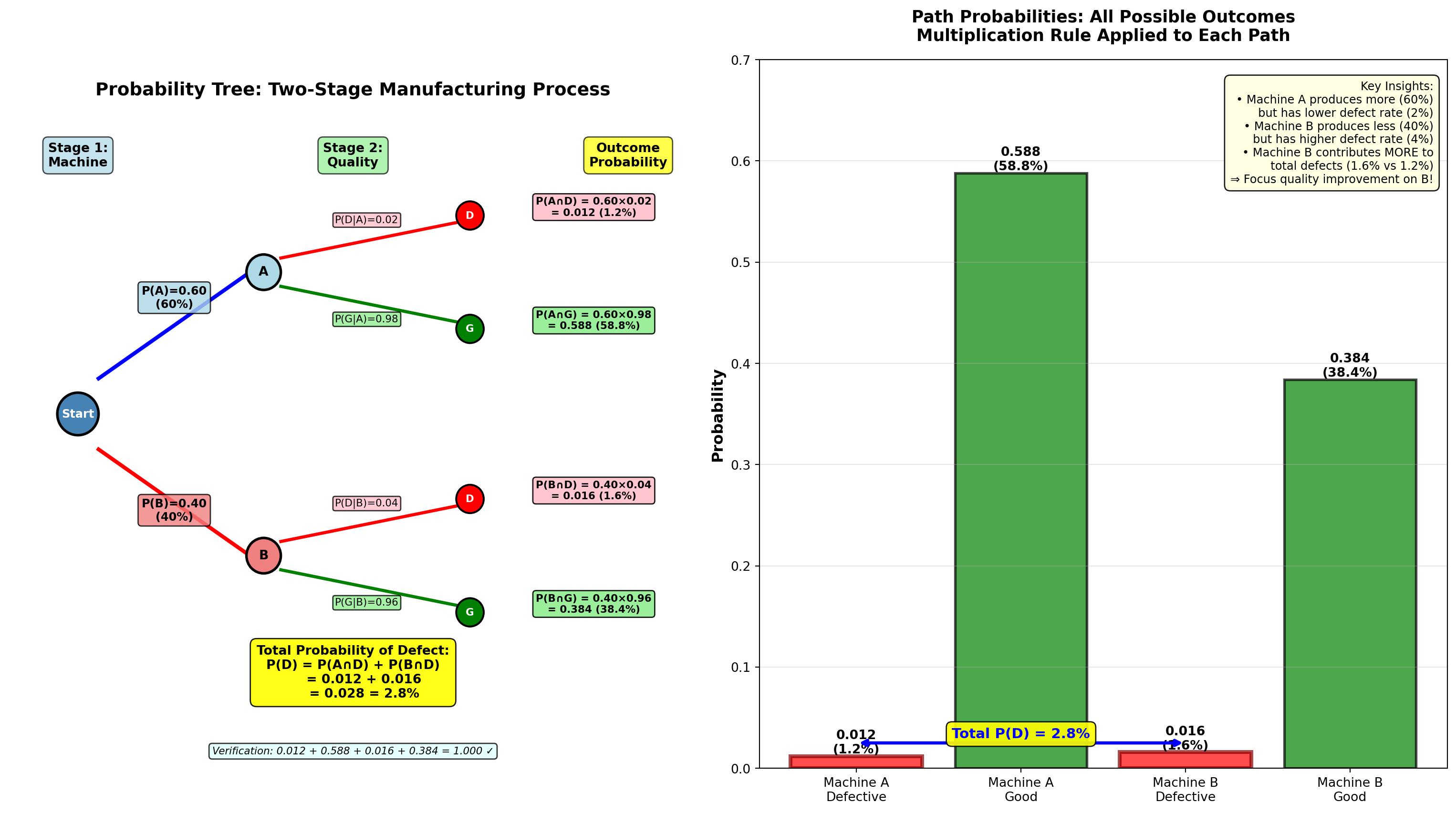
5.8 4.8 Bayes’ Theorem
Bayes’ Theorem (named after Reverend Thomas Bayes, 18th century) allows us to update probabilities based on new evidence. It’s one of the most powerful tools in statistics and data science.
NoteBayes’ Theorem Formula
For two events:
P(A \mid B) = \frac{P(B \mid A) \times P(A)}{P(B)}
Expanded (using total probability):
P(A \mid B) = \frac{P(B \mid A) \times P(A)}{P(B \mid A) \times P(A) + P(B \mid \bar{A}) \times P(\bar{A})}
For multiple mutually exclusive events A_1, A_2, \ldots, A_n:
P(A_i \mid B) = \frac{P(B \mid A_i) \times P(A_i)}{\sum_{j=1}^{n} P(B \mid A_j) \times P(A_j)}
Components: - P(A): Prior probability (before seeing evidence B)
- P(B \mid A): Likelihood (probability of evidence given A is true)
- P(A \mid B): Posterior probability (updated probability of A given evidence B)
- P(B): Total probability of evidence (normalization constant)
Interpretation: Bayes’ Theorem reverses the conditional—if you know P(B \mid A), you can calculate P(A \mid B).
5.8.1 Example 4.12: Machine Source Identification (Bayes’ Theorem)
Continuing Example 4.11 (Dunham Manufacturing):
Given: - Machine A: 60% of production, 2% defect rate
- Machine B: 40% of production, 4% defect rate
- A randomly selected unit IS defective
Question: What is the probability it came from Machine A?
Solution:
We want P(A \mid D) (“probability from Machine A given it’s defective”).
From the probability tree: - P(A) = 0.60 (prior probability—before knowing about defect)
- P(D \mid A) = 0.02 (likelihood—defect rate if from Machine A)
- P(D \mid B) = 0.04 (defect rate if from Machine B)
- P(B) = 0.40 (prior for Machine B)
- P(D) = 0.028 (total probability of defect from tree)
Apply Bayes’ Theorem:
P(A \mid D) = \frac{P(D \mid A) \times P(A)}{P(D)}
= \frac{P(D \mid A) \times P(A)}{P(D \mid A) \times P(A) + P(D \mid B) \times P(B)}
= \frac{0.02 \times 0.60}{0.02 \times 0.60 + 0.04 \times 0.40}
= \frac{0.012}{0.012 + 0.016} = \frac{0.012}{0.028} = 0.4286 = 42.86\%
Interpretation:
Even though Machine A produces 60% of total output, given that a unit is defective, there’s only a 42.86% probability it came from Machine A.
Why is this LESS than 60%?
Because Machine A has a lower defect rate (2% vs 4%). When we observe a defect, it’s more likely to have come from the higher-defect Machine B.
Verify: P(B \mid D) = 1 - 0.4286 = 0.5714 = 57.14\% (Machine B is more likely source)
5.8.2 Example 4.13: Hiring Qualified Candidates (Bayes’ Theorem Application)
TechStartup Inc. is hiring data analysts. Historical data shows:
- 60% of interviewed candidates are actually qualified (Q)
- Of qualified candidates: 67% have statistics training (T)
- Of unqualified candidates: 20% have statistics training
Question: If a candidate has statistics training, what is the probability they are qualified?
Should TechStartup only interview candidates with statistics training?
Solution:
We want P(Q \mid T) (“probability qualified given statistics training”).
Given: - P(Q) = 0.60 (prior—before knowing about training)
- P(T \mid Q) = 0.67 (likelihood—training rate among qualified)
- P(T \mid \bar{Q}) = 0.20 (training rate among unqualified)
- P(\bar{Q}) = 1 - 0.60 = 0.40 (prior for unqualified)
Step 1: Calculate total probability of statistics training using law of total probability:
P(T) = P(T \mid Q) \times P(Q) + P(T \mid \bar{Q}) \times P(\bar{Q})
= 0.67 \times 0.60 + 0.20 \times 0.40 = 0.402 + 0.080 = 0.482 = 48.2\%
Step 2: Apply Bayes’ Theorem:
P(Q \mid T) = \frac{P(T \mid Q) \times P(Q)}{P(T)}
= \frac{0.67 \times 0.60}{0.482} = \frac{0.402}{0.482} = 0.834 = 83.4\%
Interpretation:
Among candidates with statistics training, 83.4% are qualified (vs. 60% in general population).
Business Decision: YES, interview only candidates with statistics training: - Increases qualified candidate rate from 60% → 83.4% (+23.4 percentage points)
- Reduces time wasted on unqualified candidates from 40% → 16.6% (58.5% reduction)
- More efficient recruiting process, lower cost per qualified hire
Code
import matplotlib.pyplot as plt
import numpy as np

fig, axes = plt.subplots(2, 2, figsize=(15, 11))

# Example 4.12: Machine identification
machines = ['Machine A', 'Machine B']
prior_probs = [0.60, 0.40]
posterior_probs = [0.4286, 0.5714]

x_pos = np.arange(len(machines))
width = 0.35

# Panel 1: Prior vs Posterior (Machine example)
bars1 = axes[0, 0].bar(x_pos - width/2, prior_probs, width, label='Prior P(Machine)',
                       color='lightblue', alpha=0.8, edgecolor='black', linewidth=2)
bars2 = axes[0, 0].bar(x_pos + width/2, posterior_probs, width, label='Posterior P(Machine|Defect)',
                       color='orange', alpha=0.8, edgecolor='black', linewidth=2)

# Add value labels
for bars in [bars1, bars2]:
    for bar in bars:
        height = bar.get_height()
        axes[0, 0].text(bar.get_x() + bar.get_width()/2., height,
                       f'{height:.1%}',
                       ha='center', va='bottom', fontweight='bold', fontsize=11)

# Show the reversal
axes[0, 0].annotate('', xy=(0 - width/2, prior_probs[0] + 0.05),
                   xytext=(0 + width/2, posterior_probs[0] + 0.05),
                   arrowprops=dict(arrowstyle='->', lw=2.5, color='red'))
axes[0, 0].text(0, 0.55, 'Decreased!\n60% → 42.9%', ha='center', fontsize=9,
               fontweight='bold', color='red',
               bbox=dict(boxstyle='round,pad=0.3', facecolor='yellow', alpha=0.9))

axes[0, 0].annotate('', xy=(1 - width/2, prior_probs[1] - 0.02),
                   xytext=(1 + width/2, posterior_probs[1] - 0.02),
                   arrowprops=dict(arrowstyle='->', lw=2.5, color='green'))
axes[0, 0].text(1, 0.42, 'Increased!\n40% → 57.1%', ha='center', fontsize=9,
               fontweight='bold', color='green',
               bbox=dict(boxstyle='round,pad=0.3', facecolor='lightgreen', alpha=0.9))

axes[0, 0].set_ylabel('Probability', fontsize=12, fontweight='bold')
axes[0, 0].set_title('Bayes\' Theorem: Prior vs. Posterior Probabilities\nExample 4.12: Machine Source Given Defect',
                    fontsize=13, fontweight='bold', pad=15)
axes[0, 0].set_xticks(x_pos)
axes[0, 0].set_xticklabels(machines)
axes[0, 0].legend(fontsize=10, loc='upper left')
axes[0, 0].grid(True, alpha=0.3, axis='y')
axes[0, 0].set_ylim(0, 0.75)

# Panel 2: Bayes calculation flow diagram
axes[1, 0].text(0.5, 0.95, 'Bayes\' Theorem Calculation Flow (Example 4.12)',
               ha='center', fontsize=13, fontweight='bold',
               transform=axes[1, 0].transAxes)

flow_text = """
Step 1: PRIOR probabilities (before observing defect)
    P(A) = 0.60    P(B) = 0.40

Step 2: LIKELIHOODS (defect rates given machine)
    P(D|A) = 0.02    P(D|B) = 0.04

Step 3: JOINT probabilities (multiply)
    P(A∩D) = P(A) × P(D|A) = 0.60 × 0.02 = 0.012
    P(B∩D) = P(B) × P(D|B) = 0.40 × 0.04 = 0.016

Step 4: TOTAL probability of evidence (sum)
    P(D) = P(A∩D) + P(B∩D) = 0.012 + 0.016 = 0.028

Step 5: POSTERIOR probability (Bayes' formula)
    P(A|D) = P(A∩D) / P(D) = 0.012 / 0.028 = 0.4286 (42.86%)
    P(B|D) = P(B∩D) / P(D) = 0.016 / 0.028 = 0.5714 (57.14%)

INTERPRETATION: Machine B more likely source of defect (57.14% > 42.86%)
despite producing less total output (40% < 60%)
⇒ Higher defect rate (4% > 2%) makes it more probable source!
"""

axes[1, 0].text(0.05, 0.88, flow_text, transform=axes[1, 0].transAxes,
               fontsize=9, verticalalignment='top', family='monospace',
               bbox=dict(boxstyle='round,pad=0.8', facecolor='lightcyan', alpha=0.9))

axes[1, 0].axis('off')

# Panel 3: Example 4.13 - Hiring candidates
candidate_groups = ['General\nPopulation', 'With Statistics\nTraining']
qualified_rates = [0.60, 0.834]
colors_qual = ['steelblue', 'green']

bars_qual = axes[0, 1].bar(candidate_groups, qualified_rates, color=colors_qual,
                           alpha=0.7, edgecolor='black', linewidth=2.5)

# Add value labels
for bar, rate in zip(bars_qual, qualified_rates):
    height = bar.get_height()
    axes[0, 1].text(bar.get_x() + bar.get_width()/2., height,
                   f'{rate:.1%}',
                   ha='center', va='bottom', fontweight='bold', fontsize=13)

# Show improvement
axes[0, 1].annotate('', xy=(0, 0.60), xytext=(1, 0.834),
                   arrowprops=dict(arrowstyle='->', lw=3, color='darkgreen'))
axes[0, 1].text(0.5, 0.74, '+23.4%\nimprovement!', ha='center', fontsize=11,
               fontweight='bold', color='darkgreen',
               bbox=dict(boxstyle='round,pad=0.4', facecolor='yellow', alpha=0.9))

axes[0, 1].set_ylabel('Probability Candidate is Qualified', fontsize=12, fontweight='bold')
axes[0, 1].set_title('Bayes\' Theorem Application: Hiring Strategy\nExample 4.13: Should We Require Statistics Training?',
                    fontsize=13, fontweight='bold', pad=15)
axes[0, 1].grid(True, alpha=0.3, axis='y')
axes[0, 1].set_ylim(0, 1.0)

# Add decision box
decision = (
    "DECISION:\n"
    "✓ YES - Interview only candidates\n"
    "  with statistics training\n\n"
    "BENEFITS:\n"
    "• Qualified rate: 60% → 83.4%\n"
    "• Waste reduction: 40% → 16.6%\n"
    "• Lower cost per qualified hire\n"
    "• More efficient process"
)
axes[0, 1].text(0.98, 0.35, decision, transform=axes[0, 1].transAxes,
               fontsize=9, verticalalignment='center', horizontalalignment='right',
               bbox=dict(boxstyle='round,pad=0.5', facecolor='lightgreen', alpha=0.9))

# Panel 4: Bayes theorem component breakdown
components = ['Prior\nP(Q)', 'Likelihood\nP(T|Q)', 'Evidence\nP(T)', 'Posterior\nP(Q|T)']
component_values = [0.60, 0.67, 0.482, 0.834]
component_colors = ['lightblue', 'lightcoral', 'lightyellow', 'lightgreen']

bars_comp = axes[1, 1].bar(components, component_values, color=component_colors,
                           alpha=0.8, edgecolor='black', linewidth=2)

# Add value labels
for bar, val in zip(bars_comp, component_values):
    height = bar.get_height()
    axes[1, 1].text(bar.get_x() + bar.get_width()/2., height,
                   f'{val:.1%}',
                   ha='center', va='bottom', fontweight='bold', fontsize=11)

# Add formula visualization
axes[1, 1].annotate('', xy=(0.5, 0.62), xytext=(0.5, 0.52),
                   arrowprops=dict(arrowstyle='->', lw=2, color='black'))
axes[1, 1].text(0.5, 0.57, '×', ha='center', fontsize=14, fontweight='bold')

axes[1, 1].annotate('', xy=(1.5, 0.55), xytext=(1.5, 0.45),
                   arrowprops=dict(arrowstyle='->', lw=2, color='black'))
axes[1, 1].text(1.5, 0.50, '÷', ha='center', fontsize=14, fontweight='bold')

axes[1, 1].annotate('', xy=(2.5, 0.75), xytext=(2.5, 0.40),
                   arrowprops=dict(arrowstyle='->', lw=2.5, color='green'))
axes[1, 1].text(2.5, 0.55, '=', ha='center', fontsize=14, fontweight='bold', color='green')

axes[1, 1].set_ylabel('Probability Value', fontsize=12, fontweight='bold')
axes[1, 1].set_title('Bayes\' Theorem Components\nP(Q|T) = P(T|Q) × P(Q) / P(T)',
                    fontsize=13, fontweight='bold', pad=15)
axes[1, 1].grid(True, alpha=0.3, axis='y')
axes[1, 1].set_ylim(0, 1.0)

# Add calculation box
calculation = (
    "Detailed Calculation:\n"
    "P(Q|T) = (0.67 × 0.60) / 0.482\n"
    "       = 0.402 / 0.482\n"
    "       = 0.834 = 83.4%\n\n"
    "Where P(T) calculated as:\n"
    "P(T) = 0.67×0.60 + 0.20×0.40\n"
    "     = 0.402 + 0.080 = 0.482"
)
axes[1, 1].text(0.02, 0.97, calculation, transform=axes[1, 1].transAxes,
               fontsize=8, verticalalignment='top', horizontalalignment='left',
               bbox=dict(boxstyle='round,pad=0.4', facecolor='lightyellow', alpha=0.9))

plt.tight_layout()
plt.show()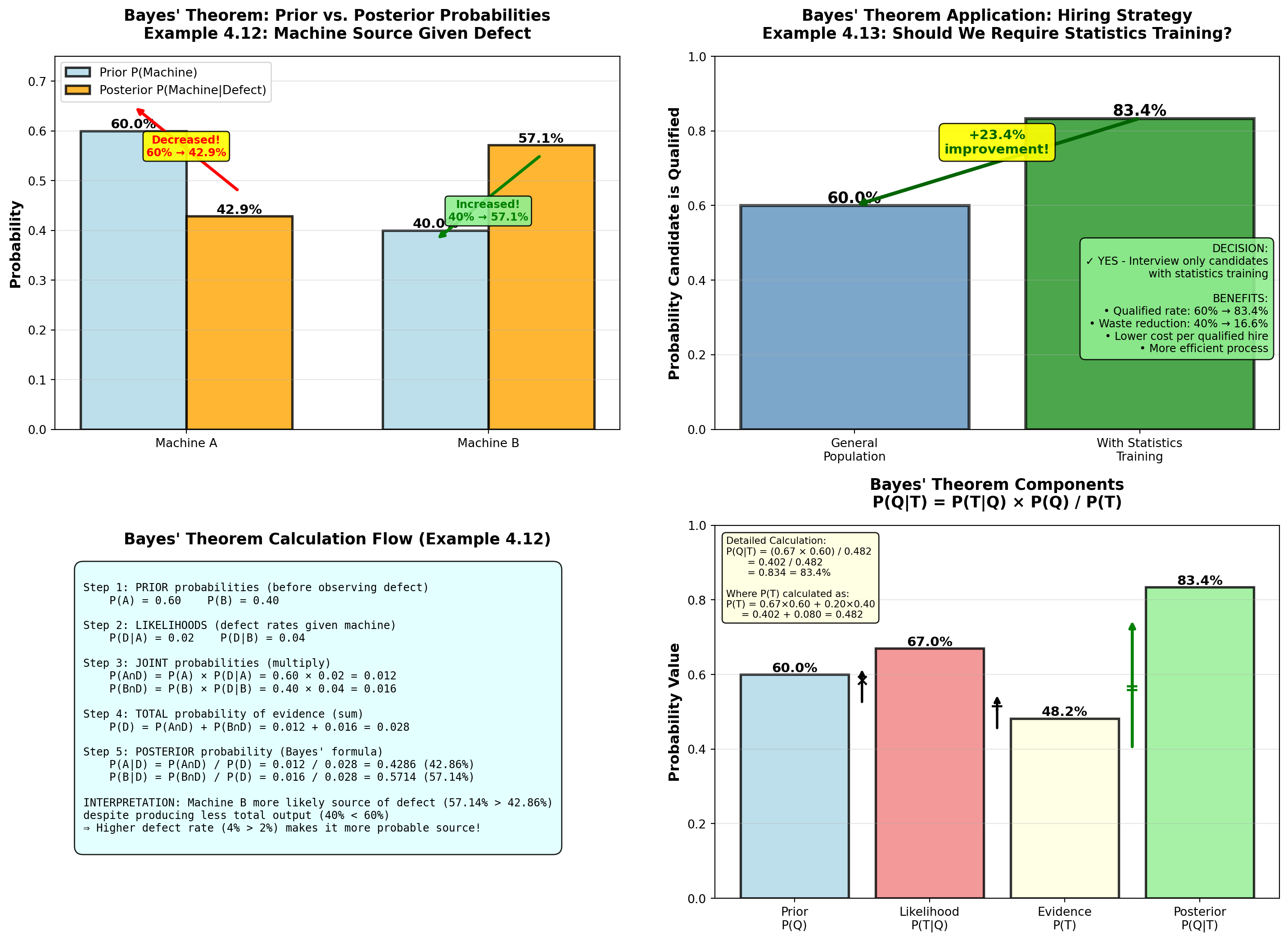
TipReal-World Applications of Bayes’ Theorem
1. Medical Diagnosis - Prior: Disease prevalence in population
- Likelihood: Test sensitivity/specificity
- Posterior: Probability of disease given positive test
- Example: Mammogram positive → What’s probability of cancer?
2. Spam Filtering - Prior: Base rate of spam emails
- Likelihood: Word frequency in spam vs. legitimate
- Posterior: Probability email is spam given word patterns
3. Quality Control - Prior: Market share of suppliers
- Likelihood: Defect rates by supplier
- Posterior: Probability defect from specific supplier
4. Financial Risk - Prior: Default rate by credit score
- Likelihood: Payment history patterns
- Posterior: Updated default probability given new information
5. A/B Testing - Prior: Expected conversion rate
- Likelihood: Observed conversions in test
- Posterior: Updated probability of version superiority
5.9 4.9 Counting Techniques
When calculating classical probabilities, we often need to count the number of possible outcomes. Counting techniques provide systematic methods for this.
NoteFundamental Counting Techniques
1. Multiplication Principle
If there are n_1 ways to do task 1, and n_2 ways to do task 2, then there are:
n_1 \times n_2 \text{ ways to do both tasks}
Generalizes to: n_1 \times n_2 \times n_3 \times \cdots \times n_k for k tasks
2. Permutations (order matters!)
Number of ways to arrange r objects from n objects:
_nP_r = \frac{n!}{(n-r)!}
Example: 5 finalists for 3 medal positions → _{5}P_3 = 60 arrangements
3. Combinations (order doesn’t matter)
Number of ways to select r objects from n objects:
_nC_r = \binom{n}{r} = \frac{n!}{r!(n-r)!}
Example: Choose 3 committee members from 5 candidates → _{5}C_3 = 10 groups
Key Distinction:
- Permutations: ABC ≠ BAC (different arrangements)
- Combinations: {A,B,C} = {B,A,C} (same group)
5.9.2 Example 4.15: Executive Committee Selection (Combinations)
Worldwide Corporation (from Example 4.3) needs to form a 3-person executive committee from a 12-member board (7 men, 5 women).
Question A: How many different 3-person committees are possible?
Solution:
Use combinations (order doesn’t matter—all committee members are equal):
_{12}C_3 = \frac{12!}{3!(12-3)!} = \frac{12!}{3! \times 9!} = \frac{12 \times 11 \times 10}{3 \times 2 \times 1} = \frac{1320}{6} = 220
Answer: 220 different committees are possible.
Question B: How many committees have exactly 2 women and 1 man?
Solution:
This is a two-stage selection: 1. Choose 2 women from 5: _{5}C_2
2. Choose 1 man from 7: _{7}C_1
Use multiplication principle:
_{5}C_2 \times _{7}C_1 = \frac{5!}{2! \times 3!} \times \frac{7!}{1! \times 6!} = 10 \times 7 = 70
Answer: 70 committees have exactly 2 women and 1 man.
Verification: This matches our earlier calculation (Example 4.3) where we found P(2W, 1M) = 70/220 = 0.318.
5.9.3 Example 4.16: License Plate Permutations
State DMV is designing new license plates with format: 3 letters + 4 digits (e.g., ABC-1234).
Question: How many unique license plates are possible?
Solution:
Use multiplication principle with replacement (letters/digits can repeat):
- Letters: 26 choices each × 3 positions = 26^3
- Digits: 10 choices each × 4 positions = 10^4
\text{Total plates} = 26^3 \times 10^4 = 17,576 \times 10,000 = 175,760,000
Answer: Over 175 million unique license plates are possible.
Business Application: Capacity planning for vehicle registration system.
Alternative: If letters/digits cannot repeat, use permutations: _{26}P_3 \times _{10}P_4 = \frac{26!}{23!} \times \frac{10!}{6!} = 15,600 \times 5,040 = 78,624,000
Code
import matplotlib.pyplot as plt
import numpy as np
from math import factorial, comb, perm

fig, axes = plt.subplots(2, 2, figsize=(15, 11))

# Panel 1: Comparison of counting methods for different scenarios
scenarios = ['Menu\nCombos\n(4×6×3)', 'Committee\nSelection\n₁₂C₃',
             'License\nPlates\n26³×10⁴', 'Medal\nPlacements\n₅P₃']
counts = [72, 220, 175760000, 60]
methods = ['Multiplication', 'Combination', 'Multiplication\n(w/ replacement)', 'Permutation']
colors_scenarios = ['lightblue', 'lightgreen', 'lightyellow', 'lightcoral']

# Use log scale for visualization
log_counts = [np.log10(c) for c in counts]

bars = axes[0, 0].barh(scenarios, log_counts, color=colors_scenarios,
                       alpha=0.8, edgecolor='black', linewidth=2)

# Add value labels
for i, (bar, count, method) in enumerate(zip(bars, counts, methods)):
    width = bar.get_width()
    if count < 1000:
        label = f'{count:,} ({method})'
    elif count < 1000000:
        label = f'{count/1000:.1f}K ({method})'
    else:
        label = f'{count/1000000:.0f}M ({method})'

    axes[0, 0].text(width + 0.2, i, label,
                   va='center', fontweight='bold', fontsize=10)

axes[0, 0].set_xlabel('Log₁₀(Number of Outcomes)', fontsize=12, fontweight='bold')
axes[0, 0].set_title('Counting Techniques Comparison\nVast Range of Outcome Counts',
                    fontsize=13, fontweight='bold', pad=15)
axes[0, 0].grid(True, alpha=0.3, axis='x')

# Panel 2: Permutations vs Combinations for same n,r
n_vals = [5, 10, 12, 15, 20]
r_val = 3

perms = [perm(n, r_val) for n in n_vals]
combs = [comb(n, r_val) for n in n_vals]

x_pos = np.arange(len(n_vals))
width = 0.35

bars_p = axes[0, 1].bar(x_pos - width/2, perms, width, label=f'Permutations ₙP₃',
                        color='lightcoral', alpha=0.8, edgecolor='black', linewidth=1.5)
bars_c = axes[0, 1].bar(x_pos + width/2, combs, width, label=f'Combinations ₙC₃',
                        color='lightgreen', alpha=0.8, edgecolor='black', linewidth=1.5)

# Add value labels
for bars in [bars_p, bars_c]:
    for bar in bars:
        height = bar.get_height()
        axes[0, 1].text(bar.get_x() + bar.get_width()/2., height,
                       f'{int(height):,}',
                       ha='center', va='bottom', fontweight='bold', fontsize=9)

# Show ratio
axes[0, 1].text(0.98, 0.97, f'Ratio: ₙP₃ / ₙC₃ = 3! = 6\n(Permutations always larger\nwhen order matters)',
               transform=axes[0, 1].transAxes,
               fontsize=10, verticalalignment='top', horizontalalignment='right',
               bbox=dict(boxstyle='round,pad=0.5', facecolor='yellow', alpha=0.9))

axes[0, 1].set_ylabel('Number of Outcomes', fontsize=12, fontweight='bold')
axes[0, 1].set_xlabel('n (Total Objects)', fontsize=12, fontweight='bold')
axes[0, 1].set_title('Permutations vs. Combinations\nSelecting r=3 Objects from n Total',
                    fontsize=13, fontweight='bold', pad=15)
axes[0, 1].set_xticks(x_pos)
axes[0, 1].set_xticklabels(n_vals)
axes[0, 1].legend(fontsize=10, loc='upper left')
axes[0, 1].grid(True, alpha=0.3, axis='y')

# Panel 3: Committee composition breakdown (Example 4.15)
compositions = ['All 3\nWomen', '2 Women\n1 Man', '1 Woman\n2 Men', 'All 3\nMen', 'TOTAL']
counts_comp = [10, 70, 105, 35, 220]
colors_comp = ['purple', 'mediumpurple', 'lightcoral', 'red', 'gold']

bars_comp = axes[1, 0].bar(compositions, counts_comp, color=colors_comp,
                           alpha=0.7, edgecolor='black', linewidth=2)

# Add value labels
for bar, count in zip(bars_comp, counts_comp):
    height = bar.get_height()
    axes[1, 0].text(bar.get_x() + bar.get_width()/2., height,
                   f'{count}',
                   ha='center', va='bottom', fontweight='bold', fontsize=12)

# Highlight most likely
bars_comp[2].set_edgecolor('darkred')
bars_comp[2].set_linewidth(3)
axes[1, 0].annotate('Most likely\ncomposition', xy=(2, 105), xytext=(2.5, 150),
                   fontsize=10, fontweight='bold',
                   bbox=dict(boxstyle='round,pad=0.4', facecolor='yellow', alpha=0.9),
                   arrowprops=dict(arrowstyle='->', lw=2, color='red'))

# Highlight total
bars_comp[4].set_edgecolor('darkgoldenrod')
bars_comp[4].set_linewidth(3)

axes[1, 0].set_ylabel('Number of Committees', fontsize=12, fontweight='bold')
axes[1, 0].set_title('Committee Compositions Using Combinations\n₁₂C₃ = 220 Total Committees',
                    fontsize=13, fontweight='bold', pad=15)
axes[1, 0].grid(True, alpha=0.3, axis='y')
axes[1, 0].set_ylim(0, 250)

# Add calculation box
calc_text = (
    "Calculations:\n"
    "• All 3 women: ₅C₃ = 10\n"
    "• 2W, 1M: ₅C₂ × ₇C₁ = 10×7 = 70\n"
    "• 1W, 2M: ₅C₁ × ₇C₂ = 5×21 = 105\n"
    "• All 3 men: ₇C₃ = 35\n"
    "• Sum: 10+70+105+35 = 220 ✓"
)
axes[1, 0].text(0.02, 0.97, calc_text, transform=axes[1, 0].transAxes,
               fontsize=9, verticalalignment='top', horizontalalignment='left',
               bbox=dict(boxstyle='round,pad=0.5', facecolor='lightcyan', alpha=0.9))

# Panel 4: Decision tree for when to use which technique
axes[1, 1].axis('off')

decision_tree = """
COUNTING TECHNIQUE DECISION TREE
═══════════════════════════════════════════════════════════════

Q1: Are you making MULTIPLE independent choices in sequence?
    │
    YES → Use MULTIPLICATION PRINCIPLE
    │     Example: Menu selection (4 × 6 × 3 = 72)
    │     Formula: n₁ × n₂ × ... × nₖ
    │
    NO → Q2: Does ORDER matter?
          │
          YES → Use PERMUTATIONS
          │     Example: Medal placements (Gold ≠ Silver ≠ Bronze)
          │     Formula: ₙPᵣ = n!/(n-r)!
          │
          NO → Use COMBINATIONS
                Example: Committee selection (member = member)
                Formula: ₙCᵣ = n!/[r!(n-r)!]

KEY QUESTIONS TO ASK:
─────────────────────────────────────────────────────────────
1. Can outcomes be repeated (with replacement)?
   YES → Use exponents: nʳ
   NO  → Use factorials: n!/(n-r)!

2. Does ABC differ from BAC?
   YES → Permutation
   NO  → Combination

3. Are choices independent?
   YES → Multiply individual counts
   NO  → Need conditional probabilities

QUICK REFERENCE:
─────────────────────────────────────────────────────────────
• Permutations ALWAYS ≥ Combinations (for same n, r)
• Ratio = r! (the number of ways to arrange r objects)
• For r=3: Permutations = 6 × Combinations
"""

axes[1, 1].text(0.5, 0.95, decision_tree, transform=axes[1, 1].transAxes,
               fontsize=9, verticalalignment='top', horizontalalignment='center',
               family='monospace',
               bbox=dict(boxstyle='round,pad=0.8', facecolor='lightyellow', alpha=0.9))

plt.tight_layout()
plt.show()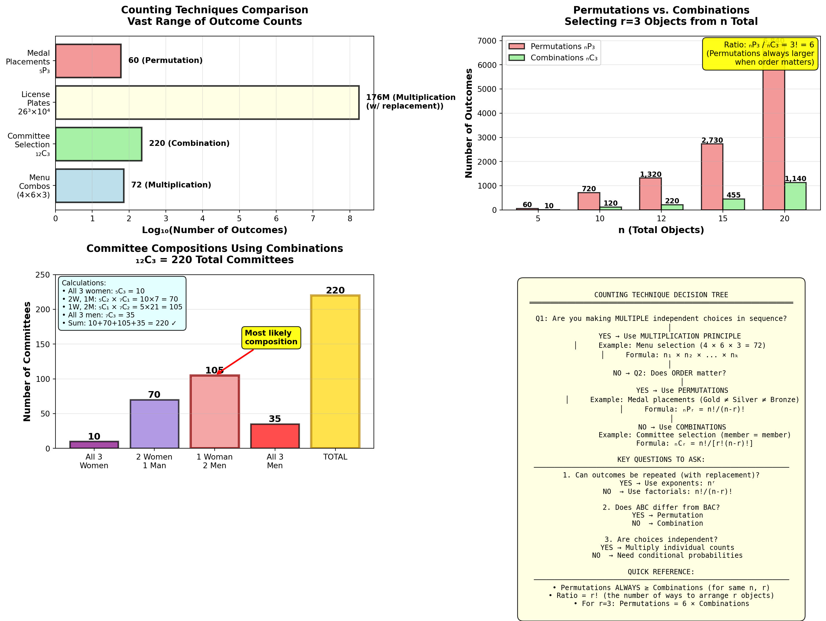
5.10 4.10 Chapter Summary
This chapter introduced probability principles—the foundation for statistical inference and business decision-making under uncertainty.
NoteKey Concepts Mastered
1. Three Approaches to Probability - Relative Frequency: Based on historical data (defect rates, conversion rates)
- Subjective: Expert judgment when no data exists (new product success)
- Classical: Equally likely outcomes (dice, cards, random selection)
2. Event Relationships - Mutually Exclusive: Cannot occur together → P(A \cap B) = 0
- Collectively Exhaustive: Cover all outcomes → \sum P(A_i) = 1
- Independent: No influence → P(A \cap B) = P(A) \times P(B)
- Complementary: Opposite outcomes → P(\bar{A}) = 1 - P(A)
3. Fundamental Probability Rules - Multiplication Rule (General): P(A \cap B) = P(A) \times P(B \mid A)
- Multiplication Rule (Independent): P(A \cap B) = P(A) \times P(B)
- Addition Rule (General): P(A \cup B) = P(A) + P(B) - P(A \cap B)
- Addition Rule (Mutually Exclusive): P(A \cup B) = P(A) + P(B)
4. Conditional Probability - Formula: P(A \mid B) = \frac{P(A \cap B)}{P(B)}
- Meaning: Probability of A given B occurred
- Application: Update probabilities based on new information
5. Bayes’ Theorem - Formula: P(A \mid B) = \frac{P(B \mid A) \times P(A)}{P(B)}
- Power: Reverse conditional probabilities
- Components: Prior → Likelihood → Posterior
6. Counting Techniques - Multiplication Principle: n_1 \times n_2 \times \cdots \times n_k
- Permutations (order matters): _{n}P_r = \frac{n!}{(n-r)!}
- Combinations (order doesn’t matter): _{n}C_r = \frac{n!}{r!(n-r)!}
5.10.1 Business Applications Summary
| Technique | Business Application | Example from Chapter |
|---|---|---|
| Relative Frequency | Quality control monitoring | Circuit board defect rate (3% vs. 2% target) |
| Subjective Probability | New product launch decisions | AR headset success probability (60%) |
| Classical Probability | Diversity analysis, legal compliance | Executive committee gender composition |
| Conditional Probability | Training ROI, hiring effectiveness | P(Excellent|Trained) = 40% vs. 15% |
| Bayes’ Theorem | Root cause analysis, diagnostic testing | Machine source of defect identification |
| Probability Trees | Multi-stage process analysis | Two-machine production system |
| Counting Techniques | Capacity planning, menu design | License plate combinations, committee selection |
5.10.2 Formula Quick Reference
NoteComplete Formula List
Basic Probability: 0 \leq P(A) \leq 1 P(\bar{A}) = 1 - P(A)
Relative Frequency: P(E) = \frac{\text{Number of times } E \text{ occurred}}{\text{Total observations}}
Classical: P(E) = \frac{\text{Number of ways } E \text{ can occur}}{\text{Total number of equally likely outcomes}}
Multiplication Rules: P(A \cap B) = P(A) \times P(B \mid A) \quad \text{(general)} P(A \cap B) = P(A) \times P(B) \quad \text{(independent)}
Addition Rules: P(A \cup B) = P(A) + P(B) - P(A \cap B) \quad \text{(general)} P(A \cup B) = P(A) + P(B) \quad \text{(mutually exclusive)}
Conditional Probability: P(A \mid B) = \frac{P(A \cap B)}{P(B)}
Bayes’ Theorem: P(A \mid B) = \frac{P(B \mid A) \times P(A)}{P(B)}
Counting Techniques: \text{Permutations: } _{n}P_r = \frac{n!}{(n-r)!} \text{Combinations: } _{n}C_r = \frac{n!}{r!(n-r)!} \text{Multiplication: } n_1 \times n_2 \times \cdots \times n_k
5.10.3 Strategic Insights for Business Leaders
TipTen Probability Principles for Better Business Decisions
Update beliefs with data (Bayes’ Theorem) — Prior assumptions should change when new evidence arrives
Recognize independence vs. dependence — Don’t multiply probabilities for correlated events
Use complement for “at least one” problems — Often easier than counting all scenarios
Conditional probabilities reveal causation — Compare P(Success|Action) to P(Success)
Small probabilities compound — Even 1% risks become significant over many trials
Subjective probabilities need calibration — Expert judgment is valuable but vulnerable to bias
Visualize with trees for sequential events — Clarity improves with branching diagrams
Count carefully in classical problems — Permutations ≠ Combinations (order matters!)
Probability quantifies uncertainty, not certainty — 80% success still means 20% failure
Decision quality ≠ Outcome quality — Good decisions can have bad outcomes (and vice versa)
5.10.4 Return to the Ski Resort Challenge
Recall our opening scenario: Michael Berry warned that many ski resorts face “high probability of bankruptcy.”
With your new probability skills, you can now:
✅ Calculate P(\text{Bankruptcy} \mid \text{Isolated location}) using conditional probability
✅ Use Bayes’ Theorem to identify resorts most at risk
✅ Compare P(\text{Bankruptcy} \mid \text{Urban}) vs. P(\text{Bankruptcy} \mid \text{Isolated})
✅ Analyze whether location and bankruptcy are independent events
✅ Create probability trees for multi-year financial projections
✅ Apply counting techniques to scenario planning
Business Recommendation:
If P(\text{Bankruptcy} \mid \text{Isolated}) >> P(\text{Bankruptcy} \mid \text{Urban}), then: - Isolated resorts should diversify revenue (summer activities, real estate)
- Investors should adjust risk premiums based on conditional probabilities
- Industry associations should target support to high-risk segments
Data-driven decisions beat gut instinct when you master probability!
END OF CHAPTER 4